1. Name: ___________________________
US. POSTAL STAMP
Printmaking Project
Dorofy – Gordon – Duckworth - Sanders
Goal:Create a stamp design based on fictional setting to be printed multiple times from a single
linoleum plate
PHASE 1 - Plan
Your composition must showcase:
- One word that embodies your chosen fictional place
(think literary, movie, etc.)
- Imagery from your chosen fictional setting
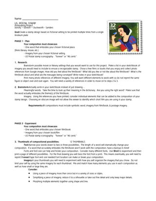
- US Postal stamp iconography: “forever” or “46 cents”
1. Research:
Brainstorm possible movie or literary settings that you would want to use for this project. Make a list in your sketchbook of
imagery you would need to include to ensure a recognizable stamp. Chose a few films or books that you enjoy and collect photo
references from Google images. How did you feel about the film/book? What did you like or not like about the film/book? What is the
film/book about and what are the messages being conveyed? Write notes in your sketchbook!
Print many photo references of different imagery. You will want different elements to work with so do not reprint the same
figure or object over and over again. You will need a variety of references in order to move on to steps 2 & 3.
2. Brainstorm:Actually write in your sketchbook instead of just drawing…
Meaningful words. Take the time to look up their meaning in the dictionary. Are you using the right word? Make sure that
the word actually embodies the theme(s) of the film/book.
Imagery. Using the references you have printed, consider individual elements that can be added to the composition of your
stamp design. Choosing an obscure image will not allow the viewer to identify which short film you are using in your stamp.
Requirements:All compositions must include symbolic word, imagery from film/book, & postage imagery.
PHASE 2 - Experiment
Your composition must showcase:
- One word that embodies your chosen film/book
- Imagery from your chosen book/film
- US Postal stamp iconography: “forever” or “46 cents”
3. Thumbnails of compositional possibilities:
12 THUMBNAILS
Text:Narrow your words down to two or three possibilities. The length of a word will dramatically change your
composition. If a word that accurately embodies the film/book won’t work with the composition, have a backup in mind!
Fonts and font size can help and hinder your composition. Consider many different fonts. Use Word to experiment and then
print a page of different possibilities. For the final drawing you will trace the font from a print. This means eventually, you will need to
reprint theexact type font and size needed.Font location can make or break your composition.
Imagery:In your thumbnails you will need to experiment with how you will organize the imagery that you chose. Do not
limit your self by using the same imagery for each thumbnail. Mix and match how many elements you use in each composition as
well as how small or large they are.
Consider:
Using a piece of imagery more than once but in a variety of sizes or styles.
Simplifying a piece of imagery; reduce it to a silhouette or take out fine detail and only keep major details.
Morphing multiple elements together using shape and line.
2. Positive and negative space; you want balance and a clear distinction between the two.
Do not be a stick in the mud in composition!
Be flexible and consider that there might be better type fonts, sizes, and locations other than your favorite.
You need to consider many options! The same goes for imagery.
AKA: DO NOT CREATE THE SAME THUMBNAIL OVER AND OVER AGAIN!!
PHASE 3 - Create
Your composition must showcase:
- One word that embodies your chosen short film
- Imagery from your chosen short film
- US Postal stamp iconography: “forever” or “46 cents”
4. Create a plate from linoleum:
Final Sketch: On the paper provided (which is exactly the same size as your linoleum plate) redraw the thumbnail with the
strongest composition. Take some time to discuss your thumbnails with your art teacher and peers in class before making your
selection. Sometimes we like an idea more than it’s success in composition.Contour Lines only!!
Transfer Sketch: Go over all of your contour lines with an ebony pencil – APPLY THICKLY! Flip your sketch and place it face
down on your linoleum plate. Burnish the back of your sketch with a hardutensil like a tape roll, the butt of your pen or pencil, scissor
handles, etc. (your hand will not be enough). This will transfer the sketch to the linoleum plate.
Ink: The pencil lines will be far too light and will rub off quickly. Ink all of your contour lines with a thick sharpie marker. Go
slow and use your best craftsmanship. These lines will be your guides for carving so they must be 100% accurate. Everything will be
backwards!
Carve: Using the safety techniques shown in demo, begin to carve into your linoleum. Don’t forget, carving deeper into the
linoleum does not change your print AT ALL.
Create texture by carving marks into the linoleum. Use the same techniques we learned in drawing:
Stippling (dots or other shapes)
Hatching
Cross Hatching
Create line weight by switching gouge tips. You can remove the tip and switch it for a thin, thick, round of angular tip. You
can also broaden a line by simply carving again adjacent to the line.
5. Print!
Test Print: On the scrap newsprint paper provided, test out pressure, amount of ink, colors etc.
The real deal: On the good paper provided, print no less than three and no more than 6 times. Mix and match paper color,
ink color, pressure etc. You may print as many test prints in between as long as this is done of scrap newsprint! You should print on
white paper at least 1 time in order to complete step 6.All wet prints go on the drying rack.
PUT YOUR NAME ON EACH PRINT BEFORE PUTTING IT IN THE DRYING RACK!!
Clean up as shown in demo; DO NOT LEAVE brayers, trays and other tools loaded with ink in the sink!