
Recommandé
Contenu connexe
Tendances
Tendances (14)
En vedette
En vedette (15)
Similaire à Film poster evaluation
Similaire à Film poster evaluation (20)
Dernier
Dernier (20)
Film poster evaluation
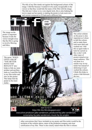
- 1. The title of my film stands out against the background colours of the image. I did this because I wanted it to be easily recognisable to the viewer so that they would link the name of the film with the image. The title text I chose is in a very digital style, this is also helping the text to stand out but mainly is making the poster to look more new and current compared to if I had used a different font. The image on the poster is important The colour scheme because it tells the on the poser is also viewer straight away important as I chose that the film is going to dull the colours to involve Bmxing and to make them and bikes. look more dark and washed out. I did this to again make it look for current as this is don’t with other types of The quote “WHEN posters aimed at my LIFES A BLUR” target audience. This “YOU BETTER was done in a HAVE FAST similar way on my REFLEX’S” also trailer but instead of helps to link my main darkening it I just product and ancillary washed the colours. tasks as I used this line I think this helps to in my film trailer and create a link between also on this poster. the two. This helps link the poster to the main trailer. other conventions that I have included on my poster and film trailer would be the inclution of the website adress, name of the prodution company and clear certification of my film. There is also clearly stated when the film is release.