9953056974 Call Girls In Pratap Nagar, Escorts (Delhi) NCR
Magazube Analysis
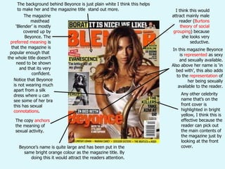
1. The magazine masthead ‘ Blender’ is mostly covered up by Beyonce. The preferred meaning is that the magazine is popular enough that the whole title doesn’t need to be shown and that its very confident. Beyonce’s name is quite large and has been put in the same bright orange colour as the magazine title. By doing this it would attract the readers attention. I think this would attract mainly male reader ( Burtons theory of social grouping ) because she looks very seductive. Any other celebrity name that’s on the front cover is highlighted in bright yellow, I think this is effective because the reader can pick out the main contents of the magazine just by looking at the front cover. The background behind Beyonce is just plain white I think this helps to make her and the magazine title stand out more. Notice that Beyonce is not wearing much apart from a silk dress where u can see some of her bra this has sexual connotations . In this magazine Beyonce is represented as sexy and sexually available. Also above her name is ‘in bed with’, this also adds to the representation of her being sexually available to the reader. The copy anchors the meaning of sexual activity.
2. Again the masthead of the magazine is partly covered up suggesting that the magazine is popular enough that the whole title doesn’t need to be on show. This time it’s a male half naked on the front cover, I think the target audience for the this issue is female readers, because with him having half his body out this also represents him as being sexually available. However I think male readers would by this because they want to be like Trey Songz and to have a body like him. On this front cover the names of the celebrities are a different colour to the vibrant red of the magazine title. However the white used to colour the celebrities names stands out against the black background. The tiled background fits in with how Trey Songz’ body is wet, and also is quite plain making him stand out.
3. In this front cover its closer shot so u can see his face in more detail. With the shot being closer u can see that his expression is very serious, this could mean that he is a more serious artist. Again the writing of the celebrities names is in white and not the same colour as the magazine title. Quite a lot of the masthead is covered up by T.I’s hat, again suggesting that the magazine is popular enough that the whole title doesn’t need to be shown. The lighting on T.I’s face makes his face stand out where his jumper nearly blends in with the background. Also the lighting on his face makes him look more serious. Also they’ve got a picture for a blackberry pin so its up to date with the technology. I think from this front cover T.I is represented as very serious.
4. The layout of the magazine represents itself as very confident because part of the masthead is covered up. The blue used to colour the title of the magazine is the same shade of blue as the shirt Kanye West is wearing, this suggests he fits in/goes with the magazine. Celebrities name stands out more than the title of the magazine, they’ve achieved this by highlighting it bright yellow. However this doesn’t look odd it still fits in with the magazine because it’s the same yellow as the tie Kanye West is wearing. This photo is different to the other magazines because the quality is not as good, it doesn’t look like a planned shoot. To me it looks like more of a photo captured at some sort of event. Plain white background making Kanye West stand out/doesn’t take the readers focus away from him.
5.
6. Even on the contents page part of the masthead is covered up by the artists head. The artist has a lot of jewellery on and gold teeth this would represent him as wealthy. The key features in this magazine seem to be about this artist and his riches. Also the writing telling you the content of the magazine is really small compared to the artist; suggesting the artist is more important. The colour red has positive connotations for example love, luck and passion but the expression on his face and is pose it doesn’t really fit in with these. However red also as negative connotations for example war, anger and danger which I think fits in better with this artists particular stance. For the title of contents sans serifs font has been used which works really well because its quite bold, plain font which stands out and therefore makes a successful title. However for the smaller font serif has been used, this makes the text look more elegant and stylish. This works well as a heading because it would catch the readers the reader attention and get them to read it.
7. The writing of the contents looks like its been typed to fit around Ciara again suggesting she’s more important than the content of the magazine. I think Ciara is represented as sexually available because she doesn’t have much clothing on ,her legs are bare and also she has quite a sexy expression on her face. And because of this I think the target audience would be mainly male. The V above Ciara I think has been purposely made to look like strings on a puppet because of how men like to be in control of the women, so Ciara could be therefore represented as the perfect woman. Ciara has been further represented as the perfect women by the colours used. Mostly white has been used and it has the connotation of purity and cleanliness. The masthead for contents has been broken up but I think this works well because it fits in with the stylish nature of the magazine.
8.
9.
10. Straight away the reader can tell the article is mainly about Will.i.am because the three others are faded in the background. The colour scheme for this double page is quite plain and also because the other three artists have been faded out so their clothes look quite plain. The main colour used is gold, and the connotation for gold is riches. So this represents Will.i.am as wealthy and maybe that he likes to show off his money because he’s got a gold suit on. The white background makes the artists stand out. The small font is sans-serif which is easy to read. The main font is serif which makes it stand out, and also fits in with the colour scheme of the double page spread.
11. Very plain double page spread, the main colours are black and white. They’ve made Lily Allen stand out by dressing her in a red shirt which goes with the red font in the paragraph. The main text is in sans-serif font which is very eye catching on the white page. Lily Allen takes up more room than the text and the main title, this would represent her as being more important than the content of the text. Compared to the other artists on and in the magazine her body is very covered up and her clothes are quite normal and plain. This could suggest that she’s not as fussed about her appearance and what she wears compared to the other artists. The font being made red makes it stand out against the black font, the reader would skip through to this.
12. The biggest text is using sans-serif font which is very common, however the second largest font uses serif font which is unusual because its usually the cover lines that uses the serif font. Serif font used for the first letter of the paragraph, stands out. The main colours used are red, black and white. The connotations for black are mostly negative for example death, evil and mystery but I think the connotations that meant here are style, ‘little black dress’, elegance and also it known to be a slimming colour. The image continues over to the next page and so does the header. The cover line is layered over the header which adds depth to the page and also adds style. Three columns have been used here, this breaks up the text so it doesn’t look as much and is also easy to read.