
Recommandé
Recommandé
Contenu connexe
Dernier
Dernier (20)
En vedette
En vedette (20)
Propaganda3presentation
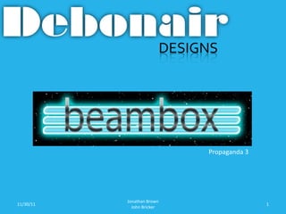
- 1. Propaganda 3 Jonathan Brown 11/30/11 1 John Bricker
- 2. Introductions • Jonathan Brown – Senior at Blue Valley Northwest – Graphic design major • John Bricker – Senior at Blue Valley North – Graphic design major Jonathan Brown 11/30/11 2 John Bricker
- 3. Myself • Jonathan Brown • My Role: To design the “create” screens, the main menu screen, and to help design user interface and wire frames • In my free time I love to play the piano Jonathan Brown 11/30/11 3 John Bricker
- 4. Propaganda 3 • Propaganda 3 is digital productions company. • Experience, creativity, personality, and a quality that only manifests itself in the work is what Propaganda 3 is all about. • The guys at Propaganda 3 have volunteered to mentor us through the creation of our android app. Jonathan Brown 11/30/11 4 John Bricker
- 5. Our Objective • Our objective is to develop and design a musical android app strictly for ones enjoyment. In addition we will gain hands-on experience of working with a a real life client and a team of individuals majoring in a variety of careers including, marketing, coding and interactive design. Jonathan Brown 11/30/11 5 John Bricker
- 6. Target Audience • Due the fact that a wide variety of individuals of all ages and backgrounds enjoy music, we agreed that there is no specific audience other than those that own an Android device. Jonathan Brown 11/30/11 6 John Bricker
- 7. Our Message • We want our customers to download this app, play around, compose, and share the music they created with their friends. Pure enjoyment. Jonathan Brown 11/30/11 7 John Bricker
- 8. Rationale • While planning for an app creation , we had to keep in mind that we only have one semester and one semester is not enough to finish. Upon this knowledge we decided we would set a foundation for the next group to build off and finish it for us. Jonathan Brown 11/30/11 8 John Bricker
- 9. Deliverables • Prior to this, Propaganda 3 hasn’t developed a synth app. • Project Summary • Personae • Application Flowchart/Site Map • Application Wireframes • Functionality Outline By Screen • Brand Attributes • Marketing Overview and Approach Options • Resources – includes color pallet, logo iterations, sharing API info, etc. Jonathan Brown 11/30/11 9 John Bricker
- 10. Competitors • Caustic Music Rack - not visually engaging very generic, looks intimidating to amateurs http://mobiputing.com/2011/05/caustic-music-rack-is-a-digital-music-studio-for-android/ • BME Synthesizer – looks very complicated, mostly professional experienced musicians would use this application. http://www.androidpit.com/en/android/market/apps/app/audio.bristol.bme700/BME- Synthesizer Jonathan Brown 11/30/11 10 John Bricker
- 11. Our First Sketch Jonathan Brown 11/30/11 11 John Bricker
- 12. Vertical but needed it in landscape view Wireframe Draft Looks cluttered and unclear Jonathan Brown 11/30/11 John Bricker 12
- 13. Wireframe Landscape View Uncluttered. Clean look Jonathan Brown 11/30/11 John Bricker 13
- 14. Digital Sketches Lasers Didn’t really “Pop” We agreed that this was the look that fit the best Jonathan Brown 11/30/11 14 John Bricker
- 15. Mock Up Create Screen Simplistic User Interface. Unique Musical Lasers Laser color will vary to correspond to diff. track layer colors Jonathan Brown 11/30/11 John Bricker 15
- 16. Track Layers Simple Design Big buttons for easy use Colors to correspond with the color of the lasers of that specific track Jonathan Brown 11/30/11 John Bricker 16
- 17. First Digital Sketches Logo Goes with beam theme Not very laser though Second Consistent with beams Final Glows like a laser. Added depth Jonathan Brown 11/30/11 17 John Bricker
- 18. Digital Sketches Main Menu Cluttered Feel Inconsistent Branding Same Inconsistency Unclear buttons Difficult to read Jonathan Brown 11/30/11 18 John Bricker
- 19. Current Digital Menu Clean, Distinguishable Buttons, consistent branding. Readable Visually Engaging Simple Design Jonathan Brown 11/30/11 19 John Bricker
- 20. Comparison Complicated/Int Simplistic User Interface. Unique Musical Lasers ting Generic Keyboard Design Jonathan Brown 11/30/11 20 John Bricker
- 21. Checklist • Wireframes (John)-October 27th:Complete • Revise wireframes and test navigation (John & Jonathan)-December 7th: In progress • App Overview Document (Entire Team)- December 7th: In progress • Attain Color Pallet Hex Codes (Jonathan)- December 7th: In progress • Marketing Strategy (Malissa & Carter)-2nd Semester: In Progress Jonathan Brown 11/30/11 21 John Bricker
- 22. Responses/Suggestions Thank you for your time and attention. I am open for any suggestions or criticism to further enhance this project. Jonathan Brown 11/30/11 22 John Bricker