SlideShare une entreprise Scribd logo
1  sur  81
Calligraphy word originated
from the Greek language called
KALOS means fair and beautiful
line and GRAPHO means
to write. In other
words,           I WRITE WITH
FAIR AND BEAUTIFUL LINE.
A power point presentation by Ranjan Raghuvir Joshi
Calligraphy word originated from the Greek language called KALOS means fair and
beautiful line and GRAPHO means to write. In other words, I WRITE WITH FAIR AND
BEAUTIFUL LINE. When I received the fellowship in 1972-73 to teach and learn the basic
design in Sir J.J.Institute of Applied Art (after completing Diploma in Commercial Art in
merit) I had to conduct the class for this Subject as part of it. My late father being
practicing Artist and Professor in Visual Art R.P.Joshi gave me an insight that, to deal with
any subject, one must find and search the origin of it. He gave me the Dictionary of The
English Language by The Rev. James Stormonth published in 1886 A.D. ninth edition by
William Blackwood and Sons, Edinburgh and London. This was the only dictionary which
have above said meaning that gave me more confidence to deal with this subject firmly
while working for the prestigious review committee (1976/77) for “syllabus 1970”
(newly introduced then of Foundation of visual art) by Directorate of
Art,                     Maharashtra State. I had to address this subject as an academic expert
to                     the state of Maharashtra’s nearly 18 Art schools on behalf of Directorate
of Art,                                   Maharashtra State.
I have to express my sense of gratitude towards: late Prof.V.R.Amberkar, late Prof.H.G. Hanumante, Prof. V.N.Yande and
also former Directors Late Prof.M.S. Satwalekar, Late Prof. Baburaoo Sadwelkar. They encourage me to research this
subject with my practical exercises in Sir J.J.Institute of Applied Art during the period of 1972 to 1977.
Sir J.J. School of Art Campus have Applied art as an independent Art Institute under Directorate
of Art, Maharashtra State, which is known as Sir J.J.Institute of Applied Art.
The debate was on during that time whether to considering this subject as pure fine art ?
amongst the faculties of fine art and applied art in the campus. Late Prof. Baburaoo Sadwelkar
then the Director of Art saw that it has more potential also as communication art while
reviewing the syllabus that was introduced in late 1970. Prof. Baburaoo Sadwelkar took the
cognizance of my finding of its original meaning and decided to expand its scope further
beyond fine art. Incidentally my earlier research mentioned above motivated me to conduct
the exercises in the two directions.
Firstly: the subject Calligraphy as the form of pure fine art, in terms of exploring its expression of
spontaneity of fair and beautiful lines. This is a Calligraphic expression with no function of
communication. This was called informal calligraphy for the student to study in detail the strokes’
line qualities that is necessary for being beautiful. I could cover this basic prerequisite to get into
the subject. Secondly: To look at Writing as a means of communication. Communication is
defined as a science because one can check its feedback rationally.
This was called formal calligraphy. Old manuscripts are a classic example
which combines both these aspects.
Student:Narendra D. Kadam-1973
I started with this which was innovative approach to explore the term Spontaneity. I told students to
close their eyes and while this was being done I went on uttering the names of various objects known to
them since their childhood days. The idea was to see retention and recall of these known forms and
how our brain renders it with no external influence, because at that time eyes were asked to closed.
This is the first experience of KALOS and GRAPHO that I mentioned at the beginning. Feedback by the
student Narendra D.Kadam in his mothertounge Marathi which says that it was interesting experience.
Drawing Triangle, Square and Circle was difficult while eyes are closed. This has help them realized the
eye and mind coordination to experience spontaneity.
Here is an attempt by me to investigate the painting possibilities from the earlier said exercise on retention and recall of
    known forms. Understanding the FINE ART angle of the calligraphy. Finding INFORMAL & FORMAL calligraphy.


Interpretation by Ranjan R. Joshi
Perception and Reality to understand “Spontaneity”
                                              This is an experiment to test one’s perception
                                              and how one can pick up to draw visual details!
                                              The photograph taken after the said drawing
                                              from the same spot to verify in reality what is
                                              lost in the final drawing. Observe the first
                                              cartoon (Pencil sketch) which allow us to verify
                                              details. This is the recent example I tried to
                                              experience the concept of “Spontaneity” an
                                              essential element for good calligraphy. What is
                                              shown in the earlier slide shows the retention
                                              and recall of the same aspect.

The Drawing before the photograph done spontaneously on the spot.
Student: Rohini Kane-1974

Here “Form does not follow function” but reveals inner aesthetics
One will find any piece of beautiful handwriting which anyone can read.
In the first aspect that is informal calligraphy, energetic, spontaneous
                                                                                               Student:Narendra D. Kadam-1973
strokes on different surfaces with any tool and medium to write is
focused where beauty is prerequisite in the entire final outcome.
It is said that “Beauty lies in the eyes of the beholder”. Individual
perceptions of beauty will be visible in abstract calligraphic strokes
produced by that “Individual”. In fine art self expression is important
aspect. The academic objective was to encourage both the aspects
simultaneously. When I look back after nearly 38 years today that is
2012 A.D to this whole event of my life it is learnt that some practicing
calligraphist do not agree to this academic rationale though as a
teacher, I feel happy in deciding this has cleared the artist’s dilemma
on the debate whether “Calligraphy is a fine art.” We can enjoy any
piece of calligraphy in either of these segments naturally as a beautiful                      Interpretation by Ranjan R. Joshi
human expression.
My following slides are the original works of students and mine calligraphy versions created
with the above said discussion. I have also presented original correspondence done during
that time with Dean of the Institute and Directorate of Art.
This was an immediate attempt
I did to explore nearly seven
writing expressions using
different nib angles and cut.
Student could see such
possibilities to get inspire.
I call it “Teachers visual aid”
for effective teaching. Here it
was also important to retain the
beauty of line being applied for
writing this text.
Inviting me to prepare the specimens for the said revised syllabus in 1977


                                                                             A letter by Late Prof. Baburaoo Sadwelkar
                                                                             then Directorate of Art Maharashtra State
                                                                             on the left side and above a letter by Late
                                                                             Prof. H.G. Hanumante then Dean of Sir J.J.
                                                                             Institute of Applied Art. Inviting me to
                                                                             prepare the specimens for the said revised
                                                                             syllabus in 1977.
This is my first handwritten draft done in 1973/74 after the completion of Fellowship
(1972/73). It was 3 years before this commitment.
Innovative way to introduce the History of Calligraphy where student is briefed about the
evolution of the subject. They have to depict the same visually.
Student: Amulya Baruha-1975.
Notice clockwise three different surfaces
       such as Gelatin, Handmade paper and
Blotting paper. Tools: Twig, Reed pen and our
    own finger which gives direct vibes while
    moving on surface. A tactile experience.
        Student: Mr. Hemant G. Salgoankar-1973
Students were ask to try more tools on one type of surface with spontaneous
strokes within the prescribed column. Objective was to develop basic sense of
two-dimensional space and to find the effect of it on this surface. They were also
exploring beautiful lines to be applied for writing letter forms.
Student :Rohini Kane-1974
Student: Monique Somaya-1974                                 Student: Monique Somaya-1974

   Here students are supposed to control the hand movement while drawing the strokes
  within the given square space. On the left is unplanned approach and on the right
  planned approach with strokes connectivity. Objective is to develop sense of aesthetics
  in both that is space and strokes with no meanings. Energy ,spontaneity and beauty of
  the strokes is important.
TOP: Student:Monique Somaya-1974
Feedback from the students after the exercise.
BOTTOM: Student: Pradeep Saran-1974
Student: R.(Raj) V. Shinge-1974

Here students are supposed to control the hand movement while drawing the strokes
within the given square space. On the left is planned approach in square and on the right
planned approach in uneven divisions. Objective is to develop sense of aesthetics in both
that is space and strokes with no meanings. Energy ,spontaneity and beauty of the strokes
is important.
Student: R.(Raj) V. Shinge-1974


                                  Student: R.(Raj) V. Shinge-1974
The practice
exercises of
brush tool is
taken further in
to DESIGN area
where students
learn to apply
the basics for
communication
This is the first step after practicing
 abstract strokes to be interpreted for language.
 Signature is appropriate which could be
 of any language being taken as an element of
 calligraphy to experience formal form.


                                                    The practice of cut nib strokes
                                                    is taken further from drill
                                                    exercise to compose calligram
                                                    (creating visual by means of
                                                    calligraphic stroke)
                                                    Student:
                                                    Mr. Hemant G. Salgoankar-1973


Student: Amulya Baruha-1975.
Student: Mr. Hemant G. Salgoankar -1973            Student: Shahab Shamshi-1973
This is the first step after practicing abstract strokes to be interpreted for language.
Signature is appropriate which could be of any language being taken as an element of
calligraphy to experience formal calligraphy form.
These are the examples of
various students work when
seen today after 35+ years still
look fresh.
The assignment was based on
the idea of exploring
compositions using brush
strokes that depicts energy
and spontaneity. They had to
explore design principles
freely. They should first
concentrate on the given
space and applying intuition
while placing the brush on the
paper surface. This is an
attempt to create informal
calligraphy with no purpose of
communication. Beauty of the
strokes is focused.
Students enjoyed every moment of
this exercise because it was free from
all the requirements.
Here “Form does not follow function”
but reveals inner aesthetics.
Feedback from the students after the exercise.


  TOP: Student:Monique Somaya-1974
  BOTTOM: Student: Shobhi Manjerkar-1975,
  BOTTOM RIGHT: Simita Patil-1975
Student: Pradeep Saran-1974
Student: Monique Somaya-1974
                               Student: Rohini Kane-1974
Student: Smita Patil-1975

Here “Form does not follow function” but
reveals inner aesthetics.
To develop sense of collecting various existing letter forms (by means of such collage) created
by other artists. This is a gradual step to understand letter forms and its beauty. For the
applied art student first exposure to the world of “TYPOGRAPHY”. According to my
observations if a student can master the art of calligraphy then for him “TYPOGRAPHY”
understanding is easier.
The First step towards formal calligraphy. “I write with the fair and beautiful line”.
Aesthetics and communication are blending here for deeper understanding of the
 subject. My own attempt before the introduction of the subject to the students.
Converting basic drill exercise into colour as the first experience of
DESIGN,             myself tried first before introducing it to the students.
Understanding concepts of Compress, Medium and Elongation of the calligraphic strokes.
Analysis and Synthesis of
Devanagri script. Teachers
and Students have to
prepare similar charts for
other scripts.
Understanding
scale and ratio of letter
forms directly on a
defined graph.
Normal, Compressed
and Expanded.
This is a
first step
towards
understand
ing the
meaning of
“fair” and
“Beautiful”
line. Here
students
learn to
encode and
decode the
human
expressions
associated
to these
type of
strokes.
This is my
attempt to
inspire
students.
Student: Amulya Baruha-1975

Students were delighted to play with such
exercises and gave surprising results.
This is a beginning of understanding
illuminated manuscript’s fundamentals.
Studying deeply the formal calligraphy.
Student: Zahid Sardar-1973


                             Student: S.B.Varvadekar-1975
                               Students were delighted to play
                                  with such exercises and gave
                                    surprising results. This is a
                                   beginning of understanding
                                     illuminated manuscript’s
                                fundamentals. Studying deeply
                                        the formal calligraphy.
Student’s work specimens showcasing the earlier study of line
             expressions and stroke directions.
Student’s work specimens
 showcasing the earlier
study of line expressions
  and stroke directions.
Student:
                                                    Mr. Hemant G. Salgoankar-1973


The most interesting assignment where students enter
into their own world of codified language. The idea was to free their mind from the
conventional language barriers. On the left Roman script’s alphabets are codified as per
own perceptions of the students calligraphic strokes as a base chart. On the right top
Roman script’s (English) original paragraph is being converted into (below) new
calligraphic writing where earlier codified defined strokes are used.
We can judge the progress of student’s idea of fair and beautiful lines.
(Inspired from my Prof.A.D.Desai’s lessons)
Student:Mr. Hemant G. Salgoankar-1973
This brief I prepared after
nearly 38 years of my first
experiment on Phonetics to
Graphic. I had an opportunity
to conduct an International
Graphic Design and
Communication Education in
Mumbai for courses from
U.K., Canada. Their freedom
in implementing the syllabus
allowed me to recall my earlier
exercise on sound and picture.
I expanded this further for
Typography.
Please see following plates
of the students of 1973/74
batch from Sir J.J.Institute of
Applied Art
Student:
                                                                           Zahid Sardar
                                                                           -1973/74


This is innovative approach through calligraphy to understand Phonetics (Sound) and its
relationships to the (VISUAL) written form that is script. Students have to create sounds
and capture them in various free strokes as per their spontaneity. Here they experience
how we depict sound in graphic form. On the right application for Monogram.
Student: Amulya Baruha-1974/75


This is innovative approach through calligraphy to understand Phonetics (Sound) and its
relationships to the (VISUAL) written form that is script. Students have to create sounds
and capture them in various free strokes as per their spontaneity. Here they experience
how we depict sound in graphic form. On the right application for Monogram.
Study of old scripts and their
writing styles. These are my
own calligraphy attempts.
Leon Ken Hon a student from China gave
this gift. Picture language and beautiful
brush strokes is the essence of this script.
Learning to explore the art of CALLIGRAM
Student: Rohini Kane-1974
                                                          from the regular object drawing.
                                                          Students are suppose to retain the quality of
                                                          calligraphic letter forms while rendering the
                                                          final art work.


                            Student:Monique Somaya-1974
Student:R. V. Shinge-1974


                                          Some printed applications of Calligram in press advertisement.

Learning to explore the art of CALLIGRAM from the regular object
drawing. Students are suppose to retain the quality of calligraphic
letter forms while rendering the final art work.
Revelations after 30 years: From 1977 to 2008- On the spot “Kalaghoda Festival workshop
 for calligraphy” in Mumbai where I could test the said syllabus concept after 30+ years.
     Please see separate power point presentation on the same followed after this…!
I had an opportunity to conduct an International Graphic
Design and Communication Education in Mumbai for
courses from U.K., Canada. Their freedom in implementing
the syllabus allowed me to recall my earlier exercise on
sound and picture. I expanded this further for Typography.
Please see following plates of the students from Empire
Education’s International Design Institute partners from
U.K. , Canada.
Student: Tina Bharucha.

Revelations after 30 years: From 1977 to 2007: This exercise was discovered while exploring innovative possibilities of “calligraphy to
letterforms” for creating the "Display type letterform design palette" in the subject Typography. On the left is a memory drawing of any
subject rendered by the student and on the right is the shapes revealed from the said memory drawing that depicts roman script
alphabets. One can take any language script instead of the roman script. They are sorted out to be rationalized for creating “Display type
letterform design palette" in Typography. You will notice that black colour markings on the memory drawing is done freely in a playful
manner. In the next plate student must use calligraphy cut nib to record these forms. The cut nib gives the advantage for defining the
uneven forms as letter forms meant for communication purpose. This concept revelation was due to my innovative teaching method
approach for International Graphic Design Education I had to conduct in Mumbai for the courses from CANADA, U.K. I never thought then
in 1977 this could be future possibility of my search in formal and informal calligraphy journey. A novel by Dan Brown“Da Vinci Code”
published after two years surprisingly gave an insight that Leonardo da Vinci the famous artist had used this codified language in some
of his paintings 400 hundred years ago..
Student: Tina Bharucha.   Assignment done in2007   Revelations after 30 years:
                                                   From 1977 to 2007:
                                                   This second slide shows the revealed palette
                                                   of letterforms and on the right side a story
                                                   board concept for web design using the
                                                   same palette. The objective of recalling
                                                   these slides is to present how one can
                                                                                                    Assignment done in
                                                   expand the study of both Informal and            1976/77
                                                   Formal calligraphy taking it further to create
                                                   Display design type.
Posters designed purely
by Calligraphy.
Late Dr.Mrs.Sharadini Dhanukar
then Head of the Pharmaceutical Dept.
of KEM Hospital –Mumbai entrusted me in
1996 to create Information Educational
Posters for the students of her
department. She encouraged me to apply
Calligraphy like the an old illuminated
Manuscript. The idea was to make them
exclusively hand drawn with a personal
touch. This is considered prestigious for
the artist in Europe and USA. My wife Prof.
Vidyalakshmi an able calligraphist helped
me in this project. Visualization and
Designing of the posters were done by me.
This was one of the best project we did
together. Today these are the proud and
permanent display of the Hospital.
It was a difficult task to create calligraphy
in a spherical shape so we decided to set a text on DTP and used it as a reference for writing by hand
with calligraphy nib. It was like “From Typography to Calligraphy”
Yes, this is not Calligraphy! When free Calligraphic letters are rationalized by means of
GEOMOTRICAL method it becomes Lettering. Every letter form is designed with some
concept and scale + ratio of height, length and width. Here is an attempt to depict the
word “DESIGN” in six different ways. They are such as Architecture,Painting,Product
Design, Industrial Design, Printing and Graphic Communication design. The letter forms are
composed and modulated as per the concept. Color palette is free with no symbolic
meaning. On the left is original expression and on the right is invert means opposite of the
original colors. This is possible only when an artist is well versed with pure Calligraphy.
My calligraphy exploration where I combined formal and informal forms ! Please see separate power
point presentation on this exhibition attached herewith!
By the unknown Typographer ! Guess who is this?

Contenu connexe

Tendances

Byzantine architecture ppt
Byzantine architecture pptByzantine architecture ppt
Byzantine architecture pptDespoina Potnia
 
Ajanta Cave Architecture
Ajanta Cave Architecture Ajanta Cave Architecture
Ajanta Cave Architecture Apurba34
 
Mauryan Art and Architecture.pptx
Mauryan Art and Architecture.pptxMauryan Art and Architecture.pptx
Mauryan Art and Architecture.pptxNasser Ahmed Syed
 
Renaissance Architecture
Renaissance ArchitectureRenaissance Architecture
Renaissance ArchitectureYash Bodane
 
Mughal architecture
Mughal architectureMughal architecture
Mughal architectureArchDuty
 
Early christian architecture
Early christian architectureEarly christian architecture
Early christian architectureGoby Cracked
 
Mauryan gandhar-gupta
Mauryan gandhar-guptaMauryan gandhar-gupta
Mauryan gandhar-guptaAppyRocks
 
Byzantine architecture
Byzantine architectureByzantine architecture
Byzantine architectureIndrajit Koner
 
Forbidden City, Beijing
Forbidden City, BeijingForbidden City, Beijing
Forbidden City, BeijingJerry Daperro
 
DISSERTATION - Mughal Architecture
DISSERTATION - Mughal ArchitectureDISSERTATION - Mughal Architecture
DISSERTATION - Mughal ArchitectureArchDuty
 
GUPTA ART, ARCHITECTURE AND CULTURE
GUPTA ART, ARCHITECTURE AND CULTUREGUPTA ART, ARCHITECTURE AND CULTURE
GUPTA ART, ARCHITECTURE AND CULTUREvimlendrarajak
 
Srinivasa Ramanujan A great INDIAN MATHEMATICIAN
Srinivasa Ramanujan A great INDIAN MATHEMATICIANSrinivasa Ramanujan A great INDIAN MATHEMATICIAN
Srinivasa Ramanujan A great INDIAN MATHEMATICIANSchooldays_6531
 

Tendances (20)

Persian architecture
Persian architecturePersian architecture
Persian architecture
 
Byzantine architecture ppt
Byzantine architecture pptByzantine architecture ppt
Byzantine architecture ppt
 
Ajanta Cave Architecture
Ajanta Cave Architecture Ajanta Cave Architecture
Ajanta Cave Architecture
 
Egyptian architecture
Egyptian architectureEgyptian architecture
Egyptian architecture
 
Mauryan Art and Architecture.pptx
Mauryan Art and Architecture.pptxMauryan Art and Architecture.pptx
Mauryan Art and Architecture.pptx
 
Duccio di buoninsegna
Duccio di buoninsegnaDuccio di buoninsegna
Duccio di buoninsegna
 
Renaissance Architecture
Renaissance ArchitectureRenaissance Architecture
Renaissance Architecture
 
Mughal architecture
Mughal architectureMughal architecture
Mughal architecture
 
Early christian architecture
Early christian architectureEarly christian architecture
Early christian architecture
 
Mauryan gandhar-gupta
Mauryan gandhar-guptaMauryan gandhar-gupta
Mauryan gandhar-gupta
 
Buddhist architecture
Buddhist architectureBuddhist architecture
Buddhist architecture
 
Byzantine architecture
Byzantine architectureByzantine architecture
Byzantine architecture
 
Forbidden City, Beijing
Forbidden City, BeijingForbidden City, Beijing
Forbidden City, Beijing
 
Romanesque Art
Romanesque ArtRomanesque Art
Romanesque Art
 
Delhi sultanate style ppt
Delhi sultanate style pptDelhi sultanate style ppt
Delhi sultanate style ppt
 
DISSERTATION - Mughal Architecture
DISSERTATION - Mughal ArchitectureDISSERTATION - Mughal Architecture
DISSERTATION - Mughal Architecture
 
Roman art
Roman artRoman art
Roman art
 
GUPTA ART, ARCHITECTURE AND CULTURE
GUPTA ART, ARCHITECTURE AND CULTUREGUPTA ART, ARCHITECTURE AND CULTURE
GUPTA ART, ARCHITECTURE AND CULTURE
 
Srinivasa Ramanujan A great INDIAN MATHEMATICIAN
Srinivasa Ramanujan A great INDIAN MATHEMATICIANSrinivasa Ramanujan A great INDIAN MATHEMATICIAN
Srinivasa Ramanujan A great INDIAN MATHEMATICIAN
 
Amazing caves of India
Amazing caves of IndiaAmazing caves of India
Amazing caves of India
 

En vedette

History of Calligraphy
History of CalligraphyHistory of Calligraphy
History of CalligraphyAndrea Fuentes
 
Calligraphy presentation
Calligraphy presentationCalligraphy presentation
Calligraphy presentationNorah Duailej
 
Calligraphy
CalligraphyCalligraphy
CalligraphyMau Palm
 
The art of calligraphy
The art of calligraphyThe art of calligraphy
The art of calligraphyEmilia Lima
 
Art, craft and calligraphy
Art, craft and calligraphyArt, craft and calligraphy
Art, craft and calligraphy13023901-016
 
Art Craft & Calligraphy
Art Craft & CalligraphyArt Craft & Calligraphy
Art Craft & Calligraphy13023901-016
 
Art craft & calligraphy elementry grade
Art craft & calligraphy elementry gradeArt craft & calligraphy elementry grade
Art craft & calligraphy elementry grade13023901-016
 
Art craftscalligraphy sept13
Art craftscalligraphy sept13Art craftscalligraphy sept13
Art craftscalligraphy sept1313023901-016
 
Islamic Calligraphy
Islamic Calligraphy Islamic Calligraphy
Islamic Calligraphy Alekhya2511
 
Art,craft and calligrafy
Art,craft and calligrafyArt,craft and calligrafy
Art,craft and calligrafy13023901-016
 
Improving your communication skills
Improving your communication skillsImproving your communication skills
Improving your communication skillsNicole Oldham
 
This could be in your family too...
This could be in your family too... This could be in your family too...
This could be in your family too... Ranjan Joshi
 
Articles in CAG Annuals since 1950
Articles in CAG Annuals since 1950Articles in CAG Annuals since 1950
Articles in CAG Annuals since 1950Ranjan Joshi
 
CAG Annuals after 1975
CAG Annuals after 1975CAG Annuals after 1975
CAG Annuals after 1975Ranjan Joshi
 
CAG Annuals since 1948
CAG Annuals since 1948CAG Annuals since 1948
CAG Annuals since 1948Ranjan Joshi
 
Applied arts after 90s
Applied arts after 90sApplied arts after 90s
Applied arts after 90sRanjan Joshi
 
Work of Prof. Arch. D. P. Joshi
Work of Prof. Arch. D. P. JoshiWork of Prof. Arch. D. P. Joshi
Work of Prof. Arch. D. P. JoshiRanjan Joshi
 
Ranjan’s Visual Alphabets - Part 1
Ranjan’s Visual Alphabets - Part 1Ranjan’s Visual Alphabets - Part 1
Ranjan’s Visual Alphabets - Part 1Ranjan Joshi
 
Ranjan’s Visual Alphabets -Part 2
Ranjan’s Visual Alphabets -Part 2Ranjan’s Visual Alphabets -Part 2
Ranjan’s Visual Alphabets -Part 2Ranjan Joshi
 

En vedette (20)

History of Calligraphy
History of CalligraphyHistory of Calligraphy
History of Calligraphy
 
Calligraphy presentation
Calligraphy presentationCalligraphy presentation
Calligraphy presentation
 
Calligraphy
CalligraphyCalligraphy
Calligraphy
 
The art of calligraphy
The art of calligraphyThe art of calligraphy
The art of calligraphy
 
Art, craft and calligraphy
Art, craft and calligraphyArt, craft and calligraphy
Art, craft and calligraphy
 
Art Craft & Calligraphy
Art Craft & CalligraphyArt Craft & Calligraphy
Art Craft & Calligraphy
 
Art craft & calligraphy elementry grade
Art craft & calligraphy elementry gradeArt craft & calligraphy elementry grade
Art craft & calligraphy elementry grade
 
Art craftscalligraphy sept13
Art craftscalligraphy sept13Art craftscalligraphy sept13
Art craftscalligraphy sept13
 
Islamic Calligraphy
Islamic Calligraphy Islamic Calligraphy
Islamic Calligraphy
 
Art,craft and calligrafy
Art,craft and calligrafyArt,craft and calligrafy
Art,craft and calligrafy
 
Improving your communication skills
Improving your communication skillsImproving your communication skills
Improving your communication skills
 
This could be in your family too...
This could be in your family too... This could be in your family too...
This could be in your family too...
 
Decoding CAG
Decoding CAGDecoding CAG
Decoding CAG
 
Articles in CAG Annuals since 1950
Articles in CAG Annuals since 1950Articles in CAG Annuals since 1950
Articles in CAG Annuals since 1950
 
CAG Annuals after 1975
CAG Annuals after 1975CAG Annuals after 1975
CAG Annuals after 1975
 
CAG Annuals since 1948
CAG Annuals since 1948CAG Annuals since 1948
CAG Annuals since 1948
 
Applied arts after 90s
Applied arts after 90sApplied arts after 90s
Applied arts after 90s
 
Work of Prof. Arch. D. P. Joshi
Work of Prof. Arch. D. P. JoshiWork of Prof. Arch. D. P. Joshi
Work of Prof. Arch. D. P. Joshi
 
Ranjan’s Visual Alphabets - Part 1
Ranjan’s Visual Alphabets - Part 1Ranjan’s Visual Alphabets - Part 1
Ranjan’s Visual Alphabets - Part 1
 
Ranjan’s Visual Alphabets -Part 2
Ranjan’s Visual Alphabets -Part 2Ranjan’s Visual Alphabets -Part 2
Ranjan’s Visual Alphabets -Part 2
 

Similaire à Calligraphy Syllabus

Art gr-1-teachers-guide-q12
Art gr-1-teachers-guide-q12Art gr-1-teachers-guide-q12
Art gr-1-teachers-guide-q12EDITHA HONRADEZ
 
Art gr-1-teachers-guide-q12
Art gr-1-teachers-guide-q12Art gr-1-teachers-guide-q12
Art gr-1-teachers-guide-q12EDITHA HONRADEZ
 
Art gr-1-teachers-guide-q12
Art gr-1-teachers-guide-q12Art gr-1-teachers-guide-q12
Art gr-1-teachers-guide-q12EDITHA HONRADEZ
 
Art gr.1 teacher's guide (q1&2)
Art gr.1 teacher's guide (q1&2)Art gr.1 teacher's guide (q1&2)
Art gr.1 teacher's guide (q1&2)Nancy Damo
 
Colour Perception and its Aesthetic Translations - Part A
Colour Perception and its Aesthetic Translations - Part AColour Perception and its Aesthetic Translations - Part A
Colour Perception and its Aesthetic Translations - Part ARanjan Joshi
 
Art ppt by jeeza
Art ppt by jeezaArt ppt by jeeza
Art ppt by jeezajeexaanjal
 
Art ppt by jeeza
Art ppt by jeezaArt ppt by jeeza
Art ppt by jeezajeexaanjal
 
Colour Perception and its Aesthetic Translations - Part C
Colour Perception and its Aesthetic Translations - Part CColour Perception and its Aesthetic Translations - Part C
Colour Perception and its Aesthetic Translations - Part CRanjan Joshi
 
Arts presentation Bachelor of Elementary Education
Arts presentation Bachelor of Elementary EducationArts presentation Bachelor of Elementary Education
Arts presentation Bachelor of Elementary EducationCarebieJanedileDiaz
 
Parallelism Experiments & Results
Parallelism Experiments & Results Parallelism Experiments & Results
Parallelism Experiments & Results Ranjan Joshi
 
KCC Art 141 Chapter 2 Curriculum And Lesson Planning
KCC Art 141 Chapter 2 Curriculum And Lesson PlanningKCC Art 141 Chapter 2 Curriculum And Lesson Planning
KCC Art 141 Chapter 2 Curriculum And Lesson PlanningKelly Parker
 
4 calligraphy is the mother of typography by ranjan r. i. joshi
4 calligraphy is the mother of typography by ranjan r. i.  joshi4 calligraphy is the mother of typography by ranjan r. i.  joshi
4 calligraphy is the mother of typography by ranjan r. i. joshiRanjan Joshi
 
UK: Diary of project- 1th year
UK: Diary of project- 1th yearUK: Diary of project- 1th year
UK: Diary of project- 1th yearDonatella Altini
 
Transitions between paragraphs
Transitions between paragraphsTransitions between paragraphs
Transitions between paragraphspyewacket97
 
ISVS_ej_7.4.2_Bambang(2).pdf
ISVS_ej_7.4.2_Bambang(2).pdfISVS_ej_7.4.2_Bambang(2).pdf
ISVS_ej_7.4.2_Bambang(2).pdfBambang Sunarto
 
Author says i say lesson plan
Author says i say lesson planAuthor says i say lesson plan
Author says i say lesson planKyle Guzik
 

Similaire à Calligraphy Syllabus (20)

Art gr-1-teachers-guide-q12
Art gr-1-teachers-guide-q12Art gr-1-teachers-guide-q12
Art gr-1-teachers-guide-q12
 
Art gr-1-teachers-guide-q12
Art gr-1-teachers-guide-q12Art gr-1-teachers-guide-q12
Art gr-1-teachers-guide-q12
 
Art gr-1-teachers-guide-q12
Art gr-1-teachers-guide-q12Art gr-1-teachers-guide-q12
Art gr-1-teachers-guide-q12
 
Art gr.1 teacher's guide (q1&2)
Art gr.1 teacher's guide (q1&2)Art gr.1 teacher's guide (q1&2)
Art gr.1 teacher's guide (q1&2)
 
Colour Perception and its Aesthetic Translations - Part A
Colour Perception and its Aesthetic Translations - Part AColour Perception and its Aesthetic Translations - Part A
Colour Perception and its Aesthetic Translations - Part A
 
Grade 2 Port 4
Grade 2 Port 4Grade 2 Port 4
Grade 2 Port 4
 
Art ppt by jeeza
Art ppt by jeezaArt ppt by jeeza
Art ppt by jeeza
 
Art ppt by jeeza
Art ppt by jeezaArt ppt by jeeza
Art ppt by jeeza
 
Colour Perception and its Aesthetic Translations - Part C
Colour Perception and its Aesthetic Translations - Part CColour Perception and its Aesthetic Translations - Part C
Colour Perception and its Aesthetic Translations - Part C
 
Portfolio
PortfolioPortfolio
Portfolio
 
Arts presentation Bachelor of Elementary Education
Arts presentation Bachelor of Elementary EducationArts presentation Bachelor of Elementary Education
Arts presentation Bachelor of Elementary Education
 
Parallelism Experiments & Results
Parallelism Experiments & Results Parallelism Experiments & Results
Parallelism Experiments & Results
 
KCC Art 141 Chapter 2 Curriculum And Lesson Planning
KCC Art 141 Chapter 2 Curriculum And Lesson PlanningKCC Art 141 Chapter 2 Curriculum And Lesson Planning
KCC Art 141 Chapter 2 Curriculum And Lesson Planning
 
Visual resume
Visual resumeVisual resume
Visual resume
 
4 calligraphy is the mother of typography by ranjan r. i. joshi
4 calligraphy is the mother of typography by ranjan r. i.  joshi4 calligraphy is the mother of typography by ranjan r. i.  joshi
4 calligraphy is the mother of typography by ranjan r. i. joshi
 
UK: Diary of project- 1th year
UK: Diary of project- 1th yearUK: Diary of project- 1th year
UK: Diary of project- 1th year
 
Ac dissolution viva
Ac dissolution vivaAc dissolution viva
Ac dissolution viva
 
Transitions between paragraphs
Transitions between paragraphsTransitions between paragraphs
Transitions between paragraphs
 
ISVS_ej_7.4.2_Bambang(2).pdf
ISVS_ej_7.4.2_Bambang(2).pdfISVS_ej_7.4.2_Bambang(2).pdf
ISVS_ej_7.4.2_Bambang(2).pdf
 
Author says i say lesson plan
Author says i say lesson planAuthor says i say lesson plan
Author says i say lesson plan
 

Plus de Ranjan Joshi

My kite project indofrench
My kite project indofrenchMy kite project indofrench
My kite project indofrenchRanjan Joshi
 
1 updated 29th nov. 2019 1a practitioners of aesthetics in applied art in mah...
1 updated 29th nov. 2019 1a practitioners of aesthetics in applied art in mah...1 updated 29th nov. 2019 1a practitioners of aesthetics in applied art in mah...
1 updated 29th nov. 2019 1a practitioners of aesthetics in applied art in mah...Ranjan Joshi
 
From calligraphy syllabus 1977 to typo 2005 ranjan r. i. joshi a visual record
From calligraphy syllabus 1977 to typo 2005 ranjan r. i. joshi a visual recordFrom calligraphy syllabus 1977 to typo 2005 ranjan r. i. joshi a visual record
From calligraphy syllabus 1977 to typo 2005 ranjan r. i. joshi a visual recordRanjan Joshi
 
6 calligraphy is the mother of typography by ranjan r. i. joshi -
6 calligraphy is the mother of typography by ranjan r. i.  joshi -6 calligraphy is the mother of typography by ranjan r. i.  joshi -
6 calligraphy is the mother of typography by ranjan r. i. joshi -Ranjan Joshi
 
5 calligraphy is the mother of typography by ranjan r. i. joshi
5 calligraphy is the mother of typography by ranjan r. i.  joshi5 calligraphy is the mother of typography by ranjan r. i.  joshi
5 calligraphy is the mother of typography by ranjan r. i. joshiRanjan Joshi
 
3 calligraphy is the mother of typography by ranjan r. i. joshi
3 calligraphy is the mother of typography by ranjan r. i.  joshi3 calligraphy is the mother of typography by ranjan r. i.  joshi
3 calligraphy is the mother of typography by ranjan r. i. joshiRanjan Joshi
 
2 calligraphy is the mother of typography by ranjan r. i. joshi
2 calligraphy is the mother of typography by ranjan r. i.  joshi2 calligraphy is the mother of typography by ranjan r. i.  joshi
2 calligraphy is the mother of typography by ranjan r. i. joshiRanjan Joshi
 
1 calligraphy is the mother of typography by ranjan r. i. joshi
1 calligraphy is the mother of typography by ranjan r. i.  joshi1 calligraphy is the mother of typography by ranjan r. i.  joshi
1 calligraphy is the mother of typography by ranjan r. i. joshiRanjan Joshi
 
The indian constitution and freedom of expression...ranjan r.i.joshi
The indian constitution and freedom of expression...ranjan r.i.joshiThe indian constitution and freedom of expression...ranjan r.i.joshi
The indian constitution and freedom of expression...ranjan r.i.joshiRanjan Joshi
 
Articles published in basoli by ranjan r. i. joshi nagpur-dr. channe
Articles published in basoli by ranjan r. i. joshi nagpur-dr. channeArticles published in basoli by ranjan r. i. joshi nagpur-dr. channe
Articles published in basoli by ranjan r. i. joshi nagpur-dr. channeRanjan Joshi
 
4 dhurandhar and applied art final article.
4 dhurandhar and applied art final article.4 dhurandhar and applied art final article.
4 dhurandhar and applied art final article.Ranjan Joshi
 
3 shabd rucheediwaliank2018 ranjan
3 shabd rucheediwaliank2018 ranjan3 shabd rucheediwaliank2018 ranjan
3 shabd rucheediwaliank2018 ranjanRanjan Joshi
 
1 updated 29th nov. 2019 1a practitioners of aesthetics in applied art in mah...
1 updated 29th nov. 2019 1a practitioners of aesthetics in applied art in mah...1 updated 29th nov. 2019 1a practitioners of aesthetics in applied art in mah...
1 updated 29th nov. 2019 1a practitioners of aesthetics in applied art in mah...Ranjan Joshi
 
9 aie and bhau family 9part
9 aie and bhau family 9part9 aie and bhau family 9part
9 aie and bhau family 9partRanjan Joshi
 
BIOGRAPHY OF ARTIST R. P. JOSHI - 1
BIOGRAPHY OF ARTIST R. P. JOSHI - 1BIOGRAPHY OF ARTIST R. P. JOSHI - 1
BIOGRAPHY OF ARTIST R. P. JOSHI - 1Ranjan Joshi
 

Plus de Ranjan Joshi (20)

My kite project indofrench
My kite project indofrenchMy kite project indofrench
My kite project indofrench
 
1 updated 29th nov. 2019 1a practitioners of aesthetics in applied art in mah...
1 updated 29th nov. 2019 1a practitioners of aesthetics in applied art in mah...1 updated 29th nov. 2019 1a practitioners of aesthetics in applied art in mah...
1 updated 29th nov. 2019 1a practitioners of aesthetics in applied art in mah...
 
From calligraphy syllabus 1977 to typo 2005 ranjan r. i. joshi a visual record
From calligraphy syllabus 1977 to typo 2005 ranjan r. i. joshi a visual recordFrom calligraphy syllabus 1977 to typo 2005 ranjan r. i. joshi a visual record
From calligraphy syllabus 1977 to typo 2005 ranjan r. i. joshi a visual record
 
6 calligraphy is the mother of typography by ranjan r. i. joshi -
6 calligraphy is the mother of typography by ranjan r. i.  joshi -6 calligraphy is the mother of typography by ranjan r. i.  joshi -
6 calligraphy is the mother of typography by ranjan r. i. joshi -
 
5 calligraphy is the mother of typography by ranjan r. i. joshi
5 calligraphy is the mother of typography by ranjan r. i.  joshi5 calligraphy is the mother of typography by ranjan r. i.  joshi
5 calligraphy is the mother of typography by ranjan r. i. joshi
 
3 calligraphy is the mother of typography by ranjan r. i. joshi
3 calligraphy is the mother of typography by ranjan r. i.  joshi3 calligraphy is the mother of typography by ranjan r. i.  joshi
3 calligraphy is the mother of typography by ranjan r. i. joshi
 
2 calligraphy is the mother of typography by ranjan r. i. joshi
2 calligraphy is the mother of typography by ranjan r. i.  joshi2 calligraphy is the mother of typography by ranjan r. i.  joshi
2 calligraphy is the mother of typography by ranjan r. i. joshi
 
1 calligraphy is the mother of typography by ranjan r. i. joshi
1 calligraphy is the mother of typography by ranjan r. i.  joshi1 calligraphy is the mother of typography by ranjan r. i.  joshi
1 calligraphy is the mother of typography by ranjan r. i. joshi
 
Dev in italy
Dev in italyDev in italy
Dev in italy
 
The indian constitution and freedom of expression...ranjan r.i.joshi
The indian constitution and freedom of expression...ranjan r.i.joshiThe indian constitution and freedom of expression...ranjan r.i.joshi
The indian constitution and freedom of expression...ranjan r.i.joshi
 
Articles published in basoli by ranjan r. i. joshi nagpur-dr. channe
Articles published in basoli by ranjan r. i. joshi nagpur-dr. channeArticles published in basoli by ranjan r. i. joshi nagpur-dr. channe
Articles published in basoli by ranjan r. i. joshi nagpur-dr. channe
 
4 dhurandhar and applied art final article.
4 dhurandhar and applied art final article.4 dhurandhar and applied art final article.
4 dhurandhar and applied art final article.
 
3 shabd rucheediwaliank2018 ranjan
3 shabd rucheediwaliank2018 ranjan3 shabd rucheediwaliank2018 ranjan
3 shabd rucheediwaliank2018 ranjan
 
1 updated 29th nov. 2019 1a practitioners of aesthetics in applied art in mah...
1 updated 29th nov. 2019 1a practitioners of aesthetics in applied art in mah...1 updated 29th nov. 2019 1a practitioners of aesthetics in applied art in mah...
1 updated 29th nov. 2019 1a practitioners of aesthetics in applied art in mah...
 
8 biobhau8update
8 biobhau8update8 biobhau8update
8 biobhau8update
 
7 biobhau7
7 biobhau77 biobhau7
7 biobhau7
 
9 aie and bhau family 9part
9 aie and bhau family 9part9 aie and bhau family 9part
9 aie and bhau family 9part
 
10 biobhau10
10 biobhau1010 biobhau10
10 biobhau10
 
6 biobhau6
6 biobhau66 biobhau6
6 biobhau6
 
BIOGRAPHY OF ARTIST R. P. JOSHI - 1
BIOGRAPHY OF ARTIST R. P. JOSHI - 1BIOGRAPHY OF ARTIST R. P. JOSHI - 1
BIOGRAPHY OF ARTIST R. P. JOSHI - 1
 

Dernier

How to Make a Duplicate of Your Odoo 17 Database
How to Make a Duplicate of Your Odoo 17 DatabaseHow to Make a Duplicate of Your Odoo 17 Database
How to Make a Duplicate of Your Odoo 17 DatabaseCeline George
 
Man or Manufactured_ Redefining Humanity Through Biopunk Narratives.pptx
Man or Manufactured_ Redefining Humanity Through Biopunk Narratives.pptxMan or Manufactured_ Redefining Humanity Through Biopunk Narratives.pptx
Man or Manufactured_ Redefining Humanity Through Biopunk Narratives.pptxDhatriParmar
 
Decoding the Tweet _ Practical Criticism in the Age of Hashtag.pptx
Decoding the Tweet _ Practical Criticism in the Age of Hashtag.pptxDecoding the Tweet _ Practical Criticism in the Age of Hashtag.pptx
Decoding the Tweet _ Practical Criticism in the Age of Hashtag.pptxDhatriParmar
 
Multi Domain Alias In the Odoo 17 ERP Module
Multi Domain Alias In the Odoo 17 ERP ModuleMulti Domain Alias In the Odoo 17 ERP Module
Multi Domain Alias In the Odoo 17 ERP ModuleCeline George
 
week 1 cookery 8 fourth - quarter .pptx
week 1 cookery 8  fourth  -  quarter .pptxweek 1 cookery 8  fourth  -  quarter .pptx
week 1 cookery 8 fourth - quarter .pptxJonalynLegaspi2
 
How to Fix XML SyntaxError in Odoo the 17
How to Fix XML SyntaxError in Odoo the 17How to Fix XML SyntaxError in Odoo the 17
How to Fix XML SyntaxError in Odoo the 17Celine George
 
Visit to a blind student's school🧑‍🦯🧑‍🦯(community medicine)
Visit to a blind student's school🧑‍🦯🧑‍🦯(community medicine)Visit to a blind student's school🧑‍🦯🧑‍🦯(community medicine)
Visit to a blind student's school🧑‍🦯🧑‍🦯(community medicine)lakshayb543
 
Mental Health Awareness - a toolkit for supporting young minds
Mental Health Awareness - a toolkit for supporting young mindsMental Health Awareness - a toolkit for supporting young minds
Mental Health Awareness - a toolkit for supporting young mindsPooky Knightsmith
 
Blowin' in the Wind of Caste_ Bob Dylan's Song as a Catalyst for Social Justi...
Blowin' in the Wind of Caste_ Bob Dylan's Song as a Catalyst for Social Justi...Blowin' in the Wind of Caste_ Bob Dylan's Song as a Catalyst for Social Justi...
Blowin' in the Wind of Caste_ Bob Dylan's Song as a Catalyst for Social Justi...DhatriParmar
 
Transaction Management in Database Management System
Transaction Management in Database Management SystemTransaction Management in Database Management System
Transaction Management in Database Management SystemChristalin Nelson
 
4.11.24 Mass Incarceration and the New Jim Crow.pptx
4.11.24 Mass Incarceration and the New Jim Crow.pptx4.11.24 Mass Incarceration and the New Jim Crow.pptx
4.11.24 Mass Incarceration and the New Jim Crow.pptxmary850239
 
DIFFERENT BASKETRY IN THE PHILIPPINES PPT.pptx
DIFFERENT BASKETRY IN THE PHILIPPINES PPT.pptxDIFFERENT BASKETRY IN THE PHILIPPINES PPT.pptx
DIFFERENT BASKETRY IN THE PHILIPPINES PPT.pptxMichelleTuguinay1
 
4.11.24 Poverty and Inequality in America.pptx
4.11.24 Poverty and Inequality in America.pptx4.11.24 Poverty and Inequality in America.pptx
4.11.24 Poverty and Inequality in America.pptxmary850239
 
Reading and Writing Skills 11 quarter 4 melc 1
Reading and Writing Skills 11 quarter 4 melc 1Reading and Writing Skills 11 quarter 4 melc 1
Reading and Writing Skills 11 quarter 4 melc 1GloryAnnCastre1
 
4.16.24 Poverty and Precarity--Desmond.pptx
4.16.24 Poverty and Precarity--Desmond.pptx4.16.24 Poverty and Precarity--Desmond.pptx
4.16.24 Poverty and Precarity--Desmond.pptxmary850239
 
Textual Evidence in Reading and Writing of SHS
Textual Evidence in Reading and Writing of SHSTextual Evidence in Reading and Writing of SHS
Textual Evidence in Reading and Writing of SHSMae Pangan
 
MS4 level being good citizen -imperative- (1) (1).pdf
MS4 level   being good citizen -imperative- (1) (1).pdfMS4 level   being good citizen -imperative- (1) (1).pdf
MS4 level being good citizen -imperative- (1) (1).pdfMr Bounab Samir
 
BIOCHEMISTRY-CARBOHYDRATE METABOLISM CHAPTER 2.pptx
BIOCHEMISTRY-CARBOHYDRATE METABOLISM CHAPTER 2.pptxBIOCHEMISTRY-CARBOHYDRATE METABOLISM CHAPTER 2.pptx
BIOCHEMISTRY-CARBOHYDRATE METABOLISM CHAPTER 2.pptxSayali Powar
 
Concurrency Control in Database Management system
Concurrency Control in Database Management systemConcurrency Control in Database Management system
Concurrency Control in Database Management systemChristalin Nelson
 

Dernier (20)

How to Make a Duplicate of Your Odoo 17 Database
How to Make a Duplicate of Your Odoo 17 DatabaseHow to Make a Duplicate of Your Odoo 17 Database
How to Make a Duplicate of Your Odoo 17 Database
 
Man or Manufactured_ Redefining Humanity Through Biopunk Narratives.pptx
Man or Manufactured_ Redefining Humanity Through Biopunk Narratives.pptxMan or Manufactured_ Redefining Humanity Through Biopunk Narratives.pptx
Man or Manufactured_ Redefining Humanity Through Biopunk Narratives.pptx
 
Decoding the Tweet _ Practical Criticism in the Age of Hashtag.pptx
Decoding the Tweet _ Practical Criticism in the Age of Hashtag.pptxDecoding the Tweet _ Practical Criticism in the Age of Hashtag.pptx
Decoding the Tweet _ Practical Criticism in the Age of Hashtag.pptx
 
Multi Domain Alias In the Odoo 17 ERP Module
Multi Domain Alias In the Odoo 17 ERP ModuleMulti Domain Alias In the Odoo 17 ERP Module
Multi Domain Alias In the Odoo 17 ERP Module
 
week 1 cookery 8 fourth - quarter .pptx
week 1 cookery 8  fourth  -  quarter .pptxweek 1 cookery 8  fourth  -  quarter .pptx
week 1 cookery 8 fourth - quarter .pptx
 
How to Fix XML SyntaxError in Odoo the 17
How to Fix XML SyntaxError in Odoo the 17How to Fix XML SyntaxError in Odoo the 17
How to Fix XML SyntaxError in Odoo the 17
 
Visit to a blind student's school🧑‍🦯🧑‍🦯(community medicine)
Visit to a blind student's school🧑‍🦯🧑‍🦯(community medicine)Visit to a blind student's school🧑‍🦯🧑‍🦯(community medicine)
Visit to a blind student's school🧑‍🦯🧑‍🦯(community medicine)
 
Mental Health Awareness - a toolkit for supporting young minds
Mental Health Awareness - a toolkit for supporting young mindsMental Health Awareness - a toolkit for supporting young minds
Mental Health Awareness - a toolkit for supporting young minds
 
Blowin' in the Wind of Caste_ Bob Dylan's Song as a Catalyst for Social Justi...
Blowin' in the Wind of Caste_ Bob Dylan's Song as a Catalyst for Social Justi...Blowin' in the Wind of Caste_ Bob Dylan's Song as a Catalyst for Social Justi...
Blowin' in the Wind of Caste_ Bob Dylan's Song as a Catalyst for Social Justi...
 
Transaction Management in Database Management System
Transaction Management in Database Management SystemTransaction Management in Database Management System
Transaction Management in Database Management System
 
Faculty Profile prashantha K EEE dept Sri Sairam college of Engineering
Faculty Profile prashantha K EEE dept Sri Sairam college of EngineeringFaculty Profile prashantha K EEE dept Sri Sairam college of Engineering
Faculty Profile prashantha K EEE dept Sri Sairam college of Engineering
 
4.11.24 Mass Incarceration and the New Jim Crow.pptx
4.11.24 Mass Incarceration and the New Jim Crow.pptx4.11.24 Mass Incarceration and the New Jim Crow.pptx
4.11.24 Mass Incarceration and the New Jim Crow.pptx
 
DIFFERENT BASKETRY IN THE PHILIPPINES PPT.pptx
DIFFERENT BASKETRY IN THE PHILIPPINES PPT.pptxDIFFERENT BASKETRY IN THE PHILIPPINES PPT.pptx
DIFFERENT BASKETRY IN THE PHILIPPINES PPT.pptx
 
4.11.24 Poverty and Inequality in America.pptx
4.11.24 Poverty and Inequality in America.pptx4.11.24 Poverty and Inequality in America.pptx
4.11.24 Poverty and Inequality in America.pptx
 
Reading and Writing Skills 11 quarter 4 melc 1
Reading and Writing Skills 11 quarter 4 melc 1Reading and Writing Skills 11 quarter 4 melc 1
Reading and Writing Skills 11 quarter 4 melc 1
 
4.16.24 Poverty and Precarity--Desmond.pptx
4.16.24 Poverty and Precarity--Desmond.pptx4.16.24 Poverty and Precarity--Desmond.pptx
4.16.24 Poverty and Precarity--Desmond.pptx
 
Textual Evidence in Reading and Writing of SHS
Textual Evidence in Reading and Writing of SHSTextual Evidence in Reading and Writing of SHS
Textual Evidence in Reading and Writing of SHS
 
MS4 level being good citizen -imperative- (1) (1).pdf
MS4 level   being good citizen -imperative- (1) (1).pdfMS4 level   being good citizen -imperative- (1) (1).pdf
MS4 level being good citizen -imperative- (1) (1).pdf
 
BIOCHEMISTRY-CARBOHYDRATE METABOLISM CHAPTER 2.pptx
BIOCHEMISTRY-CARBOHYDRATE METABOLISM CHAPTER 2.pptxBIOCHEMISTRY-CARBOHYDRATE METABOLISM CHAPTER 2.pptx
BIOCHEMISTRY-CARBOHYDRATE METABOLISM CHAPTER 2.pptx
 
Concurrency Control in Database Management system
Concurrency Control in Database Management systemConcurrency Control in Database Management system
Concurrency Control in Database Management system
 

Calligraphy Syllabus

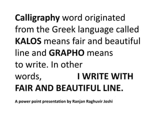
  • 1. Calligraphy word originated from the Greek language called KALOS means fair and beautiful line and GRAPHO means to write. In other words, I WRITE WITH FAIR AND BEAUTIFUL LINE. A power point presentation by Ranjan Raghuvir Joshi
  • 2. Calligraphy word originated from the Greek language called KALOS means fair and beautiful line and GRAPHO means to write. In other words, I WRITE WITH FAIR AND BEAUTIFUL LINE. When I received the fellowship in 1972-73 to teach and learn the basic design in Sir J.J.Institute of Applied Art (after completing Diploma in Commercial Art in merit) I had to conduct the class for this Subject as part of it. My late father being practicing Artist and Professor in Visual Art R.P.Joshi gave me an insight that, to deal with any subject, one must find and search the origin of it. He gave me the Dictionary of The English Language by The Rev. James Stormonth published in 1886 A.D. ninth edition by William Blackwood and Sons, Edinburgh and London. This was the only dictionary which have above said meaning that gave me more confidence to deal with this subject firmly while working for the prestigious review committee (1976/77) for “syllabus 1970” (newly introduced then of Foundation of visual art) by Directorate of Art, Maharashtra State. I had to address this subject as an academic expert to the state of Maharashtra’s nearly 18 Art schools on behalf of Directorate of Art, Maharashtra State. I have to express my sense of gratitude towards: late Prof.V.R.Amberkar, late Prof.H.G. Hanumante, Prof. V.N.Yande and also former Directors Late Prof.M.S. Satwalekar, Late Prof. Baburaoo Sadwelkar. They encourage me to research this subject with my practical exercises in Sir J.J.Institute of Applied Art during the period of 1972 to 1977.
  • 3. Sir J.J. School of Art Campus have Applied art as an independent Art Institute under Directorate of Art, Maharashtra State, which is known as Sir J.J.Institute of Applied Art. The debate was on during that time whether to considering this subject as pure fine art ? amongst the faculties of fine art and applied art in the campus. Late Prof. Baburaoo Sadwelkar then the Director of Art saw that it has more potential also as communication art while reviewing the syllabus that was introduced in late 1970. Prof. Baburaoo Sadwelkar took the cognizance of my finding of its original meaning and decided to expand its scope further beyond fine art. Incidentally my earlier research mentioned above motivated me to conduct the exercises in the two directions. Firstly: the subject Calligraphy as the form of pure fine art, in terms of exploring its expression of spontaneity of fair and beautiful lines. This is a Calligraphic expression with no function of communication. This was called informal calligraphy for the student to study in detail the strokes’ line qualities that is necessary for being beautiful. I could cover this basic prerequisite to get into the subject. Secondly: To look at Writing as a means of communication. Communication is defined as a science because one can check its feedback rationally. This was called formal calligraphy. Old manuscripts are a classic example which combines both these aspects.
  • 5. Student:Narendra D. Kadam-1973 I started with this which was innovative approach to explore the term Spontaneity. I told students to close their eyes and while this was being done I went on uttering the names of various objects known to them since their childhood days. The idea was to see retention and recall of these known forms and how our brain renders it with no external influence, because at that time eyes were asked to closed. This is the first experience of KALOS and GRAPHO that I mentioned at the beginning. Feedback by the student Narendra D.Kadam in his mothertounge Marathi which says that it was interesting experience. Drawing Triangle, Square and Circle was difficult while eyes are closed. This has help them realized the eye and mind coordination to experience spontaneity.
  • 6. Here is an attempt by me to investigate the painting possibilities from the earlier said exercise on retention and recall of known forms. Understanding the FINE ART angle of the calligraphy. Finding INFORMAL & FORMAL calligraphy. Interpretation by Ranjan R. Joshi
  • 7. Perception and Reality to understand “Spontaneity” This is an experiment to test one’s perception and how one can pick up to draw visual details! The photograph taken after the said drawing from the same spot to verify in reality what is lost in the final drawing. Observe the first cartoon (Pencil sketch) which allow us to verify details. This is the recent example I tried to experience the concept of “Spontaneity” an essential element for good calligraphy. What is shown in the earlier slide shows the retention and recall of the same aspect. The Drawing before the photograph done spontaneously on the spot.
  • 8. Student: Rohini Kane-1974 Here “Form does not follow function” but reveals inner aesthetics
  • 9. One will find any piece of beautiful handwriting which anyone can read. In the first aspect that is informal calligraphy, energetic, spontaneous Student:Narendra D. Kadam-1973 strokes on different surfaces with any tool and medium to write is focused where beauty is prerequisite in the entire final outcome. It is said that “Beauty lies in the eyes of the beholder”. Individual perceptions of beauty will be visible in abstract calligraphic strokes produced by that “Individual”. In fine art self expression is important aspect. The academic objective was to encourage both the aspects simultaneously. When I look back after nearly 38 years today that is 2012 A.D to this whole event of my life it is learnt that some practicing calligraphist do not agree to this academic rationale though as a teacher, I feel happy in deciding this has cleared the artist’s dilemma on the debate whether “Calligraphy is a fine art.” We can enjoy any piece of calligraphy in either of these segments naturally as a beautiful Interpretation by Ranjan R. Joshi human expression. My following slides are the original works of students and mine calligraphy versions created with the above said discussion. I have also presented original correspondence done during that time with Dean of the Institute and Directorate of Art.
  • 10. This was an immediate attempt I did to explore nearly seven writing expressions using different nib angles and cut. Student could see such possibilities to get inspire. I call it “Teachers visual aid” for effective teaching. Here it was also important to retain the beauty of line being applied for writing this text.
  • 11. Inviting me to prepare the specimens for the said revised syllabus in 1977 A letter by Late Prof. Baburaoo Sadwelkar then Directorate of Art Maharashtra State on the left side and above a letter by Late Prof. H.G. Hanumante then Dean of Sir J.J. Institute of Applied Art. Inviting me to prepare the specimens for the said revised syllabus in 1977.
  • 12. This is my first handwritten draft done in 1973/74 after the completion of Fellowship (1972/73). It was 3 years before this commitment.
  • 13. Innovative way to introduce the History of Calligraphy where student is briefed about the evolution of the subject. They have to depict the same visually. Student: Amulya Baruha-1975.
  • 14.
  • 15. Notice clockwise three different surfaces such as Gelatin, Handmade paper and Blotting paper. Tools: Twig, Reed pen and our own finger which gives direct vibes while moving on surface. A tactile experience. Student: Mr. Hemant G. Salgoankar-1973
  • 16. Students were ask to try more tools on one type of surface with spontaneous strokes within the prescribed column. Objective was to develop basic sense of two-dimensional space and to find the effect of it on this surface. They were also exploring beautiful lines to be applied for writing letter forms. Student :Rohini Kane-1974
  • 17. Student: Monique Somaya-1974 Student: Monique Somaya-1974 Here students are supposed to control the hand movement while drawing the strokes within the given square space. On the left is unplanned approach and on the right planned approach with strokes connectivity. Objective is to develop sense of aesthetics in both that is space and strokes with no meanings. Energy ,spontaneity and beauty of the strokes is important.
  • 18. TOP: Student:Monique Somaya-1974 Feedback from the students after the exercise. BOTTOM: Student: Pradeep Saran-1974
  • 19. Student: R.(Raj) V. Shinge-1974 Here students are supposed to control the hand movement while drawing the strokes within the given square space. On the left is planned approach in square and on the right planned approach in uneven divisions. Objective is to develop sense of aesthetics in both that is space and strokes with no meanings. Energy ,spontaneity and beauty of the strokes is important.
  • 20. Student: R.(Raj) V. Shinge-1974 Student: R.(Raj) V. Shinge-1974
  • 21. The practice exercises of brush tool is taken further in to DESIGN area where students learn to apply the basics for communication
  • 22. This is the first step after practicing abstract strokes to be interpreted for language. Signature is appropriate which could be of any language being taken as an element of calligraphy to experience formal form. The practice of cut nib strokes is taken further from drill exercise to compose calligram (creating visual by means of calligraphic stroke) Student: Mr. Hemant G. Salgoankar-1973 Student: Amulya Baruha-1975.
  • 23. Student: Mr. Hemant G. Salgoankar -1973 Student: Shahab Shamshi-1973 This is the first step after practicing abstract strokes to be interpreted for language. Signature is appropriate which could be of any language being taken as an element of calligraphy to experience formal calligraphy form.
  • 24. These are the examples of various students work when seen today after 35+ years still look fresh. The assignment was based on the idea of exploring compositions using brush strokes that depicts energy and spontaneity. They had to explore design principles freely. They should first concentrate on the given space and applying intuition while placing the brush on the paper surface. This is an attempt to create informal calligraphy with no purpose of communication. Beauty of the strokes is focused.
  • 25. Students enjoyed every moment of this exercise because it was free from all the requirements. Here “Form does not follow function” but reveals inner aesthetics.
  • 26. Feedback from the students after the exercise. TOP: Student:Monique Somaya-1974 BOTTOM: Student: Shobhi Manjerkar-1975, BOTTOM RIGHT: Simita Patil-1975
  • 27. Student: Pradeep Saran-1974 Student: Monique Somaya-1974 Student: Rohini Kane-1974
  • 28. Student: Smita Patil-1975 Here “Form does not follow function” but reveals inner aesthetics.
  • 29.
  • 30.
  • 31.
  • 32. To develop sense of collecting various existing letter forms (by means of such collage) created by other artists. This is a gradual step to understand letter forms and its beauty. For the applied art student first exposure to the world of “TYPOGRAPHY”. According to my observations if a student can master the art of calligraphy then for him “TYPOGRAPHY” understanding is easier.
  • 33.
  • 34.
  • 35.
  • 36.
  • 37.
  • 38.
  • 39.
  • 40.
  • 41. The First step towards formal calligraphy. “I write with the fair and beautiful line”. Aesthetics and communication are blending here for deeper understanding of the subject. My own attempt before the introduction of the subject to the students.
  • 42. Converting basic drill exercise into colour as the first experience of DESIGN, myself tried first before introducing it to the students.
  • 43. Understanding concepts of Compress, Medium and Elongation of the calligraphic strokes.
  • 44. Analysis and Synthesis of Devanagri script. Teachers and Students have to prepare similar charts for other scripts.
  • 45. Understanding scale and ratio of letter forms directly on a defined graph. Normal, Compressed and Expanded.
  • 46. This is a first step towards understand ing the meaning of “fair” and “Beautiful” line. Here students learn to encode and decode the human expressions associated to these type of strokes. This is my attempt to inspire students.
  • 47. Student: Amulya Baruha-1975 Students were delighted to play with such exercises and gave surprising results. This is a beginning of understanding illuminated manuscript’s fundamentals. Studying deeply the formal calligraphy.
  • 48. Student: Zahid Sardar-1973 Student: S.B.Varvadekar-1975 Students were delighted to play with such exercises and gave surprising results. This is a beginning of understanding illuminated manuscript’s fundamentals. Studying deeply the formal calligraphy.
  • 49. Student’s work specimens showcasing the earlier study of line expressions and stroke directions.
  • 50. Student’s work specimens showcasing the earlier study of line expressions and stroke directions.
  • 51. Student: Mr. Hemant G. Salgoankar-1973 The most interesting assignment where students enter into their own world of codified language. The idea was to free their mind from the conventional language barriers. On the left Roman script’s alphabets are codified as per own perceptions of the students calligraphic strokes as a base chart. On the right top Roman script’s (English) original paragraph is being converted into (below) new calligraphic writing where earlier codified defined strokes are used. We can judge the progress of student’s idea of fair and beautiful lines. (Inspired from my Prof.A.D.Desai’s lessons)
  • 52. Student:Mr. Hemant G. Salgoankar-1973
  • 53. This brief I prepared after nearly 38 years of my first experiment on Phonetics to Graphic. I had an opportunity to conduct an International Graphic Design and Communication Education in Mumbai for courses from U.K., Canada. Their freedom in implementing the syllabus allowed me to recall my earlier exercise on sound and picture. I expanded this further for Typography. Please see following plates of the students of 1973/74 batch from Sir J.J.Institute of Applied Art
  • 54. Student: Zahid Sardar -1973/74 This is innovative approach through calligraphy to understand Phonetics (Sound) and its relationships to the (VISUAL) written form that is script. Students have to create sounds and capture them in various free strokes as per their spontaneity. Here they experience how we depict sound in graphic form. On the right application for Monogram.
  • 55. Student: Amulya Baruha-1974/75 This is innovative approach through calligraphy to understand Phonetics (Sound) and its relationships to the (VISUAL) written form that is script. Students have to create sounds and capture them in various free strokes as per their spontaneity. Here they experience how we depict sound in graphic form. On the right application for Monogram.
  • 56. Study of old scripts and their writing styles. These are my own calligraphy attempts.
  • 57. Leon Ken Hon a student from China gave this gift. Picture language and beautiful brush strokes is the essence of this script.
  • 58. Learning to explore the art of CALLIGRAM Student: Rohini Kane-1974 from the regular object drawing. Students are suppose to retain the quality of calligraphic letter forms while rendering the final art work. Student:Monique Somaya-1974
  • 59. Student:R. V. Shinge-1974 Some printed applications of Calligram in press advertisement. Learning to explore the art of CALLIGRAM from the regular object drawing. Students are suppose to retain the quality of calligraphic letter forms while rendering the final art work.
  • 60. Revelations after 30 years: From 1977 to 2008- On the spot “Kalaghoda Festival workshop for calligraphy” in Mumbai where I could test the said syllabus concept after 30+ years. Please see separate power point presentation on the same followed after this…!
  • 61.
  • 62. I had an opportunity to conduct an International Graphic Design and Communication Education in Mumbai for courses from U.K., Canada. Their freedom in implementing the syllabus allowed me to recall my earlier exercise on sound and picture. I expanded this further for Typography. Please see following plates of the students from Empire Education’s International Design Institute partners from U.K. , Canada.
  • 63.
  • 64.
  • 65.
  • 66. Student: Tina Bharucha. Revelations after 30 years: From 1977 to 2007: This exercise was discovered while exploring innovative possibilities of “calligraphy to letterforms” for creating the "Display type letterform design palette" in the subject Typography. On the left is a memory drawing of any subject rendered by the student and on the right is the shapes revealed from the said memory drawing that depicts roman script alphabets. One can take any language script instead of the roman script. They are sorted out to be rationalized for creating “Display type letterform design palette" in Typography. You will notice that black colour markings on the memory drawing is done freely in a playful manner. In the next plate student must use calligraphy cut nib to record these forms. The cut nib gives the advantage for defining the uneven forms as letter forms meant for communication purpose. This concept revelation was due to my innovative teaching method approach for International Graphic Design Education I had to conduct in Mumbai for the courses from CANADA, U.K. I never thought then in 1977 this could be future possibility of my search in formal and informal calligraphy journey. A novel by Dan Brown“Da Vinci Code” published after two years surprisingly gave an insight that Leonardo da Vinci the famous artist had used this codified language in some of his paintings 400 hundred years ago..
  • 67. Student: Tina Bharucha. Assignment done in2007 Revelations after 30 years: From 1977 to 2007: This second slide shows the revealed palette of letterforms and on the right side a story board concept for web design using the same palette. The objective of recalling these slides is to present how one can Assignment done in expand the study of both Informal and 1976/77 Formal calligraphy taking it further to create Display design type.
  • 68. Posters designed purely by Calligraphy. Late Dr.Mrs.Sharadini Dhanukar then Head of the Pharmaceutical Dept. of KEM Hospital –Mumbai entrusted me in 1996 to create Information Educational Posters for the students of her department. She encouraged me to apply Calligraphy like the an old illuminated Manuscript. The idea was to make them exclusively hand drawn with a personal touch. This is considered prestigious for the artist in Europe and USA. My wife Prof. Vidyalakshmi an able calligraphist helped me in this project. Visualization and Designing of the posters were done by me. This was one of the best project we did together. Today these are the proud and permanent display of the Hospital.
  • 69.
  • 70. It was a difficult task to create calligraphy in a spherical shape so we decided to set a text on DTP and used it as a reference for writing by hand with calligraphy nib. It was like “From Typography to Calligraphy”
  • 71. Yes, this is not Calligraphy! When free Calligraphic letters are rationalized by means of GEOMOTRICAL method it becomes Lettering. Every letter form is designed with some concept and scale + ratio of height, length and width. Here is an attempt to depict the word “DESIGN” in six different ways. They are such as Architecture,Painting,Product Design, Industrial Design, Printing and Graphic Communication design. The letter forms are composed and modulated as per the concept. Color palette is free with no symbolic meaning. On the left is original expression and on the right is invert means opposite of the original colors. This is possible only when an artist is well versed with pure Calligraphy.
  • 72. My calligraphy exploration where I combined formal and informal forms ! Please see separate power point presentation on this exhibition attached herewith!
  • 73.
  • 74.
  • 75.
  • 76.
  • 77.
  • 78.
  • 79.
  • 80.
  • 81. By the unknown Typographer ! Guess who is this?

Notes de l'éditeur

  1. Student: Rohini Kane
  2. Interpretation by Ranjan R. Joshi
  3. Feedback from the students after the exercise.
  4. Student: R.(Raj) V.Shinge
  5. Student: Pradeep Saran
  6. Student: Zahid Sardar
  7. Assignment done in 1976/77
  8. By the unkown