
Recommandé
Contenu connexe
Tendances
Tendances (16)
Similaire à Tame Impala Digipak Analysis
Similaire à Tame Impala Digipak Analysis (20)
Plus de josh38642
Tame Impala Digipak Analysis
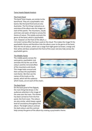
- 1. Tame Impala Digipak Analysis The Front Panel The band Tame Impala, are similar to the band Pond. They are a psychedelic rock band a like the band Pond and are also Australian. The first thing I noticed as an overview of the album was the images on each of the panels. The mountains, clouds and trees and water all help to convey the theme of nature. This totally contrasts the genre of the band, which is psychedelic rock. However on the front of the album, a mirrored / vortex effect has been used on the cloud. This makes the image fit the psychedelic theme and therefore links the album cover to the genre of the band. Also the mix of colours, which use a range from light green to brown, orange and then white and blue compliment the front of the cover and also help convey the psychedelic genre. The Middle Panels The middle panels convey the same genre, psychedelic rock and does this by the use of the colours and the mirrored effect of the mountains and clouds. This image looks unusual and then conveys the psychedelic rock theme. We then see the names of the tracks on the panels, which tell the audience which tracks, are on each of the vinyl’s. The Back Panel On the back panel of the Digipak, the main thing that draws in the audiences attention is the image of the view over the trees. This theme has been carried on from the first panel, the front cover. The colours are also similar, which keeps a good level of consistency throughout the album. The bright colours contrast the dark colours and this contrast help convey the genre of the album by creating a psychedelic theme.