1. Typography Design
Choosing Your Fonts
One of the most crucial parts of your Publication is the se- ous, stylish or sloppy. They can also help engage your read-
lection of your fonts. What fonts you choose to use make a ers or turn them off from your publication completely. With
statement about your publication. Your fonts subconsciously that in mind, lets take a brief look at some typography terms
tell your readers whether or not your publication is fun, seri- and the basic rules for font selection.
Type Terminology
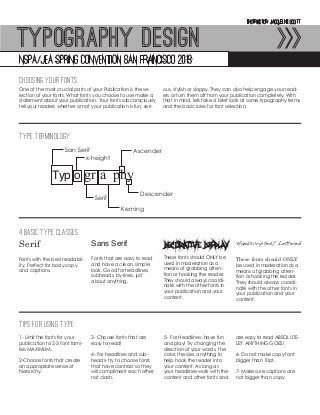
San Serif Ascender
x-height
Typ o gr a phy
Descender
Serif
Kerning
4 Basic Type Classes
Serif Sans Serif Decorative Display Handscripted/ Lettered
Fonts with the best readabil- Fonts that are easy to read These fonts should ONLY be These fonts should ONLY
ity. Perfect for body copy and have a clean, simple used in moderation as a be used in moderation as a
and captions. look. Good for headlines, means of grabbing atten- means of grabbing atten-
subheads, by-lines, just tion or hooking the reader. tion or hooking the reader.
about anything. They should always coordi- They should always coordi-
nate with the other fonts in nate with the other fonts in
your publication and your your publication and your
content. content.
Tips for Using Type:
1- Limit the fonts for your 3- Choose fonts that are 5- For Headlines- have fun are easy to read ABSOLUTE-
publication to 2-3 font fami- easy to read! and play! Try changing the LEY ANYTHING GOES!
lies MAXIMUM. direction of your words, the
4- For headlines and sub- color, the size, anything to 6- Do not make copy font
2-Choose fonts that create heads- try to choose fonts help hook the reader into bigger than 10pt.
an appropriate sense of that have contrast so they your content. As long as
hierarchy. will compliment each other, your headlines work with the 7- Make sure captions are
not clash. content and other fonts and not bigger than copy.