
Recommandé
Contenu connexe
Tendances
Tendances (19)
Similaire à Part 3 Evaluation
Similaire à Part 3 Evaluation (20)
Plus de kalkidanbrook
Part 3 Evaluation
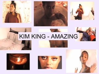
- 1. KIM KING - AMAZING
- 2. We were able to synergize all three of our products through the use of the rose. The rose is a symbol of love and so by using this prop, it helped to further establish the themes of love and devotion that our song "Amazing" is about. As well as the imagery, we used a colour palette of red, pink and white to also connote our themes as they are feminine colours widely associated with the idea of love. We were also able to synergize all three of our products by consistently using the same typography. The font we used was very simple, black and classy, as we did not want too much going on. Instead we wanted the focus to be on the images, as that was what carried the emotion and meaning that we hoped would grab the audiences attention. The mode of address is soulful and passionate as the lyrics touch on a personal topic that the audience can identify with (U&G - personal identification), hence the album name "From the Heart". In the music video the artist keeps eye contact with the camera (this is known as direct address), as if she speaking to the audience and telling them her story. This is done in order to connote how she has nothing to hide and wants to make sure her message comes across to the viewer. The locations synergize all three of our products, specifically the bedroom. The bedroom is a place of privacy and is effective in connoting the themes of love, romance and sex, which to a certain extent is what our chosen song highlights. Even though she is nude in the ancillary products, she has been covered up appropriately, so there is sex appeal but at the same time her representation of being a classy and respectable woman is being protected. The females within our target audience may aspire to be like the artist whilst for the males its entertaining due to her seductive body language luring them in.
- 3. Here are screenshots of my three products. These are some screenshots from Rihannas recent music video for her song Pour It Up. It is typical for RnB female artists to be objectified in their music videos. From the images you can clearly see how she is showing off her body and this is not classy at all. We wanted to subvert from this common representation and make sure our artist, Kim King, was portrayed as a sophisticated and down to earth woman, so that the audience can personally identify with her music through her positive representation. We chose to represent our artist as a classy, independent and humble woman because when my partner and I did research on our artist, Kim King, we came across her biography and found that she already had a strong personality and this was evident when listening to her songs. For example, in her biography she says As i got older, life took turns, I started to learn different things, and when I turned 21 and I had my first child my mother passed. This clearly indicates how she is very experienced, therefore we also chose to represent her as a role model. This representation is carried out in all three of our texts. In the music video our artist is the bath tub. This creates appropriate sex appeal as she is covered up in order to protect her representation. In the magazine advert the artist lays on the bed wrapped in cream silk sheets. The image is seductive as well as being appropriate. Lastly, in the Digipak she also is situated on the bed wrapped in cream silk sheets. Again, these images are appropriate whilst still enticing the audience. The fact that Kim King is covered up appeals to our target audience, in particular females because unlike popular RnB artists such as Rihanna (see top right hand images for more information ), our artist shows off her voice not her body. This empowers the females of our target audience and they look up to her, as they also aspire to posses such qualities.