
Recommandé
Contenu connexe
Tendances
Tendances (20)
En vedette
En vedette (17)
Similaire à Fifty shades powerpoint
Similaire à Fifty shades powerpoint (20)
Dernier
Dernier (20)
Fifty shades powerpoint
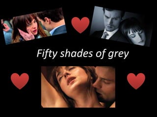
- 1. Fifty shades of grey
- 2. Production title Both universal and focus theatres were the productions companies for the movie. Universal was founded in 1912 by Carl Laemmle who's been successful with the company of creating a revenue of 4.239 billion pounds. This is part of the success of other successful movies such as Love actually, also a romance genre, that generating a huge mass of money from the box office of 246.9 million. At the beginning of the movie, the productions company's are also showed straight away, this is significant as their ident is a recognizable tune which will immediately draw the audience in due to other successful movies.
- 3. Film Title The opening sequence conforms to its general code and conventions through its typography. The typography of a films opening credits is vital in setting audiences expectations and giving a film a certain look or feel. The font appears over a medium shot of a cloudy, dark sky. It is in white capital letters in which white is associated with light, goodness, innocence, purity, and virginity. This links to the narrative of the film where the girl is considered to be innocent in the situation and vulnerable. The color black in the background connotes darkness creating a binary opposition of how the characters differentiate in the movie in what there personality’s are like and what they believe in. This is also highlighted by the fact that the title is written in blocked capitals linking to the male character having dominance over the female. The fact that the audience can establish genre through the typography is useful as the audiences expectations are met right from the outset. The typography also shows key themes that will re-emerge as the narrative progresses allowing the audience to begin to interact with the film and make certain narrative predictions. The director would have chosen this typography as it is important that an opening sequence reflects and fits in with the mood and tone of a film .
- 4. Names of cast The credits of the main stars are first to appear, after the introduction of the production company. The most important stars appear first, names that of Dakota Johnson, and then descending in order of importance, acting as evidence for the presence of star appeal. This is where big named actors are used to draw in a audience to a film and raise its profile, essentially acting as synergy to a film raising its profile. Dakota Johnson is a well known actress whom has won a BAFTA for rising star award and has been in very popular and acclaimed performances such as black mass and bigger splash all indicating her presence in the movie and encourages her fan base to watch the movie raising the box office selling. The film credits, are cut with the non-diegetic sound track, fading in and out to the beat. The typography again is written in white in blocked capital displaying the binary opposition linking to the genre of the movie, erotic romance, as the capitals could represent the dominance of the man whilst the white represents the purity of the female.
- 5. Crew credits The production credits are shown in order of importance via an ascending order eventually culminating to the director Sam Taylor Johnson, a convention of the opening sequence. Sam Taylor Johnson as the director is the most senior position on set. Other senior positions are also displayed such as the DOP and the music compositor which has been created by Annie Lennox, in which the song is one of rock and rolls hall of fame that shaped rock and roll acting as evidence of synergy for the movie.
- 6. Indication of place Indication of place is shown through the establishing shot straight after the films opening title sequence. The long shot immediately shows the setting of Vancouver due to the skyscrapers which are a significant part of the place and the bridge. This is then reinforced By the building of the Escala which is a significant place in Vancouver. In this reverse shot, we are shown vancouver on a more personal scale with a more close up view on the scenery. We are shown water and boats which present an idea that these will have a significant part in the movie ahead. The white dove also shown in the shot is a prominent part as doves represent peace and are often known to appear with the virgin Mary linking the genre of the film and the character in the movie.
- 7. Introduction to characters This is the first introduction we get of our first character Jamie. The medium shot allows us to see him surrounded by black suits and smart clothing signifying that he is a wealthy man who has a very good upper class job, which is well paid. This links to the stereotype of anyone dressed in a suit, is wealthy and is of higher statues. The blue jeans, with a green coat ad backpack all relate to the idea of a typical American girl. This first introduction of the character then signifies that she is someone who has no real importance and is just an average girl intriguing the audience to think about how she is such a prominent and key character.
- 8. The opening title sequence links and regards to genre and tone through the use of non diegetic sounds, with the soundtrack ill put a spell on you by Jay Hawkins. The soundtrack is vital in settings the audiences expectations, the choice of song is deliberate to establish key themes. The song, ill put a spell on you, is an upbeat song that creates a sense of mystery linking the genre of a erotic romance. It is played directly after the production company is shown, empathizing the opening title sequence by drawing the audience in to the movie and to focus on the production titles. The song is very popular in which acts as evidence of synergy for the movie.