6. Jane Anybody 2nd
Course Name
Take out your Whiteboards
For each of the following color slides,
Write one or two words that relate to
the emotions created by the following
colors
Then hold up your whiteboards for the
teacher to see
7.
8.
9.
10.
11.
12.
13.
14.
15.
16. COLOR
Is the visual perceptual property
Corresponding in humans
To the categories called red, yellow, blue
and others
17. COLOR
Color derives from the spectrum of light
(distribution of light energy versus
wavelength)
Interacting in the eye
with the spectral sensitivities of the
light receptors
18. COLOR
Color categories and physical
specifications of color are also associated
with
objects, materials, light sources, etc.
Based on their physical properties such
as
light absorption
Reflection
or emission spectra
19. COLOR
Color is one of the most powerful of the
artistic elements
It has tremendous expressive qualities.
Understanding the uses of color is
crucial to effective composition in
design
A knowledge of color terms helps us
to appreciate the different ways that
color may be used in art and design
21. Remember this picture?
An example of lines
Also an excellent
illustration of vibrant
color
21
22. Color Systems
Color classification "systems" have been
devised to organize and identify color
relationships
A most familiar one is the 12 hue "Color
Wheel"
introduced by Johannes Itten (1888-1967)
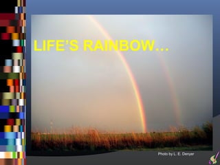
24. Light Spectrum
The spectrum is the colors of the
rainbow
arranged in their natural order:
Red - Orange - Yellow - Green - Blue -
Indigo - Violet.
The mnemonic for this is ROY G BIV
Or RGB
25. Hues
A hue is one of the colors of the spectrum
Hue is the correct word to use to refer to
just the pure spectrum colors
Any given color can be described in terms
of its value and hue
In addition, a range of physical
phenomena and psychological effects
combine
to affect our perceptions of a color
26. Hues on a Color Wheel
Hues have a circular order as illustrated in
the color wheel
The color wheel is a useful device to help
us explain the relationships between
Primary, Secondary and Tertiary colors
29. Color Classifications
Primary colors
These colors are pure-you can’t create them from other colors and all others are
created from them.
Red, blue, and yellow
Secondary colors
These colors are formed when equal parts of two primary colors are combined.
Orange, green, and violet
Intermediate colors-These colors are formed by mixing a primary
color with a secondary color next to it.
All kinds of other colors….
30. Primary Colors
On the color wheel
Places the PRIMARY colors equidistant from each
other.
32. Secondary Colors
In-between the primaries are the
"SECONDARY" colors. In between the
primary and secondary colors are the
INTERMEDIATES
(also called the TERTIARIES).
33. Creating Secondary Colors
Secondary colors are made by mixing two
primary colors together:
red and yellow to get orange
yellow and blue to get green
red and blue to get purple
+ =
+ =
+ =
34. Note…
The secondary color you get depends
on the proportions in which you mix
the two primaries
36. Tertiary Colors
If you mix three primary colors
together,
you get a tertiary color
Also thought of as a combination of primary
and secondary colors
37. The Six Tertiary colors
Red-Orange
Yellow-Orange
Yellow-Green
Blue-Green
Blue-Violet
Red-Violet
What is another place where you have heard the term Tertiary?
38. Easy way to remember names
An easy way to remember these names is to
place the primary name before the other color
So, the tertiary color produced when mixing the
primary color blue with the secondary color
green, is called 'blue-green“
And so on…
42. The Color Harmonies
Monochromatic
Complimentary
Split Complimentary
Triadic
Analogous
43. Monochromatic
One Color – Different shades
The monochromatic color scheme uses
variations in lightness and saturation of a single
color
This scheme looks clean and elegant
Monochromatic colors go well together
producing a soothing effect
The monochromatic scheme is very easy on
the eyes,
especially with blue or green hues
44. Monochromatic
You can use it to establish an overall mood
The primary color can be integrated with
neutral colors such as
black, white, or gray
However, it can be difficult, when using this
scheme, to highlight the most important
elements.
45. COMPLIMENTARY
Colors that are opposite each other on
the color wheel are considered to be
complementary colors
example: red and green
The high contrast of complementary
colors creates a vibrant look especially
when used at full saturation
This color scheme must be managed well
so it is not jarring
46. COMPLIMENTARY
Complementary colors are tricky to
use in large doses,
but work well when you want
something to stand out
Complementary colors are really
bad for text
47. SPLIT COMPLIMENTARY
The split-complementary color
scheme is a variation of the
complementary color scheme
In addition to the base color,
it uses the two colors adjacent to its
complement
48. SPLIT COMPLIMENTARY
This color scheme has the same
strong visual contrast as the
complementary color scheme
but has less tension.
The split-complimentary color scheme
is often a good choice for beginners
because it is difficult to mess up
49. TRIADIC
A triadic color scheme uses colors
that are evenly spaced around
the color wheel
Triadic color harmonies tend to
be quite vibrant, even if you use
pale or unsaturated versions of
your hues
50. TRIADIC
To use a triadic harmony successfully,
the colors should be carefully
balanced
let one color dominate
and use the two others for accent
51. ANALAGOUS
Analogous color schemes use
colors that are next to each other
on the color wheel
They usually match well and
create serene and comfortable
designs
52. ANALAGOUS
Analogous color schemes are often
found in nature and are harmonious
and pleasing to the eye
Make sure you have enough contrast
when choosing an analogous color
scheme
53. ANALAGOUS
Choose one color to dominate
A second to support
The third color is used
along with black, white or gray
as an accent
54. What were the Color Harmonies
Again?
Monochromatic
Complimentary
Split Complimentary
Triadic
Analogous