
Recommandé
Contenu connexe
Tendances
Tendances (20)
Similaire à Research: Conventions of music magazine
Similaire à Research: Conventions of music magazine (20)
Plus de keeleyman
Plus de keeleyman (20)
Research: Conventions of music magazine
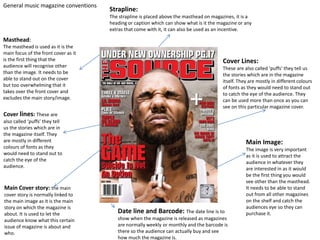
- 1. General music magazine conventions Masthead: The masthead is used as it is the main focus of the front cover as it is the first thing that the audience will recognise other than the image. It needs to be able to stand out on the cover but too overwhelming that it takes over the front cover and excludes the main story/image. Date line and Barcode: The date line is to show when the magazine is released as magazines are normally weekly or monthly and the barcode is there so the audience can actually buy and see how much the magazine is. Cover Lines: These are also called ‘puffs’ they tell us the stories which are in the magazine itself. They are mostly in different colours of fonts as they would need to stand out to catch the eye of the audience. They can be used more than once as you can see on this particular magazine cover. Cover lines: These are also called ‘puffs’ they tell us the stories which are in the magazine itself. They are mostly in different colours of fonts as they would need to stand out to catch the eye of the audience. Main Cover story: the main cover story is normally linked to the main image as it is the main story on which the magazine is about. It is used to let the audience know what this certain issue of magazine is about and who. Main Image: The image is very important as it is used to attract the audience in whatever they are interested in as it would be the first thing you would see other than the masthead. It needs to be able to stand out from all other magazines on the shelf and catch the audiences eye so they can purchase it. Strapline: The strapline is placed above the masthead on magazines, it is a heading or caption which can show what is it the magazine or any extras that come with it, it can also be used as an incentive.
- 2. Mise En Scene created by the background on the double page spread. Main image. Main title like a front coverTitle of double page spread Story to go with the title, image and cover story. The Subtitle also stands out as it is highlighted black and the cover story appeals to the audience because it is about a rap group. The picture also takes up most of the double page spread which appeals to audience as they are a rap group and are known as individual artists and people will want to read it and the use of image stands out. The main title stands out and appeals to the audience because it is big and bold it also stands out because it is black and white and they contrast well together so it appeals more to the audience. The use of font is also quite appealing because there is not much of it which is good because my audience wont really want to read much, even though it’s a rap magazine its writing style was quite formal and informative about the group and tells you about the spread.
- 3. Contents page Main image on the contents page, is not too big but is there to give an insight of the contents of the magazine. Pull quote from the magazine which links to the main image of the contents. Masthead of magazine/content page Banner – shows what the content page is about/what’s in it. Magazine Logo/Brand Content of the contents page/Magazine Date Issued