SlideShare une entreprise Scribd logo
1  sur  9
DECONSTRUCTION OF
SCHOOL MAGAZINES
three front covers and three contents pages
FRONT COVERS
HILBRE HIGH SCHOOL
The logo looks slightly odd, as if it has                                         The boarder at the top and bottom of the cover
been stuck on. However, this could be                                             asserts itself with the school by using the colour
the effect they wanted as it stands out.                                          purple

The main image which fills the                                                    The title is very effective as the bold white font
background is strong and attention                                                follows the theme of the cover. The schools
grabbing as it shows both staff and                                               name is the biggest so their audience can
students in construction clothing with                                            familiarise themselves with the school. But
spades inferring they are getting stuck                                           more effectively they have used the word
in. contributing with work and getting                                            ‘Endeavour’ which means ‘we can do it’
their hands dirty. The idea of team work                                          reflecting the image of them working to get
presents the school very positively. The                                          things done. It all flows and fits together
style of the picture used reflects the                                            perfectly, with a sense of power.
mood and the editorial style of the
magazine.                                                                         The whole presentation looks very professional

There is a student with a disability also                                         Everyone has a smile of their face which
taking part in the work which reflects                                            suggests they’re all happy where they are, doing
Hilbre school as being diverse and                                                what they’re doing. It reflects the school as an
offering equal rights and opportunities.                                          enjoyable place to be, working with a smile. It
                                                    The word ‘Inside’ mirrors     creates a harmonious effect
There’s a limited colour scheme and font set. Too   the title of the magazine
                                                    with the same font style      The colour scheme seems quite dull to
many colours and too many font styles will make
                                                    which draws your attention    me, perhaps this shows the mood of the school.
the cover look messy and hard to read.
                                                    to the text features. These   The use of cool colours I believe would recede
                                                    promise a clear benefit to    from the younger viewer but maybe an older
The font and colour scheme is clean and clear       the reader and offer          viewer would appreciate it more. If could be
emphasizing the idea that the school is quite       something for new readers     suggested that this magazine is meant for the
formal.                                                                           parents/carers of students.
KING EDWARD VI SCHOOL -
       HIGH PROFILE
The title ‘High Profile’ is solely the title of                                           The excessive use of the colour black makes
the magazine, not actually the name of the                                                the magazine look sleek and professional , a
school. Perhaps this is because the school                                                connotation of the school perhaps.
is a high profile school and they want to                                                 The cover is split up using the law of thirds.
attract customers more with this fact. It                                                 allowing it to be easily distinguished.
could be that people will remember it by
this rather than the name of the actual                                                   The white text separates itself and contrasts
school. The title is the largest text on the                                              with the dark background creating a sense of
cover and stands out. The second half                                                     energy. The simplicity of the font is effective
‘profile’ is bolder highlighting it’s more                                                as too many fonts and font colours would
important as it’s the profile of the school.                                              make the       magazine cover look messy,
                                                                                          confused and hard to read especially as there
The schools actual name could easily go                                                   is a very busy image. Therefore, it ‘s clear it
unnoticed as there is a lot going on, the                                                 has been well thought about , making it look
cover is very busy and it’s in small print                                                extremely professional
above the title of the magazine. We could
suggest this is the idea that the school                                                  The main feature ‘Hair Raising Show’ is a play
wants because they want their audience to                                                 on words, it’s the selling point and relates to
be curious where their exciting magazine                                                  the main image which is a typical convention
comes from and read inside to find out                                                    of a magazine to entice readers
                                                          This magazine is for a
The cover highlights that drama is a key subject for      young audience.            It     The ‘plus’ at the bottom of the cover
this school and possibly what the school is specialised   connotes fun and attracts         promises a clear benefit to the reader and
in., what they’re proud of. This effectively comes        its audience through this         offers something for new readers. Although
across in an exciting way with the main image             means, with the main              this text is in small print it stands out as the
reproducing a scene from the musical ‘Hairspray’ .        image                  being      ‘plus’ is written in pink whereas the rest of
This entices customers to the school, especially those    bold, colourful and eye-          the text on the cover is written in white .
with an interest in the creative world and shows them     catching. It suggests this is     The use of the colour pink reflects the school
this is what they could be apart of                       what the school is all about      being an all girls school
THE RUTHINIAN SCHOOL
The presentation of the cover shows                                                        Doesn’t posses typical forms and conventions
symmetry and fluency. The placement of                                                     of a school magazine, for example exciting
both the text and the logo shows a sense of                                                headings a large image or images to entice
formality and organisation.                                                                readers. perhaps this is due to the idea that
                                                                                           this school is different to others and you have
The cover looks quite sophisticated, posh                                                  to read inside to find out how and why which
and perhaps regal. The simplicity of the                                                   creates a sense of mystery.
cover is very effective as it forms an idea
that the school is distinguished                                                           It is apparent that the school issue their
                                                                                           magazine yearly by the date placed largely at
The school logo is placed on the masthead                                                  the bottom of their magazine. We can infer
and fills the entire top half of the cover                                                 that the date is important to the school and
which is the most significant part as it’s the                                             magazine as it’s the only other piece of writing
first place you look. This, suggests the logo                                              after the schools name.
is the most important aspect for the school
                                                                                           Its extremely formal presentation and the lack
and they want people to be familiar and
                                                                                           of images except their use of the school logo
remember it
                                                                                           suggests that their magazine is solely about the
The magazine asserts itself with the school                                                school itself and therefore it’s audience rather
by displaying the school colours over the                                                  than     being     students,      more     being
entirety of the background. It could be                                                    parents/carers who are planning to send their
suggested that the school is a mixed one as      This cover certainly wouldn’t attract a   children to this school and it’s more of an
the school colours attract both girls with       young audience as       although the      information guide/magazine about the
the colour purple and boys with the colour       school colours are very bold it doesn't   school,          perhaps          full        of
blue                                             give off an element of fun which          reviews, achievements, results OFSTED
                                                 young audiences feed off. The whole       reports and such like. This idea has developed
The use of the colour cream for the text         layout in every aspect puts across an     by the fact it’s only issued yearly and every
and logo fits well on the cover standing         older audience who would appreciate       year schools take on a new set of students.
out against the bold background                  this kind of layout                       The ‘2008’ reflects the importance of the
CONTENTS PAGES
WALLASEY SCHOOL
Issue number lets the reader keep up                                            The image of the school covers the masthead of
to date with which magazine they                                                the page. This is the first place people will look an
are reading.      The number 4 is                                               it seems quite engaging. It will familiarises the
highlighted       with     a       red                                          reader with the school.
outline, showing its importance. The
use of the colour red around the 4 fits                                         The image of the school is very natural as it shows
perfectly as it’s featured on                                                   the school surrounded by nature. The natural
numerous places on the contents                                                 lighting shows purity and innocence of the school.
page.                                                                           It seems like a nice place to be.

The school logo is featured at the                                              The title ‘Welcome’ is one of the largest pieces of
very top of the page next to the name                                           text and stands out in white, which gives a sense of
of the school. By the use of red in                                             warmth and friendliness. The font gives a
the logo, over the cover, and being                                             harmonious effect. The ‘welcome’ overlaps the
the colour of the head teachers tie, it                                         image suggesting the school welcomes everyone
suggest that this colour is one of the
school uniform colour                                                           Head teachers letter a typical convention of a
                                                                                school magazine contents page. The image of the
‘what’s in this issue’ offers a benefit                                         head teacher is there to familiarise readers with the
to the reader, letting them know                                                head of the school. It could be there for new
what     the     magazine      consists                                         readers also, so they can remember an important
of, allowing them to jump to the          The design and overall presentation   face for future reference if they decide to go along
section that takes their interest to      looks    smart,   organised    and    to the meet the school. He is dressed smart which
read. The mix of colours used for         sophisticated with an edge by the     reflects the schools reputation and gives a first
this section adds an edge to the          bright use of red                     impression to new readers about the school. The
contents page and a sense of fun as                                             background colour of the letter flows with the
elsewhere uses a more natural colour      looks mature, perhaps for an older    image of the school with a brown colour reflecting
scheme.                                   audience                              nature.
BEBINGTON HIGH SCHOOL
There is only one image which draws your                                                  Title ‘welcome’ and ‘New’ stands out in a
attention especially with the colour against                                              yellow/orange colour. It‘s funky font and
the excessive use of blue everywhere else. It                                             positioning on slant add an edge of fun. It’s
Shows two young boys in their uniform.                                                    a very arty contents page, perhaps this is a
They are smiling which suggests they are                                                  key subject at the school.
happy at this school. You could infer if you
didn’t know the school that is was solely a                                               The strip of black at the top stands out and
boys school from the extreme use of blue                                                  highlights what the magazine is
throughout the contents page and the only
image being two boys
                                                                                          ‘What’s in this issue’ is in a light turquoise
                                                                                          whereas the head teachers letter is in a dark
A head teachers letter and a list of what’s to
                                                                                          blue. This separates the different sets of
come in the magazine are typical
                                                                                          text
conventions of a school contents page
                                                                                          The whole layout is neat and organised
In the first sentence in the head teachers                                                making it easy to follow
letter, he states the magazine is called
‘Shine’. It stands out in the same colour                                                 I think it’s for a young audience as it gives a
and font of the header at the top of the                                                  sense of immatureness. It’s extremely bold
page. Although, you would think that if it                                                and eye catching which is exactly what
was the title of the magazine is would have                                               young audiences appreciate. It’s well suited
been placed at the top and made to stand         The excessive amount of text and
                                                                                          and attractive to it’s audience
out more perhaps with a bigger font size.        minimal images make it quite boring, a
From naming the magazine ‘Shine’ it could        bit like a story. There is no main
be suggested that this reflects the students     feature to catch your eye. The same
at the school, with each one shining or by       style font is being used.     There’s
attending the school they have learnt to         nothing spectacular about it
shine.
KING EDWARD VI SCHOOL
The title is the largest piece of text and                                                 Even though it’s a school magazine it seems
written in a funky font to stand out. The                                                  the least bit interesting and exciting
positioning of the title is the first place you                                            targeting an older audience.
look at the very top centre of the page. This
enabling the audience to understand its the                                                The contents is extremely different from the
contents page                                                                              first two contents pages iv deconstructed in
                                                                                           it’s simplicity, boring font styles, lack of
There is not much going on, it appears                                                     colour and images
very simple making it easy and clear to
read and follow                                                                            There is a faded, washed out image in
                                                                                           background although you can barely make
The fact that their are no images make s it
                                                                                           out what it is
extremely boring. Images are usually a
typical convention and seen as an appealing                                                Page numbers, headings and descriptions
factor to entice readers. Therefore this                                                   are typical convention of a contents page
magazine breaks that convention. Perhaps
their front cover and the rest of the
                                                                                           The use of colour is minimalistic. Black and
magazine follows this same theme or
                                                                                           white are typical colours most magazines
perhaps the rest of the magazine is
                                                                                           use. Contrasting dark against white stands
extremely enticing, therefore felt they
                                                                                           out. There are no bright colours to attract.
needn't make the contents page enticing.

The boarder appears to be the only                Includes the basics of what a contents page     The page and issue number are
interesting feature and is quite unusual          is – to inform you of what's to come in the     placed at the bottom below the
for a contents page to have therefore setting     magazine, perhaps this is all they wanted       boarder
it apart from others. It makes it appear          from their contents page an that's why
more attractive.                                  they’ve made it so basic, simple and straight
                                                  to the point. They want you to focus on the
                                                  text an not get taken away by images

Contenu connexe

Tendances

Presentation for resit of mediaaaaaaaaa
Presentation for resit of mediaaaaaaaaaPresentation for resit of mediaaaaaaaaa
Presentation for resit of mediaaaaaaaaasophieroberts
 
Music magizines content research and anylasis final on blog
Music magizines content research and anylasis final on blogMusic magizines content research and anylasis final on blog
Music magizines content research and anylasis final on blog07scott
 
Music covers
Music coversMusic covers
Music coversDragonium
 
Presentation for resit of media
Presentation for resit of mediaPresentation for resit of media
Presentation for resit of mediasophieroberts
 
Resaearch
ResaearchResaearch
ResaearchEvo11
 
Resaearch
ResaearchResaearch
ResaearchEvo11
 
Task8 evaluation
Task8 evaluationTask8 evaluation
Task8 evaluationasmediaf12
 
NME front cover analysis
NME front cover analysisNME front cover analysis
NME front cover analysisLaraMedia
 
Magazine analysis
Magazine analysisMagazine analysis
Magazine analysisBrad Essex
 
Media studies evaluation
Media studies evaluationMedia studies evaluation
Media studies evaluationpoppydodgsonx
 
Music magazine evaluation 4 7
Music magazine evaluation 4 7Music magazine evaluation 4 7
Music magazine evaluation 4 7MicaRossHarris
 
Magazine analysis
Magazine analysisMagazine analysis
Magazine analysis960940
 

Tendances (18)

Presentation for resit of mediaaaaaaaaa
Presentation for resit of mediaaaaaaaaaPresentation for resit of mediaaaaaaaaa
Presentation for resit of mediaaaaaaaaa
 
Music magizines content research and anylasis final on blog
Music magizines content research and anylasis final on blogMusic magizines content research and anylasis final on blog
Music magizines content research and anylasis final on blog
 
Blogspot
BlogspotBlogspot
Blogspot
 
Music covers
Music coversMusic covers
Music covers
 
Presentation for resit of media
Presentation for resit of mediaPresentation for resit of media
Presentation for resit of media
 
Rolling stones analysis
Rolling stones analysisRolling stones analysis
Rolling stones analysis
 
Resaearch
ResaearchResaearch
Resaearch
 
Resaearch
ResaearchResaearch
Resaearch
 
Media as fdhdfhdf
Media as fdhdfhdfMedia as fdhdfhdf
Media as fdhdfhdf
 
Task8 evaluation
Task8 evaluationTask8 evaluation
Task8 evaluation
 
NME front cover analysis
NME front cover analysisNME front cover analysis
NME front cover analysis
 
Magazine analysis
Magazine analysisMagazine analysis
Magazine analysis
 
Media studies evaluation
Media studies evaluationMedia studies evaluation
Media studies evaluation
 
Magazine analysis
Magazine analysisMagazine analysis
Magazine analysis
 
Music magazine evaluation 4 7
Music magazine evaluation 4 7Music magazine evaluation 4 7
Music magazine evaluation 4 7
 
Living BooksL Classroom Activities Overview
Living BooksL Classroom Activities OverviewLiving BooksL Classroom Activities Overview
Living BooksL Classroom Activities Overview
 
Magazine analysis
Magazine analysisMagazine analysis
Magazine analysis
 
Pitch presentation1
Pitch presentation1Pitch presentation1
Pitch presentation1
 

En vedette

2nd hand management books for sale
2nd hand management books for sale2nd hand management books for sale
2nd hand management books for saleJecelyn Beh
 
09 apr2012 presentation
09 apr2012 presentation09 apr2012 presentation
09 apr2012 presentationbittermellon
 
Group 3 film noir presentation
Group 3   film noir presentationGroup 3   film noir presentation
Group 3 film noir presentationRachel Agyefron
 
Match show
Match showMatch show
Match showjtmoses
 
Geili 2012.2.25-ngo
Geili 2012.2.25-ngoGeili 2012.2.25-ngo
Geili 2012.2.25-ngoYiruo Dong
 
Geili 2012.2.25-wwf
Geili 2012.2.25-wwfGeili 2012.2.25-wwf
Geili 2012.2.25-wwfYiruo Dong
 
オリジナルMIDIシーケンサ 開発ノート
オリジナルMIDIシーケンサ 開発ノートオリジナルMIDIシーケンサ 開発ノート
オリジナルMIDIシーケンサ 開発ノートyou_ucchy
 
Problems and Potential for Open and Distance Learning in Asia
Problems and Potential for  Open and Distance Learning in AsiaProblems and Potential for  Open and Distance Learning in Asia
Problems and Potential for Open and Distance Learning in AsiaKikumaEhime
 
Спецпроекты в нишевых СМИ
Спецпроекты в нишевых СМИСпецпроекты в нишевых СМИ
Спецпроекты в нишевых СМИEvgeniy Smirnov
 
Mathematics for economics
Mathematics for economicsMathematics for economics
Mathematics for economics8891743524
 
Poor Person’s Bailer Retrieval System
Poor Person’s Bailer Retrieval SystemPoor Person’s Bailer Retrieval System
Poor Person’s Bailer Retrieval Systemgraniteiii
 

En vedette (15)

Geology 101
Geology 101Geology 101
Geology 101
 
2nd hand management books for sale
2nd hand management books for sale2nd hand management books for sale
2nd hand management books for sale
 
09 apr2012 presentation
09 apr2012 presentation09 apr2012 presentation
09 apr2012 presentation
 
Group 3 film noir presentation
Group 3   film noir presentationGroup 3   film noir presentation
Group 3 film noir presentation
 
How To Get More Sales
How To Get More SalesHow To Get More Sales
How To Get More Sales
 
Film pitch
Film pitchFilm pitch
Film pitch
 
Match show
Match showMatch show
Match show
 
Geili 2012.2.25-ngo
Geili 2012.2.25-ngoGeili 2012.2.25-ngo
Geili 2012.2.25-ngo
 
Geili 2012.2.25-wwf
Geili 2012.2.25-wwfGeili 2012.2.25-wwf
Geili 2012.2.25-wwf
 
Pronouns
PronounsPronouns
Pronouns
 
オリジナルMIDIシーケンサ 開発ノート
オリジナルMIDIシーケンサ 開発ノートオリジナルMIDIシーケンサ 開発ノート
オリジナルMIDIシーケンサ 開発ノート
 
Problems and Potential for Open and Distance Learning in Asia
Problems and Potential for  Open and Distance Learning in AsiaProblems and Potential for  Open and Distance Learning in Asia
Problems and Potential for Open and Distance Learning in Asia
 
Спецпроекты в нишевых СМИ
Спецпроекты в нишевых СМИСпецпроекты в нишевых СМИ
Спецпроекты в нишевых СМИ
 
Mathematics for economics
Mathematics for economicsMathematics for economics
Mathematics for economics
 
Poor Person’s Bailer Retrieval System
Poor Person’s Bailer Retrieval SystemPoor Person’s Bailer Retrieval System
Poor Person’s Bailer Retrieval System
 

Similaire à School Magazine Analysis

PowerPoint College Magazine Research
PowerPoint College Magazine ResearchPowerPoint College Magazine Research
PowerPoint College Magazine Researchkerryanne1995
 
My magazine annotation
My magazine annotationMy magazine annotation
My magazine annotationErnestBlogging
 
Analysis of college magazines
Analysis of college magazinesAnalysis of college magazines
Analysis of college magazinesmarwasaroya
 
Preliminary task
Preliminary taskPreliminary task
Preliminary taskaarons0902
 
Annotation of two magazines front cover’s
Annotation of two magazines front cover’sAnnotation of two magazines front cover’s
Annotation of two magazines front cover’sJessieGee14
 
Preliminary task
Preliminary taskPreliminary task
Preliminary taskAnitahoxha
 
School magazine conventions
School magazine conventionsSchool magazine conventions
School magazine conventionsQainaat
 
Dennotations of college magazine
Dennotations of college magazineDennotations of college magazine
Dennotations of college magazineTheaMiller3
 
Analysis of existing magazines
Analysis of existing magazinesAnalysis of existing magazines
Analysis of existing magazineschantellesynnott
 
Contents Page Analysis
Contents Page AnalysisContents Page Analysis
Contents Page AnalysisCharis Creber
 
Resaearch
ResaearchResaearch
ResaearchEvo11
 
The Preliminary task
The Preliminary taskThe Preliminary task
The Preliminary taskAidan_Penzo
 
Analysis of a school mag jordan jj
Analysis of a school mag jordan jjAnalysis of a school mag jordan jj
Analysis of a school mag jordan jjJordan Julien
 
College magazine analysis 1
College magazine analysis 1College magazine analysis 1
College magazine analysis 1957422
 
As media transition project
As media transition projectAs media transition project
As media transition projectMaddy39241
 
Music covers
Music coversMusic covers
Music coversDragonium
 
My magazineanalysis
My magazineanalysisMy magazineanalysis
My magazineanalysisJvrdan
 
Music magazine Evaluation 1
Music magazine Evaluation 1Music magazine Evaluation 1
Music magazine Evaluation 1Dariusazadeh
 

Similaire à School Magazine Analysis (20)

PowerPoint College Magazine Research
PowerPoint College Magazine ResearchPowerPoint College Magazine Research
PowerPoint College Magazine Research
 
My magazine annotation
My magazine annotationMy magazine annotation
My magazine annotation
 
Analysis of college magazines
Analysis of college magazinesAnalysis of college magazines
Analysis of college magazines
 
Preliminary task
Preliminary taskPreliminary task
Preliminary task
 
Magazine Analysis
Magazine AnalysisMagazine Analysis
Magazine Analysis
 
Annotation of two magazines front cover’s
Annotation of two magazines front cover’sAnnotation of two magazines front cover’s
Annotation of two magazines front cover’s
 
Preliminary task
Preliminary taskPreliminary task
Preliminary task
 
School magazine conventions
School magazine conventionsSchool magazine conventions
School magazine conventions
 
Dennotations of college magazine
Dennotations of college magazineDennotations of college magazine
Dennotations of college magazine
 
Analysis of existing magazines
Analysis of existing magazinesAnalysis of existing magazines
Analysis of existing magazines
 
Contents Page Analysis
Contents Page AnalysisContents Page Analysis
Contents Page Analysis
 
Resaearch
ResaearchResaearch
Resaearch
 
The Preliminary task
The Preliminary taskThe Preliminary task
The Preliminary task
 
Analysis of a school mag jordan jj
Analysis of a school mag jordan jjAnalysis of a school mag jordan jj
Analysis of a school mag jordan jj
 
Q7
Q7Q7
Q7
 
College magazine analysis 1
College magazine analysis 1College magazine analysis 1
College magazine analysis 1
 
As media transition project
As media transition projectAs media transition project
As media transition project
 
Music covers
Music coversMusic covers
Music covers
 
My magazineanalysis
My magazineanalysisMy magazineanalysis
My magazineanalysis
 
Music magazine Evaluation 1
Music magazine Evaluation 1Music magazine Evaluation 1
Music magazine Evaluation 1
 

Dernier

Incoming and Outgoing Shipments in 3 STEPS Using Odoo 17
Incoming and Outgoing Shipments in 3 STEPS Using Odoo 17Incoming and Outgoing Shipments in 3 STEPS Using Odoo 17
Incoming and Outgoing Shipments in 3 STEPS Using Odoo 17Celine George
 
ECONOMIC CONTEXT - PAPER 1 Q3: NEWSPAPERS.pptx
ECONOMIC CONTEXT - PAPER 1 Q3: NEWSPAPERS.pptxECONOMIC CONTEXT - PAPER 1 Q3: NEWSPAPERS.pptx
ECONOMIC CONTEXT - PAPER 1 Q3: NEWSPAPERS.pptxiammrhaywood
 
Difference Between Search & Browse Methods in Odoo 17
Difference Between Search & Browse Methods in Odoo 17Difference Between Search & Browse Methods in Odoo 17
Difference Between Search & Browse Methods in Odoo 17Celine George
 
Proudly South Africa powerpoint Thorisha.pptx
Proudly South Africa powerpoint Thorisha.pptxProudly South Africa powerpoint Thorisha.pptx
Proudly South Africa powerpoint Thorisha.pptxthorishapillay1
 
Inclusivity Essentials_ Creating Accessible Websites for Nonprofits .pdf
Inclusivity Essentials_ Creating Accessible Websites for Nonprofits .pdfInclusivity Essentials_ Creating Accessible Websites for Nonprofits .pdf
Inclusivity Essentials_ Creating Accessible Websites for Nonprofits .pdfTechSoup
 
4.18.24 Movement Legacies, Reflection, and Review.pptx
4.18.24 Movement Legacies, Reflection, and Review.pptx4.18.24 Movement Legacies, Reflection, and Review.pptx
4.18.24 Movement Legacies, Reflection, and Review.pptxmary850239
 
INTRODUCTION TO CATHOLIC CHRISTOLOGY.pptx
INTRODUCTION TO CATHOLIC CHRISTOLOGY.pptxINTRODUCTION TO CATHOLIC CHRISTOLOGY.pptx
INTRODUCTION TO CATHOLIC CHRISTOLOGY.pptxHumphrey A Beña
 
Roles & Responsibilities in Pharmacovigilance
Roles & Responsibilities in PharmacovigilanceRoles & Responsibilities in Pharmacovigilance
Roles & Responsibilities in PharmacovigilanceSamikshaHamane
 
Judging the Relevance and worth of ideas part 2.pptx
Judging the Relevance  and worth of ideas part 2.pptxJudging the Relevance  and worth of ideas part 2.pptx
Judging the Relevance and worth of ideas part 2.pptxSherlyMaeNeri
 
Keynote by Prof. Wurzer at Nordex about IP-design
Keynote by Prof. Wurzer at Nordex about IP-designKeynote by Prof. Wurzer at Nordex about IP-design
Keynote by Prof. Wurzer at Nordex about IP-designMIPLM
 
Visit to a blind student's school🧑‍🦯🧑‍🦯(community medicine)
Visit to a blind student's school🧑‍🦯🧑‍🦯(community medicine)Visit to a blind student's school🧑‍🦯🧑‍🦯(community medicine)
Visit to a blind student's school🧑‍🦯🧑‍🦯(community medicine)lakshayb543
 
Science 7 Quarter 4 Module 2: Natural Resources.pptx
Science 7 Quarter 4 Module 2: Natural Resources.pptxScience 7 Quarter 4 Module 2: Natural Resources.pptx
Science 7 Quarter 4 Module 2: Natural Resources.pptxMaryGraceBautista27
 
USPS® Forced Meter Migration - How to Know if Your Postage Meter Will Soon be...
USPS® Forced Meter Migration - How to Know if Your Postage Meter Will Soon be...USPS® Forced Meter Migration - How to Know if Your Postage Meter Will Soon be...
USPS® Forced Meter Migration - How to Know if Your Postage Meter Will Soon be...Postal Advocate Inc.
 
Like-prefer-love -hate+verb+ing & silent letters & citizenship text.pdf
Like-prefer-love -hate+verb+ing & silent letters & citizenship text.pdfLike-prefer-love -hate+verb+ing & silent letters & citizenship text.pdf
Like-prefer-love -hate+verb+ing & silent letters & citizenship text.pdfMr Bounab Samir
 
Karra SKD Conference Presentation Revised.pptx
Karra SKD Conference Presentation Revised.pptxKarra SKD Conference Presentation Revised.pptx
Karra SKD Conference Presentation Revised.pptxAshokKarra1
 
ENGLISH6-Q4-W3.pptxqurter our high choom
ENGLISH6-Q4-W3.pptxqurter our high choomENGLISH6-Q4-W3.pptxqurter our high choom
ENGLISH6-Q4-W3.pptxqurter our high choomnelietumpap1
 
How to Add Barcode on PDF Report in Odoo 17
How to Add Barcode on PDF Report in Odoo 17How to Add Barcode on PDF Report in Odoo 17
How to Add Barcode on PDF Report in Odoo 17Celine George
 
Field Attribute Index Feature in Odoo 17
Field Attribute Index Feature in Odoo 17Field Attribute Index Feature in Odoo 17
Field Attribute Index Feature in Odoo 17Celine George
 

Dernier (20)

Incoming and Outgoing Shipments in 3 STEPS Using Odoo 17
Incoming and Outgoing Shipments in 3 STEPS Using Odoo 17Incoming and Outgoing Shipments in 3 STEPS Using Odoo 17
Incoming and Outgoing Shipments in 3 STEPS Using Odoo 17
 
ECONOMIC CONTEXT - PAPER 1 Q3: NEWSPAPERS.pptx
ECONOMIC CONTEXT - PAPER 1 Q3: NEWSPAPERS.pptxECONOMIC CONTEXT - PAPER 1 Q3: NEWSPAPERS.pptx
ECONOMIC CONTEXT - PAPER 1 Q3: NEWSPAPERS.pptx
 
Difference Between Search & Browse Methods in Odoo 17
Difference Between Search & Browse Methods in Odoo 17Difference Between Search & Browse Methods in Odoo 17
Difference Between Search & Browse Methods in Odoo 17
 
Proudly South Africa powerpoint Thorisha.pptx
Proudly South Africa powerpoint Thorisha.pptxProudly South Africa powerpoint Thorisha.pptx
Proudly South Africa powerpoint Thorisha.pptx
 
Inclusivity Essentials_ Creating Accessible Websites for Nonprofits .pdf
Inclusivity Essentials_ Creating Accessible Websites for Nonprofits .pdfInclusivity Essentials_ Creating Accessible Websites for Nonprofits .pdf
Inclusivity Essentials_ Creating Accessible Websites for Nonprofits .pdf
 
4.18.24 Movement Legacies, Reflection, and Review.pptx
4.18.24 Movement Legacies, Reflection, and Review.pptx4.18.24 Movement Legacies, Reflection, and Review.pptx
4.18.24 Movement Legacies, Reflection, and Review.pptx
 
OS-operating systems- ch04 (Threads) ...
OS-operating systems- ch04 (Threads) ...OS-operating systems- ch04 (Threads) ...
OS-operating systems- ch04 (Threads) ...
 
INTRODUCTION TO CATHOLIC CHRISTOLOGY.pptx
INTRODUCTION TO CATHOLIC CHRISTOLOGY.pptxINTRODUCTION TO CATHOLIC CHRISTOLOGY.pptx
INTRODUCTION TO CATHOLIC CHRISTOLOGY.pptx
 
Roles & Responsibilities in Pharmacovigilance
Roles & Responsibilities in PharmacovigilanceRoles & Responsibilities in Pharmacovigilance
Roles & Responsibilities in Pharmacovigilance
 
Judging the Relevance and worth of ideas part 2.pptx
Judging the Relevance  and worth of ideas part 2.pptxJudging the Relevance  and worth of ideas part 2.pptx
Judging the Relevance and worth of ideas part 2.pptx
 
Keynote by Prof. Wurzer at Nordex about IP-design
Keynote by Prof. Wurzer at Nordex about IP-designKeynote by Prof. Wurzer at Nordex about IP-design
Keynote by Prof. Wurzer at Nordex about IP-design
 
Visit to a blind student's school🧑‍🦯🧑‍🦯(community medicine)
Visit to a blind student's school🧑‍🦯🧑‍🦯(community medicine)Visit to a blind student's school🧑‍🦯🧑‍🦯(community medicine)
Visit to a blind student's school🧑‍🦯🧑‍🦯(community medicine)
 
Science 7 Quarter 4 Module 2: Natural Resources.pptx
Science 7 Quarter 4 Module 2: Natural Resources.pptxScience 7 Quarter 4 Module 2: Natural Resources.pptx
Science 7 Quarter 4 Module 2: Natural Resources.pptx
 
USPS® Forced Meter Migration - How to Know if Your Postage Meter Will Soon be...
USPS® Forced Meter Migration - How to Know if Your Postage Meter Will Soon be...USPS® Forced Meter Migration - How to Know if Your Postage Meter Will Soon be...
USPS® Forced Meter Migration - How to Know if Your Postage Meter Will Soon be...
 
FINALS_OF_LEFT_ON_C'N_EL_DORADO_2024.pptx
FINALS_OF_LEFT_ON_C'N_EL_DORADO_2024.pptxFINALS_OF_LEFT_ON_C'N_EL_DORADO_2024.pptx
FINALS_OF_LEFT_ON_C'N_EL_DORADO_2024.pptx
 
Like-prefer-love -hate+verb+ing & silent letters & citizenship text.pdf
Like-prefer-love -hate+verb+ing & silent letters & citizenship text.pdfLike-prefer-love -hate+verb+ing & silent letters & citizenship text.pdf
Like-prefer-love -hate+verb+ing & silent letters & citizenship text.pdf
 
Karra SKD Conference Presentation Revised.pptx
Karra SKD Conference Presentation Revised.pptxKarra SKD Conference Presentation Revised.pptx
Karra SKD Conference Presentation Revised.pptx
 
ENGLISH6-Q4-W3.pptxqurter our high choom
ENGLISH6-Q4-W3.pptxqurter our high choomENGLISH6-Q4-W3.pptxqurter our high choom
ENGLISH6-Q4-W3.pptxqurter our high choom
 
How to Add Barcode on PDF Report in Odoo 17
How to Add Barcode on PDF Report in Odoo 17How to Add Barcode on PDF Report in Odoo 17
How to Add Barcode on PDF Report in Odoo 17
 
Field Attribute Index Feature in Odoo 17
Field Attribute Index Feature in Odoo 17Field Attribute Index Feature in Odoo 17
Field Attribute Index Feature in Odoo 17
 

School Magazine Analysis

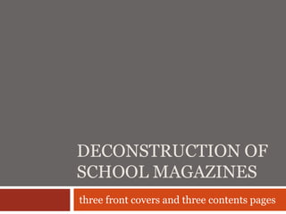
  • 1. DECONSTRUCTION OF SCHOOL MAGAZINES three front covers and three contents pages
  • 3. HILBRE HIGH SCHOOL The logo looks slightly odd, as if it has The boarder at the top and bottom of the cover been stuck on. However, this could be asserts itself with the school by using the colour the effect they wanted as it stands out. purple The main image which fills the The title is very effective as the bold white font background is strong and attention follows the theme of the cover. The schools grabbing as it shows both staff and name is the biggest so their audience can students in construction clothing with familiarise themselves with the school. But spades inferring they are getting stuck more effectively they have used the word in. contributing with work and getting ‘Endeavour’ which means ‘we can do it’ their hands dirty. The idea of team work reflecting the image of them working to get presents the school very positively. The things done. It all flows and fits together style of the picture used reflects the perfectly, with a sense of power. mood and the editorial style of the magazine. The whole presentation looks very professional There is a student with a disability also Everyone has a smile of their face which taking part in the work which reflects suggests they’re all happy where they are, doing Hilbre school as being diverse and what they’re doing. It reflects the school as an offering equal rights and opportunities. enjoyable place to be, working with a smile. It The word ‘Inside’ mirrors creates a harmonious effect There’s a limited colour scheme and font set. Too the title of the magazine with the same font style The colour scheme seems quite dull to many colours and too many font styles will make which draws your attention me, perhaps this shows the mood of the school. the cover look messy and hard to read. to the text features. These The use of cool colours I believe would recede promise a clear benefit to from the younger viewer but maybe an older The font and colour scheme is clean and clear the reader and offer viewer would appreciate it more. If could be emphasizing the idea that the school is quite something for new readers suggested that this magazine is meant for the formal. parents/carers of students.
  • 4. KING EDWARD VI SCHOOL - HIGH PROFILE The title ‘High Profile’ is solely the title of The excessive use of the colour black makes the magazine, not actually the name of the the magazine look sleek and professional , a school. Perhaps this is because the school connotation of the school perhaps. is a high profile school and they want to The cover is split up using the law of thirds. attract customers more with this fact. It allowing it to be easily distinguished. could be that people will remember it by this rather than the name of the actual The white text separates itself and contrasts school. The title is the largest text on the with the dark background creating a sense of cover and stands out. The second half energy. The simplicity of the font is effective ‘profile’ is bolder highlighting it’s more as too many fonts and font colours would important as it’s the profile of the school. make the magazine cover look messy, confused and hard to read especially as there The schools actual name could easily go is a very busy image. Therefore, it ‘s clear it unnoticed as there is a lot going on, the has been well thought about , making it look cover is very busy and it’s in small print extremely professional above the title of the magazine. We could suggest this is the idea that the school The main feature ‘Hair Raising Show’ is a play wants because they want their audience to on words, it’s the selling point and relates to be curious where their exciting magazine the main image which is a typical convention comes from and read inside to find out of a magazine to entice readers This magazine is for a The cover highlights that drama is a key subject for young audience. It The ‘plus’ at the bottom of the cover this school and possibly what the school is specialised connotes fun and attracts promises a clear benefit to the reader and in., what they’re proud of. This effectively comes its audience through this offers something for new readers. Although across in an exciting way with the main image means, with the main this text is in small print it stands out as the reproducing a scene from the musical ‘Hairspray’ . image being ‘plus’ is written in pink whereas the rest of This entices customers to the school, especially those bold, colourful and eye- the text on the cover is written in white . with an interest in the creative world and shows them catching. It suggests this is The use of the colour pink reflects the school this is what they could be apart of what the school is all about being an all girls school
  • 5. THE RUTHINIAN SCHOOL The presentation of the cover shows Doesn’t posses typical forms and conventions symmetry and fluency. The placement of of a school magazine, for example exciting both the text and the logo shows a sense of headings a large image or images to entice formality and organisation. readers. perhaps this is due to the idea that this school is different to others and you have The cover looks quite sophisticated, posh to read inside to find out how and why which and perhaps regal. The simplicity of the creates a sense of mystery. cover is very effective as it forms an idea that the school is distinguished It is apparent that the school issue their magazine yearly by the date placed largely at The school logo is placed on the masthead the bottom of their magazine. We can infer and fills the entire top half of the cover that the date is important to the school and which is the most significant part as it’s the magazine as it’s the only other piece of writing first place you look. This, suggests the logo after the schools name. is the most important aspect for the school Its extremely formal presentation and the lack and they want people to be familiar and of images except their use of the school logo remember it suggests that their magazine is solely about the The magazine asserts itself with the school school itself and therefore it’s audience rather by displaying the school colours over the than being students, more being entirety of the background. It could be parents/carers who are planning to send their suggested that the school is a mixed one as This cover certainly wouldn’t attract a children to this school and it’s more of an the school colours attract both girls with young audience as although the information guide/magazine about the the colour purple and boys with the colour school colours are very bold it doesn't school, perhaps full of blue give off an element of fun which reviews, achievements, results OFSTED young audiences feed off. The whole reports and such like. This idea has developed The use of the colour cream for the text layout in every aspect puts across an by the fact it’s only issued yearly and every and logo fits well on the cover standing older audience who would appreciate year schools take on a new set of students. out against the bold background this kind of layout The ‘2008’ reflects the importance of the
  • 7. WALLASEY SCHOOL Issue number lets the reader keep up The image of the school covers the masthead of to date with which magazine they the page. This is the first place people will look an are reading. The number 4 is it seems quite engaging. It will familiarises the highlighted with a red reader with the school. outline, showing its importance. The use of the colour red around the 4 fits The image of the school is very natural as it shows perfectly as it’s featured on the school surrounded by nature. The natural numerous places on the contents lighting shows purity and innocence of the school. page. It seems like a nice place to be. The school logo is featured at the The title ‘Welcome’ is one of the largest pieces of very top of the page next to the name text and stands out in white, which gives a sense of of the school. By the use of red in warmth and friendliness. The font gives a the logo, over the cover, and being harmonious effect. The ‘welcome’ overlaps the the colour of the head teachers tie, it image suggesting the school welcomes everyone suggest that this colour is one of the school uniform colour Head teachers letter a typical convention of a school magazine contents page. The image of the ‘what’s in this issue’ offers a benefit head teacher is there to familiarise readers with the to the reader, letting them know head of the school. It could be there for new what the magazine consists readers also, so they can remember an important of, allowing them to jump to the The design and overall presentation face for future reference if they decide to go along section that takes their interest to looks smart, organised and to the meet the school. He is dressed smart which read. The mix of colours used for sophisticated with an edge by the reflects the schools reputation and gives a first this section adds an edge to the bright use of red impression to new readers about the school. The contents page and a sense of fun as background colour of the letter flows with the elsewhere uses a more natural colour looks mature, perhaps for an older image of the school with a brown colour reflecting scheme. audience nature.
  • 8. BEBINGTON HIGH SCHOOL There is only one image which draws your Title ‘welcome’ and ‘New’ stands out in a attention especially with the colour against yellow/orange colour. It‘s funky font and the excessive use of blue everywhere else. It positioning on slant add an edge of fun. It’s Shows two young boys in their uniform. a very arty contents page, perhaps this is a They are smiling which suggests they are key subject at the school. happy at this school. You could infer if you didn’t know the school that is was solely a The strip of black at the top stands out and boys school from the extreme use of blue highlights what the magazine is throughout the contents page and the only image being two boys ‘What’s in this issue’ is in a light turquoise whereas the head teachers letter is in a dark A head teachers letter and a list of what’s to blue. This separates the different sets of come in the magazine are typical text conventions of a school contents page The whole layout is neat and organised In the first sentence in the head teachers making it easy to follow letter, he states the magazine is called ‘Shine’. It stands out in the same colour I think it’s for a young audience as it gives a and font of the header at the top of the sense of immatureness. It’s extremely bold page. Although, you would think that if it and eye catching which is exactly what was the title of the magazine is would have young audiences appreciate. It’s well suited been placed at the top and made to stand The excessive amount of text and and attractive to it’s audience out more perhaps with a bigger font size. minimal images make it quite boring, a From naming the magazine ‘Shine’ it could bit like a story. There is no main be suggested that this reflects the students feature to catch your eye. The same at the school, with each one shining or by style font is being used. There’s attending the school they have learnt to nothing spectacular about it shine.
  • 9. KING EDWARD VI SCHOOL The title is the largest piece of text and Even though it’s a school magazine it seems written in a funky font to stand out. The the least bit interesting and exciting positioning of the title is the first place you targeting an older audience. look at the very top centre of the page. This enabling the audience to understand its the The contents is extremely different from the contents page first two contents pages iv deconstructed in it’s simplicity, boring font styles, lack of There is not much going on, it appears colour and images very simple making it easy and clear to read and follow There is a faded, washed out image in background although you can barely make The fact that their are no images make s it out what it is extremely boring. Images are usually a typical convention and seen as an appealing Page numbers, headings and descriptions factor to entice readers. Therefore this are typical convention of a contents page magazine breaks that convention. Perhaps their front cover and the rest of the The use of colour is minimalistic. Black and magazine follows this same theme or white are typical colours most magazines perhaps the rest of the magazine is use. Contrasting dark against white stands extremely enticing, therefore felt they out. There are no bright colours to attract. needn't make the contents page enticing. The boarder appears to be the only Includes the basics of what a contents page The page and issue number are interesting feature and is quite unusual is – to inform you of what's to come in the placed at the bottom below the for a contents page to have therefore setting magazine, perhaps this is all they wanted boarder it apart from others. It makes it appear from their contents page an that's why more attractive. they’ve made it so basic, simple and straight to the point. They want you to focus on the text an not get taken away by images