
Recommandé
Contenu connexe
Tendances
Tendances (18)
En vedette
Similaire à Digipak analysis inside
Similaire à Digipak analysis inside (20)
Dernier
Dernier (20)
Digipak analysis inside
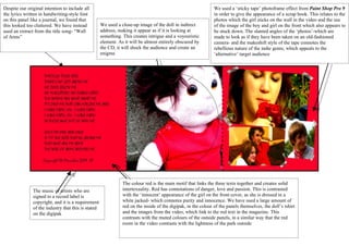
- 1. Despite our original intention to include all We used a ‘sticky tape’ photoframe effect from Paint Shop Pro 9 the lyrics written in handwriting-style font in order to give the appearance of a scrap book. This relates to the on this panel like a journal, we found that photos which the girl sticks on the wall in the video and the use this looked too cluttered. We have instead We used a close-up image of the doll in indirect of the image of the boy and girl on the front which also appears to used an extract from the title song- “Wall address, making it appear as if it is looking at be stuck down. The slanted angles of the ‘photos’-which are of Arms” something. This creates intrigue and a voyeuristic made to look as if they have been taken on an old-fashioned element. As it will be almost entirely obscured by camera- and the makeshift style of the tape connotes the the CD, it will shock the audience and create an rebellious nature of the indie genre, which appeals to the enigma ‘alternative’ target audience The colour red is the main motif that links the three texts together and creates solid The music of artists who are intertexuality. Red has connotations of danger, love and passion. This is contrasted signed to a record label is with the ‘innocent’ appearance of the girl on the front cover, as she is dressed in a copyright, and it is a requirement white jacked- which connotes purity and innocence. We have used a large amount of of the industry that this is stated red on the inside of the digipak, in the colour of the panels themselves, the doll’s tshirt on the digipak and the images from the video, which link to the red text in the magazine. This contrasts with the muted colours of the outside panels, in a similar way that the red room in the video contrasts with the lightness of the park outside