
Recommandé
Recommandé
Contenu connexe
Similaire à Responsive Web Design for Universal Access: 2019
Similaire à Responsive Web Design for Universal Access: 2019 (20)
Plus de Kate Walser
Plus de Kate Walser (16)
Dernier
Dernier (20)
Responsive Web Design for Universal Access: 2019
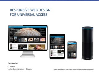
- 1. 1 RESPONSIVE WEB DESIGN FOR UNIVERSAL ACCESS Images: Mashable.com, https://www.yonomi.co/blog/hey-alexa-meet-yonomi/ Kate Walser CX Insights kwalser@cxinsights.com • @kwalser
- 2. 2 CHALLENGE: “WE WANT A MOBILE WEBSITE”
- 3. 3 EARLY MOBILE STRATEGY TWO SITES – WWW.FACEBOOK.COM, M.FACEBOOK.COM › Two sites – – Server checks browser / device – Present that site m.facebook.com Don Smith
- 4. 4 RESPONSIVE ONE SITE, MULTIPLE VIEWS Photo credit: http://sixrevisions.com/mobile/methods-mobile-websites/
- 5. 5 ADDITIONAL MOTIVATION WCAG 2.1: SUCCESS CRITERION 1.4.10 REFLOW (LEVEL AA) › Web Content Accessibility Guideline (WCAG) 2.1’s success criterion 1.4.1 on Reflow requires that content, when it’s resized, can still be understood without loss of context or information. Think one column, as an example. https://www.w3.org/WAI/WCAG21/Understanding/reflow.html
- 6. 6 CHROME’S AUDIT TOOLS INCLUDE MOBILE AND SEARCH ENGINE OPTIMIZATION (SEO) CHECKS…
- 7. 7 ADDITIONAL MOTIVATION MOBILE-READY AND RESPONSIVE SITES RANK BETTER IN GOOGLE Google Mobile-friendly Test: https://search.google.com/test/mobile-friendly
- 8. 8 SPEAKER – KATE WALSER › Usability & accessibility specialist › Member of TEITAC, or Section 508 / Section 255 refresh committee › Principal consultant at CX Insights, the user experience division of Tritus Technologies, Inc. › Originally from upstate NY, now call Fairfax, VA (near DC) home
- 9. 9 WHAT IS RESPONSIVE DESIGN?
- 10. 10 Elements have a set width, like 600 pixels wide, and don’t adjust for device size, so content is either cut off or really small and hard to read. Images do not resize either. FLUID, BUT NOT RESPONSIVE
- 11. 11 AT A GLIMPSE Phone, kindle, tablet, desktop views of Mashable.com Screenshots of Mashable.com
- 12. 12 GOALS In responsive web design, we use the same content and adjust it to best fit the content and features for that device. Think of pruning a bush – when done well, after trimming back the “overgrown” areas, the bush still resembles the original bush, but is cleaner and more beautiful.
- 14. 14 HTTPS://WWW.TEXAS.GOV/ LANDSCAPE – TABLET (IPAD, SAMSUNG GALAXY TAB)
- 15. 15HTTPS://WWW.TEXAS.GOV/ SMART PHONE (GALAXY III, IPHONE, ANDROID)
- 16. 16 DEMO
- 17. 17 HOW DOES IT WORK?
- 18. 18 3 ELEMENTS 1. Fluid grid and adjustable widths e.g., column width = 45%, 25ems, or 6 columns wide 2. Media queries (check device / browser width) e.g., if the device width (or the max-width of the viewable area) is 480px or 30em wide, then show this and move that 3. Scalable images e.g., image is 24em x 12em (vs. 248px x 124px) for desktop, and 12em x 6em for mobile
- 19. 19 Wireframes show web page elements and how they look, where they go on different devices “Media Queries,” by Juan Arregin Source: http://dribbble.com/shots/185755-Media-Queries STACK, HIDE, OR CHANGE SIZE OF ITEMS “Media Queries,” by Juan Arregin Source: http://dribbble.com/shots/185755-Media-Querie
- 20. 20 ADJUST VIA CASCADING STYLE SHEET (CSS) RULES /* Mobile */ #welcome {width: 100%;} .buttons {padding:0.25em;margin:5px;} .decoration {display:none;} @media only screen and (min-width: 48em) { /* Desktop and landscape tablet – 768px wide and up*/ #welcome {width: 62.5%;} .buttons {padding:0.25em 0.5em;margin:10px;} .decoration {display:inline;width:1.5em;height:1em;} }
- 21. 21 LOOKING AT THE CODE https://www.austintexas.gov
- 22. 22 22 RESPONSIVE FOR FUN EFFECTS https://teatrlalka.pl/en
- 23. 23 RESPONSIVE AND IMPROVED ACCESS
- 25. 25 ADJUST CSS TO MAKE LARGER “TOUCH” TARGETS
- 26. 26 CHALLENGE 2 HOVER ELEMENTS AREN’T REACHABLE ON MOBILE Elements that are only available on hover can’t be accessed by mobile users. They also can’t be accessed by users who use the keyboard (in combination with a screen reader) or discoverable by users with speech recognition.
- 27. 27 Once event listeners are added to make the items reachable on mobile devices, it also resolves the issue of making them reachable via keyboard. ADD TAB STOPS AND MAKE ELEMENTS REACHABLE BY KEYBOARD OR TAP
- 28. 28 Multiple navigation elements precede the content on the USA.gov website CHALLENGE 3 MANY TAB STOPS BEFORE CONTENT USA.gov Desktop version
- 29. 29 Since the USA.gov uses a responsive design, at narrower widths, the submenus are hidden, making it easier for users to tab to main section options and content. COLLAPSED NAVIGATION CAN HELP USERS REACH CONTENT MORE QUICKLY
- 30. 30 CHALLENGE 4 IMAGES THAT DEGRADE ON ZOOM Images designed at one resolution degrade as users, especially those with screen magnifiers, increase their screen magnification. Images: http://coding.smashingmagazine.com/2012/01/16/resolution-independence-with-svg/
- 31. 31 USE RESPONSIVE, SCALABLE SVG IMAGES Scalable vector graphics used for responsive web designs also improve screen usage for those with visual impairments.
- 32. 32 CHALLENGE 5 HIDDEN, HELPER CONTENT When a user hovers over the items on this chart, they can see a tooltip with information about the category. The tooltips were made keyboard accessible so a user could tab thru them, but it wasn’t obvious to mobile users that more information existed. There was also an alternative chart description hidden offscreen for screen reader users.
- 33. 33 INCLUDE A CUE ONSCREEN FOR ALL USERS By including a visual cue onscreen that alternative descriptions were available, it helped give access to mobile users and also made things more accessible for those who use speech recognition or screen readers that don’t pick up offscreen text, like ZoomText.
- 34. 34 CHALLENGE 6 BEING SIRI & ALEXA & SEO-FRIENDLY Images: http://www.thefigjamchronicles.com/blog-of-awesomeness/new-siri-features-in-ios-7-you-may-have-missed, https://www.yonomi.co/blog/hey-alexa-meet-yonomi/ In prepping their sites to work well with Siri, Cortana, Amazon Echo and other virtual assistants, organizations can use snippets and be more thoughtful about keyword placement throughout the site.
- 35. 35 - JAWS heading and link lists give users a way to quickly jump to headings and links with keywords that match what they want. Vague and ambiguous headings and links (e.g., “Click here” and others) make it hard for users with assistive tools to navigate and will make it hard for users of virtual assistants also. INCLUDE KEYWORDS IN HEADINGS AND LINKS FOR EASIER NAVIGATION
- 36. 36 PLANNING A RESPONSIVE DESIGN
- 37. 37 1. CONSIDER USERS, CONTEXTS, GOALS
- 38. 38 2. DEFINE TOP TASKS PER CONTEXT
- 39. 39 3. PRIORITIZE FEATURES & CONTENT
- 40. 40 4. THINK “MOBILE FIRST”, CHOOSE BREAKPOINTS *START SMALL AND INCREASE WIDTH UNTIL CONTENT STARTS TO LOOK SUBOPTIMAL. Google Analytics reports include Mobile reports. Check the Devices section, and drill down by screen resolution or browser as a secondary dimension to see what users are using to visit your site.
- 41. 41 Quick sketches can be enough to create the responsive design. 5. DECIDE IF / HOW LAYOUT CHANGES
- 42. 42 6. DESCRIBE BEHAVIOR AND STYLE RULES AND TRANSLATE TO CSS RULES MIN-WIDTH WHAT IT MEANS BEHAVIOR / STYLE RULES Less than 50em At widths less than 50em (e.g., 50em x ~12px/em = 600px), article and aside / sidebar should each span the full width. article {} aside {} 50em Once the width reaches 50ems (~600px), then resize the article so it’s occupies about 2/3 of the container width, and position it on the left, with the aside / sidebar on the right. article { float: left; width: 66.3333%; } aside { float: left; width: 66.3333%; }
- 43. 43 7. CONSIDER INTERACTIONS, WIDE ITEMS ESPECIALLY TABLES, DIALOGS, DROP-DOWN MENUS, POP-UP HELP
- 44. 44 8. ADJUST PADDING, POSITIONING FOR HARD TO REACH / TOUCH ITEMS https://www.fairfaxcounty.gov/library/
- 45. 45 UPDATED SITE Fairfax County Website, https://www.fairfaxcounty.gov
- 46. 46 9. VALIDATE CODE, BANISH JAVASCRIPT ERRORS & TEST NATIVELY ON IOS
- 48. 48 Google Chrome Browser, Developer Tools – View > Developer > Developer Tools Firefox Developer Tools – Tools > Web Developer > Responsive Design View BROWSER DEVELOPER TOOLS Google Chrome Firefox
- 51. 51 SUMMARY Combine media queries, scalable images, adjustable widths Identify the main goals, contexts, and reasons users will visit your site and build up from those (mobile first) Design accordingly
- 52. 52 CONTACT KATE WALSER KWALSER@CXINSIGHTS.COM • @KWALSER ADDITIONAL RESOURCES › “Responsive Web Design,” by Ethan Marcotte Article: http://alistapart.com/article/responsive-web-design Book: http://www.abookapart.com/products/responsive-web-design › “Logical Breakpoints for Your Responsive Design,” by Vasilis van Gemert http://www.smashingmagazine.com/2013/03/01/logical-breakpoints-responsive-design/ › ResponsiveDesign.is
Notes de l'éditeur
- Louisiana.gov
- Knowbility.org
- What’s the heart, core of your product? If hidden, which elements would be missed by users? Which items are just for visual appeal? Which things are harder to use?
- How do users reach your site? What features and content do they use most?
- Wireframes Even Google Chrome developer toolbar