
Recommandé
Contenu connexe
Tendances
Tendances (19)
En vedette
En vedette (18)
Similaire à Magazine mastheads catch eyes
Similaire à Magazine mastheads catch eyes (20)
Dernier
Dernier (20)
Magazine mastheads catch eyes
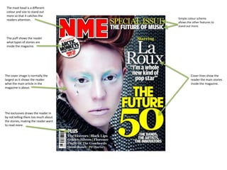
- 1. The mast head is a different colour and size to stand out more so that it catches the readers attention. Simple colour scheme allows the other features to stand out more. The puff shows the reader what types of stories are inside the magazine. The cover image is normally the Cover lines show the largest as it shows the reader reader the main stories what the main article in the inside the magazine. magazine is about. The exclusives draws the reader in by not telling them too much about the stories, making the reader want to read more.
- 2. This mast head is a different font and size to the rest of the cover to make it stand out. However, it keeps in with the colour scheme. The puff shows the reader exclusives inside the magazine and make them The cover image consists of the want to read more. band mentioned. The photo is studio taken and has the lead singer in the front of the photo making him the focus. The colour scheme The exclusive doesn’t tell makes the magazine the reader too much recognisable to readers about the story but and allows other stories enough to get them to stand out if out in a interested. It also shows different colour. that this is the only magazine to have it. The cover line shows the main article in The strip includes headlines the magazine and of stories and sometimes catches the readers exclusives to show the eye by being in a reader the other stories bigger font but still within the magazine. in keeping with the colour scheme.
- 3. The smaller The title is a larger images are of the text than the others smaller articles to make it stand out that are not as to the reader. big as the main article. The main article The colour scheme picture is bigger than is simple to make the rest to make it the main articles stand out to the stand out. reader. Its is also central. The advertisement is for the magazine and catches The page number the readers eye. of the bigger articles is of a larger font to make it stand out. The smaller font contents is of the smaller articles and regulars.
- 4. The title of this The main image shows contents page is the reader what the of a large font main article of the and in keeping magazine is and gives with the colour the page number to scheme which where they can find it. carries on from the front cover. These titles show the These images reader the title, page show samples number and also give a of the main summary of the article. articles inside This makes it easier for the magazine. the reader to find the articles they want read. These titles show the reader where they can find what they want by organising the articles and stories in the A letter from the magazine. editor makes the magazine more personal and gives the reader an outline of what articles and stories are in the magazine. This advert is to promote the magazine itself and catches the readers eye.
- 5. The title is a larger A brief introduction is given to the font to the rest to article and gives the reader an outline catch the readers about the article. eye . The main image draws the readers eye to the article. A quote makes the article seem more personal to the reader and also breaks up the text. Drop capitals show the reader where the article begins. The article is set out in typical columns.
- 6. The quote make the article The article is set out in typical columns. feel more personal to the reader. And catches their eye. The timeline gives the reader and outline of the band’s history. The smaller images are of other band members this draws the reader’s attention to them. The biggest image on the page is of the lead singer, drawing the reader’s attention to him.