Hotel And Home Service Available Kolkata Call Girls Diamond Harbour ✔ 6297143...
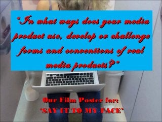
In what ways does your media product
1. “ In what ways does your media
product use, develop or challenge
forms and conventions of real
media products?”
Our Film Poster for:
‘SAY IT TO MY FACE’
2. Conventions of Film Posters
- A Film Poster must have conspicuous
typography, iconography, lasting appeal
and recognisability.
- There must be prominent use of
photography.
- The typography is inventive,
recognisable and suitable.
- Institutional Information is displayed at
the bottom of the poster.
- There is usually reviews from outside
companies.
3. “ A Film Poster must have conspicuous typography, iconography, lasting appeal
and recognisability.”
We feel we have followed this important convention as one of our aims when producing this product was
to ensure the audience is interested in our documentary to increase the likeliness of them watching our
film.
I believe our poster is
Also at the top of our film poster,
appealing for our audience
the rewards are iconography of
through different ways. Our
film posters, also this will gather
photo is shocking, with a very
interest as it suggests the
literal message of suicide,
product is commendable as it is
which is likely to capture the
worthy of winning such
audiences attention and
respected film awards which
makes the genre more
would influence the audiences
recognisable. The photo has
respect for the film.
outlined, striking edits which
The title has recognisability as
it is used in our documentary.
This helps achieve brand
identity and allows the
audience to distinguish how all
products are linked.
The use of laptop is iconography
of the cyber-bulling genre,
establishing the genre and making
the poster iconic.
The use of glow behind the writing on the poster helps to emphasise its meaning and
makes it stand out which should capture the audiences attention. We feel this is
effective as it would cause the audience to look closer at our poster which is helpful
when trying to convince the audience to watch your product.
makes it stand out. This has
proved successful as we
would draw in the audiences
attention and establish the
documentary has a serious
message and topic.
The Channel 4 logo is iconic
to the audience due to its
excellent reputation for
exhibiting challenging
subjects and being the
home of documentaries.
4. “There must be prominent use of photography.” we are
Using a laptop
We believe using long shot,
we have captured the
audiences eye by displaying
themes of isolation and
seclusion on the subject which
will make the audience think.
Despite the black and white
colour connoting distress and
suffering we feel it may not
capture the audiences
attention as much as a picture
with colour, and believe our
poster may have drawn the
eye of more audience
members had we used colour.
exploiting the cyber-bullying
genre and displaying
iconography of the internet
and advancing technologies.
This helps to educate the
audience on the content of
the documentary, and helps
them realise whether it is a
product they would be
interested in.
Using Natasha has helped create
brand identity within our products as
Natasha is used in our documentary,
review and film poster. This will
increase recognisability with our
audience.
We have met this convention conclusively, as we feel our picture is the focal point of our poster
and the photography helps to establish the genre and have strong connotations of cyberbullying
and the effects of it.
5. -“The typography is inventive, recognisable and suitable.”
We feel we have challenged this convention slightly, as our title is not of a large size,
which is conventional for film posters, however we feel it is inventive and is
recognisable due to its brand identity.
The font size is not large and overpowering on our poster, however we
feel the size does not matter as it is still large enough to recognise and
appreciate.
We have accomplished this through use of ‘KEYBOARD FONT’ from
DAFONT.com, which will become recognisable to the audience as the
font is brand identity used in the documentary.
By adding in a glow behind the font we have made it stand out and
emphasise its meaning adding connotations of how important the
theme of the documentary is, establishing the documentary Channel 4
conventions, that their documentaries usually tackle difficult issues.
As the keyboard shape acts as iconography to
the internet, it becomes more likely that this will
catch the audiences eye, due to increasing
prevalence of internet use, the audience will be
able to identify the topic of the documentary
and capture the interest, establishing the cyberbullying genre.
6. “Institutional information is displayed at the bottom of the
poster”
We followed this convention using a conventional film poster font, ‘SF FILM FONT’. We
followed this convention as we feel it helps to inform the audience of as much information
on the production stages of the film, also crediting all the work that goes into the product.
This also makes our poster look more professional and realistic and establishes the
documentary genre.
Positioning the text at the bottom of the poster is not
only conventional, but also effective. I believe this is true
as it does not become the focal point of your poster, but
if the audience desires to read it, they know it is there,
this will help to increase their confidence in knowing the
production is impressive as they have access to
knowledge on who has produced it, and whether their
work is of good quality.
By using this font, it helps make the
information clear and easy for the
audience to read. I feel we have done
this well, as the font will help us to build
up our audience members as they will
feel they know more about the
production.
By using a white font, with a black outline, I feel
has helped to make our font striking and appeal
important. This is good as it is still noticeable,
but kept other elements, such as our picture the
prominent part of our poster.
7. “ There is usually reviews from outside companies”
We have followed this convention in our film poster by using the
convention Gold Feather style awards, given by ‘Sundance Film
Festival’, and ‘Cannes Film Festival’.
Using these prestigious film awards, it is likely the reputation of our
documentary would be respected, as these awards tell the audience
the product is of good quality . Our poster then tells the audience
that it is worth watching, as it was worth awarding this title. This is
then likely to increase the mass of our audience which proves our
decision to use awards successful as if we were to distribute our
product it is likely that our target audience would be interested in
watching our documentary.
8. Institutional Conventions of
Channel 4 Posters
Channel 4 posters have elements of recognisability that the
audience can identify as Channel 4 products.
9. The LOGO
In print, the facia of the logo is invisible, so that it integrates with its
surroundings. We see its distinctive shadow overlaying photographs,
illustrations and textures.
Despite many brands placing their logo in the bottom
right of their film poster, CHANNEL 4 place theirs
in a centre-right position. This is unique to channel
4 and therefore the audience can instantly recognise
it.
Channel 4 uses only basic colouring on their logo,
they avoid using different versions of the same colour.
Other colours may be used where appropriate.
10. SAY IT TO MY FACE POSTER.
Our Channel 4 logo is placed
just below the centre-right
position, but still too high to be
considered bottom right and
therefore recognisable to an
audience.
Our logo facia is invisible and
integrating with the
background, which is
conventional for channel 4 film
posters. We feel this makes
our poster more professional
and realistic.
Using a black logo looks
sophisticated and is
recognisable to the audience
through its conventional
simplicity of the colouring of
channel 4 logo’s.
11. Visual Identity
At the heart of the Channel 4 visual identity is the belief that writing and
design must work together. Channel 4 is innovative, independent and
irreverent. Therefore, the tone of voice needs to be bold, surprising and
challenging.
Our poster’s writing and
design works together to
visually identify with the
theme of the documentary,
cyber-bullying.
We feel we achieve this through
the use of iconography, the laptop
resting on the subjects knee. Also,
this links in with our title font. The
recognisability that the font is a
keyboard helps the audience to
understand the genre is based on
new technologies.
OUR POSTER
To make our poster bold we
used and underlay glow
behind our text. This helps to
emphasise its importance
and outline the significance of
the message of our
documentary.
12. Imagery
Channel 4 should always produce engaging, original, memorable and eyecatching advertising solutions.
The literal image displays the harsh reality behind
the topic of our documentary. Using a gun to
display a method of suicide will shock our audience.
This method of captivating an audience always
engages them, therefore we have follow this
convention of Channel 4 posters, as we believe the
imagery we use portrays shocking ideologies and
will become memorable to the audience due to its
horrific message.
13. Genre Poster Conventions
Cyber-bullying and social media products
make use of various conventions to
portray their message on a poster
advertising campaign.
14. Our poster for, ‘Say it to my Face’ follow genre conventions when compared to ‘Cyberbully’.
1.
Use of ICONOGRAPHY of the cyber-bullying genre. Both posters use the advanced hardware
technology, laptops. Both are central to the film poster connoting power, dominance and informs the
audience of its underlining importance in the products.
2.
Using blue as a background helps to connote freedom and peace. This reassures the audience that
despite cyber-bullying being a difficult and challeging topic to deal with, both have resolutions which
are explored in the products.
3.
It is conventional for cyber-bullying genre to use a ‘subject’. In this case, both posters use a distressed
female, as stereotypically females are weaker than males. Both subjects are reading whats on screen
and showing physical emotion. This connotes the seriousness of the topic and will emphasise its
importance to the audience.