
Recommandé
Contenu connexe
Tendances
Tendances (19)
Similaire à Rock Band Magazine Cover Photo Selection
Similaire à Rock Band Magazine Cover Photo Selection (20)
Plus de lilyana_01
Plus de lilyana_01 (20)
Dernier
Dernier (20)
Rock Band Magazine Cover Photo Selection
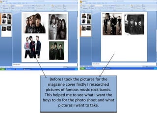
- 1. Before I took the pictures for the magazine cover firstly I researched pictures of famous music rock bands. This helped me to see what I want the boys to do for the photo shoot and what pictures I want to take.
- 2. Here are some of the pictures I took
- 3. I didn't use this one because the This one is also a bit lightening isn't (it is too bright, but it too bright at the top). could be edited with And also half of the Photoshop. However, body of the boy on this isn't the the left side is cut, conception I am which has a negative aiming for as the impact on the image picture represents 3 friendly looking boys and I want them to appear more serious. This is another good image. I like the lightening ( it isn't dark neither bright) and I also like the modelling. However I didn't use it because I don’t think is appropriate for a front page of a magazine. After I took the pictures I chose few I could work on and consider their advantages and disadvantages.
- 4. At the end I chose to work on this image because I used this picture for the cover of the magazine because the quality is good, it represents what I was aiming for (serious looking, proud guys) The lightening is good which made it easier for me to Photoshop. There is also a lot of space on the top where I can put the title of the magazine.