
Recommandé
Contenu connexe
Tendances
Tendances (20)
En vedette
Similaire à Analysis of Front covers, contents pages and double page spreads.
Similaire à Analysis of Front covers, contents pages and double page spreads. (20)
Dernier
Dernier (20)
Analysis of Front covers, contents pages and double page spreads.
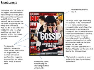
- 1. Front covers The middle title ‘The gossip’ is Uses Freebies to draw the biggest font size and most you in. noticeable piece of text, this is because it is the main feature and USP of this issue. This piece of text seems to anchor The image shows a girl dominating the image suggesting that the and as she is at the front and can image is of ‘The Gossip’. be seen more. Also the image Also the bit of text under the overlaps the title which shows that middle title tells you what the magazine is well know as by you’ll find out about ‘the looking at it you can easily recognise gossip’ it is short but is easy it from others and because you may enough to elaborate on know this magazine your past yourself. knowledge can tell you what the magazine title is saying. It is easily recognised as NME use the same colours red black and The contents white, because it is easier to read indicators, show more the text. They also use the same font things you are likely to buy style for the title each issue. the magazine for, for example some could purchased the magazine The barcode Is essential so need because there is a section to be on the page, its positioned about ‘Muse’ a famous The baseline shows out the way. band. more exciting and interesting stuff that will be inside.
- 2. The title ‘KERRANG!’ is The magazine is well know smashed which suggests harsh. and popular, it is recognised Also, the title contains as in most issues it uses the onomatopoeia the word same front font for the title ‘KERRANG!’ is loud, metal and sticks to the colour noise and guitar. scheme red, white and black. This is unique as know other The sub title of the magazine has a title smashed. image is ‘Unfold the As well, it uses a ‘!’ which puzzle of life..’ which is a suggests shock and surprise. play on words as this would be more under The image of Biffy Clyro shows power and stand able for fans, as it aggression by the way they are standing is the name one of their and how the shadow is casted on them. albums. The ellipse ‘...’ Also they're eye level is all directed at the makes us think they will camera which addresses you personally. be more inside. The size of the font for the words ‘Biffy clyro’ and the fact they are going form edge to edge suggested that the image is of Biffy Clyro and they are the main feature (unique selling point) of this The barcode Is magazine. essential so need to Freebies encourages the be on the page, its audiences to buy them. Word positioned out the ‘FREE’ is in capitals to make it way. noticeable. The base line is busy, full and active suggesting there will be a lot inside of the magazine.
- 3. Uses a Puff, normal showing a freebie. By using a puff it makes it jump out of the page catching your eye. The title is black and white which is bright and loud. The explanation mark suggests loud and fun. The women on the front cover is well known, this attracts audience that want to know more about Fearne Cotton “Exclusive” suggest this is the only place you will find this information. The barcode Is essential so need to be on the page, its positioned out The cover line includes other the way but is still interesting stories to attract noticeable. the reader and with a pictures. The text is straight to the point but tells you what you will see. The text and background contrasts so sticks out and is easier to read.
- 4. Contents pages This contents page from the music magazine ‘kerrang!’ has unique set up as it has a different lay out to a basic contents page, as it doesn’t have the three columns and is split across the screen. The large picture takes up a half of the upper The titles follows the same design page, this is because this is in each issue, it is seen as loud and quite a important part of violent as the headings are large the magazine, and is likely and have a smashed styled font. to be the main attraction The smashed font also entitles the of the magazine because type of music the magazine is he is famous and will based on. attract his fans. This contents page includes a editor’s letter which makes the magazine more personal. The letter is normally saying thank The sub titles are yellow you fro buying the magazine and writing on a black about the editor. background this allows the reader to easily read the writing and notice the categories. also it links the magazine together on this page because the yellow and black are the main colours through out this issue.
- 5. The layout of this contents page is unlike Uses one man which is stood any other and carries along side the text, showing this contents page style he is the main focus on the throughout every page. issue, this makes it Mojo contents page uses a recognizable . simple colour schema of red The magazine pick out black and white. features that would The contents page is unique appeal the most and compared to other magazines anchor them with a page as it only uses one image. number so it is easily to find and read more about a certain feature. Red and white are used The contents page keeps against the background some things similar every so that they stand out. issue to keep the magazine The subtitles and recognisable, for example numbers for the features they have a cover story every are bold which are eye issue and use the same set catching and allow the out of title and the same font. audience to quickly find what they are interested in and where it is. They use a grab quote The contents page has a which is separate from small division of the everything else on the categories as ‘cover story’ page, getting them to is singled out because of read more about it . the sub title.
- 6. The style is very differently set out to the front page, as the contents page shows a lot more information. The contents page is a navigating tool, it helps you locate where the main interest of the magazines are. Three main images as these The title ‘CONTENTS’ uses the are the main interests of the same colour scheme as the magazines, mostly the large magazine each issue which gives magazines would attract identity to the magazine, and extra audience and are the can be recognized well . special ordinal stories of the magazines. The magazine picks out the most interesting parts of the magazine, which will attract Also, the pictures have audience and shows them on page numbers on the contents page . them, this is to show where you can find this This contents page uses large font piece of information for the page name for example the magazine. ‘Fashion’. This is so you can easily find the page and find out what the page will be about and either This contents page is go straight to the page or to find a basic design which more out read the smaller font. you would be likely to see in most The numbers are in a magazines. It uses different font to the three columns and writing and are large to contains more than stand out . one image.
- 7. Double page spreads This is a double page spread from the magazine ‘Q’ it uses a majority of conventions uses on double page spreads. The large heading of ‘lady GAGA’ and the large image indicates this article is about the music artist ‘lady GAGA’. It is easy to recognise which magazine this is featured in as it contains the logo in the bottom right hand corner. another way the audience can tell it is from the magazine ‘Q’ is that it uses the same house style of colours and font. For example the large ‘L’ is n the same font and colour as the title of the magazine . The large ‘S’ catches the audience eye and show that Observers the rule of thirds using this is the start of the text. The columns, this basic layout is used in most What connects the two pages magazine is direction the double page spreads it allows the writer to together is that there is a reader. divide the text up, get more on one page and picture of lady Ga Ga and the is easy to read because it is organized. text on the other side is about Lady Ga Ga.
- 8. By having ‘VIIP Q+A’ the audience can recognize which magazine this double page spread is from. The white and pink on black text make it easier to read and eye catching. The heading is large and bold making it stand out and focus’ on the text below. The heading tells the audience about the music artist and information that pushes the reader to read the copy. As well, The name ‘Dizzee Rascal’ is singled out as it is in a different colour because this is who the article is all about. The letter ‘B’ at the start of the text is a pull quote and indicates where to start reading from as the font and size The image is of the artist which is makes it very eye catching. The ‘B’ This magazine does not use the rule of interviewed this connects the two uses the same font as the magazine thirds but is still easy to follow. The pages together. Also there is a title, this would also give the pages text is informal as it uses questions connect between the two pages as a recognition. which or in bold and answers. This quote had been plucked from the informal text would appeal to younger text. readers possibly 16-20 year olds. The house colour is pink, black and white as they are used throughout the double page spread.
- 9. This double page spread has the same basic design conventions but has some differences. The heading stands out as it is large and uses bold text, catching the readers eye. Like the Vip Q+A double page spread the artists name ‘Solange Knowles’ is blue this singles her name out from the text, showing that the copy is focused on her. At the start of the copy a sentence is in bold and is darker, this is eye catching and encourages the reader to read the whole article, it is called a grab quote ‘grabbing’ the audience in. The image is continues between the top pages overlapping them Grab quote The house style is used through out this technique connects the two to gain recognition. The main colours pages together. As well the featured are blue white and black. image connects the pages as the Image links to the type of genre copy talks about the artist. magazine as Solange Knowles is a This double page spread uses the pop artist and this magazine is rule of three on both pages, where based upon the genre POP. as normally it is just used on one page. The rule of three divides the page up making it easy to read .
Notes de l'éditeur
- Oioi sailor!