Designing for Words
•
3 likes•818 views

This document discusses typographic style for web design. It covers topics like typefaces vs fonts, typesetting principles, anatomy of characters, kerning, leading, vertical spacing, hyphenation, quotation marks and responsive design considerations. The sections include introductions to type, choosing tools, typesetting for the web and responsiveness. Guidelines are provided for layout, scale, measurements and other elements.

Recommended
More Related Content
Similar to Designing for Words
Similar to Designing for Words (20)
Recently uploaded
Recently uploaded (20)
Designing for Words
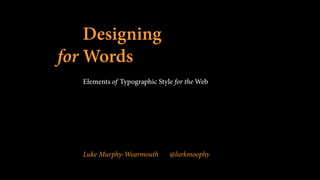
- 1. Designing for Words Elements of Typographic Style for the Web Luke Murphy-Wearmouth @lurkmoophy
- 2. I am not an expert. I am an enthusiast.
- 3. leave the road when you wish.
- 4. break the rules, break them beautifully, deliberately and well.
- 5. The sections: 1. An Introduction to Type 2. Choosing the Right Tool 3. Typesetting for the Web 4. Typesetting for RWD
- 7. Typeface vs Font 1. Typeface — the overall design of a collection Helvetica is a typeface
- 8. Typeface vs Font 1. Typeface — the overall design of a collection Helvetica is a typeface 2. Font — The physical embodiment of a collection of letters, numbers, symbols etc. Helvetica Bold is a font
- 9. Typeface vs Font ! font is what you use Typeface is what you see
- 10. Typesetting 1. Typesetting is the composition of text by means of arranging physical types or the digital equivalents.
- 11. Anatomy of a character 1. x-height — the space between the baseline and the mean line. The height of a lowercase x.
- 13. Anatomy of a character 1. x-height — the space between the baseline and the mean line. The height of a lowercase x. 2. ascenders and descenders — the tops and bottoms of letters like b, d, j, q
- 15. Anatomy of a character 1. x-height — the space between the baseline and the mean line. The height of a lowercase x. 2. ascenders and descenders — the tops and bottoms of letters like b, d, j, q 3. cap-height — height of a capital letter
- 16. H cap-height
- 17. Anatomy of a character 4. counter — the open space within a letter, both partially closed (c) and closed (o)
- 18. dcounter
- 19. Anatomy of a character 4. counter — the open space within a letter, both partially closed (c) and closed (o) 5. serif — a little stroke found at the end of main vertical and horizontal strokes of some letterforms
- 20. d serif serif
- 21. Kerning 1. adjusting the space between characters in a proportional font to achieve a visually pleasing result
- 22. War
- 23. War
- 24. Leading 1. The space between baselines
- 26. A type that stops you in the middle of a sentence and asks you to admire its smartness is a bad type “
- 28. The way we read
- 29. rodscones
- 31. detect movement sensitive in low light rodscones process detail register sharpness
- 32. foveal
- 35. this is a sentence made of words saccade
- 36. this is a sentence made of words fixation point
- 37. The morning had dawned clear and cold, with a crispness that hinted at the end of summer. They set forth at daybreak to see a man beheaded, twenty in all, and Bran rode among them, nervous with excitement. This was the first time he had been deemed old enough to go with his lord father and his brothers to see the king's justice done. It was the ninth year of summer, and the seventh of Bran's life. ! The man had been taken outside a small holdfast in the hills. Robb thought he was a wildling, his sword sworn to Mance Rayder, the King-beyond-the-Wall. It made Bran's skin prickle to think of it. He remembered the hearth tales Old Nan told them. The wildlings were cruel men, she said, slavers and slayers and thieves. They consorted with giants and ghouls, stole girl children in the dead of night, and drank blood from polished horns. And their women lay with the Others in the Long Night to sire terrible half-human children.
- 38. Testing 1. greater understanding > speed
- 39. the Rules 1. Read the text before designing it
- 40. the Rules 1. Read the text before designing it 2. Work out the inner logic of the text
- 41. the Rules 1. Read the text before designing it 2. Work out the inner logic of the text 3. Consider the other elements
- 42. the Rules 1. Read the text before designing it 2. Work out the inner logic of the text 3. Consider the other elements 4. Honour and elucidate the character of the text
- 43. the Rules 1. Read the text before designing it 2. Work out the inner logic of the text 3. Consider the other elements 4. Honour and elucidate the character of the text 5. Shape the page
- 44. the Rules 1. Read the text before designing it 2. Work out the inner logic of the text 3. Consider the other elements 4. Honour and elucidate the character of the text 5. Shape the page 6. Give full attention to incidental details
- 45. Learn the basics of identification
- 47. What was the original intended use?
- 48. Special effects
- 49. Consider usage
- 50. Licensing
- 51. 3 contexts 1. Technical 2. Thematic
- 52. Suit the task as well as the subject
- 53. 3 contexts 1. Technical 2. Thematic 3. Historical
- 60. Modular scale
- 61. Use ems not pt 1. EU law
- 62. Use ems not pt 1. EU law 2. It keeps everything relative and scalable
- 63. Use ems not pt 1. EU law 2. It keeps everything relative and scalable 3. ems vs rems
- 64. Choosing your scale ! 0.75 0.83 1 1.1667 1.333 1.5 1.75 2 3 4 5 http://www.type-scale.com.com/
- 65. Choosing your scale ! 0.75 0.83 1 1.1667 1.333 1.5 1.75 2 3 4 5 p h4 h3 h2 h1
- 66. Choosing your scale ! body { font-size: 16px; } ! p { font-size: 1em; } ! h1 { font-size: 3em; }
- 67. Margins 1. Lock the text block
- 68. Margins 1. Lock the text block 2. Frame the text block
- 69. Margins 1. Lock the text block 2. Frame the text block 3. Protect the text block
- 70. Margins ! Rule of thumb: 5% either way
- 71. Margins ! p { font-size: 1em; width: 90%; margin: 0 auto; }
- 72. Measure 1. Ideal line length is 45-75 characters http://css-tricks.com/bookmarklet-colorize-text-45-75-characters-line-length-testing/
- 73. Measure 1. Ideal line length is 45-75 characters 2. Dependent on the font, alignment etc.
- 74. Measure 1. Ideal line length is 45-75 characters 2. Dependent on the font, alignment etc. 3. Use ems not pxs/percentages
- 75. Measure ! p { font-size: 1em; width: 90%; margin: 0 auto; max-width: 33em; }
- 76. Letterspacing 1. Don’t letterspace lowercase letters without a reason
- 77. Letterspacing 1. Don’t letterspace lowercase letters without a reason 2. Letterspace strings of capitals, small caps and strings of digits
- 78. letter-spacing: 1. You can use positive and negative values 2. It’s animatable 3. Sub-pixel values aren’t cross-browser
- 79. letter-spacing: ! h1 { font-size: 3em; letter-spacing: 1em; } ! .string-of-digits { letter-spacing: 0.05em; }
- 80. letter-spacing: ! $( document ).ready( function() { var rex = new RegExp( "([0-9]{3,})", “gm" ); $( “*” ).each( function(){ var $this = $( this ); var content = $this.html(); $this.html( content.replace( rex, “<span class= “string-of-digits”>$1</span>” ) ); }); });
- 81. Leading 1. Music is the space between notes
- 82. Leading 1. Music is the space between notes 2. It’s about vertical rhythm and feel
- 83. Leading 1. Music is the space between notes 2. It’s about vertical rhythm and feel 3. My rule of thumb: 140%
- 84. Leading ! p { font-size: 1em; width: 90%; margin: 0 auto; max-width: 33em; line-height: 1.4em; }
- 85. Kerning 1. Kern consistently or not at all 2. It’s more about font choice than technical solutions
- 88. text-rendering: 1. auto 2. optimizeSpeed 3. optimizeLegibility
- 89. text-rendering: 1. auto 2. optimizeSpeed 3. optimizeLegibility 4. geometricPrecision
- 90. text-rendering: ! p { font-size: 1em; width: 90%; margin: 0 auto; max-width: 33em; line-height: 1.4em; /*probably not a good idea yet */ text-rendering: optimizeLegibility }
- 91. Kerning 1. Kern consistently or not at all 2. It’s more about font choice than technical solutions 3. kerning.js (if you’re a control freak) #pixel-perfect { -letter-kern: 1px 1px 0 0 0 1px 0 2px 0 0 0 0 0; } !
- 92. Vertical space and rhythm 1. Tempo should not change arbitrarily in music
- 93. Vertical space and rhythm 1. Tempo should not change arbitrarily in music 2. Even multiples of the basic leading
- 94. Vertical space and rhythm ! p { font-size: 1em; width: 90%; margin: 0 auto; max-width: 33em; line-height: 1.4em; margin-bottom: 0.7em; }
- 95. Vertical space and rhythm ! p { font-size: 1em; width: 90%; margin: 0 auto 0.7em auto; max-width: 33em; line-height: 1.4em; }
- 96. Vertical space and rhythm 1. Tempo should not change arbitrarily in music 2. Even multiples of the basic leading 3. Don’t interrupt the rhythm of the page
- 97. Vertical space and rhythm ! p { font-size: 1em; width: 90%; margin: 0 auto 0.7em auto; max-width: 33em; line-height: 1.4em; hanging-punctuation: first; }
- 98. Vertical space and rhythm ! blockquote p, .hanging-punctuation { text-indent: -0.5em; }
- 99. Vertical space and rhythm ! ul, ol { padding-left: 0; overflow: visible; }
- 100. Types of dashes 1. Pedantry at its finest
- 101. Types of dashes ! subtraction sign/hyphen - en dash – – em dash — — http://en.wikipedia.org/wiki/Dash
- 102. Types of dashes 1. Pedantry at its finest 2. Use an en dashes with space either side in copy, or a close set em dash
- 103. Types of dashes 1. Pedantry at its finest 2. Use an en dashes with space either side in copy, or a close set em dash 3. Use a close set en dash for ranges
- 104. Hyphenation 1. Leave at least two characters behind 2. Take at least three forward 3. Avoid more than three hyphenated lines 4. Hyphenate according to conventions of language
- 105. Quotation marks 1. " — straight quotes 2. ‘ ’ and “ ”
- 106. Quotation marks ! str = str.replace(/"(?=w|$)/g, "“"); str = str.replace(/(?<=w|^)"/g, "”"); str = str.replace(/(?<=[w,.?!)]|^)"/g, "”");
- 107. Columns 1. Now possible with CSS3 and column-count:
- 108. Columns ! p { font-size: 1em; width: 90%; margin: 0 auto 0.7em auto; max-width: 33em; line-height: 1.4em; column-count: 3; column-gap: 1.4em; -moz-column-count: 3; -moz-column-gap: 1.4em; -webkit-column-count: 3; -webkit-column-gap: 1.4em; }
- 109. Columns 1. Now possible with CSS3 and column-count: 2. A word of caution…
- 111. Widows & orphans 1. Widows still manual, using
- 112. Widows & orphans 1. Widows still manual, using 2. There are other solutions, but they come with a price https://github.com/matthewlein/jQuery-widowFix
- 113. Widows & orphans 1. Widows still manual, using 2. There are other solutions, but they come with a price 3. Orphans apparently sorted by the column algorithm
- 114. Widows & orphans 1. Widows still manual, using 2. There are other solutions, but they come with a price 3. Orphans apparently sorted by the column algorithm 4. Don’t forget print
- 115. Widows & orphans ! @media print { p { orphans: 3; } }
- 116. Typesetting and Responsive Web Design
- 117. The things that don’t matter ! (don’t hit me)
- 118. Aim for consistency in quality
- 119. The things that do matter
- 122. The rabbit hole
- 123. colophon ! The body text was set in Minion Pro Medium, Medium Italic, Semibold and Semibold Italic ! The code text was set in Lucida Console Regular.
- 124. Designing for Words Elements of Typographic Style for the Web Luke Murphy-Wearmouth @lurkmoophy
Editor's Notes
- “If you use this book as a guide, by all means leave the road when you wish. That is precisely the use of a road: to reach individually chosen points of departure.”
- “By all means break the rules, and break them beautifully, deliberately and well. That is one of the ends for which they exist” - Bringhurst
- similarly spaces shouldn’t jump about on a page
- this can be done with lists and punctuation - word processors
- unfortunately not supported anywhere yet.
- you could also use js and regex to add a span to any hanging punctuation
- Fixes that pesky indentation
- 66 characters per line doesn’t work on a small screen. That’s because the printed form was never meant to be this small. We have to adapt. This means changing the size and measure when we’re on small screens. Jason Pamental suggests 33-35 characters per line, which I think is a nice space.
- We need to start thinking outside of size when it comes to responsive and start thinking about contexts. Did you know that you can target a TV specifically using media queries? Not only is this a size concern, but a consumption concern too. It’s a very different experience reading something from 1 foot away as opposed to 8-10 feet. Also, the way the screen renders text is completely different. This is an area that will come out a lot more in the future.