
Recommandé
Contenu connexe
Tendances
Tendances (19)
En vedette
Similaire à Magazine research q kerrang nme
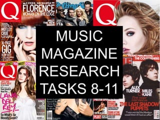
Magazine research q kerrang nme
- 2. Mast head is bold, as usual, and significant as The head line is in a it is what draws the contrasting metallic attention of the reader. silver colour. The only different coloured font Cover lines are like a on the cover. newspaper, red and black, and are The main fonts are sans consistent. This is the serif for the main features. house style of Q. Very The other articles featured eye-catching and are on the cover are in serif the main two colours font. The strapline quote is of the magazine. in serif to be formal. Different sized fonts The house style is to create an impact consistent and the magazine follows the usual conventions for a Columns are featured cover. like a contents page for consistency Q MAGAZINE FRONT COVER
- 3. Contents page is a double page spread Red is the spot colour. Red, black and white works well together This is my favourite contents page because it works really well: red, white and black with a little bit of grey is good. I will base my contents around Q’s contents. Cover story gets its own headlining Body copy is the same font, but with Captions under the articles are box the headlines standing out in capitals in a flushed style, not justified letters & serif Pagination is consistent, same colour as the article headlines, and house style is still showing in the contents page Q magazine contents page
- 4. Right page is a simple photography with one pull quote of WOB (white on black REVERSED- TYPE, striking compared to the usual convention [ i.e. on the other page]) Pull quote is in capitals and a flushed style with a red comment underneath in a serif font. Drop cap, bold. The fact that there is a ‘gutter’ underneath, the drop-cap is a lot more striking. An interesting double page spread. I like the white space and how the columns do not form to the whole page. Q magazine double page spread
- 5. Red mast head, which is a The banner above the mast very common colour on head is leaded, spaced a little music magazine mast heads. wider than the other type on the cover. This cover doesn’t follow NME’s usual conventions and The fonts are a mixture of I think that this cover is sans-serif and serif. messy and unattractive. Pull quotes are used once. The artwork is like a magazine/newspaper collage This is my least favourite front with cut outs and cardboard. cover because it looks like a I think that the cover is not child has done it. Magazines as strong as the other should be neat on the cover magazine covers out there in the music magazine market. Again there are black and red are the main font colours with the headlines being black on white. NME MAGAZINE FRONT COVER
- 6. The problem with this Each headline has a contents page is that it corresponding bares little resemblance picture. Pagination is and similarity with the used. front cover, although the contents page does The page is in actually follow the usual columns that are conventions of the easily to follow and magazine. work well Its house style of the Best thing about this contents is good. contents is the Body copy is bold. columns and the use of the pictures. I like Red and black is used this more than frequently again by this Kerrang!’s one. magazine. Headlines (from the cover) have bold sans-serif fonts whereas the other articles have are in serif fonts. The body copy is flushed. NME MAGAZINE CONTENTS PAGE
- 7. Double page spread is interesting because it doesn’t typically use the colours from the rest of the magazine. The house style is different here. Spot colours are blue and grey and are skewed around the artwork. The columns are in unconventional shapes which makes the double page spread a bit more interesting. Bold fonts. Flushed style. Despite being interesting this is my Sidebar of visuals, graphs – least favourite double page spread. breaks the conventions of The use of white space is The blue and grey isn’t that bold and I the page. good because it is used in a think that it is kind of bland for a way where there isn’t too double page spread much space and it is not too busy. NME MAGAZINE DOUBLE PAGE SPREAD
- 8. Kerrang! Front cover Complimentary colours of yellow, blue, red and white on black. Despite the busy cover the colours work well KERRANG! Magazine Front cover together. The mast head is behind the artist(s) featured. The mast head is white, bold and distorted in a metal/rock music type of font. There is a banner above the mast head for freebies, enticing the reader to buy the magazine. Cover lines are in black, yellow, white and red. The whole cover’s type face is in capital letters, emphasizes the genre of the music magazine, rock/metal. There are mainly headlines but no pull quotes and there are two subheadings. Weight is heavy on the cover and the fonts are unjustified. By far my least favourite front cover. It is too busy and it yells at you with all capital letters. I don’t like it
- 9. This is my least Right hand side favourite contents column features are page of the three highlighted with black magazines. It does boxes that are work, because of the justified. KERRANG! MAGAZINE CONTENTS PAGE column on the right hand side, but I don’t think it is as good as Headlines are in Q magazine or NME’s capital again contents page’s. Body copy main font is bold. Some features/news have subsidiary headlines, information about the article itself
- 10. Image is in the middle of the pages Doesn’t follow the house style or conventions of the rock-y style of Kerrang! but is a good addition to the magazine Font is justified but indented to allow the reader to read and find the next paragraph easier. Black white and red are highlighted here throughout Box panels are used A nice contrast compared to the cover, classy like Q magazine. This double page spread is joint favourite with Q’s double page spread This double page spread works Captions in italic handwritten well and I think that this is my font favourite double page spread out of the three. Sidebox is in vivid red with black and white font. This Drop caps are in red and are eye works really well catching Serif headline of black and red 4 different fonts, 2 sans, 2 serif Body copy is serif KERRANG! MAGAZINE again DOUBLE PAGE SPREAD