
Recommandé
Contenu connexe
En vedette
Dernier
Dernier (20)
All results and some analysed
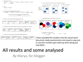
- 1. I have recorded the numbers into the actual word document made questionnaire and saved a copy just in case the numbers get mixed up when being put into EXCEL. All results and some analysed By Marya, for blogger
- 2. About the audience • I asked 20 people which year they were in and most of which were sixth formers. I tried to fit in different ages and years and thus I asked a few teachers as well. This is for the reason that I wanted to know who the magazine really appealed to. Age (approx.) year 7 year 10 sixth form Teachers 10% 25% 55% 10%
- 3. • I asked mainly females as Plumstead Manor is a girls school. This could determine the colour scheme that they may choose in the questions to come. 25% 75% Gender Male Female
- 4. About the Headline • Castellar • Times New Roman • Broadway • Century Gothic • Algerian • I had given the audiences 5 options od headline fonts that would be suitable for the Plumilious headline. The surprising results show that Broadway has gained the most votes and has won by 5 percent. 25% 20% 25% 30% Headline castellar times new roman Broadway century gothic algerian
- 5. About the Images How many images in an A4 26% 42% 32% page? 2 large 3 medium 4 small In this question I had given people a option of 3 appropriate choices to choose from that could be fitted onto an A4 page. The results showed that the majority of people would rather a moderate amount of images that is large enough to be seen from a short distance. Hence the answer of 3 medium images.
- 6. Colours Colour schemes 10% 30% 35% 15% 10% the pro the pastel the same cool greens In this question I had found out that many people would prefer to stay with the same old colour scheme from Plumline magazine. Very few went for the pastels and this could be for the reason that Plumline already uses pastels and the “same” colours which include red, blue and white.
- 7. For difficult results • For difficult results such as these where there are 3 lots of 25 percent's I had chosen to actually pick a final and appropriate font for the main text. This may not have been the peoples choice but yet as I have been in this school and have read many Plumline I had to be the judge and settle the results. Therefore I have chosen to go with arial for the main texts font. 25% 10% 10% 5% 25% 25% Font - Main text Calibiri Arial narrow Arial Bradley handwritting tc Times new roman comic san ms
- 8. Students Parents Govenors Teacher Ofsted Other 35% Who is it for? 40% 10% 10% 5% 25% 10% 10% 5% 25% 25% Font - Main text Calibiri Arial narrow Arial Bradley handwritting tc Times new roman comic san ms
- 9. 75% 25% Main text Format normal underlined bold slanted Bold Italic Heading colour 5% 35% 35% 10% 15% Yellow Black Red Pink blue