
Recommandé
Contenu connexe
Tendances
Tendances (15)
En vedette
Similaire à Evaluation question 1
Similaire à Evaluation question 1 (20)
Plus de matt_roberts
Plus de matt_roberts (20)
Dernier
Dernier (20)
Evaluation question 1
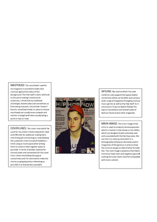
- 1. MASTHEAD: The masthead I used for my magazineis onewhichshows clear contrast againstthecolourofthe background. Thetitleitselfis short, breifand to the pointmaking it standout to audiences.I think thatmy masthead challenges sharedcodes and conventions as from doing research,I found that I haven’t found a masthead similar or sameto mineas mastheads are usuallymorecompact and shorter inlengthwith themusually being a word or two at most. COVERLINES: The cover lines which I’ve used for my articleI triedto keepbrief, short and effective for audiences making them interesting yet nottoolong to readallowing the audience’s time toreadall headlines.I tried using as muchspacewhen writing them to leaveas littlenegative space as possible. In terms of written material for shared codes and conventions for thecover lines I think minefollowthetypical conventions and I’ve alsotriedto makethe stories as gripping andas interesting as possiblein as fewwords as possible. MAIN IMAGE: The main imageofthe artist is used toconveyhis facialexpression which is neutral.It also shows us his clothes which aredesigner brand commonly seen and associatedwith theHip Hopscene.We see him ina closeup shotwhich is a photography techniquecommonly usedin magazines ofthis genreas it aims to show the artist so wegetan idea ofwhat helooks like. The mainimageis placedsothat there’s minimum head room andnegativespaceleft making thecover seem morefullandpacked with more content. SKYLINE:My skylinewhich I’veused conforms and supports thetypicalskyline convention which can beoften seen acrossa wide rangeofmagazines throughoutvarious music genres as well as Hip Hop itself. So in conclusionI’d say my Skyline follows the typical conventions and shared codes of Skylines found across other magazines
- 2. PULL QUOTE: My pull quoteused ‘Playing with fire’ relating directly back to the artist’s name ‘Firebeats’ which is a play on words and gives us a senseofthe scale oftheartists’ popularity andinfluenceas tosay ‘Playing with fire’ would connotehe’s a big dealor thathe’s important.I used this pullquote tobe interesting and catchy Main image:My main imageis a medium shot ofmy artist facedagainst a background showing his waistupwards. I’ve placed it inthe top left ofthe pageto capturereader’s attention yet leaving enough room for text tobeplacedand written upon fromfeature article FEATURE ARTICLE: My use of columns onmy featurepage article supports typicalconventions and shared codes as columns areoften used in HipHop stylemagazines and especially can befoundin big well known publications such as VIBEand Rolling Stonebut can alsobe seen throughout various other publications as well as Hip Hop magazines.
- 3. MAIN IMAGE: For my main imageI placed myartistin an upright seated positionwith his hands placed ina praying motion andposition which can sometimes be seen andassociated withotherHip Hop magazines andpopularartists such as ‘Fiasco’ and ‘Thegame’ whoareboth widely known and wellrespected Hip Hopartists. The artistis also shown to bemaking direct eye contactwith thereader making them engaged upon the articleand to pulltheir focus in. STORY LINES: The story lines I used on my feature pagearticle aredesigned tobe short, to thepointand informative tothe reader onwhat theyareabout. I’ve tried to use as littlewords as possible whencreating the titlelines creating a senseofinterest for readers. I’ve alsouseda colour scheme which shows contrast onthepage for making story lines and page numbers stand out from eachother creating a nicevariety ofcolour on thepage FEAUTURE PAGE TITLES: The page titlefor this featurepage is simply called‘Features’ making itsimpleand effective for the reader. Itlets them know what the pageis aboutand whatthey can expect to find on thepage. I’vealso includeda small sub heading which reads ‘In the mix’ which is something seen on VIBES magazinefeature pagearticle including theartist’50Cent’ COLOUR SCHEME: COLOUR SCHEME: The colour scheme which I used is a fairlybasic one which consists of two main colours being red andwhite. These two colours standout witheach other along with the red border making the page more visually appealing yet I’d say wouldconform againsttypical conventions and shared codes for feature page articles