1. As Media Studies – Coursework Evaluation
Q.1 In what does your media product use, develop or challenge forms and conventions of real
media product?
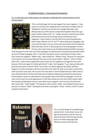
This is my final design for my cover page of my music magazine. I have
chosen to use that cover image because I have took a multiple shots of
“MaAamkie “and this one was the one I thought that looks really
effective because of the way he is stood which signifies that he has got
power and he is better than “us “ readers and also it looks like one of the
professional pictures that are being used on professional music
magazines. I have chosen to use that font for my mast head because I
think it looks effective: the “R” and “T” letters looks kind of gangster stile
and rest of the letters are just normal and casual which kind of makes the
whole title look “Grime-y” because grime is more like gangster-ish kind
of music, also I have chose to use the gold and diamond effects because I
think they give the title even more kind of gangster-ish look because of the gold and diamonds which
are kind of linked to gangster stuff + it also links with grime music as well because It looks urban. I
have named my magazine “ Riddim Ting “ which stands for “ Rhythm Thing ” because it is used quite
a lot in grime music and also links with the music as the name involves “ Rhythm “ which is linked
with music. I have chosen a gold/ black colour theme for my magazine and magazine front cover
because I think once again it is linked with kind of “urban “and “gangster “music style and links with
grime because grime is kind of “black “music and is not about happiness but about stuff that
happens on streets and what is life like around UK in the urban life style so my colour scheme links
with my chosen music style. All my cover lines have been in formal English because I didn’t want to
have informal stuff on my front cover because of making it looking less professional also because
formal English is easier to understand for some people rather than informal language, I’ve set my
cover lines all over the cover page because I think they stands out more and it looks unique rather
than boring and looking the same as some other music magazine, all of my cover line titles have
been wrote with “ Urban Rubber “ font because I think it looks “urban” and suitable for grime music
because it is kind of “ block “ looking like font which could signify “ Bricks ” which is more of “urban”
and grime style theme.
This is my final design of my double page
spread article. I have chosen to use one
big mid-shot picture and one close-up
picture because I think the big mid-shot
picture on whole right page looks
effective as well as will make the
2. audience remember who the grime star is because of the size picture and also most professional
music magazines use the same technique and use one big and one small picture on their double
page articles, I have chosen to use the small close-up picture of “MaAamkie’s” face because I think it
looks effective as well as when reader is reading the article and will see his face then it will be easier
for readers to remember what he looks like and also the way he is looking directly at the reader will
make the reader think that he is looking straight into their eyes and will remember him easier. I have
chosen to use 3 columns because I think that the article looks more interesting when it’s small but
interesting rather than massive blocks of writing which might not be that interesting to reader if
they see the amount of texts they have to read while my article goes straight to the point and tells
all details need and a short interview. I have chosen to use quite big title for my article so that it will
be easier for people to remember “MaAamkie’s” name and also it stand out because it is placed on
black background and uses gold font with diamond effect which bring link with grime music and it is
linked with my chosen colour theme which was gold/ black. Use of language in my article is mostly
formal with some informal bits to make it look more interesting as well as more fun for people to
read and also some bits use’ grime’ words like “ ting “ or “ dat “ or “riddim “ so that it reminds the
reader that he/she are reading a grime music magazine.
This is final design for my content page of my grime music
magazine. I have chosen to use mostly mid-shot photographs so
that it will be easier for readers to look at them and also it is
more suitable for content page because if they were long-shots
then they would be quite hard to see and the page wouldn’t be
that interesting to look at and wouldn’t look as effective as it
looks like right now. I have chosen to use 3 columns because I
wanted to use one whole column for texts, one whole column
for pictures, and once column for picture and text so that overall
it is all balanced out and also look interesting to look at and
unique from other already existing music magazines. I have used
one type of font (Berlin Sans FB) for whole content page so that
it doesn’t look dodgy and untidy, also it looks better with just
one type of font because it looks more professional and more
like real music magazine. I have used “ Urban Rubber “ for my title ‘Content’ because I wanted title
to stand out to people and also that font looks kind of old and “ blocky “ which links which my grime
music target. I have chosen to use just white and black colour for my content page because I wanted
it to look casual and clear as well as professional like the other music magazine’s content page looks
like, at last I have chosen to use formal language for my content page because I want it to be easy to
understand and clear for my readers to read without struggle.
3. Q.2 How does your media product represent particular social groups?
My music magazine represent people who like “ urban “ or “ grime “ music because of the colour use
I have used which is gold and black which signifies that is aimed more at “ dark “ side of music which
is more like “ gangster rap “ or “ hard core grime “ which is mainly about problems happening on
streets of UK and police problems. Also the person on front cover is teenager which could mean
that teenagers could also read this magazine as well as people who are in their early 30’s because
nowadays most grime artist are starting at age of 16 and are popular with the older generation as
well. Also my front cover character looks kind of moody and is wearing hood which could signify that
this magazine is not about happy music but only about grime and rap music. My magazine could be
for both genders because grime music is for both genders females and males as there are already
famous female grime artists, my magazine is for any race/ ethnicity group because grime is multi
cultural as there are artist who are from South Africa, Nigeria, Trinidad and also there are white
artist who are English or Chinese artist who are partly English or have grown up in England so grime
music is for any race or ethnicity which my magazine does show as it uses white grime artist as well
as black artist on my content page. My magazine mainly represents working class of people because
it is usually the people who are living in urban parts of cities who work every day and trying to make
living and some struggle and that’s what grime music is about: struggle and reality, and this is shown
on my content page as my black & white artists do not look rich or posh so it shows that it is made
for working class of people. Grime music is for straight people because so far I have not met or heard
of homosexual person who would listen to grime music as it is kind of “ tough “ which homosexual
people wouldn’t really like. My magazine doesn’t show any type of region issues because grime
music is happening all over UK not just North or South so I have not chosen to make my magazine
purposely for only one region of UK.
Example:
The gold text and black background represent more like a “ gangster “
and “ urban “ side of music so that shows that my music magazine is
aimed at people who like “ grime “ or “ rap “ music as well as if they
are into urban kind of music .
Q.3 What kind of media institution might distribute your magazine and why?
The magazine publisher who is suitable and could distribute my music magazine could be RWDmag
because their magazines are based on urban style music like: UK-garage, rap, hip-hop, drum & bass,
dubstep and grime, and that’s what my magazine is about, a grime music so I think it would exactly
fit with RWDmag since they already do magazine about that kind of music style.
RWD Magazine is a British based magazine which features
news, interviews and charts on hip hop, R’n’B, UK garage,
Drum and bass and U.S. house music. It is released monthly,
distributing 98,300 copies each time and is ABC certified. It's considered the largest
magazine on urban music and lifestyle in the United Kingdom. RWD Magazine became a
well known name in UK underground urban music circles in mid to late 2003. This coincided
4. with the rise of a new urban music genre, which later became popularly referred to as
Grime.
Retailers where I would my magazine to be sold:
JD sport
HMV Music Store
Virgin Media Store
Q.4 Who would be the audience for your media product?
Kozzie Wiley
Scratchy
Audience for my grime music is mostly males as my magazine has so far only male artist so but as
you can see above they are existing grime artist and there a difference in what they are wearing
because grime music does not really have its type of clothing but if has to be one type of clothing it
would be definitely baggy clothes and ‘hoodies’ because grime has evolved from rap music and rap
music is about baggy clothes and kind of urban clothes which are more of dark colours like “ black,
grey “ and colour any colours that aren’t really “ happy “ colours because grime is not about
happiness mostly. My audience will be people from 15years old up to early 30’s because there is
wide range of grime artist with different age difference like for example “Wiley “ is 33 years old and
“MaAamkie” who is only 18 years old so age of my audience does not really matter, the haircuts my
audience would be mostly having really short hair e.g. short back and sides, V’s and crew cut
because they are the haircuts that most grime artist have and are more, also my audience will
probably will be working class as most of the people who do or listen to grime music are working
class because grime talks about everyday’s struggle of working class people so that is the audience
that would probably read my magazine.
http://www.youtube.com/watch?v=5JkKpO8IH14
5. Q.5 How did you attract/ address your audience?
I have tried to get a video interview but none of the people I have spoke to about my magazine
would do a video report so instead I have left them with all three pictures of my Front, Content and
Double page spread and with piece of paper and asked to write 3 brief points about what they think
of my magazine and they could be either pro’s or con’s and asked to put’ + ‘if the comment is
positive and ‘ - ‘if the comment is negative. Now I am going to include the brief comments of the 3
people I have asked to rate my magazine.
Matthew aged 16.
+ Nice colour scheme.
+ Like the gold font.
- White background on content page should have been black as rest of the magazine.
Josh aged 17.
+ Picture angle of front cover picture of mamkeli.
+ I like the “new artist “cover line font with the diamond effect.
+ Like the pictures of the 3 grime artist on content page.
Callum aged 18.
+ Gold with diamond font.
+ Black and gold background on front page.
- Article seems a bit short.
So here is the brief feedback that I got of my friends when I have asked to briefly evaluate my 3
pages.
Q.6 What have you learnt about technologies from the process of constructing this product?
I have learnt a lot of stuff from constructing this product like how to make an interesting photograph
and what angle it should have been take to make it look interesting. I haven’t learnt much from
using internet as a research tool because I have barely used because my magazine is first to be
focusing on grime music so I didn’t need much of skills on internet when I was just looking for
existing music magazines and publishers. I have learnt how to use Blogger as my online “folder”
where I have all my magazine work, I found it very easy and clear to use and I didn’t have much
trouble with it at all and it is quite reliable, also it is a great way to store your work if you want to get
easy access to it from all over the world because it is on internet. I haven’t learnt much from using
Photoshop because I already knew how to use Photoshop before I started this project as I have been
using Photoshop since year 11 in high school and in my spare time as well so it was nothing new to
me and I already knew how to do every single thing I was asked to do. From using Quark as a
method of combining text and images, I have to say that I have learnt quite a lot from using it
because when I have first used Quark I didn’t know how to do anything on it but now I could do
simple task as I have learnt from it when I have been using it quite a lot from designing my content
page and double page article.
Here are some screen shot’s that I have taken to show briefly how I have used Photoshop:
6. As you can see in this screenshot, I do not
have title of my magazine because I have
disabled it from being to be seen by clicking
on little eye icon in bottom right hand corner.
As you can see that in this screenshot I have
enabled the little block of text by clicking on
eye tool.
In this slide you can see the full finished
magazine front cover because I have enabled
all layers to be seen by clicking on the eye
tool.
Q.7 Looking back at your preliminary task, what do you feel you have learnt in the progression from
it to the full product?
I have learnt quite a lot since I have done my preliminary task, for example I have learnt how to use
Quark far more professionally and also I have learnt how to use camera to make best pictures
possible: from which angle the picture should be took or what kind of lighting should be on or what
7. contrast setting it should be set on to make the best picture possible which didn’t know when i was
making my college magazine as my preliminary task, also I have learnt how to positions and design
cover page, content page and double side spread and make it look professional and more like
professional magazine that are on market and all this thanks to loads of practise and looking back at
mistakes I have done on my preliminary task. And that’s about it since these are the only things I
have improved in which made me think differently when I was doing my final piece.
Final Design of my Music Magazine Front Cover
Final Design of my Music Magazine Front Cover.