
Recommandé
Recommandé
Contenu connexe
Dernier
Dernier (17)
En vedette
En vedette (20)
In what way does your media product use, develop or challenge forms and conventions of real media products?
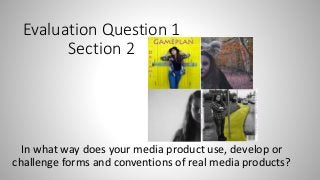
- 1. Evaluation Question 1 Section 2 In what way does your media product use, develop or challenge forms and conventions of real media products?
- 2. Conventions of digipak layout With my digipak I used the conventions of the 4 panel digipak, which are typically used within the genre of pop rock, as seen with the digipaks of pop rock bands such as; The Arctic Monkeys, Panic! At the Disco, Fall Out Boy and Maroon 5. The digipaks are typically black and white which appeal to the target audience’s eye. This is a convention I decided to break, through making nearly ¾ of my digipak colour, which made it more eye catching and therefore more likely to attract the target audiences eye. Also using colour linked to the title of my song “Brightly coloured dream”.
- 4. Conventions of panel 1 The conventions of a digipak panel 1 are to be eye catching, to attract the prospective audience. This is a convention which I used with my own digipak. Another convention is to have the name of the band and the album on the front, around the main image so that the audience knows who the album is by and what it is called, this is another convention which I stuck to with my panel 1.
- 5. Conventions of panel 2 and 3 Inside a digipak there is the holder for the CD. A lot of digipaks are see- through with more album artwork behind which goes with the rest of the packaging. Such as with my digipak I used half face photos of the actress we used for our video, instead of having them meet in the middle I decided to change the style and switch over panel 2 and 3 and have them on opposite sides. This was so that when the CD was placed over panel 3 it would not hide the album art.
- 6. Conventions of Panel 4 Another convention of any digipak, not just pop rock, which I used was on my panel 4. The conventions of a panel 4 on a digipak is to have the track-list and a bar-code. This is so that the audience can see the tracks included in the album and so that it can be sold. For the bar-code I found one on line and cropped it to place as a new layer onto my panel 4.
- 7. Fonts In the album art of pop rock the fonts are blocky and easy to read, you can see this with my attached examples. From bands such as the Arctic Monkeys, Fall Out Boy and Panic! At The Disco. I decided to keep with this convention to make the name of the artist and album easy to read, the font I used was Lithos Pro. I chose this font because it was easy to read and therefore would be easy for the potential target audience to read. I developed the conventions of traditional pop rock fonts with this font, it is not as bold as some of the others, although I did stick to the convention of using different colours and making the name of the artist bigger than the name of the album so that people know who the album is by.
- 8. Panel 1 before and after editing For Panel 1 I increased the brightness to make the yellow stand out more, I then cropped it to size and added the name of the artist and album on the top.
- 9. Panel 2 and 3 before and after editing For panel 2 I changed the colour contrasts to make the leaves on the forest floor pink and to increase the orange of the leaves upon the trees. For panel 3 I cropped the photo to size so that I would only have half her face, but also so that it was the same size as panel 2, then I changed the colour to black and white to reflect how she is in black and white for her reality shots in the video and to contrast with the bright colours on the rest of the digipak.
- 10. Conventions of magazine adverts I stuck to many conventions of music magazine adverts, such as the links to social media, the release date, the quotes from music magazines and links to the music video itself. The idea of a magazine advert is to attract the target audience into buying the music. Which is why I used the yellow brick road idea to catch the readers eye. I also used the actress from the music video, not only to link back but also to make it relatable to the audience. Another convention which I developed to was the A4 portrait layout of the magazine advert. A pop punk convention which I stuck to was the use of a black border around the main image so that the image is the focus and then the audience goes onto read the text around to find out more about the release date and the band themselves.