
Recommandé
Contenu connexe
Similaire à Chapter 6 review
Similaire à Chapter 6 review (20)
Plus de mlabuski
Plus de mlabuski (20)
Dernier
Dernier (20)
Chapter 6 review
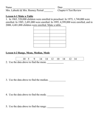
- 1. Name _________________________________ Date ______________________ Mrs. Labuski & Mrs. Rooney Period _______ Chapter 6 Test Review Lesson 6-1 Make a Table 1. In 1965, 520,000 children were enrolled in preschool. In 1975, 1,748,000 were enrolled. In 1985, 2,491,000 were enrolled. In 1995, 4,399,000 were enrolled, and in 2000, 4,481,000 children were enrolled. Make a table. Lesson 6-2 Range, Mean, Median, Mode 10 5 9 14 14 12 10 14 12 14 2. Use the data above to find the mean. _____________ 3. Use the data above to find the median. _____________ 4. Use the data above to find the mode. _____________ 5. Use the data above to find the range. _____________
- 2. Lesson 6-3 Additional Data & Outliers The table shows enrollment data for several science classes Science Class Enrollment Class Students Mr. Hunter 31 31 Mr. Solomon 29 29 Mrs. Madison 24 24 Mrs. MacMillian 12 Mrs. Little 34 34 Mrs. Smith 23 23 6. What is the outlier? _______________ 7. How does the outlier affect the mean? _______________________________ __________________________________________________________________ __________________________________________________________________ _______________________________________________________________ Lesson 6-4 Bar Graphs ______________8. In which country did people spend $5,000,000 on toys in 2000? ______________9. How much more money was spent on toys in the United States than in Japan?
- 3. Lesson 6-5 Frequency Tables & Histograms 10. The data in the table shows the number of videos rented by 25 customers on a given day. Make a frequency table with intervals. Add a cumulative Frequency column Videos Frequency Cumulative Frequency Lesson 6-6 Ordered Pairs Name the ordered pairs for each location on the grid. 11. A ___________ 12. B___________ 13. C ___________ 14. D___________ 15. E___________
- 4. Plot and label the following ordered pairs: 16. A (3, -2) 17. B (0, -4) 17. C (-2, -5) 19. D (1, -3) 20. Label the y-axis 21. Label the x-axis Lesson 6-7 Line Graphs 22. In which month shown on the line graph does Washington usually receive the most precipitation? _____________________________ 23. In general, how does precipitation in Washington, D.C., change between August and October? ______________________________ 24. In which months does the city usually receive the same amount of precipitation? ______________________________
- 5. Lesson 6-8 Misleading Graphs 26. Why is this graph misleading? _______________________________________ ___________________________________________________________________ 27. What might people believe from the misleading graph? ___________________ ___________________________________________________________________ ___________________________________________________________________
- 6. Name _________________________________ Date ______________________ Mrs. Labuski & Mrs. Rooney Period _______ Chapter 6 Test Review Lesson 6-1 Make a Table 1. In 1965, 520,000 children were enrolled in preschool. In 1975, 1,748,000 were enrolled. In 1985, 2,491,000 were enrolled. In 1995, 4,399,000 were enrolled, and in 2000, 4,481,000 children were enrolled. Make a table. Year Number of students 1965 520,000 1975 1,748,000 1985 2,491,000 1995 4,399,000 2000 4,481,000 Lesson 6-2 Range, Mean, Median, Mode 10 5 9 14 14 12 10 14 12 14 2. Use the data above to find the mean. 11.4 3. Use the data above to find the median.12 4. Use the data above to find the mode. 14 5. Use the data above to find the range. 9 Lesson 6-3 Additional Data & Outliers
- 7. The table shows enrollment data for several science classes Science Class Enrollment Class Students Mr. Hunter 31 31 Mr. Solomon 29 29 Mrs. Madison 24 24 Mrs. MacMillian 12 Mrs. Little 34 34 Mrs. Smith 23 23 6. What is the outlier? 12 – Mrs. MacMillian’s class 7. How does the outlier affect the mean? With the outlier the mean is 25.5 students per class. Without the outlier the mean is 28.2 students per class. The outlier decrease the average number of students per class Lesson 6-4 Bar Graphs United Kingdom8. In which country did people spend $5,000,000 on toys in 2000? about 27 million 9. How much more money was spent on toys in the United States than in Japan? Lesson 6-5 Frequency Tables & Histograms
- 8. 10. The data in the table shows the number of videos rented by 25 customers on a given day. Make a frequency table with intervals. Add a cumulative Frequency column Videos Frequency Cumulative Frequency 0-1 7 7 2-3 13 20 4-5 5 25 Lesson 6-6 Ordered Pairs Name the ordered pairs for each location on the grid. 11. A (-4, 3) 12. B (-1, 5) 13. C (0, 2) 14. D(5, 6) 15. E(-3, -2) Plot and label the following ordered pairs: y-axis
- 9. 16. A (3, -2) 17. B (0, -4) 17. C (-2, -5) 19. D (1, -3) x-axis 20. Label the y-axis 21. Label the x-axis Lesson 6-7 Line Graphs 22. In which month shown on the line graph does Washington usually receive the most precipitation? August 23. In general, how does precipitation in Washington, D.C., change between August and October? It decreases 24. In which months does the city usually receive the same amount of precipitation? October and December Lesson 6-8 Misleading Graphs
- 10. 26. Why is this graph misleading? The graph is misleading because scale on the y- axis does not start at zero – it starts at 40. The lower part of the vertical scale is missing, so the differences in attendance seem greater than they really are. 27. What might people believe from the misleading graph? It looks like from May to June the baseball attendance dropped drastically almost to nothing. People might believe that no one attended baseball in June. The actual decrease was from 83,000 to 41,000.