
Recommandé
Contenu connexe
Tendances
Tendances (20)
Similaire à Lesson 6 8 misleading graphs
Similaire à Lesson 6 8 misleading graphs (20)
Plus de mlabuski
Plus de mlabuski (20)
Dernier
Dernier (20)
Lesson 6 8 misleading graphs
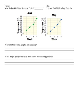
- 1. Name __________________________________ Date __________________ Mrs. Labuski / Mrs. Rooney Period ________ Lesson 6-8 Misleading Graphs Why are these line graphs misleading? ___________________________________________________________________ ___________________________________________________________________ ___________________________________________________________________ What might people believe from these misleading graphs? ___________________________________________________________________ ___________________________________________________________________ ___________________________________________________________________
- 2. The graph shows the total number of medals won by four countries at the 2002 Winter Olympics. 1. According to the height of each bar, which country appears to have won approximately half the number of medals won by the United States? ___________________________________________________________________ ___________________________________________________________________ ___________________________________________________________________ 2. Look at the numbers on the left to estimate the number of medals won by each country. ___________________________________________________________________ ___________________________________________________________________ ___________________________________________________________________ 3. Use the estimates in Exercise 2 to determine whether the answer to Exercise 1 is accurate. ___________________________________________________________________ ___________________________________________________________________ ___________________________________________________________________ Think and Discuss 4. Discuss how the graph is misleading. ___________________________________________________________________ ___________________________________________________________________ ___________________________________________________________________ 5. Explain how you could modify the graph to represent the data more accurately. ___________________________________________________________________ ___________________________________________________________________ ___________________________________________________________________
- 3. Name __________________________________ Date __________________ Mrs. Labuski / Mrs. Rooney Period ________ Lesson 6-8 Misleading Graphs Why are these line graphs misleading? If you look at the scale for each graph, you will notice that the April graph goes from 54° to 66° and the May graph goes from 68° to 80°. What might people believe from these misleading graphs? People might believe that the temperatures in May were about the same as the temperatures in April. In reality, the temperatures in April were about 15 degrees lower.
- 4. The graph shows the total number of medals won by four countries at the 2002 Winter Olympics. 1. According to the height of each bar, which country appears to have won approximately half the number of medals won by the United States? _Norway___________________________________________________________ ___________________________________________________________________ ___________________________________________________________________ 2. Look at the numbers on the left to estimate the number of medals won by each country. Germany — 35, USA — 34, Norway — 24, Canada — 17 ___________________________________________________________________ ___________________________________________________________________ 3. Use the estimates in Exercise 2 to determine whether the answer to Exercise 1 is accurate. No, the answer to Exercise 1 is not accurate Think and Discuss 4. Discuss how the graph is misleading. The vertical axis starts at 10, rather than zero. The intervals are not even: 0- 10, and then by 5’s 5. Explain how you could modify the graph to represent the data more accurately. Start the vertical axis at zero ___________________________________________________________________