Beginners Guide to TikTok for Search - Rachel Pearson - We are Tilt __ Bright...
Batman, The Dark Knight Poster Analysis - A2 Media Studies
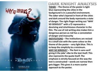
1. THEME – The theme of the poster is light
blue representing the cities in the
background is in a peaceful environment.
The Joker who’s layered in front of the cities
and dark around the body represents a state
of danger. The right-finger writing out “WHY
SO SERIOUS?” with a represents a
deceiving and mischievous character in the
film. The use of red writing also makes him a
dangerous person as red has a connotation
of danger and insecurity
INSTITUTIONS – The institutions are resized
to a small size with the same colour as the
theme of the poster – very light blue. This is
to keep the simplicity to a minimum.
WHY SO SERIOUS? – The font is sans-serif
giving it the joke’ vibe to the text itself. This
also represents the quote itself. The
emphasis is strictly focused on the way the
text is constructed – words are narrow then
gets bigger. This gives it a more scarier
approach to the poster.
2. THE JOKER – The character is wearing a boss-
like coat with rough hair and make-up on his
face which forms a juxtaposition. It also
counters the stereotype of clowns having a
big belly and making positive banter. This
tells the audience that this movie shows a
different representation of people – this can
encourage stakeholders to see this film.