
Recommandé
Contenu connexe
Tendances
Tendances (20)
Similaire à Horror poster analysis
Similaire à Horror poster analysis (20)
Horror poster analysis
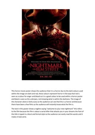
- 1. This horror movie poster shows the audience that it is a horror due to the dark colours used within the image are dark and red, these colours represent horror in the way that red is seen as a colour for anger and blood so it is a good colour to be used within a horror poster and black is seen as the unknown, not knowing what is within the darkness. The image of the character alone is fairly scary so the audience can see that this is a horror and because there have been a few films so the audience will instantly know what the film is. The text in this poster shows a tagline saying “welcome to your new nightmare” this refers to the film because the film is about a serial killer that attacks you in your dreams the font of the title is typed in a blunt and formal style so the audience can easily read the words and it makes it look eerie.
- 2. Horror poster analysis 2 This poster for the film scream 4 shows the audience the world famous scream mask which has been merged into the killers weapon of choice which is a knife. This can be done because the scream series is a franchise and being that it is the 4 th one people don’t need to see much within the poster because they generally know what the film will be about, even people who haven’t seen the film know the franchise. This poster has a simple blunt tagline at the top of the page stating “New decade, New rules” Being that this film was released in 2011 and Scream 3 was released in 2000 so it’s a new decade and with the tagline saying new rules it can keep the audience interested in the franchise, it could mean new ways the victims are killed etc. The colours used are just red white and black, i9 believe the red is
- 3. used within the title and the date because it is the colour of blood and it brings a horror feel to the poster. The black is used I believe to bring out the white colours within the poster because the white parts of the poster shows the main image top the audience. Also the killer in scream is known for wearing the white mask and black robe like clothing so that is another reason these colours could have been used, so the audience can relate to the poster and what they know. Horror poster analysis 3
- 4. This poster for the ring shows a simple image with a simple but blunt tagline. The colours of this poster gives it a paranormal feel to it especially the colour of the actual ring around the title of the film, it is like a whitish purple colour and the effect that is put on to it where it seems to fade to black just gives it more of a horror feel to it. This poster is so simple but it still has that horror feel to it due to the use of colour and the childish font used to title the poster. This poster is the first horror movie poster that I have analysed that I don’t think a camera was used I believe by the way this poster looks it has all been created digitally, that could be a way for me and my group to create our horror movie poster.