Writing Content that Works Everywhere edUi

We know web content should be different from print—but what about mobile? Learn how writing that works on mobile devices can make your entire website more efficient and engaging (and save users from scrolling through a sea of microscopic text). Colleges and universities face specific content issues that challenge usability for mobile web. Lots of pages, multiple authors and departments, and even the writing styles popular in academia can work together to make mobile users cringe. Writing content for your website that also works on mobile doesn’t have to hurt. See how transforming long pages of content into tidy nuggets packed with informational gold can clean up your desktop site and make it easy for mobile users to navigate efficiently and get done what they came to do.

Recommandé
Contenu connexe
En vedette
Dernier
Dernier (20)
Writing Content that Works Everywhere edUi
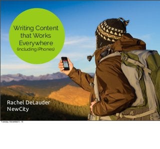
- 1. Writing Content that Works Everywhere (including iPhones) Rachel DeLauder NewCity Tuesday, November 5, 13
- 3. Responsive Design Tuesday, November 5, 13 - Why responsive vs. mobile site? * Search engines give preference to responsive sites in rankings * Avoids duplicate content to update and maintain * Having reduced/limited content for a separate mobile site can be bad for usability
- 4. Why Reformat Content for Mobile? Tuesday, November 5, 13 - More engaging for users - Clean out unnecessary content on your site to reduce the amount to manage and maintain over time - Improve users’ ability to navigate the site and find what they came looking for
- 5. Why Reformat Content for Mobile? More e!cient and engaging Tuesday, November 5, 13 - More engaging for users - Clean out unnecessary content on your site to reduce the amount to manage and maintain over time - Improve users’ ability to navigate the site and find what they came looking for
- 6. Why Reformat Content for Mobile? More e!cient and engaging Clean out the clutter Tuesday, November 5, 13 - More engaging for users - Clean out unnecessary content on your site to reduce the amount to manage and maintain over time - Improve users’ ability to navigate the site and find what they came looking for
- 7. Why Reformat Content for Mobile? More e!cient and engaging Clean out the clutter Improve usability Tuesday, November 5, 13 - More engaging for users - Clean out unnecessary content on your site to reduce the amount to manage and maintain over time - Improve users’ ability to navigate the site and find what they came looking for
- 8. "We’re going to use mobile as a lens to make all our content better, regardless of platform." — Karen McGrane, Content Strategy for Mobile Tuesday, November 5, 13 - Writing for mobile is just good writing. - There are arguments about whether a mobile context exists at all — whether you should design differently for someone waiting at a bus stop or an airport versus someone sitting down at their desk. - Good news for content people is that it doesn’t matter because one benefits the other — mobile platforms place the most constraints on writing (length, simplicity), so if we write for the environment with the most constraints, we're also cleaning up the clutter from our (now) more flexible desktop sites.
- 9. Focus Your Content Tuesday, November 5, 13 - Cluttered web page is like a business's phone answering service that's too long: * Reads you the hours of operation, exceptions for certain holidays, emergency contact numbers, the weather, then finally gets to the menu that says "Press 1 to reach billing department, Press 2 to schedule an appointment…" Which is all you really wanted to hear in the first place. - Similarly, if you clutter up your web page with news and events, announcements, employees of the month, mission and vision statements, and messages from the dean or director, your users can't quickly see your navigational links to Academic Programs, Admissions, Student Life, etc., which in most cases, is the content they’re actually looking for. - Website should be more like a touch-screen menu at a bank, not a department’s whole filing cabinet of text.
- 10. What are some content problems for responsive sites? Tuesday, November 5, 13 Higher education styles, or content types specific to libraries and museums?
- 11. Content Issues Specific to Higher Ed Tuesday, November 5, 13
- 12. Content Issues Specific to Higher Ed Looooong pages Tuesday, November 5, 13
- 13. Content Issues Specific to Higher Ed Looooong pages Multiple authors Tuesday, November 5, 13
- 14. Content Issues Specific to Higher Ed Looooong pages Multiple authors Departmental “silos” Tuesday, November 5, 13
- 15. Content Issues Specific to Higher Ed Looooong pages Multiple authors Departmental “silos” Academic style Tuesday, November 5, 13
- 16. Content Audit Tuesday, November 5, 13
- 17. Tuesday, November 5, 13 - Representative sample is ok: broad and deep * some from each section (admissions, academics...) * four or five levels down * make sure you get some from each content type (news, policies, degrees, department landing pages...)
- 18. Auditing tips Tuesday, November 5, 13 - Live document, google spreadsheet - Train trusted users, interns with no political ties, etc. to help you evaluate pages and fill in the spreadsheet. Review for internal validity! - Agree on criteria for deletion: "We should delete content that…" vet it, then apply objectively.
- 19. Auditing tips Keep it alive Tuesday, November 5, 13 - Live document, google spreadsheet - Train trusted users, interns with no political ties, etc. to help you evaluate pages and fill in the spreadsheet. Review for internal validity! - Agree on criteria for deletion: "We should delete content that…" vet it, then apply objectively.
- 20. Auditing tips Keep it alive Share responsibility Tuesday, November 5, 13 - Live document, google spreadsheet - Train trusted users, interns with no political ties, etc. to help you evaluate pages and fill in the spreadsheet. Review for internal validity! - Agree on criteria for deletion: "We should delete content that…" vet it, then apply objectively.
- 21. Auditing tips Keep it alive Share responsibility De"ne your terms Tuesday, November 5, 13 - Live document, google spreadsheet - Train trusted users, interns with no political ties, etc. to help you evaluate pages and fill in the spreadsheet. Review for internal validity! - Agree on criteria for deletion: "We should delete content that…" vet it, then apply objectively.
- 22. Categories for mobile Tuesday, November 5, 13 Problem images: tables, infographics, etc. that need to display at a large size or specific dimensions
- 23. Categories for mobile Word/character counts Tuesday, November 5, 13 Problem images: tables, infographics, etc. that need to display at a large size or specific dimensions
- 24. Categories for mobile Word/character counts Problem images Tuesday, November 5, 13 Problem images: tables, infographics, etc. that need to display at a large size or specific dimensions
- 25. Categories for mobile Word/character counts Problem images File format (html, .pdf, .doc, .ppt) Tuesday, November 5, 13 Problem images: tables, infographics, etc. that need to display at a large size or specific dimensions
- 26. Categories for mobile Word/character counts Problem images File format (html, .pdf, .doc, .ppt) Content housed in Flash Tuesday, November 5, 13 Problem images: tables, infographics, etc. that need to display at a large size or specific dimensions
- 29. A A B B E C Structured Content F D G C D E F G Tuesday, November 5, 13 - Responsive design is not just about designing a way to display graphics and images. - You also have to structure your content so that it will display properly in multiple formats, so: * subheads with important information don’t disappear * inline images with relevant or critical content don’t get lost at certain breakpoints * don’t put anything essential in sidebars that display above the fold on desktop but get bumped to the bottom on a vertically
- 30. A A B B E C Structured Content F D G C D E F G Tuesday, November 5, 13 - Responsive design is not just about designing a way to display graphics and images. - You also have to structure your content so that it will display properly in multiple formats, so: * subheads with important information don’t disappear * inline images with relevant or critical content don’t get lost at certain breakpoints * don’t put anything essential in sidebars that display above the fold on desktop but get bumped to the bottom on a vertically
- 31. A A B B E C Structured Content F D G C D E F G Tuesday, November 5, 13 - Responsive design is not just about designing a way to display graphics and images. - You also have to structure your content so that it will display properly in multiple formats, so: * subheads with important information don’t disappear * inline images with relevant or critical content don’t get lost at certain breakpoints * don’t put anything essential in sidebars that display above the fold on desktop but get bumped to the bottom on a vertically
- 32. A A B B E C Structured Content F D G C D E F G Tuesday, November 5, 13 - Responsive design is not just about designing a way to display graphics and images. - You also have to structure your content so that it will display properly in multiple formats, so: * subheads with important information don’t disappear * inline images with relevant or critical content don’t get lost at certain breakpoints * don’t put anything essential in sidebars that display above the fold on desktop but get bumped to the bottom on a vertically
- 33. Tuesday, November 5, 13 - Article in a Typical CMS: * Looks simple, doesn’t appear to be a lot of pieces * Title, giant WYSIWYG blob for “body text” - Gives the writer (or content paster) control over layout on a desktop page, but some people should not be given control over those type of decisions...
- 34. Tuesday, November 5, 13 Break it down structurally by function: * Title/header * Lead * Detail copy * Pull quote * Related articles * Custom teasers for RSS feeds or landing pages
- 35. Writing & Editing Tuesday, November 5, 13 Sometimes you won’t have a staff to help you complete a content audit, or time from developers to help you structure your content by creating new fields in the CMS. The following are some actual tips anyone with edit access to a page can do to make it less likely to break your mobile view on a responsive site.
- 36. Tuesday, November 5, 13 Editing does take effort, but especially if you’re doing a redesign, think in terms of “Would many long pages of content be worth the effort if you had to manually move them each over?” Pages that just look long and wordy on a desktop site seem to scroll on forever in mobile Even with a good responsive design, content can be hard to let go of.
- 37. Tuesday, November 5, 13 Editing does take effort, but especially if you’re doing a redesign, think in terms of “Would many long pages of content be worth the effort if you had to manually move them each over?” Pages that just look long and wordy on a desktop site seem to scroll on forever in mobile Even with a good responsive design, content can be hard to let go of.
- 38. Tuesday, November 5, 13 Editing does take effort, but especially if you’re doing a redesign, think in terms of “Would many long pages of content be worth the effort if you had to manually move them each over?” Pages that just look long and wordy on a desktop site seem to scroll on forever in mobile Even with a good responsive design, content can be hard to let go of.
- 39. Tuesday, November 5, 13 Editing does take effort, but especially if you’re doing a redesign, think in terms of “Would many long pages of content be worth the effort if you had to manually move them each over?” Pages that just look long and wordy on a desktop site seem to scroll on forever in mobile Even with a good responsive design, content can be hard to let go of.
- 40. Tuesday, November 5, 13 A lot of content owners think of it not as not wanting to "lose" any content on the old site, they want to know where it will map to the new content structure. Instead, try to get them to think about what is worthy of the new site? What supports users' goals and the goals of the organization? Is all that extra content helping you or harming you? Long pages: Presenter's paradox, Kimberlee Weaver, Virginia Tech * People presenting information often want to provide as much as possible, filling in their main ideas and “great” content with other good details to support it. * But psychology and marketing researchers have found that adding more information can weaken your message; adding "good" supporting ideas to "great" ones dilutes your whole intent in the mind of the reader.
- 41. Get to the Point Tuesday, November 5, 13 * Inverted pyramid, don’t bury the lede - The old advice: “tell them what you’re going to say, say it, then tell them what you just told them” * Instead, leave out transitions and framing language like “The following information will...” “Welcome to the department of...” * Writers use as a shortcut to get started, but removing will make things instantly shorter, and users won’t miss it - Place your call to action at the top, rather than beneath paragraphs of text that scroll on for days
- 42. Get to the Point Put most important info right up front Tuesday, November 5, 13 * Inverted pyramid, don’t bury the lede - The old advice: “tell them what you’re going to say, say it, then tell them what you just told them” * Instead, leave out transitions and framing language like “The following information will...” “Welcome to the department of...” * Writers use as a shortcut to get started, but removing will make things instantly shorter, and users won’t miss it - Place your call to action at the top, rather than beneath paragraphs of text that scroll on for days
- 43. Get to the Point Put most important info right up front Skip the pleasantries Tuesday, November 5, 13 * Inverted pyramid, don’t bury the lede - The old advice: “tell them what you’re going to say, say it, then tell them what you just told them” * Instead, leave out transitions and framing language like “The following information will...” “Welcome to the department of...” * Writers use as a shortcut to get started, but removing will make things instantly shorter, and users won’t miss it - Place your call to action at the top, rather than beneath paragraphs of text that scroll on for days
- 44. Get to the Point Put most important info right up front Skip the pleasantries Prioritize your call to action Tuesday, November 5, 13 * Inverted pyramid, don’t bury the lede - The old advice: “tell them what you’re going to say, say it, then tell them what you just told them” * Instead, leave out transitions and framing language like “The following information will...” “Welcome to the department of...” * Writers use as a shortcut to get started, but removing will make things instantly shorter, and users won’t miss it - Place your call to action at the top, rather than beneath paragraphs of text that scroll on for days
- 45. Good (Mobile) Style Tuesday, November 5, 13 - No marketing language, jargon: watch your adjectives and give examples, details instead * “world-class faculty, engaged students, beautiful campus” - One-sentence paragraphs are ok. So are fragments. * Use shorter sentences and minimize commas and hyphens—will not only help you with responsive design, but is good for SEO purposes. * Don’t have to write like a third-grader, but 14 clauses with 8 semi-colons and 3 dashes are too much when users are reading a screen, especially a tiny one. - Speaking to users with second-person “you” will not only shorted stiffly worded workarounds, but help you keep the rest of the language more
- 46. Good (Mobile) Style Cut the #u$ Tuesday, November 5, 13 - No marketing language, jargon: watch your adjectives and give examples, details instead * “world-class faculty, engaged students, beautiful campus” - One-sentence paragraphs are ok. So are fragments. * Use shorter sentences and minimize commas and hyphens—will not only help you with responsive design, but is good for SEO purposes. * Don’t have to write like a third-grader, but 14 clauses with 8 semi-colons and 3 dashes are too much when users are reading a screen, especially a tiny one. - Speaking to users with second-person “you” will not only shorted stiffly worded workarounds, but help you keep the rest of the language more
- 47. Good (Mobile) Style Cut the #u$ Less Joyce, more Hemingway Tuesday, November 5, 13 - No marketing language, jargon: watch your adjectives and give examples, details instead * “world-class faculty, engaged students, beautiful campus” - One-sentence paragraphs are ok. So are fragments. * Use shorter sentences and minimize commas and hyphens—will not only help you with responsive design, but is good for SEO purposes. * Don’t have to write like a third-grader, but 14 clauses with 8 semi-colons and 3 dashes are too much when users are reading a screen, especially a tiny one. - Speaking to users with second-person “you” will not only shorted stiffly worded workarounds, but help you keep the rest of the language more
- 48. Good (Mobile) Style Cut the #u$ Less Joyce, more Hemingway Speak to users, not about them Tuesday, November 5, 13 - No marketing language, jargon: watch your adjectives and give examples, details instead * “world-class faculty, engaged students, beautiful campus” - One-sentence paragraphs are ok. So are fragments. * Use shorter sentences and minimize commas and hyphens—will not only help you with responsive design, but is good for SEO purposes. * Don’t have to write like a third-grader, but 14 clauses with 8 semi-colons and 3 dashes are too much when users are reading a screen, especially a tiny one. - Speaking to users with second-person “you” will not only shorted stiffly worded workarounds, but help you keep the rest of the language more
- 49. Formatting Tuesday, November 5, 13 - People don’t read the web the same way they do books and magazines * Use lots of headers and white space to give their eye a place to land * Make sure to keep header and content styles consistent throughout the site * Inconsistent usage will become more obvious as the styles are used to determine how that content is presented on smaller screens. - Bulleted lists hep with scanning and are a convenient, clean way to get complex info across - Bold, Italic, underline, colored text compete for attention and chop up your copy. * Instead, Stock your links and headers with keywords and use consistent styling. * Removing extra words competing for attention is the best way to get them noticed.
- 50. Formatting Make it scannable/scrollable Tuesday, November 5, 13 - People don’t read the web the same way they do books and magazines * Use lots of headers and white space to give their eye a place to land * Make sure to keep header and content styles consistent throughout the site * Inconsistent usage will become more obvious as the styles are used to determine how that content is presented on smaller screens. - Bulleted lists hep with scanning and are a convenient, clean way to get complex info across - Bold, Italic, underline, colored text compete for attention and chop up your copy. * Instead, Stock your links and headers with keywords and use consistent styling. * Removing extra words competing for attention is the best way to get them noticed.
- 51. Formatting Make it scannable/scrollable Befriend bulleted lists Tuesday, November 5, 13 - People don’t read the web the same way they do books and magazines * Use lots of headers and white space to give their eye a place to land * Make sure to keep header and content styles consistent throughout the site * Inconsistent usage will become more obvious as the styles are used to determine how that content is presented on smaller screens. - Bulleted lists hep with scanning and are a convenient, clean way to get complex info across - Bold, Italic, underline, colored text compete for attention and chop up your copy. * Instead, Stock your links and headers with keywords and use consistent styling. * Removing extra words competing for attention is the best way to get them noticed.
- 52. Formatting Make it scannable/scrollable Befriend bulleted lists Simplify formatting Tuesday, November 5, 13 - People don’t read the web the same way they do books and magazines * Use lots of headers and white space to give their eye a place to land * Make sure to keep header and content styles consistent throughout the site * Inconsistent usage will become more obvious as the styles are used to determine how that content is presented on smaller screens. - Bulleted lists hep with scanning and are a convenient, clean way to get complex info across - Bold, Italic, underline, colored text compete for attention and chop up your copy. * Instead, Stock your links and headers with keywords and use consistent styling. * Removing extra words competing for attention is the best way to get them noticed.
- 53. Formatting Make it scannable/scrollable Befriend bulleted lists Simplify formatting Don’t hide relevant content in PDFs Tuesday, November 5, 13 - People don’t read the web the same way they do books and magazines * Use lots of headers and white space to give their eye a place to land * Make sure to keep header and content styles consistent throughout the site * Inconsistent usage will become more obvious as the styles are used to determine how that content is presented on smaller screens. - Bulleted lists hep with scanning and are a convenient, clean way to get complex info across - Bold, Italic, underline, colored text compete for attention and chop up your copy. * Instead, Stock your links and headers with keywords and use consistent styling. * Removing extra words competing for attention is the best way to get them noticed.
- 54. Making a Change Tuesday, November 5, 13
- 55. Recommendations Tuesday, November 5, 13 - Hire a freelancer or short-term specialist to get you through the project, then have a solid plan to take over when you get to the maintenance stage. - How do you eat an elephant? *Work in sections or on top-level content until you can a handle on it. Most university sites have thousands of pages, so be patient. - Share the work among content owners and writers for each department you can train to edit and do a quick review with later. Break things up in a spreadsheet (like a content audit) with deadlines and names of people responsible so that everyone knows what to expect.
- 56. Recommendations If your product is content, invest in people who specialize in it Tuesday, November 5, 13 - Hire a freelancer or short-term specialist to get you through the project, then have a solid plan to take over when you get to the maintenance stage. - How do you eat an elephant? *Work in sections or on top-level content until you can a handle on it. Most university sites have thousands of pages, so be patient. - Share the work among content owners and writers for each department you can train to edit and do a quick review with later. Break things up in a spreadsheet (like a content audit) with deadlines and names of people responsible so that everyone knows what to expect.
- 57. Recommendations If your product is content, invest in people who specialize in it Plan manageable chunks Tuesday, November 5, 13 - Hire a freelancer or short-term specialist to get you through the project, then have a solid plan to take over when you get to the maintenance stage. - How do you eat an elephant? *Work in sections or on top-level content until you can a handle on it. Most university sites have thousands of pages, so be patient. - Share the work among content owners and writers for each department you can train to edit and do a quick review with later. Break things up in a spreadsheet (like a content audit) with deadlines and names of people responsible so that everyone knows what to expect.
- 58. Recommendations If your product is content, invest in people who specialize in it Plan manageable chunks Enlist help Tuesday, November 5, 13 - Hire a freelancer or short-term specialist to get you through the project, then have a solid plan to take over when you get to the maintenance stage. - How do you eat an elephant? *Work in sections or on top-level content until you can a handle on it. Most university sites have thousands of pages, so be patient. - Share the work among content owners and writers for each department you can train to edit and do a quick review with later. Break things up in a spreadsheet (like a content audit) with deadlines and names of people responsible so that everyone knows what to expect.
- 59. Thank you! Please rate this session: http://eduiconf.org/sessions/writing-content-thatworks-everywhere-including-iphones/ @rdelaude Slides available: www.insidenewcity.com Tuesday, November 5, 13