SlideShare une entreprise Scribd logo
1  sur  4
Bold title

Bright colours

Themes- Orange, yellow, black, white,
summer

Fonts- bold, eye catching, relevant to
the theme of the magazine.

Woman’s magazine- suitable images,
suitable fonts and colours.

Easy to read, readable to from a
newsstand etc..

Follows the stereotypical ‘vogue’
layout/theme

Different styles of fonts/boldness

Subheadings to give further information.
The masthead is bold and easy to see.

The fonts used are appropriate and are
relevant to the genre of the magazine.

The image is medium close up, however,
the image is in front if the masthead so
its dominating the cover.

The colours work together well.

Its eye catching and appeals to the
target market.

The negative space on the image is
used up by text.

Overall I think this is a good cover for a
magazine as its appropriate, ye
catching and looks good.
Bold text

Suitable fonts for the target audience.

You can clearly see the audience the
magazine is aimed at- Health conscious
men.

Suitable colour scheme- Red, Black,
White.

Easy to read, readable from newsstand
etc.

Relevant images for the magazine.

Just enough information on the cover,
not giving away what's inside or not
overloaded with text or images.

Different sizes ad boldness of text.

Subheadings to give further information.
Bold colours/text

Suitable font styles for the aim of the
magazine.

Relevant images for the magazine.

The front cover looks crowded
compared to other magazine covers-
this could put readers off.

Eye catching colours and titles.

Subheadings to give further information.

Contenu connexe

En vedette

Question generating process
Question generating processQuestion generating process
Question generating processCodyloklamcheung
 
тест по химии
тест по химиитест по химии
тест по химииKasatiknat
 
загадки
загадкизагадки
загадкиKasatiknat
 
кроссворд 5 хим
кроссворд 5 химкроссворд 5 хим
кроссворд 5 химKasatiknat
 
ребусы и загадки по химии для малышей
ребусы и загадки по химии для малышейребусы и загадки по химии для малышей
ребусы и загадки по химии для малышейKasatiknat
 
загадки
загадкизагадки
загадкиKasatiknat
 
Carta dei Servizi MICRODENT
Carta dei Servizi MICRODENTCarta dei Servizi MICRODENT
Carta dei Servizi MICRODENTmicrodent
 
Guida ai Disturbi Gengivali
Guida ai Disturbi GengivaliGuida ai Disturbi Gengivali
Guida ai Disturbi Gengivalimicrodent
 

En vedette (10)

Question generating process
Question generating processQuestion generating process
Question generating process
 
тест по химии
тест по химиитест по химии
тест по химии
 
загадки
загадкизагадки
загадки
 
кроссворд 5 хим
кроссворд 5 химкроссворд 5 хим
кроссворд 5 хим
 
ребусы и загадки по химии для малышей
ребусы и загадки по химии для малышейребусы и загадки по химии для малышей
ребусы и загадки по химии для малышей
 
загадки
загадкизагадки
загадки
 
Carta dei Servizi MICRODENT
Carta dei Servizi MICRODENTCarta dei Servizi MICRODENT
Carta dei Servizi MICRODENT
 
Presentatie DocuCare
Presentatie DocuCarePresentatie DocuCare
Presentatie DocuCare
 
Guida ai Disturbi Gengivali
Guida ai Disturbi GengivaliGuida ai Disturbi Gengivali
Guida ai Disturbi Gengivali
 
ไอทีนิวส์
ไอทีนิวส์ไอทีนิวส์
ไอทีนิวส์
 

Plus de nicolealice95 (20)

Evaluation
EvaluationEvaluation
Evaluation
 
Final products
Final productsFinal products
Final products
 
Drafts
DraftsDrafts
Drafts
 
Final cover changes [autosaved]
Final cover changes [autosaved]Final cover changes [autosaved]
Final cover changes [autosaved]
 
Layout
LayoutLayout
Layout
 
Research results
Research resultsResearch results
Research results
 
Final cover changes [autosaved]
Final cover changes [autosaved]Final cover changes [autosaved]
Final cover changes [autosaved]
 
Draft 2
Draft  2Draft  2
Draft 2
 
Cp draft 1
Cp draft 1Cp draft 1
Cp draft 1
 
Draft 1
Draft 1Draft 1
Draft 1
 
Cp draft 1
Cp draft 1Cp draft 1
Cp draft 1
 
New colour scheme
New colour schemeNew colour scheme
New colour scheme
 
Colour scheme
Colour schemeColour scheme
Colour scheme
 
Fonts
FontsFonts
Fonts
 
Masthead font
Masthead fontMasthead font
Masthead font
 
Names
NamesNames
Names
 
Names
NamesNames
Names
 
Audience
AudienceAudience
Audience
 
Genre
GenreGenre
Genre
 
Genre
GenreGenre
Genre
 

Magazine covers

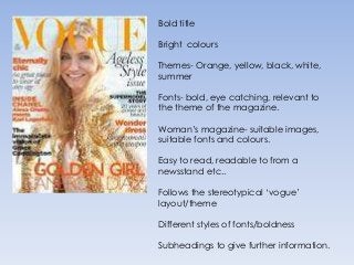
  • 1. Bold title Bright colours Themes- Orange, yellow, black, white, summer Fonts- bold, eye catching, relevant to the theme of the magazine. Woman’s magazine- suitable images, suitable fonts and colours. Easy to read, readable to from a newsstand etc.. Follows the stereotypical ‘vogue’ layout/theme Different styles of fonts/boldness Subheadings to give further information.
  • 2. The masthead is bold and easy to see. The fonts used are appropriate and are relevant to the genre of the magazine. The image is medium close up, however, the image is in front if the masthead so its dominating the cover. The colours work together well. Its eye catching and appeals to the target market. The negative space on the image is used up by text. Overall I think this is a good cover for a magazine as its appropriate, ye catching and looks good.
  • 3. Bold text Suitable fonts for the target audience. You can clearly see the audience the magazine is aimed at- Health conscious men. Suitable colour scheme- Red, Black, White. Easy to read, readable from newsstand etc. Relevant images for the magazine. Just enough information on the cover, not giving away what's inside or not overloaded with text or images. Different sizes ad boldness of text. Subheadings to give further information.
  • 4. Bold colours/text Suitable font styles for the aim of the magazine. Relevant images for the magazine. The front cover looks crowded compared to other magazine covers- this could put readers off. Eye catching colours and titles. Subheadings to give further information.