Gonda Nitya salvi 8617370543 VIP model college girls ...
Poster analyses
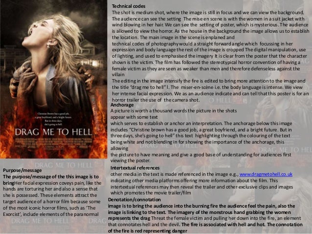
1. Technical codes
The shot is medium shot, where the image is still in focus and we can view the background.
The audience can see the setting The mise en scene is with the women in a suit jacket with
wind blowing in her hair. We can see the setting of poster, which is mysterious. The audience
is allowed to view the horror. As the house in the background the image allows us to establish
the location. The main image in the scene is enplaned and
technical codes of photography would a straight forward angle which focussing in her
expression and body language the rest of the image is cropped The digital manipulation, use
of lighting, and used to emphasised the imagery It is clear from the poster that the character
shown is the victim. The film has followed the stereotypical horror convention of having a
female victim as they are seen as weaker than men and therefore defenseless against the
villain
The editing in the image intensify the fire is edited to bring more attention to the image and
the title “drag me to hell” l. The miser-en-scène i.e. the body language is intense. We view
her intense facial expression. We as an audience indicate and can tell that this poster is for an
horror trailer the use of the camera shot.
Anchorage
A picture is worth a thousand words the picture in the shots
appear with some text
which serves to establish or anchor an interpretation. The anchorage below this image
includes “Christine brown has a good job, a great boyfriend, and a bright future. But in
three days, she’s going to hell” this text highlighting through the colouring of the text
being white and not blending in for showing the importance of the anchorage, this
allowing
the picture to have meaning and give a good base of understanding for audiences first
viewing the poster.
Intertextual references
other media in the text is made referenced in the image e.g., www.dragmetohell.co.uk
indicating other media platforms offering more information about the film. This
intertextual references may then reveal the trailer and other exclusive clips and images
which promotes the movie trailer/film
Purpose/message
The purpose/message of the this image is to
bringHer facial expression coveys pain, like the
hands are torturing her and also a sense that
she is possessed. These elements attract the
target audience of a horror film because some
of the most iconic horror films, such as ‘The
Exorcist’, include elements of the paranormal
Denotation/connotation
image is to bring the audience into the burning fire the audience feel the pain, also the
image is linking to the text. The imagery of the monstrous hand grabbing the women
represents the drag Threat the female victim and pulling her down into the fire, an element
that connotates hell and the devil. The fire is associated with hell and hot. The connotation
of the fire is red representing danger
2. Effect and effectiveness
The effectiveness of the image brings major impact, your
immediately drawn to the bright colours and can view the
drag me to hells intense agony through the quality of the
picture
Effect and effectiveness
The effectiveness of the trailer is
draw in both primary and
secondary audiences. The poster
is effectively in the sense that its
simplistic with powerful colours
and conation that would help the
audience to remember what the
main theme of the film is about.
Because the picture represent
the title
Target audience
the demographic would be slightly different...
probably younger and more female based.
A horror films target audience is generally
those in the age group 15-25. The secondary
audience
is dating couples. this is more likely to be either
very close but not married couples or first date
couples
Representation
These elements attract the target audience
of a horror film because some of the most
iconic horror films, such as ‘The Exorcist’,
include elements of the paranormal. The
mise-en-scene, such as the costume, hair
and make up, of the character suggests
that she is an average person. This makes
the film even more scary because
members of the target audience can
imagine themselves in this position
3. The title font is very
simple as not to
steal attention from
the main image but
it still stands out
because it is all in
capitals and the
white stands out
against the fire in
the background
’ This is a hook for the target
audience because it already
supplies them with lots of
questions such as ‘Why is she
going to hell?’. This also informs
the audience of the character’s
name and in turn, the audience
is becomes more involved as
they are beginning to find out
more about her just by the
poster
The names of the production
and distribution companies
are shown so that they can
stake their claim in the films
revenue as well as advertise
their company on the official
media products
other media in the text is made referenced in the image e.g., www.dragmetohell.co.uk indicating other
media platforms offering more information about the film. This intertextual references may then reveal
the trailer and other exclusive clips and images which promotes the movie trailer/film
This is a teaser poster as it
says ‘coming soon’ rather
than stating an official
release date. This indicates
that the audience will have
to be proactive to find out
more information about the
film and look out for more
information or media, such
as official posters and
trailers, of the film