
Recommandé
Contenu connexe
Tendances
Tendances (19)
En vedette
Similaire à Evaluation
Plus de olibrandon
Dernier
Dernier (20)
Evaluation
- 1. Evaluation Is your advertising campaign fit for purpose and why? I think it is. The people with the main focus on them in the posters are within the age limit of 16-24. The audience can relate to the people in the poster and realise that there are charities out there that can help them. My main messages in my posters are that SASH can help homeless people. This lets anyone in the age range that SASH target know that this charity is specifically set up for them. The colour scheme also matches the main colour that SASH use which is green. I have used the green SASH logo and put their contact details in the same green colour. Does it communicate your message clearly and why? I think it does as all of my posters say something to do with SASH being able to help you or have already helped homeless people. The text also stands out because I have used white text against the black background and also the SASH logo and contact details stand out because they are also against the black background but are coloured green. They aren’t that big but if it grabs some ones attention then they might come closer to see the details. The message of telling people what company are distributing these products is put across quite well as all the posters have the SASH logo and all follow the green colour scheme that SASH have on all of their products. My leaflet has a lot of SASH information on so people will easily be able to understand what SASH do. It includes a case study about a real person and all the contact details about SASH, a lot more than what is on my posters. This tells people what they do and where they are based. Is it appropriate for your target audience and why? Yes it is because all the main people that people focus on the most are in between 16 and 24 which is SASH’s target audience. One of the posters also says to stop youth homelessness. This is aimed at younger homeless people and if someone aged between 16-24 saw this they might consider contacting them.SASH is a homeless charity and all my posters say that they can help homeless people so it does let people know what they do. I didn’t make anything too graphic but I think the target audience is mature enough that if I made a mildly graphic poster they wouldn’t be too affected by it. My posters are simple for anyone to understand but that still means the target audience will understand it too and be able to get help because of it. Oliver Georgiou
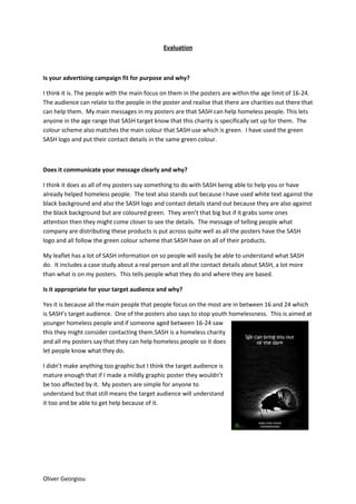
- 2. Compare and contrast your original intentions with the outcomes you arrived at. One of my original ideas was to have a homeless man in black and white as other regular people walk past in colour to imply that the homeless man is ignored and not part of society. I tried to do this but I couldn’t supply an image good enough to do this so I found an image close to what my plan was and altered it a little as one of my final products was a homeless man in colour and the rest of the image in black and white with everyone as a silhouette so it gave off a message that we will help you if no one else does as all the pedestrians are the same to the homeless man and don’t help. My original plan for all my products were to have three bus stop posters but the images I found were landscape so they would work better as billboard posters. I have also done a leaflet which I didn’t plan doing at all but I had to as I had run over my schedule and completed my posters before I said I would. How effective are the techniques you have used and why? I used first person so when the audience read the poster it is talking to them and sort of involves them in it. For example one of my slogans was “We can help you if no one else does”. It gets to the audience as it says “You” especially if you are reading it as a young homeless person. A lot of the text I used is quite plain and simple to get the message across that SASH do help people. There isn’t a lot of text on any of my posters. I have kept a house style with the same font and colours so people can recognize what advertising campaign it is without having to look at the logo on the image. I also used a black border on each of my posters even though it is hard to see with the gradient tool I used on Photoshop. Some other techniques I used on Photoshop are polygonal lasso tool to Rotorscope the man in one of my posters that almost gives it a sort of Banksy artistic effect. I also used the quick selection tool to select the pedestrians in on of my posters to colour them in black to make them look like silhouettes. I also used the gradient tool a lot to darken the edges of my posters, especially on my image above to make the person on the floor look like the light is shining on him more to imply that he can see the light and is being saved. The layout of all of my posters is the same with the big image and a border with white writing in it and also the SASH logo and contact details. Is the content effective and why? I think it is because it is quite emotional and if a young homeless person saw these posters they can relate to it and it could become quite personal and get to them. My posters tell people that SASH do actually help people so homeless people know and know who to contact, also other people that like Oliver Georgiou
- 3. to donate to charities know that they do actually do something with the money they give them because some people don’t trust companies as some have been known to be set up to take the profit for themselves. I also think they are effective because my two billboard posters are quite artistic and grabs peoples attention as they are different to normal SASH posters as the ones I have seen are just text so I think my posters will be more effective. What impact do you think your advertising campaign will have on the public and why? I think that it will raise awareness of SASH because it is a lot different to SASH’s posters now. I think my posters will grab people’s attention more they include more images than text. From my questionnaire people said they preferred images to text so I used that information to work better with the viewers. I think it will let people know that SASH do help people and also makes people aware of what age range they work with. The posters will make 16-24 year olds more aware of what to do if they do become or are already homeless. Overall I think it will have a good effect because the posters aren’t graphic or strange like some homeless posters are. What are the technical and aesthetic qualities of your work? My two billboard posters are quite artistic for example on of them I used the rotorscope technique on Photoshop and changed the colours of the man graphitised on the wall. The effect it gave off was a sort of artistic Banksy look. I wanted the man to stand out more so I decided to edit it by using the rotorscope technique. I also made the background black and white and blurred it a bit. My second billboard poster is also quite artistic as I coloured in the pedestrians in black to give off an effect that the homeless man in the poster thinks everyone is the same as in they don’t help but my text in this image is “We can help if no one else does” so it could make the viewer feel bad as they might not ever give a homeless person change or have ever tried to help them in any way. My bus top poster is a lot darker as in the colour as the only thing in the light is the outline of the homeless person on the floor. All my posters have the same house style as I have a black border with the green SASH logo, contact details and the slogan of the poster in white to stand out against the black background. Overall I am happy with all my final products as they are better than what I had in mind before I started production. I am pleased they all look like proper posters. Something I would change it maybe having another poster like my bus stop poster as it isn’t as artistic but still looks professional. Oliver Georgiou