
Recommended
More Related Content
Similar to Styleguide Sway
Similar to Styleguide Sway (20)
Recently uploaded
Recently uploaded (20)
Styleguide Sway
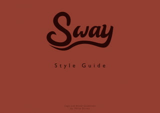
- 1. S t y l e G u i d e Logo and Brand Guidelines by: Philip Dir ven
- 3. L o n g b o a r d i n g i s f o r e v e r y o n e 01 Logo 07 Minimum size and clearspace 10 Main Colors 12 Photography and filmography 05 Don’t disturb the peace 08 Logo on boards 11 Typography 19 Tone of voice ORIGINAL URBAN C R E AT I V I T Y FOREST
- 4. Logo This is our logo. It was made out of the feeling of longboarding. The logo shows the feeling of longboarding. your longboard through the city, mountains The words that go hand in hand with the logo or park. You and your longboard are one. are: Peace, freedom, minimalism and smooth. Sway is there for you to get that awesome Sway gives this feeling even more. Sway with feeling of freedom.
- 5. Don’t disturb the peace Putting pretty things together doesn’t make a pretty whole. You wouldn’t use two different trucks on a longboard, or wear sliding gloves on a party, would you? Likewise, don’t do the following: longboards • Don’t place the logo in the corners. • Don’t use words beside the logo. • Don’t rotate. • Don’t make your own design of the logo. * • Don’t use a shadow behind the logo. • Don’t scale out of proportion. • Don’t use the wrong colors behind the logo. • Don’t use low quallity. (minimal 250 dpi) * Except for artists and designers who design the underside of a skateboard. See page 9.
- 6. longboards • The logo is always centered. • If you want a different color, use these. • Use short words and subjects below.
- 7. Minimum size and clearspace Sway wants to give their riders a feeling of freedom and individuality. The logo wants the same. Freedom and individuality. The minimal size for print reproduction is 10 mm. Smaller would render the text illegible. A bit of breathing room around the logo is welcome. A minimal area, of the ‘w’ in the logo.
- 8. Logo on longboards Sway builds longboards, unique longboards. Every board has it’s own style. Sway likes to work together with designers and artists. They can put their creativity in the design of a board. But how do we combine that with our design? Here are some clear guidelines and inspiring ideas. Logo No matte r wh at yo u r bo ard lo o ks like , it always h as t o f it n ic e ly. Hor i zon ta l a n d ver tica l sy m m e t r i cal de c k H o r izo n t a l s y m m et r ic a l d ec k
- 9. Logo on the back No matter what the design of the artist is, the logo has to be centered on the longboard. A designer or artist is allowed to costumize the logo but remember : Don’t disturb the peace. Hor i zon ta l a n d ver tica l sy m m e t r i cal de c k H o r izo n t a l s y m m et r ic a l d ec k
- 10. Main colors Original Urban Forest Creativity Brown says stability, reliability, and Beige says quiet, pleasantness, calm, Green says growth, nature, harmony, Purple says creativity, inspiration, approachability. It is the color of understated elegance, purity and refreshing, peaceful, contentment, ceremony, motivation, passion, our earth and is associated with all softness. confidence, beauty, balance, inner perception and calmness. things natural or organic. peace, calming, environment, healthy, vitality, renewal, spring, generosity, and freshness. cyan 56 cyan 62 cyan 77 cyan 74 magenta 75 magenta 64 magenta 57 magenta 77 yellow 72 yellow 79 yellow 75 yellow 57 black 82 black 75 black 78 black 77 cyan 29 cyan 34 cyan 82 cyan 38 magenta 82 magenta 58 magenta 20 magenta 39 yellow 83 yellow 93 yellow 90 yellow 43 black 25 black 20 black 06 black 16
- 11. Typography To ensure constancy, here are a few recommendations for placement. To make it easy, we specifid sizes for some canvas sizes. Normal font: Chapters: Gill Sans Book Futura Std Book Use: Use: Website, poster, social media images Website, poster, social media images Size: 12pt Size: 14pt Align: Left Align: Centered Intro text: Quotes: Gill Sans Book Itallic Gill Sans bold itallic Use: Use: Website, stories, interviews Website, stories, interviews Size: 13pt Size: 13pt Align: Jusitfy with last line aligned left Align: Jusitfy with last line aligned left
- 12. Photography and filmography A picture or movie is a piece of the personality of Sway. This also determines the look and feel of Sway. It’s very important that the photos look good, professional and have a good quality. There are a few words that have to be recognizable in our pictures. At least two of these words must be in a Sway picture. Minimalism Tranquility The simplest and fewest elements are used The primal feeling of longboarding based on to create the maximum effect. tranquility. When you pick up your longboard up and go, you have the feeling that you float away. That feeling should also come back in the photos or video’s. Openness Friendship Sway wants to be there for everyone. All That awesome feeling when you are subcultures, generations and ages. There is no longboarding with your best friends. Moments limit and everyone is welcome. Longboarding that you’ll never forget. Search for a spot, is for everyone. roll, do tricks, challenge, crash and laugh. The real friends feeling.
- 18. Tone of voice We want people to feel special. When you have a Sway longboard, you are special and unique. We are enthusiastic, contemporary, likeable, accurate, innovative, social, friendly, funny and a little stubborn. We don’t use lengthy descriptions. This leaves breathing air on the canvas and keeps the reader’s attention. We don’t like to talk very much, but if we say something it’s strong. “Sway is the silent boy in class who is actually quite popular.”
- 19. L o n g b o a r d i n g i s f o r e v e r y o n e