9. Visual hierarchy
toolbox
Contrast Alignment
Size Proximity
Color & saturation Density / White space
Texture Repetition
Salience (bottom- Gestalt principles of
up visual attention) visual perception
22. show & tell
Visual hierarchy
Contrast Alignment
Size Proximity
Color & saturation Density / White space
Texture Repetition
Notes de l'éditeur
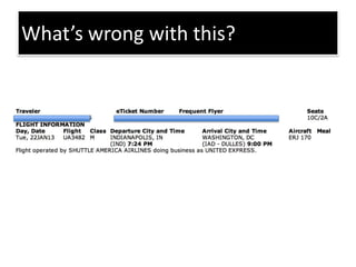
Information design – no clear hierarchy. Not clear what’s most important. Hard to see, understand, find information. Give handout with this and iPhone screens. Spend 10 minutes sketching solutions on how to present this info on an iPhone app. Show 2-3 solutions on docucam.
Information design – no clear hierarchy. Not clear what’s most important. Hard to see, understand, find information. Give handout with this and iPhone screens. Spend 10 minutes sketching solutions on how to present this info on an iPhone app. Show 2-3 solutions on docucam.
No visual hierarchy vs. visual hierarchy. It guides the eye, points out what to look at first, second, third. What tools are used here? Proximity/ white space, alignment, color, color saturation, size.
What techniques are used here to achieve visual hierarchy? How is color used? Why is color used this way? (what’s important).
Quality of an object that allows an individual to perform an action. Communicate that possibility to perform the action.
United iPhone app. Critique: visual hierarchy & affordances. What are areas/chunks? How does the app indicate clickability? How do you know what’s most important? Divided into top for regular navigation and bottom for important, immediate actions.