SlideShare une entreprise Scribd logo
1  sur  30
Preliminary Round Critiques
                                           (CTR+ click to go to see full-sized photos)


                                                  Username: Alanna Tarantella
                                                   Team: Uh Oh Spaghetti-Os


               Photo 1: No                              Photo 2:                           Photo 3: Moving
                  Control                            Breaking Bonds                        Forward
Head Judge Critique:

-Kris Ramos, tinaateurface:
          Going into the preliminary round, I held the highest expectations for your team. From your application I could see that the
model is extremely attractive and while far from professional, the photography wasn’t displeasing. However, upon viewing your
preliminary photos, I became confused as to why I had previously been so excited to see your future work. Honestly, I was ready to
immediately refuse your admittance into the competition as one of the ten contestants, but the other sets of photos we received
were equally bad if not worse. In other words, your effort was extremely disappointing and you fell from one of my favorite teams
to one that I believe needs to improve greatly in order to continue in this competition.
          The modeling in all three photos, leaves much to be desired. The model looks particularly uncomfortable in the first photo
and while the eye contact in the second photo is striking, the angle of the face isn’t particularly flattering. The last photo is rather
poorly cropped and appears to have nothing to do with the task. In fact, none of your photos really displayed what the task was
about and even with your captions I did not understand the concepts you were trying to portray.
          The model’s obvious strength is her expressive face, however, she failed to use this to her advantage in this task. In the first
photo her face is completely unemotional. Is she feeling restricted by her inability to resist video games, or is the controller symbolic
of a lack of control or freedom in general? The model’s expression in the second photo is fierce, but slightly inappropriate for the
task. Rather then looking satisfied or ecstatic that you’ve broken free from your bonds, you just look angry and slightly evil. I’m not
even sure what the overall mood is supposed to be in the last one, although you do have a hint of a smile. Unfortunately, it’s just
really unclear as to what the idea behind the last photo is.
          Photography wise, these photos are also pretty bland. All three photos are too close up of the model and don’t show
enough context. In fact, they’re so closely cropped that the whole point of the photo is completely lost. For example, the idea of
the second photo would have been much more compelling if you zoomed out on the model breaking chains and using her whole
body to express the feeling of freedom that comes with overcoming oppression.
          You also need to watch the angles that you take the photos from. The first really doesn’t work well as a horizontal photo.
Again, you should’ve zoomed out and captured her whole hand gripping the controller, straightened the photo so that the model
was upright, and instructed her to look agitated over having no control.
          Additionally, you need to pay closer attention to props and background. All three backgrounds not only fail to add to your
photos, but they actually work against them. I know these were all taken at the last minute and without much thought, and
honestly, it really shows. I’m disappointed that these photos appear more fit for myspace exposure than for a photography contest.
Photography Critiques:

-Sandy, Tragidy:
         These photos look very MySpacey to me, which makes me sad since the model is gorgeous. I don’t like your choice to focus
on the controller and not the model in the first picture. The remaining two photos were a bit blurry, so try to fix that next time.

-Daniel, Pheregames: Unavailable for this week

-Kaitlyn, Tyrian Purplexx:
          I wasn’t sure if I was still just starstruck from Mooncat’s body of work if I really am just a huge b***h regarding this
competition, but I was highly disappointed in what this team had to offer us this week. The first two look like the model took them
on her own: they’re a very stereotypical “Facebook photo” type of shot. The second looks like a lazy attempt to redeem the first two,
but all three fail to portray the theme for me.
          If the model was deleted from the first photo it would be a very strikingly composed photo of that controller, but the
slightly blurry, poorly placed model fills of the frame too busily.
The lighting of the second photo is too harsh and its almost too difficult to discern the “Chain” against the dark red of the model’s
hair.
          I like the final photo the best of the three, but it took me forever to figure out where the model was emerging from (its the
trunk of a car...for anyone who couldn't tell). The lighting is harsh again, and the halo around the model’s head makes lines hard to
discern. The natural lighting was too late in the day for this photo and resulted in right eye of the model’s right eye (which should
have been deleted before the photo was entered).
          All around a bit of a disappointment, I was hoping for better from this team.

-Nick Sullivan, rpgcubed:
          Your photos are pretty good, but I have quite a few compositional issues with them. The use of negative space is
underwhelming at best and by expanding the frame of the photos you could easily have fixed this. While each photo does seem to
express your view of freedom, there are some things you could have done to better show the symbolism.
          In my opinion, the first photo is the best of the three. The lighting, while slightly lopsided and showing too much contrast,
adds to the symbolism of freedom. My only recommendation is that you expand the frame of the photo on the left. As it currently
stands, the fishbowl appears crowded and is not the center of focus of the image. Other than that, this photo is definitely one of the
best out of any submitted.
          Your second photo really takes a step away from traditional modeling photography. The relaxed and soft style of the photo
accentuates the feeling of the photo being comfortable and free, while not detracting too much from the overall image. As in the
first photo, I would advise that you rotate and pan the frame to the left, encompassing the couch and model entirely in the white
wall, which would wonderfully withhold the worrying welt of waste in the corner.
          The third photo has a number of issues with it, namely the angle of the shot and the background. I like the idea, but the
complicated background takes away from her appearance of freedom of expression. If the door, wall, step, and garden were slightly
less interesting themselves, she would be much more the focal point of the picture. The angle both foreshortens her entire body,
making her appear slightly worse than she would otherwise, and completely does away with her neck, ringing her head in a wreath
of hair, and so making it far too completely the sole focus of the shot. Other than these things, the photo is rather good, and
effectively portrays freedom of expression.

-Demi, DemiTHEchipmunk: Unavailable for this week

Modeling Critiques:

-Cassandra, Anriazna:
          Honestly I do have to say that I was disappointed with these images after what they submitted for their application; they
really paled in comparison. The Nintendo picture and the chain picture looked like a typical MySpace or Facebook profile picture and
looked about the quality as if she took them herself (ignoring the fact you can see both of her hands in the Nintendo picture). In the
Nintendo image her face appeared to have no real emotion and was not posed properly at all - it just didn’t look good. The chain
picture was cute in a sense and she did show            !2a decent amount of emotion but it needs work to be able to cut it. Perhaps
they should take something like it and turn it into a full body or half body shot. They should work on more than just head shots as
that’s just not enough to judge for modeling all the time. Their car image was okay but looked more like a thrown-together ad for a
Honda instead of a well planned out image. As I said before there should be a bit more of the model in the image instead of just her
head, shoulders and part of one arm. The emotion is there but it is hard to place what it is as the picture just doesn’t seem to flow. I
would say that this team’s strong point is that the model does have a very photogenic face but they need to work on using it better -
try to show more emotion and practice posing a bit differently. Experiment with some different types of shots instead of only head
shots and just keep looking for ways to improve. Unfortunately I couldn’t really find too much of the theme the contest called for in
this set of pictures but I can see what they were trying to do.

-River, Osahar: Unavailable for this week

-Shawn Keeney, Opaque Transparency:
         I loved the application photos, but these a kind of a disappointment for me. What I'm getting is that the pictures kind of
show a process of freedom, but if it weren't for the captions, I would have no clue that was the intent. Photo 3 is my favorite,
probably because it takes me back to the application photos where the model was smiling. I like her angry look too, from Photo 2,
and that one sort of gives of a "freedom" message, but it's not too clear.

-Momo, -Ninja Cat Momo-:
          The first picture here is a decent picture, however the model's face is a bit awkward... blank, you could say. There's not
much there, maybe a hint of defiance, but I don't know why that would be there. She looks almost uncomfortable, and this is
accentuated by her strange pose. You can see her neck lifted slightly off the floor, and the strain is reflected in her face. I do like that
her hair is over her shoulders and not covering her neck (this makes me really happy, actually) and how just a bit of her right hand is
peeking in at the bottom of the frame. The left hand is a little... just floating there, but if you happen to see the cord in the picture it
makes sense.
          This second picture was the make-it-or-break-it point for me. I really, really loved this... it's probably my favorite for this
prompt. Her face is stunning, screaming defiance, and the chain in her mouth really shows me freedom. It's as if she's daring us to
break our chains, too. Fierce, ferocious and powerful are the first three words that come to mind. The green in her eye contrasts
greatly with all the red and really stands out; the missing red eye really adds to the power in just her left. The cropping on the photo
is nice, you don't get any odd stumps, her hair acts as a natural frame. I also like the little flash of teeth in this picture. This is
honestly the one that brought the score up for this set.
          This is my least favorite in this set. The right elbow and hand are hidden, either out of frame or out of sight. But what gets
me the most in this is the strange color. The model looks happy under the hood, but the light adds an orange glow which does not
blend well with the red hair. There are way too many warm colors in this. The light has given her eyes a very strange color and
patches of her skin are a sickly yellow.

-Jordan-Elizabeth, KRYST4L M3TH: Unavailable for this week
Username: Amos Van Alen
                                                     Team: The Lost Girls


           Photo 1: The Freedom to Live                                    Photo 3: The Freedom of
                   Your Own Life                                                  Expression


                                                Photo 2: The Freedom of
                                                        Comfort
Head Judge Critique:

-Kris Ramos, tinaateurface:
          These were by far some of the best we received of the bunch, unfortunately this is no reason to feel instantly elated. While
you did create some of my favorite photos this week, they were also not nearly up to your potential. In general, I absolutely adored
all of your concepts. They were unique, clever, and it was so obvious in every photo how they represented freedom that captions
weren’t even necessary to get your point across. That being said, there are still many technical flaws in your photos.
          My main problem with your photos this week was the photography; specifically the horrendous cropping. Every photo is
cropped in a way that is very distracting to the viewer’s eye because of awkwardly cut off limbs. The first photo would look much
more dynamic if you zoomed out and showed more of the lovely background. In the third, the angle makes the model look larger
than she is and puts too much emphasis on her face. Again, zoom out: this competition is not strictly for modeling, the goal is to
create a great photograph and the focus should not be completely on the model. The background in your second photo is very
distracting. It would have been much more professional looking if you had centered the couch against a white wall, left a lot of
negative space (the wall) above it, and captured the whole body without cutting off the leg.
          The modeling, on the other hand, is actually quite good. Although somewhat plain, the posing is strong and mostly fits the
mood of your photos. When it comes to posing, my favorite photo was the second. You look comfortable, relaxed, and incredible
free. Although your arms look slightly awkward, you did a good job of positioning yourself while lying down. With the bad cropping
your right leg looks a bit deformed, but I’m guessing that if the photo was zoomed out, the positioning of both your legs would be
very nice.
          Unfortunately, however, the second photo is the only one in which you look like an actual model. Your back is awkwardly
hunched in the first photo and your entire body looks constricted. Considering the task was to depict freedom, I would have liked
your body language in this photo to be more relaxed. Additionally, your face and body should be angled toward the camera. The
photograph would be so much better if we could see more of your beautiful face. In the third photo, your face is too close to the
camera and, again, your body is too rigid to express freedom. The pose is also very ordinary; I would like to see more variety from
you.
          Overall, your creativity is off the charts and your execution isn’t bad either. All of your photos were eye catching and kept
me interested. If you continue on this path, you should do well in this competition. Just watch your cropping and angles and try to
create a greater photograph rather than a simple photo of a model.

Photography Critiques:

-Sandy, Tragidy:
         So, I think I am in love with these girls. In terms of composition, these photos are gorgeous. When I first looked at these
pictures, I thought "Freedom of Comfort" was a little ehh but it grew on me and I'm starting to think "Freedom to live your own life"
is my least favorite. The lighting on the model and fish bowl is lovely, but the way the grass looks sort of burns my eyes.

-Daniel, Pheregames: Unavailable for this week

-Kaitlyn, Tyrian Purplexx:
         MUCH better compositionally speaking, the photographer here clearly took into account the time of day and the setting for
each of their photos. The theme is very clearly and uniquely expressed in each of them, and I was really charmed by the way they
chose to interpret each of their captions, particularly the first two.
         The first photo is very well lit, and as someone who usually takes photos outdoors I know this is hard. Had the sun been an
inch higher or lower that fish bowl would have caught a terrible glare and we wouldn’t have been able to see the fish at all. The
chosen color palette of the photo is cool colors, which combined with warm lighting makes everything pop. Very smart decision on
the part of the photographer.
         The second is also extremely well-lit and appears to use natural lighting once again. Weither its actually natural or not isn’t
important, simply the fact that it looks that way
emphasizes their caption “the freedom of comfort.” The colors are a little busy, but I like it. It reminds me of how no one’s pajamas
ever match. The focus of this photo is on the foreground, softening the background so that the busy palette doesn’t ruin the photo.
Nicely done!
         The final photo, photographically speaking, is the least impressive of the bunch. Very safe. Very nice, but probably a cop out
on an original interpretation of the theme.

-Nick Sullivan, rpgcubed:
          Your photos are pretty good, but I have quite a few compositional issues with them. The use of negative space is
underwhelming at best and by expanding the frame of the photos you could easily have fixed this. While each photo does seem to
express your view of freedom, there are some things you could have done to better show the symbolism.
          In my opinion, the first photo is the best of the three. The lighting, while slightly lopsided and showing too much contrast,
adds to the symbolism of freedom. My only recommendation is that you expand the frame of the photo on the left. As it currently
stands, the fishbowl appears crowded and is not the center of focus of the image. Other than that, this photo is definitely one of the
best out of any submitted.
          Your second photo really takes a step away from traditional modeling photography. The relaxed and soft style of the photo
accentuates the feeling of the photo being comfortable and free, while not detracting too much from the overall image. As in the
first photo, I would advise that you rotate and pan the frame to the left, encompassing the couch and model entirely in the white
wall, which would wonderfully withhold the worrying welt of waste in the corner.
          The third photo has a number of issues with it, namely the angle of the shot and the background. I like the idea, but the
complicated background takes away from her appearance of freedom of expression. If the door, wall, step, and garden were slightly
less interesting themselves, she would be much more the focal point of the picture. The angle both foreshortens her entire body,
making her appear slightly worse than she would otherwise, and completely does away with her neck, ringing her head in a wreath
of hair, and so making it far too completely the sole focus of the shot. Other than these things, the photo is rather good, and
effectively portrays freedom of expression.

-Demi, DemiTHEchipmunk: Unavailable for this week.

Modeling Critiques:

-Cassandra, Anriazna:
           This team did a marvelous job all around. The fish picture was very nicely posed and the model’s face looks tranquil which
adds to the theme of the image. The only bit I can find to criticize is that I feel her right arm should have been a little lower so it
didn’t make a straight line with her chin. The outfitting also goes along well with the picture and helps to give you that peaceful
feeling. Their relaxing image is another great picture both pose-wise and emotion-wise. The way her arms are spread and her legs
are positioned go well with her face which expresses severe contentment and relaxation. The wardrobe and the choice to wave her
bra in the air also help play with the picture giving it more a feeling of just chilling out at the house. I would have liked to be able to
see either a full-body shot or have the image cut off just passed her left foot but it is still an amazing picture.
           Their final picture was also a good picture but there are a few things that I find wrong. The picture would have been a little
better had the model turned her face a little to the right to show off the makeup a little better. Another thing is that because she
was locking her left knee it makes her leg appear to be bent in the wrong direction which makes it seem rather awkward. I also
would have liked to see a little more emotion in the image than there was but there is still some emotion present. All in all I feel like
this is a really great team; the model is very good at proper posing etiquette as well as showing emotion and their wardrobe is spot-
on. They mainly just need to work on making sure that every image is the best it can be and just try to show off a hint more emotion
in all their images. Perfection is key. They were wonderful at capturing the theme for this round - every picture just screamed
freedom.

-River, Osahar: Unavailable for this week

-Shawn Keeney, Opaque Transparency:
          I am LOVING all three of their photos. I love that each picture is shows a totally different interpretation of freedom. My
favorite is Photo 2, because I'm sure not wearing a bra is quite freeing for many women, and I can really feel the model's joy and
relief when I look at the picture. Photos 1 and 3 are great too, Photo 1 especially.

-Momo, -Ninja Cat Momo-:
          I really like the creativity behind their pictures. For the modeling, in the first picture; I think it's a really wonderful pose. My
only slight complaint would be that her arm is right next to her face and not shadowed, so it kind of blends in a little bit. Other than
that, though, she's in a nice spot and easy to focus on, you can see both of her legs and though you can't see her neck, it's not a
strange warped look.
          For the second picture; I really wish they had at least caught her foot in it, it looks like her leg is strangely elongated.
However, you really don't notice much past her wonderfully happy face. She looks overjoyed, you can't help but smile a bit with her.
Her pose is very natural but flattering, though the shirt is a bit scrunched by the neck for my liking.
          For the third picture, I'm not a huge fan of her modeling at all. Her left foot (our right) is cut off and both of her feet are
strangely small due to the angle of the camera. Her head is just floating there, her hair covering all of her neck, and her right leg (our
left) looks like a nub due to the black boot blending into the shadows. Her fingers, on her hips, look chopped because they seem to
be squeezing. Her right arm (our left) is elongated and looks unnatural. All in all, though, not bad, and I'd like to see more from them.

-Jordan-Elizabeth, KRYST4L M3TH: Unavailable for this week
Username: beagleteer
                                                             Team: 1867


             Photo 1: After a long day in the
            real world, it feels good to let go


                                                                              Photo 2: Moving
                                                                                  Forward


           Photo 3: Though confident from                                      Photo 2: With Tim Horton’s
            the day she was born, she has                                      in hand and the woods in my
                                                                                 backyard, Canada is what
Head Judge Critique:

-Kris Ramos, tinaateurface:
          I gave you permission to put two photos together for this challenge only and judging by these photos, I’m especially glad
that I have forbidden this for the future. I understand your intent with the before and after effect of taking off your façade, but I
think your execution was pretty awful. The two photos are unnecessary as you could have gotten the same concept across by
trailing your outer clothing along the floor and posing in your real skin (style of clothing in this case). Additionally, the photo is too
dark and it’s difficult to see your face. It’s also hard to see details because both photos are so small thanks to putting two of them
together and although I understand that the background is suppose to express the quirky real you, it ends up being too distracting
and taking away from the impact of the photo. They simply aren’t striking.
          Your second photo is also an example of completely unnecessary photo fusing. It’s obvious you couldn’t choose between
the two photos and so decided to turn in both. Having such small photos really diminishes the quality and it’s always a problem
when the model’s face isn’t really visible. Facial expression is crucial when it comes to successfully showing certain things like
freedom. The first Canadian photo is by far better photography, but the model fails to bring emotion to the photo. The squatting is
also awkward and I’m not really sure why you’re holding a cup. There also appears to be some awkward animal behind the model.
The second Canadian photo, while not having great composition, is a better when it comes to expression. Your body language has a
hint of freedom and although I can’t see it that well, I see a hint of a serene face. I wish you had turned in this photo alone and
larger.
          I really loved the concept of your last photo, but, unfortunately, your execution leaves much to be desired. The couch is
awkward, the picture frame distracting along with the lamp shadow, and I’m surprised you couldn’t come up with a better
background. It says nothing about your topic and looks very confusing and cluttered. I also don’t really understand the mood that
you were trying to portray in this photograph. Rather than looking liberated, the model actually looks a bit wistful or reminiscent of
the past.
          All in all, I feel as I can’t correctly judge these photos because of their size. They’ve lost their impact, clarity, and intrigue.
Your team does, however, have interesting and creative ideas that, once you figure out how to successfully execute them, will turn
out some amazing photographs.
Photography Critiques:

-Sandy, Tragidy:
         I’m disappointed that you chose to not have more light in the first photo due to the fact that you had so many beautiful
colors. The second and third ones were a little better, but lighting is still the biggest issue. However, the third photo intrigued me
and I wanted to know the meaning behind it.

-Daniel, Pheregames: Unavailable for this week

-Kaitlyn, Tyrian Purplexx:
         The first photo would have been so SO amazing had it been lit properly and I was a little upset to see it come out so dark.
The vibrant colors of the backdrop, clothing, and hair of the model were all lost in the shadow.
         The second photo had the same problem, but not as heartily as the first. The shadows of the trees simply cut across the
model and washed out the vibrant color palette.
         I liked the third photo best, since it was the most visually appealing. It was balance (blank left and right thirds with the
model in the middle third). It was the hardest to connect to the theme, but the colors were really interesting. Even though I’m not a
modeling judge, I remain really enchanted with this team’s model. She photographs so well!

-Nick Sullivan, rpgcubed:
         Not only are your photos not that great, you violate our eyes even more by forcing upon us almost double the number of
photos. This is definitely one of the worst flaws of this set. On the other hand, if the photos themselves were any good, this could be
disregarded. Composition-wise, the photos all seem rather bland. Additionally, the ideas behind them, while relatively obvious, do
not seem to have anything to do with the theme of freedom. The first photo at least slightly corresponds, but even that is a stretch.
Unless your photos become many many times better than any that currently exist on this planet, please, for the sake of us all, stop
linking photos together.

-Demi, DemiTHEchipmunk: Unavailable for this week

Modeling Critiques:

-Cassandra, Anriazna:
           The main problem I have with this team is that they bent the rules; the assignment was to submit only three images and
they submitted five as putting two side-by-side does not count as one image. Ignoring this I found the modeling to be mediocre. In
their first set of images there is a good amount more emotion expressed in the first picture than the second but the posing in the
second is much better than the first. All-in-all the pictures were not lighted properly making it hard to really see what’s going on.
           Their second set of images I find hard to see good things in. In the picture on top the model looks very bored and
unemotional, almost as if she doesn’t know that someone is taking her picture. With how the shadows from the tree are falling on
her arm it makes her arm appear to be distorted and her hand awkwardly sized. Her feet are also way too squished. Out of all five
images their last one would be the best for modeling and staging. The positioning of her arms is practically perfect and you can feel a
sense of contemplation in her face which helps to give the picture more life. I do believe the outfitting should have been different
however as it makes the bottom of the image look really bulky.
           I thought that this team did an alright job with capturing the theme that was assigned. What the model has done the best
would be with showing emotion but she will need to work on making it more clearly defined and to be sure to express it in each of
her photos. What I would recommend her to improve on is making sure she holds a pose and to learn which poses are best for her;
everyone has a “good side” and everyone has certain poses that are best for their person.

-River, Osahar: Unavailable for this week

-Shawn Keeney, Opaque Transparency:
           This team was another of my favorites from the applications because the model was so unique, but I'm not blown away by
them either this time. I like Photo 2 because I get a sense of freedom from it, but I get nothing of that from Photos 1 and 3. Photo 3
might work as a transformation picture from then to now, and Photo 1 just looks like a Facebook or MySpace picture that she could
have taken herself (I should also mention I'm not a huge fan of bathroom pictures, unless that relates to the picture's theme). I'm
still kind of rooting for them though.
-Momo, -Ninja Cat Momo-:
           Two photos next to each other really made this a hard set to judge, as in each picture with two, one was by far better than
the other in modeling-terms. I'm completely on the fence about this one. In the first picture, the second picture is much better than
the first. You can see a hint of a smile on the model's face, you get her wonderful silhouette and she's framed nicely. In the first half,
the glasses are meshing into her head and she looks a tad dazed or confused, and her arm is cut out of the photo.
           In the second photo, the first picture is much better than the second in terms of modeling. You have a powerful squat
(hehe, that sounds funny, but it's true) and a "don't mess with me face". Freedom can mean being in charge, having your way, and
the model looks like she's going to get her way. She's yanking on the flag, which gives kind of a cool look to the photo... I'm not sure
how to explain it, but I like it. The second part of this picture, however, is... meh. She's covering up her body with the flag, her right
arm is cut out of the picture from the flag and her left hand isn't in the best position. Also, she's focusing more outside of the frame,
which gives you the impression she's distracted and doesn't seem to care too much about the flag.
           I don't really see freedom so much as sadness in the third picture. If not sadness, I see a wistful type of look. The posing is
wonderful, clutching the laptop with the picture on it really gives a sense of comfort to the model, or perhaps it holds a memory.
You can see the focus is outside the frame, which just adds to the wistfulness-- it gives the impression she's not here, she's thinking
about something else. I like the wall behind her being white, but I feel the picture should have been removed from the wall to kind
of isolate her more. It meshes into her head funnily.

-Jordan-Elizabeth, KRYST4L M3TH: Unavailable for this week


                                                         Username: cjaoov
Team: Tegan and Sierra


                  Photo 1: Paying on                                            Photo 2: Take away
                 credit is like gambling                                        my gun and you take


                                        Photo 3: The new Lady Liberty.
Head Judge Critique:

-Kris Ramos, tinaateurface:
          I have to say that I was unimpressed by the photos you submitted for the preliminary round. They’re bland as photographs
and unflattering of the model. In fact, I don’t have much to say, other than, I simply don’t like them. The lighting on all three photos
is quite poor and strongly takes away from the impact of the photo. The model’s expression doesn’t express freedom whatsoever;
rather, she appears bored if not dead. Additionally, every single one of your photos looks like it was taken on a whim, as if the
situation was merely two friends with a camera, snapping photos of a good time.
          To get into specifics, you should notice some simple things: the cropping of the leg in photo two, the use of flash in photo
three (flash pretty much always looks bad), and the poor angle of photo 3. The photographer needs to work on creating a dynamic
photograph that is visually appealing. The model needs to work on expressing emotion and conveying meaning.
          You may notice that my critique for you team is substantially shorter than what I’ve written for most of the others. This is
simply because there isn’t much to say. It’s hard to critique a photo that doesn’t even look like it belongs in a photo competition. I’d
like you to read over some critiques for other groups, to get a sense of what you need to change to make your photos look more
professional.
Photography Critiques:

-Sandy, Tragidy: Unavailable for this week

-Daniel, Pheregames: Unavailable for this week

-Kaitlyn, Tyrian Purplexx:
          I thoughts these photos had to be explained with their captions, which we explicitly stated was not to be necessary.
However, along with their explanations, these photos are quite clever interpretations of the theme, I was impressed by their take.
I wasn’t too impressed by the composition, particularly of the first and third. In those two photos the light is too harsh and washes
out the subject. In the first it creates an overall red hue to everything, which I’m sure was not the intent. In the final photo it makes
the colors clash and an overall unappealing look, though the angle is interesting and makes the model appear higher than she is.
          The second photo of the best of the lot. The colors are interesting, but do not class and the fence draws the eye to the
model and her pointed gun.
I hope to see better from these two in the future

-Nick Sullivan, rpgcubed:
         Rule 1: Flash is never a good idea. When in doubt, wait for better light. Seriously. No matter what. I cannot stress this
enough. Also, the random tilts make your photo look like you took it in 10 seconds. Don’t intentionally make it look like you have no
sense of balance... Your ideas could be worse, but they’re definitely nowhere near good. If your photo doesn’t stand without a
caption, it won’t stand with one. None of your photos inherently express the idea of freedom. The first and last are better than the
second photo, but even they are either overly blunt and bland (first) or could be easily misinterpreted (second). I’m actually rather
disappointed with all of your photos, but I’m hoping you can pull something together in the future.

-Demi, DemiTHEchipmunk: Unavailable for this week

Modeling Critiques:

-Cassandra, Anriazna:
           I felt that this team didn’t do all that well. The model still has to work on proper posing etiquette as well as showing
emotion in her face instead of just looking like she’s posing for a picture. The feel of their gambling picture is cute but I feel as
though her hands should have been poised differently. In this image the model is showing the most emotion out of three but it is still
hard to decipher what it is that she’s expressing as it isn’t all that strong. In their gun picture the model is doing a better job with
how she holds herself but it would be better if she was standing a bit straighter and if her legs were positioned differently. While the
outfit is cute I can’t help but feel like the color choice for the sash was wrong - it appears to disappear into the shed.
           For the most part the patriotic picture is the best pose-wise. I would say though that her head shouldn’t be so profiled as it
makes her head seem to be cutting into the sky with how much of a side shot it is and it just looks wrong. This team did a decent job
at fitting the theme all around. I would recommend them to keep working on better posing and definitely to work on expressing
emotion in all of their images.

-River, Osahar: Unavailable for this week

-Shawn Keeney, Opaque Transparency:
         I don't like Photo 1, because if it weren't for the captions, I wouldn't have even noticed the credit card, let alone known that
the picture was supposed to be about freedom. However, I like Photo 2; I'm digging the whole pro-right-to-bear-arms and get-off-
my-property-or-I'll-shoot-you vibes the model gives off. Photo 3 is a bit campy, but I get the idea. I really like that this team has a
sense of humor that is visible in their pictures. Should make the competition veeery interesting.

-Momo, -Ninja Cat Momo-:
         The modeling in the first picture doesn't convince me of much, let alone freedom. I see handcuffs... the opposite of
freedom? That confuses me. I also don't understand the credit cards or cards. I associate these with gambling or excessive spending
which is seen to be more of a shackle than a freedom as it can be an addiction. The model's face is very blank, just staring at you,
and the angle makes the neck seem off. I don't like this picture very much.
I like this picture better than the first, but I feel it's not much better as far as modeling goes. The right foot is cut out of
frame, creating a long-leg illusion or a nub illusion. Her left leg and foot are hidden by the dress and right leg, causing them to look
slightly deformed as well. The neck is almost non-existent from the harsh turning of the head. The left arm is hidden almost
completely behind the gun. However, the bow on the dress gives a nice silhouette to the body and the facial expression is better
than the last picture.
          This picture is by far the best in modeling. You get a clear, brave stance from the model, and you can see her wonderful
elongated neck and jawline. The only flaw in the modeling would be her right hand on her hip is slightly deformed due to the fingers
curling behind in rather than in front. The outstretched arm is a nice touch. I feel though that this would have been better executed
in the daytime. The blue of her shirt adds an odd feeling to the blue of the night sky.

-Jordan-Elizabeth, KRYST4L M3TH: Unavailable for this week
Username: Dread Pirate Sam
                                                   Team: The Cougar's Beret


           Photo 1: Even though your wings
           are made of paper, let them carry


                                                                     Photo 3: Expression. The truest
               Photo 2: Only in your dreams                                 form of freedom.
                       are you free.
Head Judge Critique:

-Kris Ramos, tinaateurface:
          If there is one thing you’ve got going for you, it’s the extreme amounts of effort you have obviously put into creating your
photos. Right off the bat, I was impressed by the work you put into drawing the wings for the first photo. Not only is it a creative
idea, but the wings must’ve taken a very long time to draw. That being said, your effort is pretty much the only good thing you have
going for you. For me the biggest problem with your photos was the poor quality. The lighting is terrible in all of them and your
third photo even looks like it may have been taken with a camera phone. On top of that, it appears as if you’ve tried to disguise the
poor quality with distracting photo-shopping. The sepia tone of the first photo is completely unnecessary and I have no idea what
the point of the spotlight effect is. It’s important that you only use photo-shop to enhance and not to take away.
          As with many other contestants, you seem to have a slight problem with composition. The cropping of the model’s head in
the first photo is quite distracting and all of your photos are zoomed in too tight. As I said to other contestants, this contest is not
simply one for models; it’s just as much about photography.
          When I view these photos, it’s difficult to gauge the model’s talent. These photos simply don’t allow for her potential. Part
of her head is cut off in photo one, she’s merely sleeping in photo two, and while somewhat expressive, the smile on her face in
photo three looks quite forced and awkward. Not to mention that the third photo is quite unflattering in general. None of the
photos seem to express freedom to me either in mood or the model’s body language or expression.
          I’d also like to mention your poor wardrobe choice. What made you feel it necessary to wear only a bra in your first photo?
Not only that, but it’s a white bra, one that stands out substantially as opposed to a nude bra. Preferably you should just be wearing
more clothes in general as this is still Gaia and the internet. Your lack of clothing is actually something of a worry for me. Not to say
you’re unattractive, quite the opposite, but there’s no need for you to be so naked. Both your application photo and your
preliminary photo showed some nudity that was completely unnecessary. Cut back on the exposure and look for an outfit that will
best compliment your theme.
          Additionally, I’d like to see you pay more attention to your backgrounds. All three of your photos would have been better
in an outdoor setting where freedom would have been well-expressed. Sometimes it’s the simple things that can greatly improve
your photos.
Photography Critiques:

-Sandy, Tragidy:
         I loved the concept of the first photo, but that is probably all the positive feedback I have for this duo. I think they might be
one of the weakest groups. Technically speaking, the photos lacked careful attention to detail.

-Daniel, Pheregames: Unavailable for this week

-Kaitlyn, Tyrian Purplexx: Unavailable for this week

-Nick Sullivan, rpgcubed:
         The main thing you’ve got going for you is your penchant for hard work. Seriously, I’m curious, how long did it take you to
draw those wings? Your composition is also less than horrible, and your photos actually convey emotion, unlike those of many of
your fellow teams. I was kind of disappointed by the low quality of the images, and the lack of focus and use of photoshop filters, but
overall your photos are still better and more expressive than most. I look forward to seeing what you’ll produce later in the
competition, and hope that you learn that photoshop is not always the way.

-Demi, DemiTHEchipmunk: Unavailable for this week

Modeling Critiques:

-Cassandra, Anriazna:
         I found this team to be rather mediocre overall but would be one of the better ones. The wing image is alright all around;
the model’s pose is lovely but I believe it would have been better if the image wasn’t cropped right at the eyebrows - it either should
have been higher or cropped below the eyes. I can see a small amount of emotion in her face but with how subtle it is it is hard to
tell whether she is expressing a mood or is just staring off. The sleeping image is very convincing - her pose and face make her
appear to be fast asleep which is perfect for the theme. Their painting scene is cute and I feel is the best out of the three - her left
hand looks perfectly poised. However her right hand and paint brush should have been still - since she was moving it just makes it
appear to be a blurry image instead of a moving image. I am having difficulty in finding the right amount of emotion in this picture
however; I can see that she is trying but I don’t feel as though it’s enough and her eye appears to be a bit glazed over as if she is
intensely starring off into space. This group I found did a good job at capturing the theme so that is a plus. I would say that the
strengths of the model is that she is good at holding herself and is fairly good at posing. She does however need to work on
expressing more emotion and to not let any posing errors slip in.

-River, Osahar: Unavailable for this week

-Shawn Keeney, Opaque Transparency:
         I wasn't a big fan during the application stage, and these photos aren't wowing me either. But, I think Photo 3 is the best
photo I've seen of the model. I feel like that picture shows who she really is, kind of artsy and cool. I've said before that I detest
sleeping pictures, hence I don't care for Photo 2, but Photo 1 is okay too. Again, the caption does most of the work as far as getting
the point across, but not too shabby. I'd like to see a lot of improvement in the pictures to come.

-Momo, -Ninja Cat Momo-:
           I'm not a huge fan of this picture. The concept is wonderful, but I feel it could have been executed a little better. My biggest
pet peeve here is that the model's head is cut off at the forehead, as if the photographer couldn't decide whether or not to put the
eyes in the picture. I don't mind cut heads, but I feel if you are going to include the eyes, include the rest of the head. It just looks
strange when the model doesn't have the top of her head. The modeling is OK, I like the outstretched arm, but I feel the shawl is
ruining the silhouette of the model. I feel as if they couldn't decide whether to go modest or edgy, so they tried something in
between, and I honestly feel the shawl shouldn't be there at all since they decided to go with no shirt. I feel to use that, you need
something under it to make a distinction between the wall, body, and shawl. The shawl does have a nice, ethereal shimmer to it, but
I feel it could have been put to more use perhaps around the waist or not at all.
           There's not too much for me to judge in the second picture, though I do sense more of an innocent theme rather than
freedom-- but the dream/sleeping part is completely visible. The model has taken on a very classic, easily-recognizable child's pose--
curled into a little ball, almost sucking the thumb. Her head is nestled into the covers and she looks very comfy, and sleeping isn't
about beauty, so I'm not worried about elegance or grace here. It looks natural, though it's nothing overly impressive. Another OK
picture.
           This is probably my favorite picture because of all the bright colors, but I have a few critiques for the model. I talked earlier
about watching camis, and once again you get the strange bulges around the armpit area, even though this is a thin model. Once
again, I'll say, be careful with camis, no matter how you're built, they're often unflattering. The bunny ear covering the shoulder isn't
too bad, as you can still see part of the arm and the hand coming up. It's not completely shut out of the picture. There is a lot going
on around her eyes, though, which bothers me a tad. Her left eye almost seems non-existent due to the shadows from the glasses
and her hair. I like the glasses, but I feel the hair should have been farther out of the face because it adds too much business around
the eyes.

-Jordan-Elizabeth, KRYST4L M3TH: Unavailable for this week
Username: melissyRAWR
                                                         Team: Sissy Q


                    Photo 1: What was that?                              Photo 2: I'm on top of the
                       What's up there?                                   world! What's going on
                                                                               down there?


                                               Photo 3: Oh my gosh, am I
                                                     getting larger?
Head Judge Critique:

-Kris Ramos, tinaateurface:
           I’ve got to say, I really don’t comprehend your concept. I get that you’re portraying something of Alice in Wonderland, but I
don’t understand why. What does this have to do with freedom? I’d say that your captions simply don’t provide explanation, but
your photos are supposed to be able to stand on their own anyway, so this isn’t an adequate excuse and even so, your captions
make the photos more confusing rather than providing any sensible explanation. Getting the point across and coming up with a set
of photos that is creative and interesting but still follows the task, is of the utmost importance. Even if your photos are amazing,
you’ll still get downgraded simply because your concept doesn’t really make sense.
           Unfortunately the composition and quality of your photos is not enough to make up for your extremely unclear concept.
The most glaring aspect of your photos is the over-use of photoshop. The contrast is so high it’s almost nauseating and if you didn’t
boost the saturation, you most definitely should have lowered it; bright orange is not a good color for skin and splotchy isn’t the
greatest texture. All in all, these photos don’t make the model look very attractive, which is sad considering she’s obviously quite
pretty.
           The first photo looks completely random and taken for no apparent reason. How does the express freedom at all? The
second photo is my favorite by far, but this doesn’t say much since it’s not even a good photo. Unlike the others however, this
photo looks like it’s at least attempting to reach a higher level of art and I can see the concept of freedom, or rather lack of freedom
in the photo.
           The third photo has awkward written all over it. The model’s body positioning is very uncomfortable and her face has a sort
of “dead-fish” look to it. You look confused and I’ve got to admit, I’m confused too, as to why there is a guitar in the photo. I don’t
understand the idea behind this photo at all. Like the first one, it looks like a completely random shot.
           While I don’t think you’re at the top of the bunch right now, I think you have to potential to be something better. The
model is pretty and although your photos are all too closely cropped, except perhaps the second, your composition isn’t horrid. I’d
like to see you guys work on more concrete concepts and tone down your photoshopping.
Photography Critiques:

-Sandy, Tragidy: Unavailable for this week

-Daniel, Pheregames: Unavailable for this week

-Kaitlyn, Tyrian Purplexx:
          All of these photos scream Confinement to me. Their composition is very tight, very dark, and very heavy in the first two,
but it seems to work to make a much more pleasing photo in the final photograph. The final photo is actually my favorite because
the flaws of the first two work to make it a much more pleasing photo. The harsh lighting sinks into the walls rather than into the
models face, making her stand out as the focal point. The use of shadow helps draw the eye to the open door behind her, but
doesn’t take away from her expression. I approve of this photo as a stand-alone, but still contend that it doesn’t follow the theme…
actually it may be the worst theme wise. The walls are tight, the model’s arms are braced up, making them look even tighter.
          Over all, this isn’t the best set of photos, but it’s not a bad one. My biggest issue with this team in the prelim task was that
their interpretation of the theme didn’t show in their photos.

-Nick Sullivan, rpgcubed:
          Your idea is kind of a stretch. I understand that imagination exemplifies freedom, but your photos definitely don’t express
imagination. In addition to the entire photo being rather bland, the background in the first photo should have a lot less random
sparkles in it. Your second photo is the best of the three, but its caption doesn’t seem to me to fit the image. Maybe something more
about lack of physical freedom but freedom in the imagination of what is happening outside? Not certain that that made any sense,
but I think you probably get what I mean. Your third photo is rather random, and doesn’t fit your idea or caption. To make someone
look larger, don’t you typically photograph them from the bottom up? The image is kind of boring, and I really wonder what made
you turn it in for a freedom prompt.

-Demi, DemiTHEchipmunk:
        I am unsure about this group’s photography. I mean, they have good ideas but the execution is lacking. Like the first photo
had a good idea of the freedom of wonder but I find myself drawn to the brick wall more so than the model. They heavily
photoshopped the lighting and it kind of took away from the quality of the photo and made the model look rough. They did work
with somewhat of a theme within the task but I don’t really see freedom, I see more entrapment. Unless you count the
freedom of wonder but that is all I got.

Modeling Critiques:

-Cassandra, Anriazna:
          This team honestly didn’t impress me much this round. Out of all three images the only one that I thought really turned out
right was the one where the model was wondering what was going on upstairs. Her posing in this image was good and you can tell
that she is curious which goes with the theme of the picture. I know it’s not what I am to be critiquing but I did find that since there
were lighting issues it really detracted from the picture. In the image that is just her face the model really looks bored more than
anything and that just makes it look like a normal everyday photo instead of a modeling shot. It also appears as though she is
slouching in this picture. Their last image where the room is getting smaller is okay but rather awkward. I feel as though it would
have been better if we could see her right hand and with how high she is holding the guitar it makes her arm look weird as well as
making the guitar seem ‘out of place.’ Her expression is alright but I don’t feel it really fits with the caption.
          I would suggest for this group to work a bit more on showing emotion in the image - we shouldn’t need captions to tell
what’s going on. Their posing is alright but I feel that they will need to work harder on it if they want to win this competition. I did
have difficulty seeing how they fit the theme of this round - the only image that I thought somewhat fit was the image where the
model was on top of the world. They just seemed like a random series of photos. Hopefully the next round there will be more work
on fitting in with what the challenge is.

-River, Osahar: Unavailable for this week

-Shawn Keeney, Opaque Transparency:
I understand what they were trying to do, but I'd give an A for effort and maybe a C- for end result. These pictures don't say
freedom at all. If this theme had been fantasy or Alice in Wonderland, they would have worked amazingly, but as images depicting
freedom they do not do their job. Even the captions leaned towards a fantasy description. The only way I knew what I was looking at
was because of the note they included about freedom being imagination to them.

-Momo, -Ninja Cat Momo-:
          I love the modeling in the first picture, the model's face made me laugh! She looks terrified, truly as the caption says,
"What's up there?!" However, I am going to be honest, the over-use of filters in these pictures turns me off a tad. There are too
many warm colors in this first picture (reds, yellows, oranges) and not enough cool colors to help balance it out (blues, greens,
purples). Due to the filters, it looks as if her arms and neck are just kind of hovering there, as the black of the shirt made it disappear
into the background. Her left hand also appears to be hovering; I can't quite make out if it's supposed to be on the wall or reaching
for the wall.
          I like the second picture, but the modeling is a little iffy. Mostly, the shoulders look scrunched up to the ears from either the
angle or awkward positioning. Since her chin is below the shoulder, it looks strange and uncomfortable.
          I also like the third picture. The model looks very curious (which I see is a theme here, also since this theme was "Alice in
Wonderland") and convincing. The angle makes it look as though she's climbing the stairs, which allows for the right arm to be cut
off at the elbow (you can assume she's holding a safety rail or such). You get a nice shadow under her jaw, separating it from her
neck. The main problem would be the neck of the guitar is covering up most of her left arm and it looks a tad strange.

-Jordan-Elizabeth, KRYST4L M3TH: Unavailable for this week
Username: nimbuscat
                                                       Team: TIMANJONI


                 Photo 1: Feeling free means                              Photo 2: The graffiti is a
                 being able to get up and go                                good message and
                                                                           question, even if it isn't


                                         Photo 3: Feeling love is freedom,
                                         and this dachshund Luna can do
Head Judge Critique:

-Kris Ramos, tinaateurface:
          At first glance, your photos don’t appear to be anything special, but upon looking at them multiple times I began to see an
endearing but subtle quality in a couple of them. For example, the first photo seems plain and ordinary, but when I analyzed it for
meaning, I saw a girl coming to the end of a dark tunnel into the light; breaking free so to speak. I’m not sure if this was done
intentionally, but either way it shows the expression of freedom. It still is, however, a boring photo. Unless you really examine it, it
simply looks like a centered tunnel and a biker in the way. I wish you had tried different angles and played with the contrast and
shadows/highlights in photoshop to create a more interesting photo. The model could have also done something to make the photo
appealing such stretching out her arms in an expression of freedom. If she can’t ride no handed, she still should’ve sat up straighter
as if looking upon the coming light with eagerness.
          The second photo is completely bland and the negative space is overpowering. If used correctly, negative space can be
really endearing, but here it just looks overwhelming. On top of that, the model looks bored out of her mind. She’s standing there,
arms awkwardly at her sides, looking at the camera as if she doesn’t know what is going on. How come she isn’t interacting with the
graffiti or at least bringing some inspiring energy to the photo? Where is the freedom?
          Now I love the idea of the last photo. I, myself, am in love, and the feeling of joy that overcomes me when I’m with my
other half is the purest form of freedom I’ve ever felt. Although I’ve never had a pet myself, I can imagine that the content liberty
that comes with having a furry companion is the same. The photography isn’t too shabby either, although one could argue that
there’s nothing to it. I, however, disagree, because you completely captured the emotion of both the model and the dog. The photo
exudes happiness and freedom and I love the way the model’s hands are caressing the dog. Unfortunately, there is a big downside
to this photo and that is the awful softening affect. This photo would look so much better if it was crisp and clear.
          All in all, I think you have interesting ideas and you’re photography isn’t half bad. I would work on being more expressive in
the modeling department and finding away to create more dynamic photos.
Photography Critiques:

-Sandy, Tragidy:
        I’m very disappointed at this. There is so much negative space in the first two photos that I cringed. I believe that the
second photo could have been so much better if the model was doing something with the graffiti, it seems like she’s just some girl
who happened to be in your way. The third picture was great in terms of lighting but the focus is quite off.

-Daniel, Pheregames: Unavailable for this week

-Kaitlyn, Tyrian Purplexx:
         This team is a perfect example of how some very subtle differences could have made a winning set. All of these photos are
very nice and I enjoyed this entry as whole both compositionally and conceptually. However, a lack of high attention to special
reasoning sort of killed it for me and this team.
         The first and second photos could have used a tighter frame and more focus on the subject matter, but lighting and color
are both charming.
         The final photo is an excellent photo. Photographing animals is very difficult but the pup in this picture is just a charming
and relaxed looking as the model herself and both are in very good light. My only issue with this photo is that its slightly out of focus,
so the model’s expression is slightly lost.
         Clean, charming photos with a nice interpretation of the theme. I really enjoyed this teams work!

-Nick Sullivan, rpgcubed:
          Of all your photos, only the first seems to me to be any good, and even it is tainted by an illogical and random caption. I
personally would have much rather you had not defiled it with any words, and instead left it to speak for itself. It would seem that it
could do it much better than you. Your third photo is your worst, due to a combination of lack of focus and an overuse of photoshop.
It could have been alright, but you apparently felt the need to pummel it into the ground beyond any recognition. Your second
photo is almost worthy of being okay. The major issue with it is completely due to the model, but I still think it should be spoken of
here, since, as her photographer, you are equally responsible. She seems rather emotionless for such an emotional piece and her
expression and arms seem slightly bored and unsure of herself. This photo, like yourselves, seems to have potential but not yet
anything more.

-Demi, DemiTHEchipmunk: Unavailable for this week

Modeling Critiques:

-Cassandra, Anriazna:
          Their bike image is okay modeling-wise but I wouldn’t honestly consider it to be a ‘modeling’ pose as the model looks like
she’s biking instead of posing. To make it work I would’ve suggested her to be straddling her bike with one leg on the ground to look
like she is just waiting for something. There isn’t much to critique here however as there’s not much of her to see. Their graffiti
image is not that great as her body is too closed in and her face doesn’t have emotion in it. Modeling isn’t about being as straight-
faced as you can be - you need to have emotion. Her arms shouldn’t be that close to her body as they look tense and her legs
shouldn’t be staggered like that unless we are getting a full-body shot from the side. The choice of wardrobe is also not the best as
the fabric does not fall right and looks to awkward. The dog picture is good and looks very ‘catalogue.’ The model has emotion in this
picture which is a plus next to the previous two and the posing is alright. There is a bit of an issue with her eyelids being blurred
however which could be from her doing a closed-eye blink right when the shot was taken; also the leash on the dog does detract
from the theme of this contest being “freedom.” The model still needs to work on posing properly as well as making sure to have
emotion in every image - she is good at smiling however so perhaps the team should go for more happy pictures. I don’t feel much
‘freedom’ from their pictures but I can see that they were trying to follow the theme.

-River, Osahar: Unavailable for this week

-Shawn Keeney, Opaque Transparency:
        I'm sorry, but these are the worst in the bunch for me. It's sad because the pictures could have been some of the best if the
model had given a bit more. In Photo 1, she could have been riding the bike with no hands. In Photo 2, she could have worked the
wall somehow and contorted her body more. In Photo 3, she could have had the dog held up in the air as she spun around with it. I
just don't feel like she knows what to do yet to take a shot to the next level.

-Momo, -Ninja Cat Momo-:
          I like this picture, but there's not much for me to judge on modeling. The silhouette is nice, except the left arm seems
veeery tiny and stub-like (if that's a word) due to being cut off at the wrist. The curls in the hair add a neat effect, especially with
how nicely the lighting comes through them. You can't see the left leg at all, but you can understand it's there because she's on a
bike.
          I'm not a huge fan of the second picture. The model here looks quite a bit awkward with her posing, and it's a little bland.
The arms are simply limp, and her left one is hidden slightly behind the dress. Her right leg is covering the left, causing a bit of a
distortion. What I do like, though, is the wonderful splash of color from the rainbow dress, and the placement of the grafitti right
next to her right ear. It frames the grafitti wonderfully.
          The third picture, though not the best picture-wise or modeling wise is probably my favorite because of the natural, happy
feeling to it. Freedom is really expressed here, as we often associate happiness with freedom and wow, does she look happy! My
only problem with the pose is actually part of the cropping; her right arm is cut off above the elbow, then it reappears in the
frame below the elbow, causing it to kind of "hover" there.

-Jordan-Elizabeth, KRYST4L M3TH: Unavailable for this week
Username: Roseanne
                                                        Team: Mooncat


            Photo 1: Cut your earthly
                     tethers


                                                                           Photo 3: Keep your societal
              Photo 2: Remove your                                          expectations off my body
Head Judge Critique:

-Kris Ramos, tinaateurface:
          Of all the photo sets we received for the preliminary round, yours were definitely the most eye-catching. Unlike many of
the photos we received, your photos were crisp and looked like they were taken with the intent of conveying something or create an
image. They don’t look as if they were taken by a couple of friends just hanging around the house. This is a big plus and made you
stand out as contestants.
          I thought the concepts of your first two photos were really well executed. The effect of the first photo is very cool and fits
the mood appropriately. I really appreciate the fact that your effects work with the actual concept. The blue tint works well and the
photo gets the point across without being to obvious about it. The model’s expression is also spot on and she manages to look dead
and expressive at the same time.
          Your second photo is by far my favorite and I love it to pieces. Although it’s a somewhat cliché subject, the photo came out
so well it can be overlooked. The composition is lovely, although it would be nice if the wipe wasn’t cut off. While the model looks
really pretty, however, I’m not sure her expression fits for the idea of freedom. It would have been better if the model looked
liberated and free because she was finally taking off the façade. However, it still accomplishes the main goal of this contest; to
create an amazing photograph.
          The third photo is the one that I have a problem with. For one, the model’s face is not in focus. This is bothersome,
especially since it’s obvious you can take an in focus photograph. While I get you were trying to be unique with the idea of being
free from what society expects, I don’t really get that from this photo. I think it has something to do with the fact that the photo is
so angry and when I think of being free from social expectations, anger is not what comes to mind. Additionally the angle of the
photo isn’t the most flattering or the most interesting. I wish there had been more movement and expression in the photo. Even a
snapshot of the model had spraying the words on the wall would have been more dynamic.
          Your team definitely has what it takes to win it, just stay on the same path and refine your photography and modeling skills.
Photography Critiques:

-Sandy, Tragidy:
        I was blown away with your choice to add more time for the exposure and I’m glad you added the tech note or else I would
have seen a lot of “great photoshop” comments. In my opinion, I think you did perfectly on this first photo. I loved the second photo
although I feel a sense of lack of security in it. The third photo disappointed me. I think you should have left out the bath curtains
and the photo would have looked much better.

-Daniel, Pheregames: Unavailable for this week

-Kaitlyn, Tyrian Purplexx:
         WOW. I’m so glad you included the photographer’s tech note. This technique is a very intense feat of camera usage and
shows a very clear attention to detail on the part of the photographer. Like other teams, Mooncat chose to stick with a theme-
within-a-theme for their photos, and that was breaking free from confinement…a true interpretation of freedom. For me, this team
was the team to beat for this task. I found only one flaw that jumped out at me in this entire set of photos and it’s the only reason
the team didn’t earn a perfect score from me for photography.
         This singular flaw was in the second photo. I thought that it was compositionally boring compared to the other two,
meaning there wasn’t much going on. The model is pressed to the right of the photo, when it would have perhaps been better to
have her centered in frame, especially with such a bland backdrop.
         The other two photos are STELLAR. The first, as I’ve already raved about, is the only creative use of camera work in this
competition so far. It was nice to know this photographer was really good friends with her camera and not just using it to point and
shoot, but to create! Additionally, the dark blue mood lighting and grey/blue/white color palette really helped the ethereality of the
photo.
         The third photo is much the same, but in different ways. Harsh, reflective light with boldly contrasting colors (Magenta,
White, Pastel Yellow) highlights the brash “******** YOU” message of the photo. I love the concept too of breaking out of the
feminine norm. I do not hesitate to say that this particular photo is at the top of my list of favorites. I would display it on my wall.

-Nick Sullivan, rpgcubed:
          Honestly, all of your photos are technically rather good. The lighting is nice, the framing of the shots is well done, and there
are no glaring issues with the composition. Despite this, I still hold issue with your photos on a more artistic level. The first and
second are not terrible, but whatever goodness they may hold is far outweighed by the horror and ineptitude of the third photo.
Beyond completely not expressing what you were trying to convey, the whole shot is rather eclectic and crowded. The model is out
of focus, there are random cans drawing the attention away from her, and the “FUCK YOU” on the wall seems out of place and
remains unexplained. What really bothers me is that your second photo is many orders of magnitude better than it, and so your
potential far outweighs what you accomplished. Basically, you could do so much better.

-Demi, DemiTHEchipmunk: Unavailable for this week

Modeling Critiques:

-Cassandra, Anriazna:
          All around I felt this team did a fairly decent job at capturing the theme. In their picture where the model is leaving her
earthly body the poising is very well done. It is believable that she is dead and the expression that she possesses in her ghost form
looks almost as if she is being ‘released.’ Their picture where she is removing her makeup is good - the positioning of the tissue to
her face was very well done and helped to express the intent of the image. However I am having difficulty with seeing much emotion
in this image and that did disappoint me. It really looks like the model is just watching the television while she takes off her makeup.
          In the image where the model is shaving her pose is extremely well done and her expression is nicely played out. You can
feel a sense of what the images message is. There is however something about the picture that doesn’t look right but I can’t place
what it is. Maybe someone else can point it out? I just think something is “off.” All-in-all I believe this team has done a fantastic job -
really great poses and emotion. They just need to work on making sure that every image they submit is practically perfect.

-River, Osahar: Unavailable for this week

-Shawn Keeney, Opaque Transparency:
Great pictures as well. Photo 1 is great because it takes the suicide theme, but does it in a way that shows the freedom of
the spirit (unlike the pcitures we got in from Fox and raccoon). I like that in the dead pose, the model has a pained expression, and in
the spirit pose she looks more peaceful. I like the other photos as well because of the theme of a girl being able to relieve herself
from the pressures of society to look a certain way.

-Momo, -Ninja Cat Momo-:
           The first picture I feel is a tad creepy... but well done in modeling and capturing 'freedom'. The blue on the 'corpse' gives off
that exact feel... that it's a corpse. There's no expression on her face which in this case, is a good thing. She is a very convincing dead
person. The 'ghost' though, is my favorite part of this picture. She looks hopeful, her eyes wide, and almost startled; staring towards
the heavens really gives you the feeling, "Well, here I go..!". I'm not sure what to make of her arms, though, they're going into the
bed, I suppose that is the coming out of the body effect, but I'm not sure how I really feel about that.
           The second picture is my favorite in this set. I love simple shots like this, and it screams freedom. For me, I'm not one who
wears makeup a lot, and I can relate with this; when I take it off after a theater show or such, I feel free. She almost looks as if she's
sighing, and (you'll notice me say this a lot, I have an issue with jawline-loving) you get a wonderful shadow under her jaw which lets
it pop nicely. There's a nice mix of popping color to catch your eye on the left, just enough to make it interesting, and then there's a
nice balance on the right, just enough to keep it soft on the eyes. The one thing I see that could be improved here, though, is the
hand; she used (or so it looks) her right hand on the left side of her face. You can almost see the awkwardness of this pose; if this
picture weren't cropped the way it was, she'd be covering up her chest in an odd manner. I feel the left hand should have been used
on the left side of the face to create a more natural framing. The hand just kinda looks like it's popping up from nowhere and looks
very strange and out-of-place.
           The third picture is OK for me. Her face has a nice expression; the jaw seems to be thrust slightly forward in an act of
defiance. Also, her focus is on the "******** You" on the wall, and really brings the viewer's attention to it (because, due to the light
pink, it's not the first thing you focus on). The issues I see here is the angle the picture was taken at, and these may be deliberate
problems-- this is my opinion on them. I feel this gives almost a cartoony effect to the picture, as her shoulders seem to be much,
much bigger than the rest of her body, but then the angle of the foot is closer to the camera than her legs, and it's been warped a
tad. Her right leg is hidden behind the bathtub and you almost don't notice it at first. Also, her left hand is completely covering her
hip, making that area look very tiny.

-Jordan-Elizabeth, KRYST4L M3TH: Unavailable for this week


                                                Username: Sparkly Tiara of Death
Team: Team Jefferson


           Photo 1: Home alone: serenity                                      Photo 2: Art is a way of
                                                                                        life


                                                   Photo 3: I love you too...
Head Judge Critique:

-Kris Ramos, tinaateurface:
         Your first photo is one of my favorite photos turned in for the preliminary task. The lighting and mood is perfect and the
model’s hand looks so graceful. In fact, I think her arm is what really makes the photo. However, her face is also subtly expressive
and gives me the impression of someone who is trapped inside feeling wistful to break free. The composition and shadow-play is
also amazing. It may be a cliché take on freedom, or lack there of, but at least you pulled off a beautiful photo.
         Unfortunately, the other photos aren’t quite up to the standards set by the first one. I like that you chose to depict
something personal such as art that sets you free, but the photo itself isn’t pleasant. The overexposed sky takes away part of her
face and is kind of blinding. The photo isn’t crisp and it’s zoomed in too close. Overall, it’s just not that interesting. Additionally, the
model’s face does not speak of freedom whatsoever. Thoughtful, yes, but not free. Make sure you cater to what the task asks for.
         Which brings me to your third photo. As I mentioned in my critique for TIMANJONI, I understand the idea of love being
liberating, however, I do not see how this photo follows that ideology whatsoever. It would make more sense of your caption spoke
to how technology is liberating because it let’s you talk to someone you love, or something of that effect. I don’t believe that was
your idea though, rather, you were thinking along the lines of love being freeing. If so, a photo of the model talking on the phone
really doesn’t make much sense. The only good thing about this photo is that the model’s face is expressive and the lighting is nice.
You obviously have the potential to turn out some brilliant photos, so as long as you put in your best effort you have a good
chance at doing well in this competition.

Photography Critiques:

-Sandy, Tragidy:
           I really liked the first photo, but it was not appropriate for the theme. It had a scary movie aura about it. The second picture
is so ridiculous, your model is beautiful but the focus is terrible. The third photo is my favorite; it looks like it could be an interesting
magazine article.

-Daniel, Pheregames: Unavailable for this week

-Kaitlyn, Tyrian Purplexx:
          Once again, I see a theme of confinement eeking out one of freedom. Like the first team, I think Team Jefferson sort of
dropped the ball on the theme interpretation. The thoughts were there, but the execution wasn’t really for me. (6.2/10).
          The first photo says nothing of serenity to me. Nothing. Suspicious mood lighting full of shadow and the stark slats of light
made from the blinds reminds my eye of prison bars. This photo speaks more to my fear of being home alone rather than my ideas
of freedom…even my abstract ones. Is this a nice photo? Perhaps. Its almost too dark in the top half, but otherwise very crisply
focused. I think perhaps a bit more light would have really made this photo excellent.
          The second two photos have the same critique for me: They don’t have as much effort put into them as the first one, and its
obvious. I can hardly grasp an attempt at interpreting the theme, but I’m mostly disappointed with the poor use of focus. The second
photo is out of focus completely out of focus in its top half, blurring the lightness of the model’s hair into the backdrop of the grey
sky. I do like the angle though; it illustrates the pensiveness created by the subject and the lighting.
          The last photo I think was an attempt at soft focus that simply made the photo blurry rather than the “glowing” effect
usually produced by soft focus. I can appreciate the use of soft focus in this photo, since it adds to the comfort of being in the
bedroom in PJs talking to a loved one.

-Nick Sullivan, rpgcubed:
          I really love your first photo. It truly shows what the other photos only tried to accomplish. The idea is really well displayed
and the image is nicely composed. In comparison, however, the other two photos fall very short. Neither picture actually makes it
look like she is free, or, indeed, very interesting. Seriously, what were you trying to get through by showing her talking on her
phone? Or writing on a notepad? If the photos themselves were even slightly good, then the ignorance of the theme could possibly
be weighted less heavily, but you failed to accomplish anything with these photos. Technically, I also have a number of issues with
both photos. The long exposure time of photo 2 caused a number of blur effects and extreme over-exposure of the image, and the
photoshopping of photo 3 is rather overdone and far too soft. Its also extremely boring, and the angle does nothing to add to the
image, and instead actually makes it look amateurish and humdrum.

-Demi, DemiTHEchipmunk:
         Only one of their photos somewhat presented freedom to me and that was the second photo. I really like the pose of the
model and the angle of the shot as well. But the first and third photos, I didn’t really get the sense of freedom. Heck, in the first
photo, I got a sense of longing for freedom rather than actual freedom. I feel they missed the mark.

Modeling Critiques:

-Cassandra, Anriazna:
           Their first image where the model realizes she is home alone is fairly well done. Her expression is beautiful and the poising
is nice - however I found that with how her kimono folded over her arm it makes her arm appear to be distorted and the lines on her
face from the blinds were much too dark. Out of all three of the images I thought the best done modeling-wise was the image where
she is drawing. She appears to be deep in thought but relaxed as one tends to be when they are drawing and her pose is perfect for
the scene. I do believe her outfitting should have been different but it doesn’t detract too much from the image. I do not like their
last image at all in all honesty. The pose is okay but definitely leaves something to be desired - her left foot is awkwardly positioned
and I feel as though her head should have been laid differently. As for her expression she really just looks like she is holding a phone
up to her face and waiting for her picture to be taken. I can’t see any love in her eyes and her smile looked poised.
This team I felt did an alright job at fitting the theme. For the most part the model is good at expressing emotion and she
does know how to position herself for images which is a plus. I would just recommend them to not submit an image that they are
not positive was well done - sometimes it’s only one flop that can bring a team crumbling.

-River, Osahar: Unavailable for this week

-Shawn Keeney, Opaque Transparency:
         This team is much improved too. I can't say I love Photo 1, because it looks more like she's locked in the house. Photo 3
doesn't scream "freedom" at me either, but I do like Photo 2. I believe that freedom is being out in nature, and she looks very
inspired by it (not like L and K's pictures where the model looked morbid). Not amazing pictures, but easily better than what I've
seen in the past.

-Momo, -Ninja Cat Momo-:
          I really like the first picture here, but the others I'm not too sure about. What I mostly like about the first picture; the
lighting on the model's face is stunning, along with her 'peeking' out of the window. Her eyeshadow has a nice blue that is incredibly
visible in the yellowish light and, though it's a little part of her, I feel this really helps make the picture stunning. The hair over the
neck here doesn't bother me too much, as you can still see a little bit of her neckline, and I feel for some reason it helps the picture.
However, I do get more of a recluse feel out of this picture rather than a freedom. She seems almost hesitant to be looking out to
the real world, in my mind... scared, even.
          As for the second picture, I'm not overly impressed with this. There is one statement I must bring up, though, from past
experiences and I see it a bit in this picture; when working with camis, beware your posing. No matter how large or skinny you are,
wearing a cami will ensure you have strange lumps and bumps almost 90% of the time. In the third picture (I'm getting ahead of
myself here) is a way to use a cami correctly; accentuating the curve of a back. But here you get that strange tightening effect near
the armpits and an odd bump around it. My main concern here though, is her hair. With very light hair like that, it gets washed out
very easily. Her hair seems to be dissolving into the sky. Also, the pen is blurry, it looks like she was shaking it and I'm not sure if this
was intended or not, but I feel unless there is a definite movement (running, jumping, etc) blurry things in pictures take away from
the quality.
          For the third picture, as I said above, I love the use of the cami here. You get a wonderfully smooth curve in the small of the
back and it's very flattering. However, I'm on the fence about the modeling here. There's nothing bad about it, but nothing
extraordinary either. It's very ordinary.

-Jordan-Elizabeth, KRYST4L M3TH: Unavailable for this week
Username: Varlet Tanoran
                                                       Team: Deadly Duet


          Photo 1: Being on top of the world
              is as free as one can get.


                                                                       Photo 3: Climbing higher and
                 Photo 2: I will get you out.                          higher into the trees... No one
                  You will have freedom.

Head Judge Critique:

-Kris Ramos, tinaateurface:
          The first thing I noticed was how cliché two out of three of your photos were. Roofs, trees, and grass fields are three
symbols most commonly associated with freedom. Since we specifically asked the contestants to get creative, this was a bit
disappointing to me. Perhaps if the photos you took had turned out amazing then this would’ve been overlooked, but they weren’t.
          Both photos have overexposed sky which is distracting and a bit blinding. The first photo is awkward and at an unflattering
angle. It looks like two people sitting on a roof casually taking photos of each other without any particular idea in mind. The third is
a tad better, but only because the trees do their part in framing the model. While her pose at least shows movement, I don’t feel
that it really shows freedom. The model is smiling slightly though, which is at least expressive.
          I really love the idea of the second photo; it’s unique, interesting, and expressive. I really feel the emotion in the photo and
I can sympathize with the subjects. However, I do have a large problem with the fact that the photographer is in the photo. We’ve
gone over this in the thread so I won’t talk about it here, but I just wish you had found another person to be the second model.
Additionally, the model should be the one in full view on the camera’s side of the fence. It’s also overexposed as the faces are way
too bright and painful to the eyes. Great idea though.
          I’d like to see more photos like your third one. I want to see your creative, imaginative, and unique side.

Photography Critiques:

-Sandy, Tragidy:
       So far, I am not liking this pair. For me, the first one was the best photo. Although, I do not think that the photographer paid
too much attention to lighting. Otherwise, a very beautiful photograph.

-Daniel, Pheregames: Unavailable for this week
-Kaitlyn, Tyrian Purplexx:
         The photos take traditional depictions of freedom and twist them, but only slightly. Just a few risks were taken in these
photos and the results were nice, but I would have liked to see more. (7.6/10)
         The first photo is great and is another favorite of mine out of the bunch. The backlighting of the model makes her look
bigger and the angle makes her look higher up than she is, making her very “on top of the world.” The vacant space in the middle of
the photo (Tree in the left third, model in the right third, vacancy in the middle) also give the illusion of vastness…a concept we often
associate with freedom.
         The lighting washes out the second photo probably due to some faulty photoshopping. I like the decision to B&W the photo
anyway since it really illustrates the bleakness of the current situation depicted in the photo. I was really interested in the “soon-to-
be-freedom” idea, and give some props to the team for executing it.
         Finally, I have no faults with the final photo. The colors used are earth and comforting. Its so charming. Well lit, nicely
composed, and properly focused. Its not extraordinary, but really a nice piece of work

-Nick Sullivan, rpgcubed:
         All of your photos suffer from basically the same problems: they’re overexposed, and the angles could be improved. Each
photo is way overexposed, which, while it could potentially be used in an artistic fashion, instead detracts substantially from the
photo. In the first and third photos the camera should be angled up more, in order to further expand upon the overall feeling of
freedom. The model’s face doesn’t necessarily have to be fully in the photo, but it should at least be visible to some extent, unless,
of course, doing so would take away from the photo. In this case, it wouldn’t.

-Demi, DemiTHEchipmunk: Unavailable for this week

Modeling Critiques:

-Cassandra, Anriazna:
          This group I felt did a very good job and I was pleased with what they presented. Their first image I felt really captured the
essence of freedom; it shows that tranquility of just being able to enjoy time by yourself at a playground - even when you‘re older
you can still enjoy the simple pleasures of life. This model is fairly good at posing as well; I do feel as though the tree picture should
have been done a bit differently and that her hand in the gate picture was a bit awkward but aside from that I can’t find much wrong
with her posing. She is also very good at showing emotion which is definitely a plus. The only issue I had with this group is that in
their second image the additional girl seemed to be more of the highlight than the groups actual model. I would have liked to see
the two reversed so that we can focus more on the main model than the other girl.
          The only thing I can find for them to work on is to just continue working on staging. In the tree picture because it is so hard
to see her hand it looks like she only has half an arm. If they want to be able to win this competition they will need to be able to
submit flawless pictures - especially in the final rounds. I do feel they are one of the better teams and I would really like to see what
all they can accomplish if they keep improving until they are practically flawless.

-River, Osahar: Unavailable for this week

-Shawn Keeney, Opaque Transparency:
        This team was probably the most improved for me. I was slightly iffy about them when I saw their application photos, but
these have changed my mind. Photo 3 is their best in my opinion, even though the depiction of freedom is a little obvious; I like the
animation, like she's really climbing the tree, and that she filled up the frame with herself. Photo 1 is pretty good, and I wasn't too
impressed with Photo 2, but see lots of promise and look foward to seeing what this team produces in the future.

-Momo, -Ninja Cat Momo-:
          I know I'm not to be judging the photos, but I really like the first picture from them. The angle is turned enough to be fun,
but I don't have to tilt my neck at all to understand what's going on in the picture. The sun nicely brings out the features of the
model's face, and you get a nice silhouette-type picture without completely washing out her face. Her jawline is beautiful, and you
really get to see how wonderfully shaped it is with her head angled how it is. The only fault I see worth mentioning in this picture
would be the odd hump created by her hoodie; her shoulder seems a bit deformed and this probably could have been fixed by
yanking it down a little or wearing something just a tad tighter so those strange bunches and humps don't appear.
          The second picture, however, I'm wary with. I'm not a huge fan of this one. Our main model is behind the gate, and I feel if
you're going to include a person in the picture other than the main model, they should not be the focus of the picture. The black and
white washes out the model on our right, and her fingers look like they're growing into her hand. You can't see where palm begins
and fingers end. The model on the left is wearing a wonderful shirt, but it's messing up the shape of her arm a bit. You can't really
see it, it blends into the shirt and I feel it would have been beautiful if she lifted that arm away from the body and we could see the
draping of the shirt. Where it is, however, I don't like it.
           As for their third picture, my first thought is, "Oh, this is a lovely pictur--WHERE IS HER RIGHT ARM?!" You can only barely
see her right fingers peeking over the trunk of the tree, and I feel this really just makes her arm look completely chopped off. My
similar sighting of this would be her right foot--it's just out of the frame of the camera, causing her to have either a really long leg or
no foot-type appearance. However, I adore the face she has, it screams "Hope" to me, and once again you get the wonderful jawline
to appear. The outstretched arms is a nice touch, I really can't describe why I like it, but I do. If it weren't for the right arm, I would
love this picture. Once again, not too amazing but pretty darn good.

-Jordan-Elizabeth, KRYST4L M3TH: Unavailable for this week

Contenu connexe

Tendances

Actual 20 Key Frames
Actual 20 Key FramesActual 20 Key Frames
Actual 20 Key FramesMitch Vc
 
Task 4 final images review portrait
Task 4 final images review portraitTask 4 final images review portrait
Task 4 final images review portraitSarahMurrayy
 
Evaluation Questions 1
Evaluation Questions 1Evaluation Questions 1
Evaluation Questions 1alexzzandertc
 
Presentation media question
Presentation media question Presentation media question
Presentation media question AmeliaHarrington
 
Task 1 work sheet 2 sebastian kim
Task 1 work sheet 2 sebastian kimTask 1 work sheet 2 sebastian kim
Task 1 work sheet 2 sebastian kimshaunaeleacy
 
Portrait task 4 final images review work sheet (1)
Portrait task 4 final images review work sheet (1)Portrait task 4 final images review work sheet (1)
Portrait task 4 final images review work sheet (1)HaiiEmmaa
 
Short film anaylsis just the two of us
Short film anaylsis just the two of usShort film anaylsis just the two of us
Short film anaylsis just the two of usJackParsons22
 
Storyboard powerpoint - music video
Storyboard   powerpoint - music videoStoryboard   powerpoint - music video
Storyboard powerpoint - music videoAmy Balmer
 
Shots in horror films
Shots in horror films Shots in horror films
Shots in horror films maddisonallin
 
Short Film Analysis
Short Film AnalysisShort Film Analysis
Short Film AnalysisDave M
 
Portrait work sheet
Portrait work sheet Portrait work sheet
Portrait work sheet SarahMurrayy
 
Photoshoot analysis henry
Photoshoot analysis henryPhotoshoot analysis henry
Photoshoot analysis henryAubert Cavallo
 
EVALUATION; Question 1
EVALUATION; Question 1EVALUATION; Question 1
EVALUATION; Question 1cathshanks
 

Tendances (20)

Media question 1
Media question 1Media question 1
Media question 1
 
Actual 20 Key Frames
Actual 20 Key FramesActual 20 Key Frames
Actual 20 Key Frames
 
Task 4 final images review portrait
Task 4 final images review portraitTask 4 final images review portrait
Task 4 final images review portrait
 
Evaluation Questions 1
Evaluation Questions 1Evaluation Questions 1
Evaluation Questions 1
 
Presentation media question
Presentation media question Presentation media question
Presentation media question
 
Task 1 work sheet 2 sebastian kim
Task 1 work sheet 2 sebastian kimTask 1 work sheet 2 sebastian kim
Task 1 work sheet 2 sebastian kim
 
Portrait task 4 final images review work sheet (1)
Portrait task 4 final images review work sheet (1)Portrait task 4 final images review work sheet (1)
Portrait task 4 final images review work sheet (1)
 
Short film anaylsis just the two of us
Short film anaylsis just the two of usShort film anaylsis just the two of us
Short film anaylsis just the two of us
 
Themed images
Themed imagesThemed images
Themed images
 
Themed images
Themed imagesThemed images
Themed images
 
Storyboard powerpoint - music video
Storyboard   powerpoint - music videoStoryboard   powerpoint - music video
Storyboard powerpoint - music video
 
Shots in horror films
Shots in horror films Shots in horror films
Shots in horror films
 
Odd girl out
Odd girl outOdd girl out
Odd girl out
 
Short Film Analysis
Short Film AnalysisShort Film Analysis
Short Film Analysis
 
Portrait work sheet
Portrait work sheet Portrait work sheet
Portrait work sheet
 
Photoshoot analysis henry
Photoshoot analysis henryPhotoshoot analysis henry
Photoshoot analysis henry
 
Sophia micro elements
Sophia micro elementsSophia micro elements
Sophia micro elements
 
Evaluation x.1
Evaluation x.1Evaluation x.1
Evaluation x.1
 
EVALUATION; Question 1
EVALUATION; Question 1EVALUATION; Question 1
EVALUATION; Question 1
 
Audience Feedback
Audience FeedbackAudience Feedback
Audience Feedback
 

En vedette

Task 6 Critiques
Task 6 CritiquesTask 6 Critiques
Task 6 Critiquesquailbites
 
Laranja e suas curiosidades parte i
Laranja e suas curiosidades parte iLaranja e suas curiosidades parte i
Laranja e suas curiosidades parte iLuzia Gabriele
 
Realistic Painter, Michele del Campo
Realistic Painter, Michele del CampoRealistic Painter, Michele del Campo
Realistic Painter, Michele del Campomaditabalnco
 
João cabral melo neto o homem dormindo
João cabral melo neto o homem dormindoJoão cabral melo neto o homem dormindo
João cabral melo neto o homem dormindoLuzia Gabriele
 
Where to find reliable instant printing singapore services
Where  to  find  reliable  instant  printing  singapore servicesWhere  to  find  reliable  instant  printing  singapore services
Where to find reliable instant printing singapore servicesFlashpixs Photography
 
Unusual Pictures I Love
Unusual Pictures I LoveUnusual Pictures I Love
Unusual Pictures I LoveBryagh
 
Grupo nossos poetas de ontem, de hoje, de sempre... 2° parte final
Grupo nossos poetas de ontem, de hoje, de sempre... 2° parte finalGrupo nossos poetas de ontem, de hoje, de sempre... 2° parte final
Grupo nossos poetas de ontem, de hoje, de sempre... 2° parte finalLuzia Gabriele
 
Mulher manoel guilherme de freitas
Mulher manoel guilherme de freitasMulher manoel guilherme de freitas
Mulher manoel guilherme de freitasLuzia Gabriele
 
Pablo neruda...um poeta... um mito
Pablo neruda...um poeta... um mitoPablo neruda...um poeta... um mito
Pablo neruda...um poeta... um mitoLuzia Gabriele
 
Pensamentos de dalai lama
Pensamentos de dalai lamaPensamentos de dalai lama
Pensamentos de dalai lamaLuzia Gabriele
 
Nikon Photo Contest 2015: Winners
Nikon Photo Contest 2015: WinnersNikon Photo Contest 2015: Winners
Nikon Photo Contest 2015: Winnersmaditabalnco
 

En vedette (20)

Final Task
Final TaskFinal Task
Final Task
 
Task 6 Critiques
Task 6 CritiquesTask 6 Critiques
Task 6 Critiques
 
Laranja e suas curiosidades parte i
Laranja e suas curiosidades parte iLaranja e suas curiosidades parte i
Laranja e suas curiosidades parte i
 
Realistic Painter, Michele del Campo
Realistic Painter, Michele del CampoRealistic Painter, Michele del Campo
Realistic Painter, Michele del Campo
 
A rotina continua
A rotina continuaA rotina continua
A rotina continua
 
Viver
ViverViver
Viver
 
João cabral melo neto o homem dormindo
João cabral melo neto o homem dormindoJoão cabral melo neto o homem dormindo
João cabral melo neto o homem dormindo
 
Where to find reliable instant printing singapore services
Where  to  find  reliable  instant  printing  singapore servicesWhere  to  find  reliable  instant  printing  singapore services
Where to find reliable instant printing singapore services
 
Unusual Pictures I Love
Unusual Pictures I LoveUnusual Pictures I Love
Unusual Pictures I Love
 
O vermelho do amor
O vermelho do amorO vermelho do amor
O vermelho do amor
 
Mãe maria
Mãe mariaMãe maria
Mãe maria
 
Quero
QueroQuero
Quero
 
Máscara e mistério
Máscara e mistérioMáscara e mistério
Máscara e mistério
 
Grupo nossos poetas de ontem, de hoje, de sempre... 2° parte final
Grupo nossos poetas de ontem, de hoje, de sempre... 2° parte finalGrupo nossos poetas de ontem, de hoje, de sempre... 2° parte final
Grupo nossos poetas de ontem, de hoje, de sempre... 2° parte final
 
Mulher manoel guilherme de freitas
Mulher manoel guilherme de freitasMulher manoel guilherme de freitas
Mulher manoel guilherme de freitas
 
Lesões afetivas
Lesões afetivasLesões afetivas
Lesões afetivas
 
Santa solange
Santa solangeSanta solange
Santa solange
 
Pablo neruda...um poeta... um mito
Pablo neruda...um poeta... um mitoPablo neruda...um poeta... um mito
Pablo neruda...um poeta... um mito
 
Pensamentos de dalai lama
Pensamentos de dalai lamaPensamentos de dalai lama
Pensamentos de dalai lama
 
Nikon Photo Contest 2015: Winners
Nikon Photo Contest 2015: WinnersNikon Photo Contest 2015: Winners
Nikon Photo Contest 2015: Winners
 

Similaire à PP: Preliminary Critiques

Shoot 3 media
Shoot 3 mediaShoot 3 media
Shoot 3 mediaSash13
 
Experiments evidence template
Experiments evidence templateExperiments evidence template
Experiments evidence templateshaniajane
 
Portraiture photography analysis
Portraiture photography analysisPortraiture photography analysis
Portraiture photography analysisHaiiEmmaa
 
Original and final photos
Original and final photosOriginal and final photos
Original and final photosasmediae15
 
Competitive photography principles
Competitive photography principlesCompetitive photography principles
Competitive photography principlesDave Shafer
 
Task 4 Final Images Portrait Review Work Sheet
Task 4 Final Images Portrait Review Work SheetTask 4 Final Images Portrait Review Work Sheet
Task 4 Final Images Portrait Review Work Sheetryansharman
 
Experiments%20evidence%20template[1]
Experiments%20evidence%20template[1]Experiments%20evidence%20template[1]
Experiments%20evidence%20template[1]shannoncloee
 
Experiments evidence template
Experiments evidence templateExperiments evidence template
Experiments evidence templateHenry123456789
 
Justification of images
Justification of imagesJustification of images
Justification of imageskirsty97
 
FMP: Updated Evaluation
FMP: Updated EvaluationFMP: Updated Evaluation
FMP: Updated EvaluationEwanWild
 
Experiments%20evidence%20template[1]
Experiments%20evidence%20template[1]Experiments%20evidence%20template[1]
Experiments%20evidence%20template[1]shannoncloee
 
Photoshoot (Media Studies AS Level)
Photoshoot (Media Studies AS Level)Photoshoot (Media Studies AS Level)
Photoshoot (Media Studies AS Level)Teddy Smith
 

Similaire à PP: Preliminary Critiques (20)

Photographs
PhotographsPhotographs
Photographs
 
Photographs
PhotographsPhotographs
Photographs
 
Model Planning 2
Model Planning 2Model Planning 2
Model Planning 2
 
Model Planning 2
Model Planning 2Model Planning 2
Model Planning 2
 
Shoot 3 media
Shoot 3 mediaShoot 3 media
Shoot 3 media
 
Experiments evidence template
Experiments evidence templateExperiments evidence template
Experiments evidence template
 
Portraiture photography analysis
Portraiture photography analysisPortraiture photography analysis
Portraiture photography analysis
 
Original and final photos
Original and final photosOriginal and final photos
Original and final photos
 
Photographs
PhotographsPhotographs
Photographs
 
Competitive photography principles
Competitive photography principlesCompetitive photography principles
Competitive photography principles
 
Task 4 Final Images Portrait Review Work Sheet
Task 4 Final Images Portrait Review Work SheetTask 4 Final Images Portrait Review Work Sheet
Task 4 Final Images Portrait Review Work Sheet
 
Experiments%20evidence%20template[1]
Experiments%20evidence%20template[1]Experiments%20evidence%20template[1]
Experiments%20evidence%20template[1]
 
Experiments evidence template
Experiments evidence templateExperiments evidence template
Experiments evidence template
 
Justification of images
Justification of imagesJustification of images
Justification of images
 
Front Cover Production
Front Cover ProductionFront Cover Production
Front Cover Production
 
FMP: Updated Evaluation
FMP: Updated EvaluationFMP: Updated Evaluation
FMP: Updated Evaluation
 
Experiments%20evidence%20template[1]
Experiments%20evidence%20template[1]Experiments%20evidence%20template[1]
Experiments%20evidence%20template[1]
 
Photoshoot (Media Studies AS Level)
Photoshoot (Media Studies AS Level)Photoshoot (Media Studies AS Level)
Photoshoot (Media Studies AS Level)
 
Photo choices
Photo choicesPhoto choices
Photo choices
 
Image choices for my dps
Image choices for my dpsImage choices for my dps
Image choices for my dps
 

PP: Preliminary Critiques

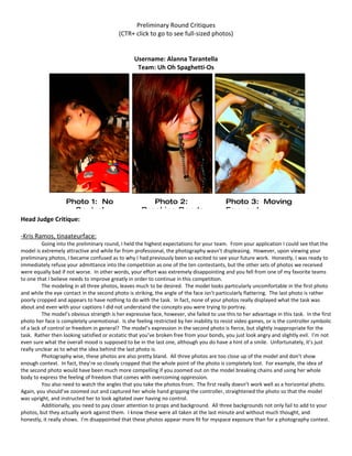
  • 1. Preliminary Round Critiques (CTR+ click to go to see full-sized photos) Username: Alanna Tarantella Team: Uh Oh Spaghetti-Os Photo 1: No Photo 2: Photo 3: Moving Control Breaking Bonds Forward Head Judge Critique: -Kris Ramos, tinaateurface: Going into the preliminary round, I held the highest expectations for your team. From your application I could see that the model is extremely attractive and while far from professional, the photography wasn’t displeasing. However, upon viewing your preliminary photos, I became confused as to why I had previously been so excited to see your future work. Honestly, I was ready to immediately refuse your admittance into the competition as one of the ten contestants, but the other sets of photos we received were equally bad if not worse. In other words, your effort was extremely disappointing and you fell from one of my favorite teams to one that I believe needs to improve greatly in order to continue in this competition. The modeling in all three photos, leaves much to be desired. The model looks particularly uncomfortable in the first photo and while the eye contact in the second photo is striking, the angle of the face isn’t particularly flattering. The last photo is rather poorly cropped and appears to have nothing to do with the task. In fact, none of your photos really displayed what the task was about and even with your captions I did not understand the concepts you were trying to portray. The model’s obvious strength is her expressive face, however, she failed to use this to her advantage in this task. In the first photo her face is completely unemotional. Is she feeling restricted by her inability to resist video games, or is the controller symbolic of a lack of control or freedom in general? The model’s expression in the second photo is fierce, but slightly inappropriate for the task. Rather then looking satisfied or ecstatic that you’ve broken free from your bonds, you just look angry and slightly evil. I’m not even sure what the overall mood is supposed to be in the last one, although you do have a hint of a smile. Unfortunately, it’s just really unclear as to what the idea behind the last photo is. Photography wise, these photos are also pretty bland. All three photos are too close up of the model and don’t show enough context. In fact, they’re so closely cropped that the whole point of the photo is completely lost. For example, the idea of the second photo would have been much more compelling if you zoomed out on the model breaking chains and using her whole body to express the feeling of freedom that comes with overcoming oppression. You also need to watch the angles that you take the photos from. The first really doesn’t work well as a horizontal photo. Again, you should’ve zoomed out and captured her whole hand gripping the controller, straightened the photo so that the model was upright, and instructed her to look agitated over having no control. Additionally, you need to pay closer attention to props and background. All three backgrounds not only fail to add to your photos, but they actually work against them. I know these were all taken at the last minute and without much thought, and honestly, it really shows. I’m disappointed that these photos appear more fit for myspace exposure than for a photography contest.
  • 2. Photography Critiques: -Sandy, Tragidy: These photos look very MySpacey to me, which makes me sad since the model is gorgeous. I don’t like your choice to focus on the controller and not the model in the first picture. The remaining two photos were a bit blurry, so try to fix that next time. -Daniel, Pheregames: Unavailable for this week -Kaitlyn, Tyrian Purplexx: I wasn’t sure if I was still just starstruck from Mooncat’s body of work if I really am just a huge b***h regarding this competition, but I was highly disappointed in what this team had to offer us this week. The first two look like the model took them on her own: they’re a very stereotypical “Facebook photo” type of shot. The second looks like a lazy attempt to redeem the first two, but all three fail to portray the theme for me. If the model was deleted from the first photo it would be a very strikingly composed photo of that controller, but the slightly blurry, poorly placed model fills of the frame too busily. The lighting of the second photo is too harsh and its almost too difficult to discern the “Chain” against the dark red of the model’s hair. I like the final photo the best of the three, but it took me forever to figure out where the model was emerging from (its the trunk of a car...for anyone who couldn't tell). The lighting is harsh again, and the halo around the model’s head makes lines hard to discern. The natural lighting was too late in the day for this photo and resulted in right eye of the model’s right eye (which should have been deleted before the photo was entered). All around a bit of a disappointment, I was hoping for better from this team. -Nick Sullivan, rpgcubed: Your photos are pretty good, but I have quite a few compositional issues with them. The use of negative space is underwhelming at best and by expanding the frame of the photos you could easily have fixed this. While each photo does seem to express your view of freedom, there are some things you could have done to better show the symbolism. In my opinion, the first photo is the best of the three. The lighting, while slightly lopsided and showing too much contrast, adds to the symbolism of freedom. My only recommendation is that you expand the frame of the photo on the left. As it currently stands, the fishbowl appears crowded and is not the center of focus of the image. Other than that, this photo is definitely one of the best out of any submitted. Your second photo really takes a step away from traditional modeling photography. The relaxed and soft style of the photo accentuates the feeling of the photo being comfortable and free, while not detracting too much from the overall image. As in the first photo, I would advise that you rotate and pan the frame to the left, encompassing the couch and model entirely in the white wall, which would wonderfully withhold the worrying welt of waste in the corner. The third photo has a number of issues with it, namely the angle of the shot and the background. I like the idea, but the complicated background takes away from her appearance of freedom of expression. If the door, wall, step, and garden were slightly less interesting themselves, she would be much more the focal point of the picture. The angle both foreshortens her entire body, making her appear slightly worse than she would otherwise, and completely does away with her neck, ringing her head in a wreath of hair, and so making it far too completely the sole focus of the shot. Other than these things, the photo is rather good, and effectively portrays freedom of expression. -Demi, DemiTHEchipmunk: Unavailable for this week Modeling Critiques: -Cassandra, Anriazna: Honestly I do have to say that I was disappointed with these images after what they submitted for their application; they really paled in comparison. The Nintendo picture and the chain picture looked like a typical MySpace or Facebook profile picture and looked about the quality as if she took them herself (ignoring the fact you can see both of her hands in the Nintendo picture). In the Nintendo image her face appeared to have no real emotion and was not posed properly at all - it just didn’t look good. The chain picture was cute in a sense and she did show !2a decent amount of emotion but it needs work to be able to cut it. Perhaps they should take something like it and turn it into a full body or half body shot. They should work on more than just head shots as that’s just not enough to judge for modeling all the time. Their car image was okay but looked more like a thrown-together ad for a Honda instead of a well planned out image. As I said before there should be a bit more of the model in the image instead of just her head, shoulders and part of one arm. The emotion is there but it is hard to place what it is as the picture just doesn’t seem to flow. I
  • 3. would say that this team’s strong point is that the model does have a very photogenic face but they need to work on using it better - try to show more emotion and practice posing a bit differently. Experiment with some different types of shots instead of only head shots and just keep looking for ways to improve. Unfortunately I couldn’t really find too much of the theme the contest called for in this set of pictures but I can see what they were trying to do. -River, Osahar: Unavailable for this week -Shawn Keeney, Opaque Transparency: I loved the application photos, but these a kind of a disappointment for me. What I'm getting is that the pictures kind of show a process of freedom, but if it weren't for the captions, I would have no clue that was the intent. Photo 3 is my favorite, probably because it takes me back to the application photos where the model was smiling. I like her angry look too, from Photo 2, and that one sort of gives of a "freedom" message, but it's not too clear. -Momo, -Ninja Cat Momo-: The first picture here is a decent picture, however the model's face is a bit awkward... blank, you could say. There's not much there, maybe a hint of defiance, but I don't know why that would be there. She looks almost uncomfortable, and this is accentuated by her strange pose. You can see her neck lifted slightly off the floor, and the strain is reflected in her face. I do like that her hair is over her shoulders and not covering her neck (this makes me really happy, actually) and how just a bit of her right hand is peeking in at the bottom of the frame. The left hand is a little... just floating there, but if you happen to see the cord in the picture it makes sense. This second picture was the make-it-or-break-it point for me. I really, really loved this... it's probably my favorite for this prompt. Her face is stunning, screaming defiance, and the chain in her mouth really shows me freedom. It's as if she's daring us to break our chains, too. Fierce, ferocious and powerful are the first three words that come to mind. The green in her eye contrasts greatly with all the red and really stands out; the missing red eye really adds to the power in just her left. The cropping on the photo is nice, you don't get any odd stumps, her hair acts as a natural frame. I also like the little flash of teeth in this picture. This is honestly the one that brought the score up for this set. This is my least favorite in this set. The right elbow and hand are hidden, either out of frame or out of sight. But what gets me the most in this is the strange color. The model looks happy under the hood, but the light adds an orange glow which does not blend well with the red hair. There are way too many warm colors in this. The light has given her eyes a very strange color and patches of her skin are a sickly yellow. -Jordan-Elizabeth, KRYST4L M3TH: Unavailable for this week
  • 4. Username: Amos Van Alen Team: The Lost Girls Photo 1: The Freedom to Live Photo 3: The Freedom of Your Own Life Expression Photo 2: The Freedom of Comfort Head Judge Critique: -Kris Ramos, tinaateurface: These were by far some of the best we received of the bunch, unfortunately this is no reason to feel instantly elated. While you did create some of my favorite photos this week, they were also not nearly up to your potential. In general, I absolutely adored all of your concepts. They were unique, clever, and it was so obvious in every photo how they represented freedom that captions weren’t even necessary to get your point across. That being said, there are still many technical flaws in your photos. My main problem with your photos this week was the photography; specifically the horrendous cropping. Every photo is cropped in a way that is very distracting to the viewer’s eye because of awkwardly cut off limbs. The first photo would look much more dynamic if you zoomed out and showed more of the lovely background. In the third, the angle makes the model look larger than she is and puts too much emphasis on her face. Again, zoom out: this competition is not strictly for modeling, the goal is to create a great photograph and the focus should not be completely on the model. The background in your second photo is very
  • 5. distracting. It would have been much more professional looking if you had centered the couch against a white wall, left a lot of negative space (the wall) above it, and captured the whole body without cutting off the leg. The modeling, on the other hand, is actually quite good. Although somewhat plain, the posing is strong and mostly fits the mood of your photos. When it comes to posing, my favorite photo was the second. You look comfortable, relaxed, and incredible free. Although your arms look slightly awkward, you did a good job of positioning yourself while lying down. With the bad cropping your right leg looks a bit deformed, but I’m guessing that if the photo was zoomed out, the positioning of both your legs would be very nice. Unfortunately, however, the second photo is the only one in which you look like an actual model. Your back is awkwardly hunched in the first photo and your entire body looks constricted. Considering the task was to depict freedom, I would have liked your body language in this photo to be more relaxed. Additionally, your face and body should be angled toward the camera. The photograph would be so much better if we could see more of your beautiful face. In the third photo, your face is too close to the camera and, again, your body is too rigid to express freedom. The pose is also very ordinary; I would like to see more variety from you. Overall, your creativity is off the charts and your execution isn’t bad either. All of your photos were eye catching and kept me interested. If you continue on this path, you should do well in this competition. Just watch your cropping and angles and try to create a greater photograph rather than a simple photo of a model. Photography Critiques: -Sandy, Tragidy: So, I think I am in love with these girls. In terms of composition, these photos are gorgeous. When I first looked at these pictures, I thought "Freedom of Comfort" was a little ehh but it grew on me and I'm starting to think "Freedom to live your own life" is my least favorite. The lighting on the model and fish bowl is lovely, but the way the grass looks sort of burns my eyes. -Daniel, Pheregames: Unavailable for this week -Kaitlyn, Tyrian Purplexx: MUCH better compositionally speaking, the photographer here clearly took into account the time of day and the setting for each of their photos. The theme is very clearly and uniquely expressed in each of them, and I was really charmed by the way they chose to interpret each of their captions, particularly the first two. The first photo is very well lit, and as someone who usually takes photos outdoors I know this is hard. Had the sun been an inch higher or lower that fish bowl would have caught a terrible glare and we wouldn’t have been able to see the fish at all. The chosen color palette of the photo is cool colors, which combined with warm lighting makes everything pop. Very smart decision on the part of the photographer. The second is also extremely well-lit and appears to use natural lighting once again. Weither its actually natural or not isn’t important, simply the fact that it looks that way emphasizes their caption “the freedom of comfort.” The colors are a little busy, but I like it. It reminds me of how no one’s pajamas ever match. The focus of this photo is on the foreground, softening the background so that the busy palette doesn’t ruin the photo. Nicely done! The final photo, photographically speaking, is the least impressive of the bunch. Very safe. Very nice, but probably a cop out on an original interpretation of the theme. -Nick Sullivan, rpgcubed: Your photos are pretty good, but I have quite a few compositional issues with them. The use of negative space is underwhelming at best and by expanding the frame of the photos you could easily have fixed this. While each photo does seem to express your view of freedom, there are some things you could have done to better show the symbolism. In my opinion, the first photo is the best of the three. The lighting, while slightly lopsided and showing too much contrast, adds to the symbolism of freedom. My only recommendation is that you expand the frame of the photo on the left. As it currently stands, the fishbowl appears crowded and is not the center of focus of the image. Other than that, this photo is definitely one of the best out of any submitted. Your second photo really takes a step away from traditional modeling photography. The relaxed and soft style of the photo accentuates the feeling of the photo being comfortable and free, while not detracting too much from the overall image. As in the first photo, I would advise that you rotate and pan the frame to the left, encompassing the couch and model entirely in the white wall, which would wonderfully withhold the worrying welt of waste in the corner. The third photo has a number of issues with it, namely the angle of the shot and the background. I like the idea, but the complicated background takes away from her appearance of freedom of expression. If the door, wall, step, and garden were slightly less interesting themselves, she would be much more the focal point of the picture. The angle both foreshortens her entire body,
  • 6. making her appear slightly worse than she would otherwise, and completely does away with her neck, ringing her head in a wreath of hair, and so making it far too completely the sole focus of the shot. Other than these things, the photo is rather good, and effectively portrays freedom of expression. -Demi, DemiTHEchipmunk: Unavailable for this week. Modeling Critiques: -Cassandra, Anriazna: This team did a marvelous job all around. The fish picture was very nicely posed and the model’s face looks tranquil which adds to the theme of the image. The only bit I can find to criticize is that I feel her right arm should have been a little lower so it didn’t make a straight line with her chin. The outfitting also goes along well with the picture and helps to give you that peaceful feeling. Their relaxing image is another great picture both pose-wise and emotion-wise. The way her arms are spread and her legs are positioned go well with her face which expresses severe contentment and relaxation. The wardrobe and the choice to wave her bra in the air also help play with the picture giving it more a feeling of just chilling out at the house. I would have liked to be able to see either a full-body shot or have the image cut off just passed her left foot but it is still an amazing picture. Their final picture was also a good picture but there are a few things that I find wrong. The picture would have been a little better had the model turned her face a little to the right to show off the makeup a little better. Another thing is that because she was locking her left knee it makes her leg appear to be bent in the wrong direction which makes it seem rather awkward. I also would have liked to see a little more emotion in the image than there was but there is still some emotion present. All in all I feel like this is a really great team; the model is very good at proper posing etiquette as well as showing emotion and their wardrobe is spot- on. They mainly just need to work on making sure that every image is the best it can be and just try to show off a hint more emotion in all their images. Perfection is key. They were wonderful at capturing the theme for this round - every picture just screamed freedom. -River, Osahar: Unavailable for this week -Shawn Keeney, Opaque Transparency: I am LOVING all three of their photos. I love that each picture is shows a totally different interpretation of freedom. My favorite is Photo 2, because I'm sure not wearing a bra is quite freeing for many women, and I can really feel the model's joy and relief when I look at the picture. Photos 1 and 3 are great too, Photo 1 especially. -Momo, -Ninja Cat Momo-: I really like the creativity behind their pictures. For the modeling, in the first picture; I think it's a really wonderful pose. My only slight complaint would be that her arm is right next to her face and not shadowed, so it kind of blends in a little bit. Other than that, though, she's in a nice spot and easy to focus on, you can see both of her legs and though you can't see her neck, it's not a strange warped look. For the second picture; I really wish they had at least caught her foot in it, it looks like her leg is strangely elongated. However, you really don't notice much past her wonderfully happy face. She looks overjoyed, you can't help but smile a bit with her. Her pose is very natural but flattering, though the shirt is a bit scrunched by the neck for my liking. For the third picture, I'm not a huge fan of her modeling at all. Her left foot (our right) is cut off and both of her feet are strangely small due to the angle of the camera. Her head is just floating there, her hair covering all of her neck, and her right leg (our left) looks like a nub due to the black boot blending into the shadows. Her fingers, on her hips, look chopped because they seem to be squeezing. Her right arm (our left) is elongated and looks unnatural. All in all, though, not bad, and I'd like to see more from them. -Jordan-Elizabeth, KRYST4L M3TH: Unavailable for this week
  • 7. Username: beagleteer Team: 1867 Photo 1: After a long day in the real world, it feels good to let go Photo 2: Moving Forward Photo 3: Though confident from Photo 2: With Tim Horton’s the day she was born, she has in hand and the woods in my backyard, Canada is what Head Judge Critique: -Kris Ramos, tinaateurface: I gave you permission to put two photos together for this challenge only and judging by these photos, I’m especially glad that I have forbidden this for the future. I understand your intent with the before and after effect of taking off your façade, but I think your execution was pretty awful. The two photos are unnecessary as you could have gotten the same concept across by trailing your outer clothing along the floor and posing in your real skin (style of clothing in this case). Additionally, the photo is too dark and it’s difficult to see your face. It’s also hard to see details because both photos are so small thanks to putting two of them together and although I understand that the background is suppose to express the quirky real you, it ends up being too distracting and taking away from the impact of the photo. They simply aren’t striking. Your second photo is also an example of completely unnecessary photo fusing. It’s obvious you couldn’t choose between the two photos and so decided to turn in both. Having such small photos really diminishes the quality and it’s always a problem when the model’s face isn’t really visible. Facial expression is crucial when it comes to successfully showing certain things like freedom. The first Canadian photo is by far better photography, but the model fails to bring emotion to the photo. The squatting is also awkward and I’m not really sure why you’re holding a cup. There also appears to be some awkward animal behind the model. The second Canadian photo, while not having great composition, is a better when it comes to expression. Your body language has a hint of freedom and although I can’t see it that well, I see a hint of a serene face. I wish you had turned in this photo alone and larger. I really loved the concept of your last photo, but, unfortunately, your execution leaves much to be desired. The couch is awkward, the picture frame distracting along with the lamp shadow, and I’m surprised you couldn’t come up with a better background. It says nothing about your topic and looks very confusing and cluttered. I also don’t really understand the mood that you were trying to portray in this photograph. Rather than looking liberated, the model actually looks a bit wistful or reminiscent of the past. All in all, I feel as I can’t correctly judge these photos because of their size. They’ve lost their impact, clarity, and intrigue. Your team does, however, have interesting and creative ideas that, once you figure out how to successfully execute them, will turn out some amazing photographs.
  • 8. Photography Critiques: -Sandy, Tragidy: I’m disappointed that you chose to not have more light in the first photo due to the fact that you had so many beautiful colors. The second and third ones were a little better, but lighting is still the biggest issue. However, the third photo intrigued me and I wanted to know the meaning behind it. -Daniel, Pheregames: Unavailable for this week -Kaitlyn, Tyrian Purplexx: The first photo would have been so SO amazing had it been lit properly and I was a little upset to see it come out so dark. The vibrant colors of the backdrop, clothing, and hair of the model were all lost in the shadow. The second photo had the same problem, but not as heartily as the first. The shadows of the trees simply cut across the model and washed out the vibrant color palette. I liked the third photo best, since it was the most visually appealing. It was balance (blank left and right thirds with the model in the middle third). It was the hardest to connect to the theme, but the colors were really interesting. Even though I’m not a modeling judge, I remain really enchanted with this team’s model. She photographs so well! -Nick Sullivan, rpgcubed: Not only are your photos not that great, you violate our eyes even more by forcing upon us almost double the number of photos. This is definitely one of the worst flaws of this set. On the other hand, if the photos themselves were any good, this could be disregarded. Composition-wise, the photos all seem rather bland. Additionally, the ideas behind them, while relatively obvious, do not seem to have anything to do with the theme of freedom. The first photo at least slightly corresponds, but even that is a stretch. Unless your photos become many many times better than any that currently exist on this planet, please, for the sake of us all, stop linking photos together. -Demi, DemiTHEchipmunk: Unavailable for this week Modeling Critiques: -Cassandra, Anriazna: The main problem I have with this team is that they bent the rules; the assignment was to submit only three images and they submitted five as putting two side-by-side does not count as one image. Ignoring this I found the modeling to be mediocre. In their first set of images there is a good amount more emotion expressed in the first picture than the second but the posing in the second is much better than the first. All-in-all the pictures were not lighted properly making it hard to really see what’s going on. Their second set of images I find hard to see good things in. In the picture on top the model looks very bored and unemotional, almost as if she doesn’t know that someone is taking her picture. With how the shadows from the tree are falling on her arm it makes her arm appear to be distorted and her hand awkwardly sized. Her feet are also way too squished. Out of all five images their last one would be the best for modeling and staging. The positioning of her arms is practically perfect and you can feel a sense of contemplation in her face which helps to give the picture more life. I do believe the outfitting should have been different however as it makes the bottom of the image look really bulky. I thought that this team did an alright job with capturing the theme that was assigned. What the model has done the best would be with showing emotion but she will need to work on making it more clearly defined and to be sure to express it in each of her photos. What I would recommend her to improve on is making sure she holds a pose and to learn which poses are best for her; everyone has a “good side” and everyone has certain poses that are best for their person. -River, Osahar: Unavailable for this week -Shawn Keeney, Opaque Transparency: This team was another of my favorites from the applications because the model was so unique, but I'm not blown away by them either this time. I like Photo 2 because I get a sense of freedom from it, but I get nothing of that from Photos 1 and 3. Photo 3 might work as a transformation picture from then to now, and Photo 1 just looks like a Facebook or MySpace picture that she could have taken herself (I should also mention I'm not a huge fan of bathroom pictures, unless that relates to the picture's theme). I'm still kind of rooting for them though.
  • 9. -Momo, -Ninja Cat Momo-: Two photos next to each other really made this a hard set to judge, as in each picture with two, one was by far better than the other in modeling-terms. I'm completely on the fence about this one. In the first picture, the second picture is much better than the first. You can see a hint of a smile on the model's face, you get her wonderful silhouette and she's framed nicely. In the first half, the glasses are meshing into her head and she looks a tad dazed or confused, and her arm is cut out of the photo. In the second photo, the first picture is much better than the second in terms of modeling. You have a powerful squat (hehe, that sounds funny, but it's true) and a "don't mess with me face". Freedom can mean being in charge, having your way, and the model looks like she's going to get her way. She's yanking on the flag, which gives kind of a cool look to the photo... I'm not sure how to explain it, but I like it. The second part of this picture, however, is... meh. She's covering up her body with the flag, her right arm is cut out of the picture from the flag and her left hand isn't in the best position. Also, she's focusing more outside of the frame, which gives you the impression she's distracted and doesn't seem to care too much about the flag. I don't really see freedom so much as sadness in the third picture. If not sadness, I see a wistful type of look. The posing is wonderful, clutching the laptop with the picture on it really gives a sense of comfort to the model, or perhaps it holds a memory. You can see the focus is outside the frame, which just adds to the wistfulness-- it gives the impression she's not here, she's thinking about something else. I like the wall behind her being white, but I feel the picture should have been removed from the wall to kind of isolate her more. It meshes into her head funnily. -Jordan-Elizabeth, KRYST4L M3TH: Unavailable for this week Username: cjaoov
  • 10. Team: Tegan and Sierra Photo 1: Paying on Photo 2: Take away credit is like gambling my gun and you take Photo 3: The new Lady Liberty. Head Judge Critique: -Kris Ramos, tinaateurface: I have to say that I was unimpressed by the photos you submitted for the preliminary round. They’re bland as photographs and unflattering of the model. In fact, I don’t have much to say, other than, I simply don’t like them. The lighting on all three photos is quite poor and strongly takes away from the impact of the photo. The model’s expression doesn’t express freedom whatsoever; rather, she appears bored if not dead. Additionally, every single one of your photos looks like it was taken on a whim, as if the situation was merely two friends with a camera, snapping photos of a good time. To get into specifics, you should notice some simple things: the cropping of the leg in photo two, the use of flash in photo three (flash pretty much always looks bad), and the poor angle of photo 3. The photographer needs to work on creating a dynamic photograph that is visually appealing. The model needs to work on expressing emotion and conveying meaning. You may notice that my critique for you team is substantially shorter than what I’ve written for most of the others. This is simply because there isn’t much to say. It’s hard to critique a photo that doesn’t even look like it belongs in a photo competition. I’d like you to read over some critiques for other groups, to get a sense of what you need to change to make your photos look more professional.
  • 11. Photography Critiques: -Sandy, Tragidy: Unavailable for this week -Daniel, Pheregames: Unavailable for this week -Kaitlyn, Tyrian Purplexx: I thoughts these photos had to be explained with their captions, which we explicitly stated was not to be necessary. However, along with their explanations, these photos are quite clever interpretations of the theme, I was impressed by their take. I wasn’t too impressed by the composition, particularly of the first and third. In those two photos the light is too harsh and washes out the subject. In the first it creates an overall red hue to everything, which I’m sure was not the intent. In the final photo it makes the colors clash and an overall unappealing look, though the angle is interesting and makes the model appear higher than she is. The second photo of the best of the lot. The colors are interesting, but do not class and the fence draws the eye to the model and her pointed gun. I hope to see better from these two in the future -Nick Sullivan, rpgcubed: Rule 1: Flash is never a good idea. When in doubt, wait for better light. Seriously. No matter what. I cannot stress this enough. Also, the random tilts make your photo look like you took it in 10 seconds. Don’t intentionally make it look like you have no sense of balance... Your ideas could be worse, but they’re definitely nowhere near good. If your photo doesn’t stand without a caption, it won’t stand with one. None of your photos inherently express the idea of freedom. The first and last are better than the second photo, but even they are either overly blunt and bland (first) or could be easily misinterpreted (second). I’m actually rather disappointed with all of your photos, but I’m hoping you can pull something together in the future. -Demi, DemiTHEchipmunk: Unavailable for this week Modeling Critiques: -Cassandra, Anriazna: I felt that this team didn’t do all that well. The model still has to work on proper posing etiquette as well as showing emotion in her face instead of just looking like she’s posing for a picture. The feel of their gambling picture is cute but I feel as though her hands should have been poised differently. In this image the model is showing the most emotion out of three but it is still hard to decipher what it is that she’s expressing as it isn’t all that strong. In their gun picture the model is doing a better job with how she holds herself but it would be better if she was standing a bit straighter and if her legs were positioned differently. While the outfit is cute I can’t help but feel like the color choice for the sash was wrong - it appears to disappear into the shed. For the most part the patriotic picture is the best pose-wise. I would say though that her head shouldn’t be so profiled as it makes her head seem to be cutting into the sky with how much of a side shot it is and it just looks wrong. This team did a decent job at fitting the theme all around. I would recommend them to keep working on better posing and definitely to work on expressing emotion in all of their images. -River, Osahar: Unavailable for this week -Shawn Keeney, Opaque Transparency: I don't like Photo 1, because if it weren't for the captions, I wouldn't have even noticed the credit card, let alone known that the picture was supposed to be about freedom. However, I like Photo 2; I'm digging the whole pro-right-to-bear-arms and get-off- my-property-or-I'll-shoot-you vibes the model gives off. Photo 3 is a bit campy, but I get the idea. I really like that this team has a sense of humor that is visible in their pictures. Should make the competition veeery interesting. -Momo, -Ninja Cat Momo-: The modeling in the first picture doesn't convince me of much, let alone freedom. I see handcuffs... the opposite of freedom? That confuses me. I also don't understand the credit cards or cards. I associate these with gambling or excessive spending which is seen to be more of a shackle than a freedom as it can be an addiction. The model's face is very blank, just staring at you, and the angle makes the neck seem off. I don't like this picture very much.
  • 12. I like this picture better than the first, but I feel it's not much better as far as modeling goes. The right foot is cut out of frame, creating a long-leg illusion or a nub illusion. Her left leg and foot are hidden by the dress and right leg, causing them to look slightly deformed as well. The neck is almost non-existent from the harsh turning of the head. The left arm is hidden almost completely behind the gun. However, the bow on the dress gives a nice silhouette to the body and the facial expression is better than the last picture. This picture is by far the best in modeling. You get a clear, brave stance from the model, and you can see her wonderful elongated neck and jawline. The only flaw in the modeling would be her right hand on her hip is slightly deformed due to the fingers curling behind in rather than in front. The outstretched arm is a nice touch. I feel though that this would have been better executed in the daytime. The blue of her shirt adds an odd feeling to the blue of the night sky. -Jordan-Elizabeth, KRYST4L M3TH: Unavailable for this week
  • 13. Username: Dread Pirate Sam Team: The Cougar's Beret Photo 1: Even though your wings are made of paper, let them carry Photo 3: Expression. The truest Photo 2: Only in your dreams form of freedom. are you free. Head Judge Critique: -Kris Ramos, tinaateurface: If there is one thing you’ve got going for you, it’s the extreme amounts of effort you have obviously put into creating your photos. Right off the bat, I was impressed by the work you put into drawing the wings for the first photo. Not only is it a creative idea, but the wings must’ve taken a very long time to draw. That being said, your effort is pretty much the only good thing you have going for you. For me the biggest problem with your photos was the poor quality. The lighting is terrible in all of them and your third photo even looks like it may have been taken with a camera phone. On top of that, it appears as if you’ve tried to disguise the poor quality with distracting photo-shopping. The sepia tone of the first photo is completely unnecessary and I have no idea what the point of the spotlight effect is. It’s important that you only use photo-shop to enhance and not to take away. As with many other contestants, you seem to have a slight problem with composition. The cropping of the model’s head in the first photo is quite distracting and all of your photos are zoomed in too tight. As I said to other contestants, this contest is not simply one for models; it’s just as much about photography. When I view these photos, it’s difficult to gauge the model’s talent. These photos simply don’t allow for her potential. Part of her head is cut off in photo one, she’s merely sleeping in photo two, and while somewhat expressive, the smile on her face in photo three looks quite forced and awkward. Not to mention that the third photo is quite unflattering in general. None of the photos seem to express freedom to me either in mood or the model’s body language or expression. I’d also like to mention your poor wardrobe choice. What made you feel it necessary to wear only a bra in your first photo? Not only that, but it’s a white bra, one that stands out substantially as opposed to a nude bra. Preferably you should just be wearing more clothes in general as this is still Gaia and the internet. Your lack of clothing is actually something of a worry for me. Not to say you’re unattractive, quite the opposite, but there’s no need for you to be so naked. Both your application photo and your preliminary photo showed some nudity that was completely unnecessary. Cut back on the exposure and look for an outfit that will best compliment your theme. Additionally, I’d like to see you pay more attention to your backgrounds. All three of your photos would have been better in an outdoor setting where freedom would have been well-expressed. Sometimes it’s the simple things that can greatly improve your photos.
  • 14. Photography Critiques: -Sandy, Tragidy: I loved the concept of the first photo, but that is probably all the positive feedback I have for this duo. I think they might be one of the weakest groups. Technically speaking, the photos lacked careful attention to detail. -Daniel, Pheregames: Unavailable for this week -Kaitlyn, Tyrian Purplexx: Unavailable for this week -Nick Sullivan, rpgcubed: The main thing you’ve got going for you is your penchant for hard work. Seriously, I’m curious, how long did it take you to draw those wings? Your composition is also less than horrible, and your photos actually convey emotion, unlike those of many of your fellow teams. I was kind of disappointed by the low quality of the images, and the lack of focus and use of photoshop filters, but overall your photos are still better and more expressive than most. I look forward to seeing what you’ll produce later in the competition, and hope that you learn that photoshop is not always the way. -Demi, DemiTHEchipmunk: Unavailable for this week Modeling Critiques: -Cassandra, Anriazna: I found this team to be rather mediocre overall but would be one of the better ones. The wing image is alright all around; the model’s pose is lovely but I believe it would have been better if the image wasn’t cropped right at the eyebrows - it either should have been higher or cropped below the eyes. I can see a small amount of emotion in her face but with how subtle it is it is hard to tell whether she is expressing a mood or is just staring off. The sleeping image is very convincing - her pose and face make her appear to be fast asleep which is perfect for the theme. Their painting scene is cute and I feel is the best out of the three - her left hand looks perfectly poised. However her right hand and paint brush should have been still - since she was moving it just makes it appear to be a blurry image instead of a moving image. I am having difficulty in finding the right amount of emotion in this picture however; I can see that she is trying but I don’t feel as though it’s enough and her eye appears to be a bit glazed over as if she is intensely starring off into space. This group I found did a good job at capturing the theme so that is a plus. I would say that the strengths of the model is that she is good at holding herself and is fairly good at posing. She does however need to work on expressing more emotion and to not let any posing errors slip in. -River, Osahar: Unavailable for this week -Shawn Keeney, Opaque Transparency: I wasn't a big fan during the application stage, and these photos aren't wowing me either. But, I think Photo 3 is the best photo I've seen of the model. I feel like that picture shows who she really is, kind of artsy and cool. I've said before that I detest sleeping pictures, hence I don't care for Photo 2, but Photo 1 is okay too. Again, the caption does most of the work as far as getting the point across, but not too shabby. I'd like to see a lot of improvement in the pictures to come. -Momo, -Ninja Cat Momo-: I'm not a huge fan of this picture. The concept is wonderful, but I feel it could have been executed a little better. My biggest pet peeve here is that the model's head is cut off at the forehead, as if the photographer couldn't decide whether or not to put the eyes in the picture. I don't mind cut heads, but I feel if you are going to include the eyes, include the rest of the head. It just looks strange when the model doesn't have the top of her head. The modeling is OK, I like the outstretched arm, but I feel the shawl is ruining the silhouette of the model. I feel as if they couldn't decide whether to go modest or edgy, so they tried something in between, and I honestly feel the shawl shouldn't be there at all since they decided to go with no shirt. I feel to use that, you need something under it to make a distinction between the wall, body, and shawl. The shawl does have a nice, ethereal shimmer to it, but I feel it could have been put to more use perhaps around the waist or not at all. There's not too much for me to judge in the second picture, though I do sense more of an innocent theme rather than freedom-- but the dream/sleeping part is completely visible. The model has taken on a very classic, easily-recognizable child's pose--
  • 15. curled into a little ball, almost sucking the thumb. Her head is nestled into the covers and she looks very comfy, and sleeping isn't about beauty, so I'm not worried about elegance or grace here. It looks natural, though it's nothing overly impressive. Another OK picture. This is probably my favorite picture because of all the bright colors, but I have a few critiques for the model. I talked earlier about watching camis, and once again you get the strange bulges around the armpit area, even though this is a thin model. Once again, I'll say, be careful with camis, no matter how you're built, they're often unflattering. The bunny ear covering the shoulder isn't too bad, as you can still see part of the arm and the hand coming up. It's not completely shut out of the picture. There is a lot going on around her eyes, though, which bothers me a tad. Her left eye almost seems non-existent due to the shadows from the glasses and her hair. I like the glasses, but I feel the hair should have been farther out of the face because it adds too much business around the eyes. -Jordan-Elizabeth, KRYST4L M3TH: Unavailable for this week
  • 16. Username: melissyRAWR Team: Sissy Q Photo 1: What was that? Photo 2: I'm on top of the What's up there? world! What's going on down there? Photo 3: Oh my gosh, am I getting larger? Head Judge Critique: -Kris Ramos, tinaateurface: I’ve got to say, I really don’t comprehend your concept. I get that you’re portraying something of Alice in Wonderland, but I don’t understand why. What does this have to do with freedom? I’d say that your captions simply don’t provide explanation, but your photos are supposed to be able to stand on their own anyway, so this isn’t an adequate excuse and even so, your captions make the photos more confusing rather than providing any sensible explanation. Getting the point across and coming up with a set of photos that is creative and interesting but still follows the task, is of the utmost importance. Even if your photos are amazing, you’ll still get downgraded simply because your concept doesn’t really make sense. Unfortunately the composition and quality of your photos is not enough to make up for your extremely unclear concept. The most glaring aspect of your photos is the over-use of photoshop. The contrast is so high it’s almost nauseating and if you didn’t boost the saturation, you most definitely should have lowered it; bright orange is not a good color for skin and splotchy isn’t the greatest texture. All in all, these photos don’t make the model look very attractive, which is sad considering she’s obviously quite pretty. The first photo looks completely random and taken for no apparent reason. How does the express freedom at all? The second photo is my favorite by far, but this doesn’t say much since it’s not even a good photo. Unlike the others however, this photo looks like it’s at least attempting to reach a higher level of art and I can see the concept of freedom, or rather lack of freedom in the photo. The third photo has awkward written all over it. The model’s body positioning is very uncomfortable and her face has a sort of “dead-fish” look to it. You look confused and I’ve got to admit, I’m confused too, as to why there is a guitar in the photo. I don’t understand the idea behind this photo at all. Like the first one, it looks like a completely random shot. While I don’t think you’re at the top of the bunch right now, I think you have to potential to be something better. The model is pretty and although your photos are all too closely cropped, except perhaps the second, your composition isn’t horrid. I’d like to see you guys work on more concrete concepts and tone down your photoshopping.
  • 17. Photography Critiques: -Sandy, Tragidy: Unavailable for this week -Daniel, Pheregames: Unavailable for this week -Kaitlyn, Tyrian Purplexx: All of these photos scream Confinement to me. Their composition is very tight, very dark, and very heavy in the first two, but it seems to work to make a much more pleasing photo in the final photograph. The final photo is actually my favorite because the flaws of the first two work to make it a much more pleasing photo. The harsh lighting sinks into the walls rather than into the models face, making her stand out as the focal point. The use of shadow helps draw the eye to the open door behind her, but doesn’t take away from her expression. I approve of this photo as a stand-alone, but still contend that it doesn’t follow the theme… actually it may be the worst theme wise. The walls are tight, the model’s arms are braced up, making them look even tighter. Over all, this isn’t the best set of photos, but it’s not a bad one. My biggest issue with this team in the prelim task was that their interpretation of the theme didn’t show in their photos. -Nick Sullivan, rpgcubed: Your idea is kind of a stretch. I understand that imagination exemplifies freedom, but your photos definitely don’t express imagination. In addition to the entire photo being rather bland, the background in the first photo should have a lot less random sparkles in it. Your second photo is the best of the three, but its caption doesn’t seem to me to fit the image. Maybe something more about lack of physical freedom but freedom in the imagination of what is happening outside? Not certain that that made any sense, but I think you probably get what I mean. Your third photo is rather random, and doesn’t fit your idea or caption. To make someone look larger, don’t you typically photograph them from the bottom up? The image is kind of boring, and I really wonder what made you turn it in for a freedom prompt. -Demi, DemiTHEchipmunk: I am unsure about this group’s photography. I mean, they have good ideas but the execution is lacking. Like the first photo had a good idea of the freedom of wonder but I find myself drawn to the brick wall more so than the model. They heavily photoshopped the lighting and it kind of took away from the quality of the photo and made the model look rough. They did work with somewhat of a theme within the task but I don’t really see freedom, I see more entrapment. Unless you count the freedom of wonder but that is all I got. Modeling Critiques: -Cassandra, Anriazna: This team honestly didn’t impress me much this round. Out of all three images the only one that I thought really turned out right was the one where the model was wondering what was going on upstairs. Her posing in this image was good and you can tell that she is curious which goes with the theme of the picture. I know it’s not what I am to be critiquing but I did find that since there were lighting issues it really detracted from the picture. In the image that is just her face the model really looks bored more than anything and that just makes it look like a normal everyday photo instead of a modeling shot. It also appears as though she is slouching in this picture. Their last image where the room is getting smaller is okay but rather awkward. I feel as though it would have been better if we could see her right hand and with how high she is holding the guitar it makes her arm look weird as well as making the guitar seem ‘out of place.’ Her expression is alright but I don’t feel it really fits with the caption. I would suggest for this group to work a bit more on showing emotion in the image - we shouldn’t need captions to tell what’s going on. Their posing is alright but I feel that they will need to work harder on it if they want to win this competition. I did have difficulty seeing how they fit the theme of this round - the only image that I thought somewhat fit was the image where the model was on top of the world. They just seemed like a random series of photos. Hopefully the next round there will be more work on fitting in with what the challenge is. -River, Osahar: Unavailable for this week -Shawn Keeney, Opaque Transparency:
  • 18. I understand what they were trying to do, but I'd give an A for effort and maybe a C- for end result. These pictures don't say freedom at all. If this theme had been fantasy or Alice in Wonderland, they would have worked amazingly, but as images depicting freedom they do not do their job. Even the captions leaned towards a fantasy description. The only way I knew what I was looking at was because of the note they included about freedom being imagination to them. -Momo, -Ninja Cat Momo-: I love the modeling in the first picture, the model's face made me laugh! She looks terrified, truly as the caption says, "What's up there?!" However, I am going to be honest, the over-use of filters in these pictures turns me off a tad. There are too many warm colors in this first picture (reds, yellows, oranges) and not enough cool colors to help balance it out (blues, greens, purples). Due to the filters, it looks as if her arms and neck are just kind of hovering there, as the black of the shirt made it disappear into the background. Her left hand also appears to be hovering; I can't quite make out if it's supposed to be on the wall or reaching for the wall. I like the second picture, but the modeling is a little iffy. Mostly, the shoulders look scrunched up to the ears from either the angle or awkward positioning. Since her chin is below the shoulder, it looks strange and uncomfortable. I also like the third picture. The model looks very curious (which I see is a theme here, also since this theme was "Alice in Wonderland") and convincing. The angle makes it look as though she's climbing the stairs, which allows for the right arm to be cut off at the elbow (you can assume she's holding a safety rail or such). You get a nice shadow under her jaw, separating it from her neck. The main problem would be the neck of the guitar is covering up most of her left arm and it looks a tad strange. -Jordan-Elizabeth, KRYST4L M3TH: Unavailable for this week
  • 19. Username: nimbuscat Team: TIMANJONI Photo 1: Feeling free means Photo 2: The graffiti is a being able to get up and go good message and question, even if it isn't Photo 3: Feeling love is freedom, and this dachshund Luna can do Head Judge Critique: -Kris Ramos, tinaateurface: At first glance, your photos don’t appear to be anything special, but upon looking at them multiple times I began to see an endearing but subtle quality in a couple of them. For example, the first photo seems plain and ordinary, but when I analyzed it for meaning, I saw a girl coming to the end of a dark tunnel into the light; breaking free so to speak. I’m not sure if this was done intentionally, but either way it shows the expression of freedom. It still is, however, a boring photo. Unless you really examine it, it simply looks like a centered tunnel and a biker in the way. I wish you had tried different angles and played with the contrast and shadows/highlights in photoshop to create a more interesting photo. The model could have also done something to make the photo appealing such stretching out her arms in an expression of freedom. If she can’t ride no handed, she still should’ve sat up straighter as if looking upon the coming light with eagerness. The second photo is completely bland and the negative space is overpowering. If used correctly, negative space can be really endearing, but here it just looks overwhelming. On top of that, the model looks bored out of her mind. She’s standing there, arms awkwardly at her sides, looking at the camera as if she doesn’t know what is going on. How come she isn’t interacting with the graffiti or at least bringing some inspiring energy to the photo? Where is the freedom? Now I love the idea of the last photo. I, myself, am in love, and the feeling of joy that overcomes me when I’m with my other half is the purest form of freedom I’ve ever felt. Although I’ve never had a pet myself, I can imagine that the content liberty that comes with having a furry companion is the same. The photography isn’t too shabby either, although one could argue that there’s nothing to it. I, however, disagree, because you completely captured the emotion of both the model and the dog. The photo exudes happiness and freedom and I love the way the model’s hands are caressing the dog. Unfortunately, there is a big downside to this photo and that is the awful softening affect. This photo would look so much better if it was crisp and clear. All in all, I think you have interesting ideas and you’re photography isn’t half bad. I would work on being more expressive in the modeling department and finding away to create more dynamic photos.
  • 20. Photography Critiques: -Sandy, Tragidy: I’m very disappointed at this. There is so much negative space in the first two photos that I cringed. I believe that the second photo could have been so much better if the model was doing something with the graffiti, it seems like she’s just some girl who happened to be in your way. The third picture was great in terms of lighting but the focus is quite off. -Daniel, Pheregames: Unavailable for this week -Kaitlyn, Tyrian Purplexx: This team is a perfect example of how some very subtle differences could have made a winning set. All of these photos are very nice and I enjoyed this entry as whole both compositionally and conceptually. However, a lack of high attention to special reasoning sort of killed it for me and this team. The first and second photos could have used a tighter frame and more focus on the subject matter, but lighting and color are both charming. The final photo is an excellent photo. Photographing animals is very difficult but the pup in this picture is just a charming and relaxed looking as the model herself and both are in very good light. My only issue with this photo is that its slightly out of focus, so the model’s expression is slightly lost. Clean, charming photos with a nice interpretation of the theme. I really enjoyed this teams work! -Nick Sullivan, rpgcubed: Of all your photos, only the first seems to me to be any good, and even it is tainted by an illogical and random caption. I personally would have much rather you had not defiled it with any words, and instead left it to speak for itself. It would seem that it could do it much better than you. Your third photo is your worst, due to a combination of lack of focus and an overuse of photoshop. It could have been alright, but you apparently felt the need to pummel it into the ground beyond any recognition. Your second photo is almost worthy of being okay. The major issue with it is completely due to the model, but I still think it should be spoken of here, since, as her photographer, you are equally responsible. She seems rather emotionless for such an emotional piece and her expression and arms seem slightly bored and unsure of herself. This photo, like yourselves, seems to have potential but not yet anything more. -Demi, DemiTHEchipmunk: Unavailable for this week Modeling Critiques: -Cassandra, Anriazna: Their bike image is okay modeling-wise but I wouldn’t honestly consider it to be a ‘modeling’ pose as the model looks like she’s biking instead of posing. To make it work I would’ve suggested her to be straddling her bike with one leg on the ground to look like she is just waiting for something. There isn’t much to critique here however as there’s not much of her to see. Their graffiti image is not that great as her body is too closed in and her face doesn’t have emotion in it. Modeling isn’t about being as straight- faced as you can be - you need to have emotion. Her arms shouldn’t be that close to her body as they look tense and her legs shouldn’t be staggered like that unless we are getting a full-body shot from the side. The choice of wardrobe is also not the best as the fabric does not fall right and looks to awkward. The dog picture is good and looks very ‘catalogue.’ The model has emotion in this picture which is a plus next to the previous two and the posing is alright. There is a bit of an issue with her eyelids being blurred however which could be from her doing a closed-eye blink right when the shot was taken; also the leash on the dog does detract from the theme of this contest being “freedom.” The model still needs to work on posing properly as well as making sure to have emotion in every image - she is good at smiling however so perhaps the team should go for more happy pictures. I don’t feel much ‘freedom’ from their pictures but I can see that they were trying to follow the theme. -River, Osahar: Unavailable for this week -Shawn Keeney, Opaque Transparency: I'm sorry, but these are the worst in the bunch for me. It's sad because the pictures could have been some of the best if the model had given a bit more. In Photo 1, she could have been riding the bike with no hands. In Photo 2, she could have worked the
  • 21. wall somehow and contorted her body more. In Photo 3, she could have had the dog held up in the air as she spun around with it. I just don't feel like she knows what to do yet to take a shot to the next level. -Momo, -Ninja Cat Momo-: I like this picture, but there's not much for me to judge on modeling. The silhouette is nice, except the left arm seems veeery tiny and stub-like (if that's a word) due to being cut off at the wrist. The curls in the hair add a neat effect, especially with how nicely the lighting comes through them. You can't see the left leg at all, but you can understand it's there because she's on a bike. I'm not a huge fan of the second picture. The model here looks quite a bit awkward with her posing, and it's a little bland. The arms are simply limp, and her left one is hidden slightly behind the dress. Her right leg is covering the left, causing a bit of a distortion. What I do like, though, is the wonderful splash of color from the rainbow dress, and the placement of the grafitti right next to her right ear. It frames the grafitti wonderfully. The third picture, though not the best picture-wise or modeling wise is probably my favorite because of the natural, happy feeling to it. Freedom is really expressed here, as we often associate happiness with freedom and wow, does she look happy! My only problem with the pose is actually part of the cropping; her right arm is cut off above the elbow, then it reappears in the frame below the elbow, causing it to kind of "hover" there. -Jordan-Elizabeth, KRYST4L M3TH: Unavailable for this week
  • 22. Username: Roseanne Team: Mooncat Photo 1: Cut your earthly tethers Photo 3: Keep your societal Photo 2: Remove your expectations off my body Head Judge Critique: -Kris Ramos, tinaateurface: Of all the photo sets we received for the preliminary round, yours were definitely the most eye-catching. Unlike many of the photos we received, your photos were crisp and looked like they were taken with the intent of conveying something or create an image. They don’t look as if they were taken by a couple of friends just hanging around the house. This is a big plus and made you stand out as contestants. I thought the concepts of your first two photos were really well executed. The effect of the first photo is very cool and fits the mood appropriately. I really appreciate the fact that your effects work with the actual concept. The blue tint works well and the photo gets the point across without being to obvious about it. The model’s expression is also spot on and she manages to look dead and expressive at the same time. Your second photo is by far my favorite and I love it to pieces. Although it’s a somewhat cliché subject, the photo came out so well it can be overlooked. The composition is lovely, although it would be nice if the wipe wasn’t cut off. While the model looks really pretty, however, I’m not sure her expression fits for the idea of freedom. It would have been better if the model looked liberated and free because she was finally taking off the façade. However, it still accomplishes the main goal of this contest; to create an amazing photograph. The third photo is the one that I have a problem with. For one, the model’s face is not in focus. This is bothersome, especially since it’s obvious you can take an in focus photograph. While I get you were trying to be unique with the idea of being free from what society expects, I don’t really get that from this photo. I think it has something to do with the fact that the photo is so angry and when I think of being free from social expectations, anger is not what comes to mind. Additionally the angle of the photo isn’t the most flattering or the most interesting. I wish there had been more movement and expression in the photo. Even a snapshot of the model had spraying the words on the wall would have been more dynamic. Your team definitely has what it takes to win it, just stay on the same path and refine your photography and modeling skills.
  • 23. Photography Critiques: -Sandy, Tragidy: I was blown away with your choice to add more time for the exposure and I’m glad you added the tech note or else I would have seen a lot of “great photoshop” comments. In my opinion, I think you did perfectly on this first photo. I loved the second photo although I feel a sense of lack of security in it. The third photo disappointed me. I think you should have left out the bath curtains and the photo would have looked much better. -Daniel, Pheregames: Unavailable for this week -Kaitlyn, Tyrian Purplexx: WOW. I’m so glad you included the photographer’s tech note. This technique is a very intense feat of camera usage and shows a very clear attention to detail on the part of the photographer. Like other teams, Mooncat chose to stick with a theme- within-a-theme for their photos, and that was breaking free from confinement…a true interpretation of freedom. For me, this team was the team to beat for this task. I found only one flaw that jumped out at me in this entire set of photos and it’s the only reason the team didn’t earn a perfect score from me for photography. This singular flaw was in the second photo. I thought that it was compositionally boring compared to the other two, meaning there wasn’t much going on. The model is pressed to the right of the photo, when it would have perhaps been better to have her centered in frame, especially with such a bland backdrop. The other two photos are STELLAR. The first, as I’ve already raved about, is the only creative use of camera work in this competition so far. It was nice to know this photographer was really good friends with her camera and not just using it to point and shoot, but to create! Additionally, the dark blue mood lighting and grey/blue/white color palette really helped the ethereality of the photo. The third photo is much the same, but in different ways. Harsh, reflective light with boldly contrasting colors (Magenta, White, Pastel Yellow) highlights the brash “******** YOU” message of the photo. I love the concept too of breaking out of the feminine norm. I do not hesitate to say that this particular photo is at the top of my list of favorites. I would display it on my wall. -Nick Sullivan, rpgcubed: Honestly, all of your photos are technically rather good. The lighting is nice, the framing of the shots is well done, and there are no glaring issues with the composition. Despite this, I still hold issue with your photos on a more artistic level. The first and second are not terrible, but whatever goodness they may hold is far outweighed by the horror and ineptitude of the third photo. Beyond completely not expressing what you were trying to convey, the whole shot is rather eclectic and crowded. The model is out of focus, there are random cans drawing the attention away from her, and the “FUCK YOU” on the wall seems out of place and remains unexplained. What really bothers me is that your second photo is many orders of magnitude better than it, and so your potential far outweighs what you accomplished. Basically, you could do so much better. -Demi, DemiTHEchipmunk: Unavailable for this week Modeling Critiques: -Cassandra, Anriazna: All around I felt this team did a fairly decent job at capturing the theme. In their picture where the model is leaving her earthly body the poising is very well done. It is believable that she is dead and the expression that she possesses in her ghost form looks almost as if she is being ‘released.’ Their picture where she is removing her makeup is good - the positioning of the tissue to her face was very well done and helped to express the intent of the image. However I am having difficulty with seeing much emotion in this image and that did disappoint me. It really looks like the model is just watching the television while she takes off her makeup. In the image where the model is shaving her pose is extremely well done and her expression is nicely played out. You can feel a sense of what the images message is. There is however something about the picture that doesn’t look right but I can’t place what it is. Maybe someone else can point it out? I just think something is “off.” All-in-all I believe this team has done a fantastic job - really great poses and emotion. They just need to work on making sure that every image they submit is practically perfect. -River, Osahar: Unavailable for this week -Shawn Keeney, Opaque Transparency:
  • 24. Great pictures as well. Photo 1 is great because it takes the suicide theme, but does it in a way that shows the freedom of the spirit (unlike the pcitures we got in from Fox and raccoon). I like that in the dead pose, the model has a pained expression, and in the spirit pose she looks more peaceful. I like the other photos as well because of the theme of a girl being able to relieve herself from the pressures of society to look a certain way. -Momo, -Ninja Cat Momo-: The first picture I feel is a tad creepy... but well done in modeling and capturing 'freedom'. The blue on the 'corpse' gives off that exact feel... that it's a corpse. There's no expression on her face which in this case, is a good thing. She is a very convincing dead person. The 'ghost' though, is my favorite part of this picture. She looks hopeful, her eyes wide, and almost startled; staring towards the heavens really gives you the feeling, "Well, here I go..!". I'm not sure what to make of her arms, though, they're going into the bed, I suppose that is the coming out of the body effect, but I'm not sure how I really feel about that. The second picture is my favorite in this set. I love simple shots like this, and it screams freedom. For me, I'm not one who wears makeup a lot, and I can relate with this; when I take it off after a theater show or such, I feel free. She almost looks as if she's sighing, and (you'll notice me say this a lot, I have an issue with jawline-loving) you get a wonderful shadow under her jaw which lets it pop nicely. There's a nice mix of popping color to catch your eye on the left, just enough to make it interesting, and then there's a nice balance on the right, just enough to keep it soft on the eyes. The one thing I see that could be improved here, though, is the hand; she used (or so it looks) her right hand on the left side of her face. You can almost see the awkwardness of this pose; if this picture weren't cropped the way it was, she'd be covering up her chest in an odd manner. I feel the left hand should have been used on the left side of the face to create a more natural framing. The hand just kinda looks like it's popping up from nowhere and looks very strange and out-of-place. The third picture is OK for me. Her face has a nice expression; the jaw seems to be thrust slightly forward in an act of defiance. Also, her focus is on the "******** You" on the wall, and really brings the viewer's attention to it (because, due to the light pink, it's not the first thing you focus on). The issues I see here is the angle the picture was taken at, and these may be deliberate problems-- this is my opinion on them. I feel this gives almost a cartoony effect to the picture, as her shoulders seem to be much, much bigger than the rest of her body, but then the angle of the foot is closer to the camera than her legs, and it's been warped a tad. Her right leg is hidden behind the bathtub and you almost don't notice it at first. Also, her left hand is completely covering her hip, making that area look very tiny. -Jordan-Elizabeth, KRYST4L M3TH: Unavailable for this week Username: Sparkly Tiara of Death
  • 25. Team: Team Jefferson Photo 1: Home alone: serenity Photo 2: Art is a way of life Photo 3: I love you too... Head Judge Critique: -Kris Ramos, tinaateurface: Your first photo is one of my favorite photos turned in for the preliminary task. The lighting and mood is perfect and the model’s hand looks so graceful. In fact, I think her arm is what really makes the photo. However, her face is also subtly expressive and gives me the impression of someone who is trapped inside feeling wistful to break free. The composition and shadow-play is also amazing. It may be a cliché take on freedom, or lack there of, but at least you pulled off a beautiful photo. Unfortunately, the other photos aren’t quite up to the standards set by the first one. I like that you chose to depict something personal such as art that sets you free, but the photo itself isn’t pleasant. The overexposed sky takes away part of her face and is kind of blinding. The photo isn’t crisp and it’s zoomed in too close. Overall, it’s just not that interesting. Additionally, the model’s face does not speak of freedom whatsoever. Thoughtful, yes, but not free. Make sure you cater to what the task asks for. Which brings me to your third photo. As I mentioned in my critique for TIMANJONI, I understand the idea of love being liberating, however, I do not see how this photo follows that ideology whatsoever. It would make more sense of your caption spoke to how technology is liberating because it let’s you talk to someone you love, or something of that effect. I don’t believe that was your idea though, rather, you were thinking along the lines of love being freeing. If so, a photo of the model talking on the phone really doesn’t make much sense. The only good thing about this photo is that the model’s face is expressive and the lighting is nice.
  • 26. You obviously have the potential to turn out some brilliant photos, so as long as you put in your best effort you have a good chance at doing well in this competition. Photography Critiques: -Sandy, Tragidy: I really liked the first photo, but it was not appropriate for the theme. It had a scary movie aura about it. The second picture is so ridiculous, your model is beautiful but the focus is terrible. The third photo is my favorite; it looks like it could be an interesting magazine article. -Daniel, Pheregames: Unavailable for this week -Kaitlyn, Tyrian Purplexx: Once again, I see a theme of confinement eeking out one of freedom. Like the first team, I think Team Jefferson sort of dropped the ball on the theme interpretation. The thoughts were there, but the execution wasn’t really for me. (6.2/10). The first photo says nothing of serenity to me. Nothing. Suspicious mood lighting full of shadow and the stark slats of light made from the blinds reminds my eye of prison bars. This photo speaks more to my fear of being home alone rather than my ideas of freedom…even my abstract ones. Is this a nice photo? Perhaps. Its almost too dark in the top half, but otherwise very crisply focused. I think perhaps a bit more light would have really made this photo excellent. The second two photos have the same critique for me: They don’t have as much effort put into them as the first one, and its obvious. I can hardly grasp an attempt at interpreting the theme, but I’m mostly disappointed with the poor use of focus. The second photo is out of focus completely out of focus in its top half, blurring the lightness of the model’s hair into the backdrop of the grey sky. I do like the angle though; it illustrates the pensiveness created by the subject and the lighting. The last photo I think was an attempt at soft focus that simply made the photo blurry rather than the “glowing” effect usually produced by soft focus. I can appreciate the use of soft focus in this photo, since it adds to the comfort of being in the bedroom in PJs talking to a loved one. -Nick Sullivan, rpgcubed: I really love your first photo. It truly shows what the other photos only tried to accomplish. The idea is really well displayed and the image is nicely composed. In comparison, however, the other two photos fall very short. Neither picture actually makes it look like she is free, or, indeed, very interesting. Seriously, what were you trying to get through by showing her talking on her phone? Or writing on a notepad? If the photos themselves were even slightly good, then the ignorance of the theme could possibly be weighted less heavily, but you failed to accomplish anything with these photos. Technically, I also have a number of issues with both photos. The long exposure time of photo 2 caused a number of blur effects and extreme over-exposure of the image, and the photoshopping of photo 3 is rather overdone and far too soft. Its also extremely boring, and the angle does nothing to add to the image, and instead actually makes it look amateurish and humdrum. -Demi, DemiTHEchipmunk: Only one of their photos somewhat presented freedom to me and that was the second photo. I really like the pose of the model and the angle of the shot as well. But the first and third photos, I didn’t really get the sense of freedom. Heck, in the first photo, I got a sense of longing for freedom rather than actual freedom. I feel they missed the mark. Modeling Critiques: -Cassandra, Anriazna: Their first image where the model realizes she is home alone is fairly well done. Her expression is beautiful and the poising is nice - however I found that with how her kimono folded over her arm it makes her arm appear to be distorted and the lines on her face from the blinds were much too dark. Out of all three of the images I thought the best done modeling-wise was the image where she is drawing. She appears to be deep in thought but relaxed as one tends to be when they are drawing and her pose is perfect for the scene. I do believe her outfitting should have been different but it doesn’t detract too much from the image. I do not like their last image at all in all honesty. The pose is okay but definitely leaves something to be desired - her left foot is awkwardly positioned and I feel as though her head should have been laid differently. As for her expression she really just looks like she is holding a phone up to her face and waiting for her picture to be taken. I can’t see any love in her eyes and her smile looked poised.
  • 27. This team I felt did an alright job at fitting the theme. For the most part the model is good at expressing emotion and she does know how to position herself for images which is a plus. I would just recommend them to not submit an image that they are not positive was well done - sometimes it’s only one flop that can bring a team crumbling. -River, Osahar: Unavailable for this week -Shawn Keeney, Opaque Transparency: This team is much improved too. I can't say I love Photo 1, because it looks more like she's locked in the house. Photo 3 doesn't scream "freedom" at me either, but I do like Photo 2. I believe that freedom is being out in nature, and she looks very inspired by it (not like L and K's pictures where the model looked morbid). Not amazing pictures, but easily better than what I've seen in the past. -Momo, -Ninja Cat Momo-: I really like the first picture here, but the others I'm not too sure about. What I mostly like about the first picture; the lighting on the model's face is stunning, along with her 'peeking' out of the window. Her eyeshadow has a nice blue that is incredibly visible in the yellowish light and, though it's a little part of her, I feel this really helps make the picture stunning. The hair over the neck here doesn't bother me too much, as you can still see a little bit of her neckline, and I feel for some reason it helps the picture. However, I do get more of a recluse feel out of this picture rather than a freedom. She seems almost hesitant to be looking out to the real world, in my mind... scared, even. As for the second picture, I'm not overly impressed with this. There is one statement I must bring up, though, from past experiences and I see it a bit in this picture; when working with camis, beware your posing. No matter how large or skinny you are, wearing a cami will ensure you have strange lumps and bumps almost 90% of the time. In the third picture (I'm getting ahead of myself here) is a way to use a cami correctly; accentuating the curve of a back. But here you get that strange tightening effect near the armpits and an odd bump around it. My main concern here though, is her hair. With very light hair like that, it gets washed out very easily. Her hair seems to be dissolving into the sky. Also, the pen is blurry, it looks like she was shaking it and I'm not sure if this was intended or not, but I feel unless there is a definite movement (running, jumping, etc) blurry things in pictures take away from the quality. For the third picture, as I said above, I love the use of the cami here. You get a wonderfully smooth curve in the small of the back and it's very flattering. However, I'm on the fence about the modeling here. There's nothing bad about it, but nothing extraordinary either. It's very ordinary. -Jordan-Elizabeth, KRYST4L M3TH: Unavailable for this week
  • 28. Username: Varlet Tanoran Team: Deadly Duet Photo 1: Being on top of the world is as free as one can get. Photo 3: Climbing higher and Photo 2: I will get you out. higher into the trees... No one You will have freedom. Head Judge Critique: -Kris Ramos, tinaateurface: The first thing I noticed was how cliché two out of three of your photos were. Roofs, trees, and grass fields are three symbols most commonly associated with freedom. Since we specifically asked the contestants to get creative, this was a bit disappointing to me. Perhaps if the photos you took had turned out amazing then this would’ve been overlooked, but they weren’t. Both photos have overexposed sky which is distracting and a bit blinding. The first photo is awkward and at an unflattering angle. It looks like two people sitting on a roof casually taking photos of each other without any particular idea in mind. The third is a tad better, but only because the trees do their part in framing the model. While her pose at least shows movement, I don’t feel that it really shows freedom. The model is smiling slightly though, which is at least expressive. I really love the idea of the second photo; it’s unique, interesting, and expressive. I really feel the emotion in the photo and I can sympathize with the subjects. However, I do have a large problem with the fact that the photographer is in the photo. We’ve gone over this in the thread so I won’t talk about it here, but I just wish you had found another person to be the second model. Additionally, the model should be the one in full view on the camera’s side of the fence. It’s also overexposed as the faces are way too bright and painful to the eyes. Great idea though. I’d like to see more photos like your third one. I want to see your creative, imaginative, and unique side. Photography Critiques: -Sandy, Tragidy: So far, I am not liking this pair. For me, the first one was the best photo. Although, I do not think that the photographer paid too much attention to lighting. Otherwise, a very beautiful photograph. -Daniel, Pheregames: Unavailable for this week
  • 29. -Kaitlyn, Tyrian Purplexx: The photos take traditional depictions of freedom and twist them, but only slightly. Just a few risks were taken in these photos and the results were nice, but I would have liked to see more. (7.6/10) The first photo is great and is another favorite of mine out of the bunch. The backlighting of the model makes her look bigger and the angle makes her look higher up than she is, making her very “on top of the world.” The vacant space in the middle of the photo (Tree in the left third, model in the right third, vacancy in the middle) also give the illusion of vastness…a concept we often associate with freedom. The lighting washes out the second photo probably due to some faulty photoshopping. I like the decision to B&W the photo anyway since it really illustrates the bleakness of the current situation depicted in the photo. I was really interested in the “soon-to- be-freedom” idea, and give some props to the team for executing it. Finally, I have no faults with the final photo. The colors used are earth and comforting. Its so charming. Well lit, nicely composed, and properly focused. Its not extraordinary, but really a nice piece of work -Nick Sullivan, rpgcubed: All of your photos suffer from basically the same problems: they’re overexposed, and the angles could be improved. Each photo is way overexposed, which, while it could potentially be used in an artistic fashion, instead detracts substantially from the photo. In the first and third photos the camera should be angled up more, in order to further expand upon the overall feeling of freedom. The model’s face doesn’t necessarily have to be fully in the photo, but it should at least be visible to some extent, unless, of course, doing so would take away from the photo. In this case, it wouldn’t. -Demi, DemiTHEchipmunk: Unavailable for this week Modeling Critiques: -Cassandra, Anriazna: This group I felt did a very good job and I was pleased with what they presented. Their first image I felt really captured the essence of freedom; it shows that tranquility of just being able to enjoy time by yourself at a playground - even when you‘re older you can still enjoy the simple pleasures of life. This model is fairly good at posing as well; I do feel as though the tree picture should have been done a bit differently and that her hand in the gate picture was a bit awkward but aside from that I can’t find much wrong with her posing. She is also very good at showing emotion which is definitely a plus. The only issue I had with this group is that in their second image the additional girl seemed to be more of the highlight than the groups actual model. I would have liked to see the two reversed so that we can focus more on the main model than the other girl. The only thing I can find for them to work on is to just continue working on staging. In the tree picture because it is so hard to see her hand it looks like she only has half an arm. If they want to be able to win this competition they will need to be able to submit flawless pictures - especially in the final rounds. I do feel they are one of the better teams and I would really like to see what all they can accomplish if they keep improving until they are practically flawless. -River, Osahar: Unavailable for this week -Shawn Keeney, Opaque Transparency: This team was probably the most improved for me. I was slightly iffy about them when I saw their application photos, but these have changed my mind. Photo 3 is their best in my opinion, even though the depiction of freedom is a little obvious; I like the animation, like she's really climbing the tree, and that she filled up the frame with herself. Photo 1 is pretty good, and I wasn't too impressed with Photo 2, but see lots of promise and look foward to seeing what this team produces in the future. -Momo, -Ninja Cat Momo-: I know I'm not to be judging the photos, but I really like the first picture from them. The angle is turned enough to be fun, but I don't have to tilt my neck at all to understand what's going on in the picture. The sun nicely brings out the features of the model's face, and you get a nice silhouette-type picture without completely washing out her face. Her jawline is beautiful, and you really get to see how wonderfully shaped it is with her head angled how it is. The only fault I see worth mentioning in this picture would be the odd hump created by her hoodie; her shoulder seems a bit deformed and this probably could have been fixed by yanking it down a little or wearing something just a tad tighter so those strange bunches and humps don't appear. The second picture, however, I'm wary with. I'm not a huge fan of this one. Our main model is behind the gate, and I feel if you're going to include a person in the picture other than the main model, they should not be the focus of the picture. The black and white washes out the model on our right, and her fingers look like they're growing into her hand. You can't see where palm begins and fingers end. The model on the left is wearing a wonderful shirt, but it's messing up the shape of her arm a bit. You can't really
  • 30. see it, it blends into the shirt and I feel it would have been beautiful if she lifted that arm away from the body and we could see the draping of the shirt. Where it is, however, I don't like it. As for their third picture, my first thought is, "Oh, this is a lovely pictur--WHERE IS HER RIGHT ARM?!" You can only barely see her right fingers peeking over the trunk of the tree, and I feel this really just makes her arm look completely chopped off. My similar sighting of this would be her right foot--it's just out of the frame of the camera, causing her to have either a really long leg or no foot-type appearance. However, I adore the face she has, it screams "Hope" to me, and once again you get the wonderful jawline to appear. The outstretched arms is a nice touch, I really can't describe why I like it, but I do. If it weren't for the right arm, I would love this picture. Once again, not too amazing but pretty darn good. -Jordan-Elizabeth, KRYST4L M3TH: Unavailable for this week