
Recommandé
Contenu connexe
Tendances
Tendances (20)
En vedette
En vedette (15)
Similaire à Media music
Similaire à Media music (20)
Plus de rcmedia-kb
Dernier
Dernier (20)
Media music
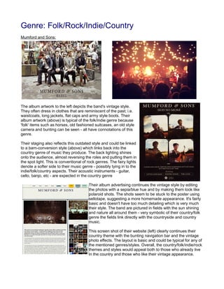
- 1. Genre: Folk/Rock/Indie/Country Mumford and Sons: The album artwork to the left depicts the band's vintage style. They often dress in clothes that are reminiscent of the past; i.e. waistcoats, long jackets, flat caps and army style boots. Their album artwork (above) is typical of the folk/indie genre because 'folk' items such as horses, old fashioned suitcases, an old style camera and bunting can be seen - all have connotations of this genre. Their staging also reflects this outdated style and could be linked to a barn-conversion style (above) which links back into the country genre of music they produce. The back lighting shines onto the audience, almost reversing the roles and putting them in the spot light. This is conventional of rock genres. The fairy lights denote a softer side to their music genre - possibly tying in to the indie/folk/country aspects. Their acoustic instruments - guitar, cello, banjo, etc - are expected in the country genre Their album advertising continues the vintage style by editing the photos with a sepia/blue hue and by making them look like polaroid shots. The shots seem to be stuck to the poster using sellotape, suggesting a more homemade appearance. It's fairly basic and doesn't have too much detailing which is very much their style. The band are pictured in fields with the sun shining and nature all around them - very symbolic of their country/folk genre the fields link directly with the countryside and country music. This screen shot of their website (left) clearly continues their country theme with the bunting navigation bar and the vintage photo effects. The layout is basic and could be typical for any of the mentioned genres/styles. Overall, the country/folk/indie/rock themes and styles would appeal both to those who already live in the country and those who like their vintage appearance.
- 2. Ben Howard: The album artwork upbove depicts a swimmer in the ocean. This has no immediate connotations with the genre of the music, but it could be interpreted that the ocean is quiet a relaxing – much like his music. Ben often dresses very casually in jeans and a t-shirt or a checked jacket – his style is very laid back which reflects his folk/indie music genre. His staging is very basic and he tends to just have a few spot lights that point him and the musicians. This, again, reflects the folk/indie nature of his music and provides a constant theme of simplicity and through his style. It conveys to the audience that they should focus on the music instead of the performance (staging and costume, etc). His tour advertising is much like Mumford and Son's album advertisement because Ben is also pictured in a field. Again, this shows that it's conventional of this genre to have connotations of the countryside and nature. He's wearing a plain t- shirt which again is deomstrative of his simplicity. His expression is concentrated and looking downwards which could be suggesting that he's concentrating on his music/music genre. His website homepage has a looped video of a swimmer going above and below the water – like his album artwork. Again, this reflects the genre by suggesting calm/tranquil music styles.
- 3. Two Door Cinema Club: The album artwork laregely reflects the indie genre due to the blue hue of the photograph being vintage and the cat being a popular modern day symbol of the indie style. The band have chosen not to appear on the cover possibly because they're already an established band and they don't need to appear on the cover to be recognised. Their staging is similar to a rock band's because of the glaring back lighting and the purple light effect. It's fairly simple and the instruments/band are the main focus on the stage. The band's style varies but they tend to opt for a smarter jacket with jeans and a shirt. Their style could be seen as outdated compared to Ben Howard's but not as outdated as Mumford and Sons'. Their album advertisement is very similar to their album artwork but it has a sepia hue to it which suggests a more vintage appearance. This links to their indie/folk genre because it's often linked to a more vintage style. Two Door Cinema Club's website uses a pastel colour scheme similar to Mumford and Sons' one. They have their music video playing at the header and their music genre can be seen throughout as a constant theme.