SlideShare une entreprise Scribd logo
1  sur  43
Télécharger pour lire hors ligne
I’m RHJR, and I’m a WP blogger. Designing the Obvious, however, is a book about web application
design principles. And I didn’t talk about blogs in it at all.

But you guys are all here to talk about blogs, so I’ve adapted things a bit, just for you WordPress
geeks. Today, I’ll follow each topic with an example of how to apply the concept to a blog.

We’ll talk about:

    1) Building only what’s absolutely necessary (and how to do it)

    2) Getting users up to speed quickly so they can start liking your app

    3) Surface the important elements on a page

    4) Handle errors
build only what’s absolutely necessary.


First, let’s talk about building only what’s absolutely necessary.
Early on, we need figure out what really needs to be built. Seems obvious, right? Well, it is, unless you
want to build something really good.

It’s easy to build everything that comes to mind. It’s easier to do that than it is to cut things out and
build only what’s absolutely necessary. But that’s what needs to be done, because a more focused app
is easier to learn and use, and easier apps lead to repeat business.

So take your wireframes (like this one) and strip things out of it until the essence of the app shines
through. What’s the core purpose of the app? What’s it do? Focus on this.

Let’s see how to do that by stripping some things out of this “fictitious” webmail app. In the book, this
is called “Interface Surgery” and there are several examples.
Strip out the ability to search the web.

    - All browsers have this. It’s redundant to include it.
Strip out the Saved Search feature.
- Takes longer to save and re-run the search than it does to just type it in
- This means we can get rid of the two tabs as well. Cleaner design.
Move the Storage Used info to another screen. It doesn’t need to be in the main UI 100% of the time.

This is a webmail app, right? So send an email when the inbox starts to get full.

OK, see the INBOX label? It’s big and bold to tell you which mailbox you’re looking at ...
So get rid of the TITLE BAR for the FOLDER box. You already know from the sidebar what folder you’re
looking at.

Get rid of Apply Action dropdown. Move these actions somewhere else. (We’ll talk about those in a
moment).

Clean up the mess. Again, a simpler design.
Surface the command links (reply, forward, etc.)

Apply some logic to the links so they’re disabled when they can’t be used. (Heck, you’re building fewer
features now, so spend some more quality time on what’s left and make it great.)

Clean up the mess again.
Reminder: This was the original.
This is the new version. Much cleaner. Much more focused.

Not a huge dierence to us, but MASSIVE to a typical user.

Let’s talk about how this applies to a blog. Usually, blogs contain several elements: a post, a link to
another post (or two), a link to the archives ... things like that.
[example of this applied to a blog]


This is Sam Stephenson’s blog (and no, I have no idea who Sam Stephenson is). He stripped out almost
everything. He left out the blogroll, the category links, the list of recent posts ... heck, he left out the
post footer!

There’s no way to digg this, StumbleUpon this, trackback it, comment on it, or anything. Each page
contains exactly one post.

I love this design. Sadly, Sam has only ever written two posts.

Bloggers are a creative bunch, and I certainly am not saying everyone should do this. This is sort of
extreme. What I’m saying is to figure out what’s actually important to YOUR blog, and kill everything
else.

If you don’t need links to previous and next posts, get rid of them. If a blogroll doesn’t really help you,
ditch it. If you and your readers won’t benefit from a list of links to categories, don’t include one.
Sometimes a blog doesn’t even need standard blog elements. A “tumblelog” is a form of a blog that
has no titles, no footers, no categories, no trackbacks, no search, no archives ... nothing. It’s just a
long series of very stream-of-consciousness posts that are either quotes, links, images, videos, or
ideas.

Of course, the trick is to avoid removing too much. Your page still needs a page title to provide some
sort of context. Tumbelogs often lack the most basic and standard elements of a web page. So be
careful if you do this.
turn beginner’s into intermediates, immediately.


Now that you’ve stripped down the app so only the important stu is in it, it’s time to focus on turning
beginners into intermediates.
Alan Cooper - “perpetual Intermediates”

Most users are not beginners. People learn as much as they need to learn very quickly, thereby
becoming intermediates. They rarely advance to expert level.

Design for the intermediates, but MAKE SURE PEOPLE CAN BECOME INTERMEDIATES IN THE FIRST
PLACE. How? Instructive design.

Almost EVERYONE fails in the area of instructive design. They never tell users how to use the app, and
they never figure it out on their own. If you hired me tomorrow to fix your app’s design, this is the first
thing I’d look at.

That said, I did find a few examples of good instructive design work. Some of them are discussed in
the book.
Surface the Help info.

Inline tips from Squidoo (from Seth Godin)

- Show up on rollover
- Short, concise tips
Take care of the “blank slates”

Basecamp screencasts

Fill up the blank slates with useful information
- Big red link
- Screencast
No milestones exist.


This is what it looks like with no instructive elements. Not very helpful, eh?
My Yahoo!’s blank slate is filled with a preview of what your page could look like.

No, Michael Jackson isn’t on it all the time.
Welcome screens:

- Call out what can be done on the page
- Show it to new users
- Set it to disappear automatically after the 5th login or something

    - As people get more familiar with the app, you don’t want them to keep bumping into newbie
stu.

BONUS:
- You can use this again when you have a new feature to announce, so it’s dual-purpose.
[example of this applied to a blog]


This is a rather well-known blog that breaks the same rule that most other blogs break.

It doesn’t make it obvious that headings are links. Almost all of the links on this page black and
underlined. But the links to the permanent post page are green and have no underline. Oh, and the
link directly to post comments is ... um, purple. You know, so it doesn’t match anything else on the
page. Four dierent link styles on the same page.

So how does someone new to this page get to become an intermediate user of this blog?

Yup. He has to guess.
[example of this applied to a blog]


And in the tooting my own horn category, this is my blog.

Notice that every link on the page is orange. The only exception is the notification area at the top, but I
underlined that one to make it clear that it’s a link, so it’s OK. ;)
surface important elements.


To further help users understand how to use your app, and so they continue enjoying your app ...

surface the important elements on each screen.
Seth Godin’s banana principle:
- Put up clear signposts on a site and people will follow them, just like a monkey follows a trail of
bananas.
What’s this page about?
- There is a point to it, but who can tell what it is?
Add some links. Color makes things stand out. But not enough.

We want to turn these 3 links into giant, clear bananas.
Surface the main points of this page - the three hot spots.
Get rid of the instructions at the end of the text, and you’re done!

Much clearer. Now the monkeys can follow the bananas.
[example of this applied to a blog]


What’s the major call-to-action on this page? What is it that the folks at WordPress want me to do
when I land on this page for the first time?

Hint: Download WordPress!

Where’s the link? In the header, of course! (Kidding.)

What pops out the most on this page? The word “Welcome” and the screenshot on the right. Neither of
these things are clickable. And the word “Welcome” doesn’t mean anything to a user. It doesn’t help
them, doesn’t get them started, doesn’t provide context, doesn’t do, well, anything.
[example of this applied to a blog]


Any idea what’s on Apple’s mind today?

There are over 30 links on the Apple.com homepage. Which one do you think they want you to click?

OK, so these aren’t blogs, but you get the idea. If you write a blog post promoting something on
another area of your site, for example, include a link, and make it big and obvious.
prevent errors with poka-yoke.
                                (POH-kah YOH-keh)


Once they start using the app, make sure they can use it without feeling like idiots by making mistakes
all the time. This one of the best ways to improve your app. If people never make mistakes in your
app, they’re going to feel really smart. That’s a good thing, and it’s something most companies never
achieve.

From Lean manufacturing processes, this is Japanese for “error-proofing”

The best way to handle an error is to prevent it from happening in the first place.

Two types: Prevention and detection

Some examples ...
Popcorn button = prevention device.
“Did you mean?”

Great idea. Helps users fix their typos and helps them correct words they don’t know how to spell.

This is a detection device.
Google Suggest

Blurs the line between prevention and detection by helping you choose a good search term.

- Doesn’t work well for people who stare at their keyboards while typing, though.
- Also, people tend to rely on the suggestions rather than their own search terms, which may have
been better.
- If using this, use it for lookup actions (like looking up someone’s phone number), not for searches
Undo systems = fantastic.
- Get rid of JS alerts/confirmations (because they suck and no one reads them)
- Clear visual notification that you can Undo

This should be in every web app where you can delete or seriously aect data. (Right now, it’s not even
in every Google app, so we’ve got a ways to go.)

This introduces “forgiveness” into your app. People can play around without being terrified of breaking
things.
Anyone signed up for ODEO?

This shot doesn’t do it justice, but these fields are HUGE. And it doesn’t really help anything. They
didn’t do anything to make the form more usable, they just filled up the page.

Imagine this at 800x600 (for people with bad vision). Four fields, and two of them would be below the
fold.
RememberTheMilk

Inline validation = prevention AND detection.
- Detects errors immediately and notifies you
- Prevents users from hitting Submit before the form is correct.
- Should still be able to hit Submit (accessibility reasons, disabled JS), but this alleviates most of the
issues people have with forms. And they really appreciate it.

This one is good, but not quite perfect. Tells you there’s an error as soon as you hit the field, before
you have a chance to enter anything.
OurProperty.co.uk

Much better. Also includes inline tips.

Let’s take a closer look at the decisions for your form design.
Typical form.

Thinking back over what we’ve talked about so far, what can we do to make it better?

(Take suggestions.)
-   Add instructive text
-   Display checkmarks when fields are correct.
-   Show errors inline.
-   Show them next to the field.
-   Show them AFTER the field loses focus
-   Disable the I’m Done button

You can make these really big - it helps. Here’s an example:
Eventful.com - large errors = easy to see

MOST users can complete this form correctly before hitting SUBMIT
- Good for users
- Can translate to less bandwidth for you, because you’ll only get ONE server call
Completed form = I’m Done button lights up and you’re good to go.

Sadly, I couldn’t find an example of good error-handling on a blog. Typically, the only place this
would apply is when a user is adding a comment to a post, and when I went through all the blogs I
read normally, I didn’t find any that used inline error messaging like this.

Obviously, the moral of the story is that you should do add this to your blog. And since WP is open
source, you can hack around it and make that work. And since I’ll be spending Monday with the dev
team, I may just try to talk them into building this functionality into WordPress. :)
Questions?
Check out the blog at www.rhjr.net for continuous reality checks on application design.

I’ll be around, so feel free to come talk to me about your apps and ask questions and such. Enjoy the
rest of WordCamp!

Contenu connexe

Tendances

Free Range Content: Unlock Your Content to Increase Your Reach
Free Range Content: Unlock Your Content to Increase Your ReachFree Range Content: Unlock Your Content to Increase Your Reach
Free Range Content: Unlock Your Content to Increase Your ReachAarron Walter
 
Thoughts on design
Thoughts on designThoughts on design
Thoughts on designshawntelford
 
Digital Deceptions WordCamp Toronto 2009
Digital Deceptions WordCamp Toronto 2009Digital Deceptions WordCamp Toronto 2009
Digital Deceptions WordCamp Toronto 2009Digital Duncan
 
Frontend United: Etching wireframes & agile UX
Frontend United: Etching wireframes & agile UXFrontend United: Etching wireframes & agile UX
Frontend United: Etching wireframes & agile UXWunderkraut
 
Traffic generationxplosion
Traffic generationxplosionTraffic generationxplosion
Traffic generationxplosionBarrie Edwards
 
6. What have you learnt about technologies from the process of constructing t...
6. What have you learnt about technologies from the process of constructing t...6. What have you learnt about technologies from the process of constructing t...
6. What have you learnt about technologies from the process of constructing t...wallflowersssss
 
Question 6
Question 6Question 6
Question 6tiapeek
 
The ultimate-step-by-step-guide-for-free-traffic
The ultimate-step-by-step-guide-for-free-trafficThe ultimate-step-by-step-guide-for-free-traffic
The ultimate-step-by-step-guide-for-free-traffickejart
 
How to Optimize Your Blog for the Mobile Shift
How to Optimize Your Blog for the Mobile ShiftHow to Optimize Your Blog for the Mobile Shift
How to Optimize Your Blog for the Mobile ShiftLeslie Samuel
 
12 internet tools you can't live without
12 internet tools you can't live without12 internet tools you can't live without
12 internet tools you can't live withoutBrenda Trott
 
Birthing a Child Theme - WordCamp Scranton
Birthing a Child Theme - WordCamp ScrantonBirthing a Child Theme - WordCamp Scranton
Birthing a Child Theme - WordCamp ScrantonLauren Pittenger
 
Young Tammy 4.4_ppp
Young Tammy 4.4_pppYoung Tammy 4.4_ppp
Young Tammy 4.4_pppTammy Young
 
5. fmp pre production 2
5. fmp pre production 25. fmp pre production 2
5. fmp pre production 2Jordannekay99
 
Why the heck isnt word press a cms
Why the heck isnt word press a cmsWhy the heck isnt word press a cms
Why the heck isnt word press a cmsJohn Eckman
 

Tendances (16)

Free Range Content: Unlock Your Content to Increase Your Reach
Free Range Content: Unlock Your Content to Increase Your ReachFree Range Content: Unlock Your Content to Increase Your Reach
Free Range Content: Unlock Your Content to Increase Your Reach
 
Thoughts on design
Thoughts on designThoughts on design
Thoughts on design
 
Digital Deceptions WordCamp Toronto 2009
Digital Deceptions WordCamp Toronto 2009Digital Deceptions WordCamp Toronto 2009
Digital Deceptions WordCamp Toronto 2009
 
Frontend United: Etching wireframes & agile UX
Frontend United: Etching wireframes & agile UXFrontend United: Etching wireframes & agile UX
Frontend United: Etching wireframes & agile UX
 
Traffic generationxplosion
Traffic generationxplosionTraffic generationxplosion
Traffic generationxplosion
 
6. What have you learnt about technologies from the process of constructing t...
6. What have you learnt about technologies from the process of constructing t...6. What have you learnt about technologies from the process of constructing t...
6. What have you learnt about technologies from the process of constructing t...
 
Question 6
Question 6Question 6
Question 6
 
The ultimate-step-by-step-guide-for-free-traffic
The ultimate-step-by-step-guide-for-free-trafficThe ultimate-step-by-step-guide-for-free-traffic
The ultimate-step-by-step-guide-for-free-traffic
 
Wireframing
WireframingWireframing
Wireframing
 
How to Optimize Your Blog for the Mobile Shift
How to Optimize Your Blog for the Mobile ShiftHow to Optimize Your Blog for the Mobile Shift
How to Optimize Your Blog for the Mobile Shift
 
12 internet tools you can't live without
12 internet tools you can't live without12 internet tools you can't live without
12 internet tools you can't live without
 
Question 6
Question 6Question 6
Question 6
 
Birthing a Child Theme - WordCamp Scranton
Birthing a Child Theme - WordCamp ScrantonBirthing a Child Theme - WordCamp Scranton
Birthing a Child Theme - WordCamp Scranton
 
Young Tammy 4.4_ppp
Young Tammy 4.4_pppYoung Tammy 4.4_ppp
Young Tammy 4.4_ppp
 
5. fmp pre production 2
5. fmp pre production 25. fmp pre production 2
5. fmp pre production 2
 
Why the heck isnt word press a cms
Why the heck isnt word press a cmsWhy the heck isnt word press a cms
Why the heck isnt word press a cms
 

En vedette

Quality assurance vs quality control
Quality assurance  vs quality controlQuality assurance  vs quality control
Quality assurance vs quality controlsukiman hadiwijaya
 
Quality Assurance vs. Quality Control
Quality Assurance vs. Quality ControlQuality Assurance vs. Quality Control
Quality Assurance vs. Quality ControlKanoah
 
Quality Assurance vs. Quality Control, Future of Software Quality
Quality Assurance vs. Quality Control, Future of Software Quality Quality Assurance vs. Quality Control, Future of Software Quality
Quality Assurance vs. Quality Control, Future of Software Quality SQALab
 
Quality Assurance Vs Quality Control
Quality Assurance Vs Quality ControlQuality Assurance Vs Quality Control
Quality Assurance Vs Quality ControlYogita patil
 

En vedette (8)

Benchmarking
Benchmarking Benchmarking
Benchmarking
 
Quality assurance vs quality control
Quality assurance  vs quality controlQuality assurance  vs quality control
Quality assurance vs quality control
 
Qc Vs Qa
Qc Vs QaQc Vs Qa
Qc Vs Qa
 
Quality Assurance vs. Quality Control
Quality Assurance vs. Quality ControlQuality Assurance vs. Quality Control
Quality Assurance vs. Quality Control
 
Quality Assurance vs. Quality Control, Future of Software Quality
Quality Assurance vs. Quality Control, Future of Software Quality Quality Assurance vs. Quality Control, Future of Software Quality
Quality Assurance vs. Quality Control, Future of Software Quality
 
Quality Assurance Vs Quality Control
Quality Assurance Vs Quality ControlQuality Assurance Vs Quality Control
Quality Assurance Vs Quality Control
 
Quality assurance
Quality assuranceQuality assurance
Quality assurance
 
QUALITY ASSURANCE
QUALITY ASSURANCEQUALITY ASSURANCE
QUALITY ASSURANCE
 

Similaire à "Designing the Obvious" at WordCamp

User Research on a Shoestring
User Research on a ShoestringUser Research on a Shoestring
User Research on a Shoestringteaguese
 
13 Signs Your UX Needs an Exorcism
13 Signs Your UX Needs an Exorcism13 Signs Your UX Needs an Exorcism
13 Signs Your UX Needs an ExorcismCrystal Beasley
 
9 worst practices in ux design
9 worst practices in ux design9 worst practices in ux design
9 worst practices in ux designSachin Khatiwoda
 
eStudio34 presents London Search Love 2015 | Practical tips for the future o...
eStudio34 presents London Search Love 2015 |  Practical tips for the future o...eStudio34 presents London Search Love 2015 |  Practical tips for the future o...
eStudio34 presents London Search Love 2015 | Practical tips for the future o...William Renedo
 
SearchLove London 2015 | Will Critchlow | Practical Tips for the Future of ...
SearchLove London 2015 |  Will Critchlow |  Practical Tips for the Future of ...SearchLove London 2015 |  Will Critchlow |  Practical Tips for the Future of ...
SearchLove London 2015 | Will Critchlow | Practical Tips for the Future of ...Distilled
 
Yahoo! App Mobile App Design Teardown
Yahoo! App Mobile App Design TeardownYahoo! App Mobile App Design Teardown
Yahoo! App Mobile App Design TeardownXander Pollock
 
Know thy interaction – How interaction is changing what we create on the web
Know thy interaction – How interaction is changing what we create on the webKnow thy interaction – How interaction is changing what we create on the web
Know thy interaction – How interaction is changing what we create on the webnolly00
 
Yikes...It Looks Like That?! - UI Worst Practices
Yikes...It Looks Like That?! - UI Worst PracticesYikes...It Looks Like That?! - UI Worst Practices
Yikes...It Looks Like That?! - UI Worst PracticesBruce Elgort
 
2020 Top Web Development Trends
2020 Top Web Development Trends2020 Top Web Development Trends
2020 Top Web Development TrendsPencil Agency
 
Designing for the Right Audience (with notes)
Designing for the Right Audience (with notes)Designing for the Right Audience (with notes)
Designing for the Right Audience (with notes)Danielle Arvanitis
 
Ego vs. Product Development
Ego vs. Product DevelopmentEgo vs. Product Development
Ego vs. Product DevelopmentBastian Gruber
 
freeessentialtools
freeessentialtoolsfreeessentialtools
freeessentialtoolsmrb205
 
Don’t make me think
Don’t make me thinkDon’t make me think
Don’t make me thinkJason White
 
Social media for the busy scientist
Social media for the busy scientistSocial media for the busy scientist
Social media for the busy scientistFelienne Hermans
 
Reactive Microservice Architecture with Groovy and Grails
Reactive Microservice Architecture with Groovy and GrailsReactive Microservice Architecture with Groovy and Grails
Reactive Microservice Architecture with Groovy and GrailsSteve Pember
 
8 amazing resources for UX & UI inspiration
8 amazing resources for UX & UI inspiration8 amazing resources for UX & UI inspiration
8 amazing resources for UX & UI inspirationClearly Innovative
 
Scripted navigation ideas for Oracle Service Cloud
Scripted navigation ideas for Oracle Service CloudScripted navigation ideas for Oracle Service Cloud
Scripted navigation ideas for Oracle Service CloudMark Kehoe
 
Start learning code with an idea
Start learning code with an ideaStart learning code with an idea
Start learning code with an ideaJoey Rigor
 
Session on mockups
Session on mockupsSession on mockups
Session on mockupsAbdul Dibosh
 

Similaire à "Designing the Obvious" at WordCamp (20)

User Research on a Shoestring
User Research on a ShoestringUser Research on a Shoestring
User Research on a Shoestring
 
13 Signs Your UX Needs an Exorcism
13 Signs Your UX Needs an Exorcism13 Signs Your UX Needs an Exorcism
13 Signs Your UX Needs an Exorcism
 
9 worst practices in ux design
9 worst practices in ux design9 worst practices in ux design
9 worst practices in ux design
 
eStudio34 presents London Search Love 2015 | Practical tips for the future o...
eStudio34 presents London Search Love 2015 |  Practical tips for the future o...eStudio34 presents London Search Love 2015 |  Practical tips for the future o...
eStudio34 presents London Search Love 2015 | Practical tips for the future o...
 
SearchLove London 2015 | Will Critchlow | Practical Tips for the Future of ...
SearchLove London 2015 |  Will Critchlow |  Practical Tips for the Future of ...SearchLove London 2015 |  Will Critchlow |  Practical Tips for the Future of ...
SearchLove London 2015 | Will Critchlow | Practical Tips for the Future of ...
 
Yahoo! App Mobile App Design Teardown
Yahoo! App Mobile App Design TeardownYahoo! App Mobile App Design Teardown
Yahoo! App Mobile App Design Teardown
 
Know thy interaction – How interaction is changing what we create on the web
Know thy interaction – How interaction is changing what we create on the webKnow thy interaction – How interaction is changing what we create on the web
Know thy interaction – How interaction is changing what we create on the web
 
Yikes...It Looks Like That?! - UI Worst Practices
Yikes...It Looks Like That?! - UI Worst PracticesYikes...It Looks Like That?! - UI Worst Practices
Yikes...It Looks Like That?! - UI Worst Practices
 
2020 Top Web Development Trends
2020 Top Web Development Trends2020 Top Web Development Trends
2020 Top Web Development Trends
 
Designing for the Right Audience (with notes)
Designing for the Right Audience (with notes)Designing for the Right Audience (with notes)
Designing for the Right Audience (with notes)
 
Ego vs. Product Development
Ego vs. Product DevelopmentEgo vs. Product Development
Ego vs. Product Development
 
TP # 4: Web 2.0 Tools
TP # 4: Web 2.0 ToolsTP # 4: Web 2.0 Tools
TP # 4: Web 2.0 Tools
 
freeessentialtools
freeessentialtoolsfreeessentialtools
freeessentialtools
 
Don’t make me think
Don’t make me thinkDon’t make me think
Don’t make me think
 
Social media for the busy scientist
Social media for the busy scientistSocial media for the busy scientist
Social media for the busy scientist
 
Reactive Microservice Architecture with Groovy and Grails
Reactive Microservice Architecture with Groovy and GrailsReactive Microservice Architecture with Groovy and Grails
Reactive Microservice Architecture with Groovy and Grails
 
8 amazing resources for UX & UI inspiration
8 amazing resources for UX & UI inspiration8 amazing resources for UX & UI inspiration
8 amazing resources for UX & UI inspiration
 
Scripted navigation ideas for Oracle Service Cloud
Scripted navigation ideas for Oracle Service CloudScripted navigation ideas for Oracle Service Cloud
Scripted navigation ideas for Oracle Service Cloud
 
Start learning code with an idea
Start learning code with an ideaStart learning code with an idea
Start learning code with an idea
 
Session on mockups
Session on mockupsSession on mockups
Session on mockups
 

Dernier

Merck Moving Beyond Passwords: FIDO Paris Seminar.pptx
Merck Moving Beyond Passwords: FIDO Paris Seminar.pptxMerck Moving Beyond Passwords: FIDO Paris Seminar.pptx
Merck Moving Beyond Passwords: FIDO Paris Seminar.pptxLoriGlavin3
 
Take control of your SAP testing with UiPath Test Suite
Take control of your SAP testing with UiPath Test SuiteTake control of your SAP testing with UiPath Test Suite
Take control of your SAP testing with UiPath Test SuiteDianaGray10
 
Dev Dives: Streamline document processing with UiPath Studio Web
Dev Dives: Streamline document processing with UiPath Studio WebDev Dives: Streamline document processing with UiPath Studio Web
Dev Dives: Streamline document processing with UiPath Studio WebUiPathCommunity
 
Nell’iperspazio con Rocket: il Framework Web di Rust!
Nell’iperspazio con Rocket: il Framework Web di Rust!Nell’iperspazio con Rocket: il Framework Web di Rust!
Nell’iperspazio con Rocket: il Framework Web di Rust!Commit University
 
TrustArc Webinar - How to Build Consumer Trust Through Data Privacy
TrustArc Webinar - How to Build Consumer Trust Through Data PrivacyTrustArc Webinar - How to Build Consumer Trust Through Data Privacy
TrustArc Webinar - How to Build Consumer Trust Through Data PrivacyTrustArc
 
"Subclassing and Composition – A Pythonic Tour of Trade-Offs", Hynek Schlawack
"Subclassing and Composition – A Pythonic Tour of Trade-Offs", Hynek Schlawack"Subclassing and Composition – A Pythonic Tour of Trade-Offs", Hynek Schlawack
"Subclassing and Composition – A Pythonic Tour of Trade-Offs", Hynek SchlawackFwdays
 
Developer Data Modeling Mistakes: From Postgres to NoSQL
Developer Data Modeling Mistakes: From Postgres to NoSQLDeveloper Data Modeling Mistakes: From Postgres to NoSQL
Developer Data Modeling Mistakes: From Postgres to NoSQLScyllaDB
 
Tampa BSides - Chef's Tour of Microsoft Security Adoption Framework (SAF)
Tampa BSides - Chef's Tour of Microsoft Security Adoption Framework (SAF)Tampa BSides - Chef's Tour of Microsoft Security Adoption Framework (SAF)
Tampa BSides - Chef's Tour of Microsoft Security Adoption Framework (SAF)Mark Simos
 
Are Multi-Cloud and Serverless Good or Bad?
Are Multi-Cloud and Serverless Good or Bad?Are Multi-Cloud and Serverless Good or Bad?
Are Multi-Cloud and Serverless Good or Bad?Mattias Andersson
 
DSPy a system for AI to Write Prompts and Do Fine Tuning
DSPy a system for AI to Write Prompts and Do Fine TuningDSPy a system for AI to Write Prompts and Do Fine Tuning
DSPy a system for AI to Write Prompts and Do Fine TuningLars Bell
 
SALESFORCE EDUCATION CLOUD | FEXLE SERVICES
SALESFORCE EDUCATION CLOUD | FEXLE SERVICESSALESFORCE EDUCATION CLOUD | FEXLE SERVICES
SALESFORCE EDUCATION CLOUD | FEXLE SERVICESmohitsingh558521
 
What's New in Teams Calling, Meetings and Devices March 2024
What's New in Teams Calling, Meetings and Devices March 2024What's New in Teams Calling, Meetings and Devices March 2024
What's New in Teams Calling, Meetings and Devices March 2024Stephanie Beckett
 
WordPress Websites for Engineers: Elevate Your Brand
WordPress Websites for Engineers: Elevate Your BrandWordPress Websites for Engineers: Elevate Your Brand
WordPress Websites for Engineers: Elevate Your Brandgvaughan
 
What is DBT - The Ultimate Data Build Tool.pdf
What is DBT - The Ultimate Data Build Tool.pdfWhat is DBT - The Ultimate Data Build Tool.pdf
What is DBT - The Ultimate Data Build Tool.pdfMounikaPolabathina
 
Moving Beyond Passwords: FIDO Paris Seminar.pdf
Moving Beyond Passwords: FIDO Paris Seminar.pdfMoving Beyond Passwords: FIDO Paris Seminar.pdf
Moving Beyond Passwords: FIDO Paris Seminar.pdfLoriGlavin3
 
Commit 2024 - Secret Management made easy
Commit 2024 - Secret Management made easyCommit 2024 - Secret Management made easy
Commit 2024 - Secret Management made easyAlfredo García Lavilla
 
The Fit for Passkeys for Employee and Consumer Sign-ins: FIDO Paris Seminar.pptx
The Fit for Passkeys for Employee and Consumer Sign-ins: FIDO Paris Seminar.pptxThe Fit for Passkeys for Employee and Consumer Sign-ins: FIDO Paris Seminar.pptx
The Fit for Passkeys for Employee and Consumer Sign-ins: FIDO Paris Seminar.pptxLoriGlavin3
 
Streamlining Python Development: A Guide to a Modern Project Setup
Streamlining Python Development: A Guide to a Modern Project SetupStreamlining Python Development: A Guide to a Modern Project Setup
Streamlining Python Development: A Guide to a Modern Project SetupFlorian Wilhelm
 
"ML in Production",Oleksandr Bagan
"ML in Production",Oleksandr Bagan"ML in Production",Oleksandr Bagan
"ML in Production",Oleksandr BaganFwdays
 

Dernier (20)

Merck Moving Beyond Passwords: FIDO Paris Seminar.pptx
Merck Moving Beyond Passwords: FIDO Paris Seminar.pptxMerck Moving Beyond Passwords: FIDO Paris Seminar.pptx
Merck Moving Beyond Passwords: FIDO Paris Seminar.pptx
 
Take control of your SAP testing with UiPath Test Suite
Take control of your SAP testing with UiPath Test SuiteTake control of your SAP testing with UiPath Test Suite
Take control of your SAP testing with UiPath Test Suite
 
Dev Dives: Streamline document processing with UiPath Studio Web
Dev Dives: Streamline document processing with UiPath Studio WebDev Dives: Streamline document processing with UiPath Studio Web
Dev Dives: Streamline document processing with UiPath Studio Web
 
DMCC Future of Trade Web3 - Special Edition
DMCC Future of Trade Web3 - Special EditionDMCC Future of Trade Web3 - Special Edition
DMCC Future of Trade Web3 - Special Edition
 
Nell’iperspazio con Rocket: il Framework Web di Rust!
Nell’iperspazio con Rocket: il Framework Web di Rust!Nell’iperspazio con Rocket: il Framework Web di Rust!
Nell’iperspazio con Rocket: il Framework Web di Rust!
 
TrustArc Webinar - How to Build Consumer Trust Through Data Privacy
TrustArc Webinar - How to Build Consumer Trust Through Data PrivacyTrustArc Webinar - How to Build Consumer Trust Through Data Privacy
TrustArc Webinar - How to Build Consumer Trust Through Data Privacy
 
"Subclassing and Composition – A Pythonic Tour of Trade-Offs", Hynek Schlawack
"Subclassing and Composition – A Pythonic Tour of Trade-Offs", Hynek Schlawack"Subclassing and Composition – A Pythonic Tour of Trade-Offs", Hynek Schlawack
"Subclassing and Composition – A Pythonic Tour of Trade-Offs", Hynek Schlawack
 
Developer Data Modeling Mistakes: From Postgres to NoSQL
Developer Data Modeling Mistakes: From Postgres to NoSQLDeveloper Data Modeling Mistakes: From Postgres to NoSQL
Developer Data Modeling Mistakes: From Postgres to NoSQL
 
Tampa BSides - Chef's Tour of Microsoft Security Adoption Framework (SAF)
Tampa BSides - Chef's Tour of Microsoft Security Adoption Framework (SAF)Tampa BSides - Chef's Tour of Microsoft Security Adoption Framework (SAF)
Tampa BSides - Chef's Tour of Microsoft Security Adoption Framework (SAF)
 
Are Multi-Cloud and Serverless Good or Bad?
Are Multi-Cloud and Serverless Good or Bad?Are Multi-Cloud and Serverless Good or Bad?
Are Multi-Cloud and Serverless Good or Bad?
 
DSPy a system for AI to Write Prompts and Do Fine Tuning
DSPy a system for AI to Write Prompts and Do Fine TuningDSPy a system for AI to Write Prompts and Do Fine Tuning
DSPy a system for AI to Write Prompts and Do Fine Tuning
 
SALESFORCE EDUCATION CLOUD | FEXLE SERVICES
SALESFORCE EDUCATION CLOUD | FEXLE SERVICESSALESFORCE EDUCATION CLOUD | FEXLE SERVICES
SALESFORCE EDUCATION CLOUD | FEXLE SERVICES
 
What's New in Teams Calling, Meetings and Devices March 2024
What's New in Teams Calling, Meetings and Devices March 2024What's New in Teams Calling, Meetings and Devices March 2024
What's New in Teams Calling, Meetings and Devices March 2024
 
WordPress Websites for Engineers: Elevate Your Brand
WordPress Websites for Engineers: Elevate Your BrandWordPress Websites for Engineers: Elevate Your Brand
WordPress Websites for Engineers: Elevate Your Brand
 
What is DBT - The Ultimate Data Build Tool.pdf
What is DBT - The Ultimate Data Build Tool.pdfWhat is DBT - The Ultimate Data Build Tool.pdf
What is DBT - The Ultimate Data Build Tool.pdf
 
Moving Beyond Passwords: FIDO Paris Seminar.pdf
Moving Beyond Passwords: FIDO Paris Seminar.pdfMoving Beyond Passwords: FIDO Paris Seminar.pdf
Moving Beyond Passwords: FIDO Paris Seminar.pdf
 
Commit 2024 - Secret Management made easy
Commit 2024 - Secret Management made easyCommit 2024 - Secret Management made easy
Commit 2024 - Secret Management made easy
 
The Fit for Passkeys for Employee and Consumer Sign-ins: FIDO Paris Seminar.pptx
The Fit for Passkeys for Employee and Consumer Sign-ins: FIDO Paris Seminar.pptxThe Fit for Passkeys for Employee and Consumer Sign-ins: FIDO Paris Seminar.pptx
The Fit for Passkeys for Employee and Consumer Sign-ins: FIDO Paris Seminar.pptx
 
Streamlining Python Development: A Guide to a Modern Project Setup
Streamlining Python Development: A Guide to a Modern Project SetupStreamlining Python Development: A Guide to a Modern Project Setup
Streamlining Python Development: A Guide to a Modern Project Setup
 
"ML in Production",Oleksandr Bagan
"ML in Production",Oleksandr Bagan"ML in Production",Oleksandr Bagan
"ML in Production",Oleksandr Bagan
 

"Designing the Obvious" at WordCamp

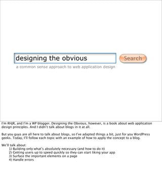
  • 1. I’m RHJR, and I’m a WP blogger. Designing the Obvious, however, is a book about web application design principles. And I didn’t talk about blogs in it at all. But you guys are all here to talk about blogs, so I’ve adapted things a bit, just for you WordPress geeks. Today, I’ll follow each topic with an example of how to apply the concept to a blog. We’ll talk about: 1) Building only what’s absolutely necessary (and how to do it) 2) Getting users up to speed quickly so they can start liking your app 3) Surface the important elements on a page 4) Handle errors
  • 2. build only what’s absolutely necessary. First, let’s talk about building only what’s absolutely necessary.
  • 3. Early on, we need figure out what really needs to be built. Seems obvious, right? Well, it is, unless you want to build something really good. It’s easy to build everything that comes to mind. It’s easier to do that than it is to cut things out and build only what’s absolutely necessary. But that’s what needs to be done, because a more focused app is easier to learn and use, and easier apps lead to repeat business. So take your wireframes (like this one) and strip things out of it until the essence of the app shines through. What’s the core purpose of the app? What’s it do? Focus on this. Let’s see how to do that by stripping some things out of this “fictitious” webmail app. In the book, this is called “Interface Surgery” and there are several examples.
  • 4. Strip out the ability to search the web. - All browsers have this. It’s redundant to include it.
  • 5. Strip out the Saved Search feature. - Takes longer to save and re-run the search than it does to just type it in - This means we can get rid of the two tabs as well. Cleaner design.
  • 6. Move the Storage Used info to another screen. It doesn’t need to be in the main UI 100% of the time. This is a webmail app, right? So send an email when the inbox starts to get full. OK, see the INBOX label? It’s big and bold to tell you which mailbox you’re looking at ...
  • 7. So get rid of the TITLE BAR for the FOLDER box. You already know from the sidebar what folder you’re looking at. Get rid of Apply Action dropdown. Move these actions somewhere else. (We’ll talk about those in a moment). Clean up the mess. Again, a simpler design.
  • 8. Surface the command links (reply, forward, etc.) Apply some logic to the links so they’re disabled when they can’t be used. (Heck, you’re building fewer features now, so spend some more quality time on what’s left and make it great.) Clean up the mess again.
  • 9. Reminder: This was the original.
  • 10. This is the new version. Much cleaner. Much more focused. Not a huge dierence to us, but MASSIVE to a typical user. Let’s talk about how this applies to a blog. Usually, blogs contain several elements: a post, a link to another post (or two), a link to the archives ... things like that.
  • 11. [example of this applied to a blog] This is Sam Stephenson’s blog (and no, I have no idea who Sam Stephenson is). He stripped out almost everything. He left out the blogroll, the category links, the list of recent posts ... heck, he left out the post footer! There’s no way to digg this, StumbleUpon this, trackback it, comment on it, or anything. Each page contains exactly one post. I love this design. Sadly, Sam has only ever written two posts. Bloggers are a creative bunch, and I certainly am not saying everyone should do this. This is sort of extreme. What I’m saying is to figure out what’s actually important to YOUR blog, and kill everything else. If you don’t need links to previous and next posts, get rid of them. If a blogroll doesn’t really help you, ditch it. If you and your readers won’t benefit from a list of links to categories, don’t include one.
  • 12. Sometimes a blog doesn’t even need standard blog elements. A “tumblelog” is a form of a blog that has no titles, no footers, no categories, no trackbacks, no search, no archives ... nothing. It’s just a long series of very stream-of-consciousness posts that are either quotes, links, images, videos, or ideas. Of course, the trick is to avoid removing too much. Your page still needs a page title to provide some sort of context. Tumbelogs often lack the most basic and standard elements of a web page. So be careful if you do this.
  • 13. turn beginner’s into intermediates, immediately. Now that you’ve stripped down the app so only the important stu is in it, it’s time to focus on turning beginners into intermediates.
  • 14. Alan Cooper - “perpetual Intermediates” Most users are not beginners. People learn as much as they need to learn very quickly, thereby becoming intermediates. They rarely advance to expert level. Design for the intermediates, but MAKE SURE PEOPLE CAN BECOME INTERMEDIATES IN THE FIRST PLACE. How? Instructive design. Almost EVERYONE fails in the area of instructive design. They never tell users how to use the app, and they never figure it out on their own. If you hired me tomorrow to fix your app’s design, this is the first thing I’d look at. That said, I did find a few examples of good instructive design work. Some of them are discussed in the book.
  • 15. Surface the Help info. Inline tips from Squidoo (from Seth Godin) - Show up on rollover - Short, concise tips
  • 16. Take care of the “blank slates” Basecamp screencasts Fill up the blank slates with useful information - Big red link - Screencast
  • 17. No milestones exist. This is what it looks like with no instructive elements. Not very helpful, eh?
  • 18. My Yahoo!’s blank slate is filled with a preview of what your page could look like. No, Michael Jackson isn’t on it all the time.
  • 19. Welcome screens: - Call out what can be done on the page - Show it to new users - Set it to disappear automatically after the 5th login or something - As people get more familiar with the app, you don’t want them to keep bumping into newbie stu. BONUS: - You can use this again when you have a new feature to announce, so it’s dual-purpose.
  • 20. [example of this applied to a blog] This is a rather well-known blog that breaks the same rule that most other blogs break. It doesn’t make it obvious that headings are links. Almost all of the links on this page black and underlined. But the links to the permanent post page are green and have no underline. Oh, and the link directly to post comments is ... um, purple. You know, so it doesn’t match anything else on the page. Four dierent link styles on the same page. So how does someone new to this page get to become an intermediate user of this blog? Yup. He has to guess.
  • 21. [example of this applied to a blog] And in the tooting my own horn category, this is my blog. Notice that every link on the page is orange. The only exception is the notification area at the top, but I underlined that one to make it clear that it’s a link, so it’s OK. ;)
  • 22. surface important elements. To further help users understand how to use your app, and so they continue enjoying your app ... surface the important elements on each screen.
  • 23. Seth Godin’s banana principle: - Put up clear signposts on a site and people will follow them, just like a monkey follows a trail of bananas.
  • 24. What’s this page about? - There is a point to it, but who can tell what it is?
  • 25. Add some links. Color makes things stand out. But not enough. We want to turn these 3 links into giant, clear bananas.
  • 26. Surface the main points of this page - the three hot spots.
  • 27. Get rid of the instructions at the end of the text, and you’re done! Much clearer. Now the monkeys can follow the bananas.
  • 28. [example of this applied to a blog] What’s the major call-to-action on this page? What is it that the folks at WordPress want me to do when I land on this page for the first time? Hint: Download WordPress! Where’s the link? In the header, of course! (Kidding.) What pops out the most on this page? The word “Welcome” and the screenshot on the right. Neither of these things are clickable. And the word “Welcome” doesn’t mean anything to a user. It doesn’t help them, doesn’t get them started, doesn’t provide context, doesn’t do, well, anything.
  • 29. [example of this applied to a blog] Any idea what’s on Apple’s mind today? There are over 30 links on the Apple.com homepage. Which one do you think they want you to click? OK, so these aren’t blogs, but you get the idea. If you write a blog post promoting something on another area of your site, for example, include a link, and make it big and obvious.
  • 30. prevent errors with poka-yoke. (POH-kah YOH-keh) Once they start using the app, make sure they can use it without feeling like idiots by making mistakes all the time. This one of the best ways to improve your app. If people never make mistakes in your app, they’re going to feel really smart. That’s a good thing, and it’s something most companies never achieve. From Lean manufacturing processes, this is Japanese for “error-proofing” The best way to handle an error is to prevent it from happening in the first place. Two types: Prevention and detection Some examples ...
  • 31. Popcorn button = prevention device.
  • 32. “Did you mean?” Great idea. Helps users fix their typos and helps them correct words they don’t know how to spell. This is a detection device.
  • 33. Google Suggest Blurs the line between prevention and detection by helping you choose a good search term. - Doesn’t work well for people who stare at their keyboards while typing, though. - Also, people tend to rely on the suggestions rather than their own search terms, which may have been better. - If using this, use it for lookup actions (like looking up someone’s phone number), not for searches
  • 34. Undo systems = fantastic. - Get rid of JS alerts/confirmations (because they suck and no one reads them) - Clear visual notification that you can Undo This should be in every web app where you can delete or seriously aect data. (Right now, it’s not even in every Google app, so we’ve got a ways to go.) This introduces “forgiveness” into your app. People can play around without being terrified of breaking things.
  • 35. Anyone signed up for ODEO? This shot doesn’t do it justice, but these fields are HUGE. And it doesn’t really help anything. They didn’t do anything to make the form more usable, they just filled up the page. Imagine this at 800x600 (for people with bad vision). Four fields, and two of them would be below the fold.
  • 36. RememberTheMilk Inline validation = prevention AND detection. - Detects errors immediately and notifies you - Prevents users from hitting Submit before the form is correct. - Should still be able to hit Submit (accessibility reasons, disabled JS), but this alleviates most of the issues people have with forms. And they really appreciate it. This one is good, but not quite perfect. Tells you there’s an error as soon as you hit the field, before you have a chance to enter anything.
  • 37. OurProperty.co.uk Much better. Also includes inline tips. Let’s take a closer look at the decisions for your form design.
  • 38. Typical form. Thinking back over what we’ve talked about so far, what can we do to make it better? (Take suggestions.)
  • 39. - Add instructive text - Display checkmarks when fields are correct. - Show errors inline. - Show them next to the field. - Show them AFTER the field loses focus - Disable the I’m Done button You can make these really big - it helps. Here’s an example:
  • 40. Eventful.com - large errors = easy to see MOST users can complete this form correctly before hitting SUBMIT - Good for users - Can translate to less bandwidth for you, because you’ll only get ONE server call
  • 41. Completed form = I’m Done button lights up and you’re good to go. Sadly, I couldn’t find an example of good error-handling on a blog. Typically, the only place this would apply is when a user is adding a comment to a post, and when I went through all the blogs I read normally, I didn’t find any that used inline error messaging like this. Obviously, the moral of the story is that you should do add this to your blog. And since WP is open source, you can hack around it and make that work. And since I’ll be spending Monday with the dev team, I may just try to talk them into building this functionality into WordPress. :)
  • 43. Check out the blog at www.rhjr.net for continuous reality checks on application design. I’ll be around, so feel free to come talk to me about your apps and ask questions and such. Enjoy the rest of WordCamp!