
Recommandé
Contenu connexe
Tendances
Tendances (20)
En vedette
En vedette (8)
Similaire à Encoding and Decoding
Similaire à Encoding and Decoding (20)
Encoding and Decoding
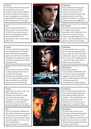
- 1. Colours The colours are dark with a lot of shadowing on the centre character, dark colours create a sense of suspense and build up due to dangerous connotations associated with darkness - red fits with the idea of this, i.e. blood. Positioning Patrick Bateman is looking off camera, toward something which we cannot see. This creates a sense of mystery and questioning as to what he is looking at so sternly – suspense is a typical feature in thriller films. Font The font used for the title is in block white, this makes it stand out from the picture; slashes in the formal typography portray that Patrick Bateman is a businessman with a more sinister side to him. Stereotypes The knife is a typical connotation for danger and murder, especially within thriller films. The promiscuous woman placed inside is also stereotypical for a victim - and all these lead to hints about the direction of the film. Colours The blue colouring is bright and cold, emphasising the isolated island; Black and shadowing is again used with the connotation of danger and helping to create the sense of unease and mystery through the film. Positioning Edward Daniels is set in a close up with the titles separating him from a wide shot of shutter island underneath, again he is looking off camera with a distressed look – this is technique often used in thriller to create question. Font The font itself is simple and bold, in varied shades of off white to contrast from the dark background and make it stand out. The capital lettering used is harsh and helps to hint at the serious notes in the thriller film. Stereotypes Flames are typically characteristic of thriller films; this on the dvd cover immediately suggests a ‘search in the dark’ which centres throughout this film – the island again has connotations of being trapped. Colours Again, like the other covers, the colours are dark with an emphasis on shadow to make the characters look more mysterious. This runs throughout thriller films, so the audience know the theme from the onset. Positioning The characters are placed with their heads at slight angles, but eyes pointing directly into the camera – this is intimidating as it gives you the idea they are looking at you and puts you on edge which is typical of thriller. Font The font of the title is different to that of the remaining typography on the front cover, this makes it stand out. The handwritten styling also personalises the front cover – this ‘handwriting’ is representative of the serial killer. Stereotypes The faint script which covers theimage could be stereotypical of psychological thriller’s. The script confuses the audience and leads them to wonder, as well as hinting to the background theme of script within the film.