SlideShare une entreprise Scribd logo
1  sur  25
Planning This section includes planning for; Fonts/colours Image/colours Choosing The Font for Artist Name and Album Title- I am aiming to look for quite a simple, bold font which isn’t too detailed and mostly sans serif. 1. Coolvetica 2.  3. 4. 5. I like this font because it isn’t too over the top therefore won’t draw attention away from the image. It makes the artist’s name more easy to read for all ages. Also. without the added detail around the letter, it doesn’t signify just femininity instead appears to be flexible with both genders. The extended curve of the ‘t’ adds individualism without being too over exaggerative, therefore making it not an ‘ordinary’ font. This font Is similar to the font above however does not have the extended curve of the ‘t’ and therefore is even more basic. This could be seen as too simplistic and in fact perhaps ‘boring’ as it lacks in individuality. This font differs from the previous fonts as it is thicker. This bolder font could suggest masculinity as it is ‘strong’ and dominant. However, I think that this may clash with the image and draw too much attention away from the image which is something I am avoiding. This font is quite thin, lacking in diameter. This may cause problems when standing out from the image and may be hard to distinguish when added on the image. Also, a background would be needed behind the font to solve this problem and stop the colours from ’blending’ which would ‘clash’ with the image. On the whole, I don’t think this font would be suitable for the album cover. This is also similar to font 1 due to the thickness of the font and slight added detail to the letters. However, this font is slightly thicker and slightly larger in height. This font is unisex as there are no added features which make it more feminine or masculine which would be suitable for the album cover.
[object Object],[object Object],[object Object],[object Object],[object Object],[object Object],Using the ‘Filler’ tool, I created 2 layers of the name’ font using different colours. Above, I used a slightly darker shade of red, more of a maroon red. I did this because a more brown red has masculine qualities relating to the male artist. However, because I am targeting females in addition, I will have to add a feature which will appeal to females, for example a ‘heart’ next to the album title. On the following page, I am going to experiment with different colours and styles. I will be looking very much into detail and changing small factors such as whether letters overlap and the angle of the shadowing (as well as colour of the shadowing). Once I have finished my designs I will then confirm with members of my group and then move onto the design of the artist name and album title.
I exported the letter ‘F’ as a brush and slightly overlapped this letter onto the rest of the word. This makes the font unique and more interesting when in comparison to a simple font. I like this font due to this and in addition, the red and the black combine both femininity and masculinity together. For this font, I have only changed the colour of the font, using the colour of black to highlight the letter ‘F’ instead of the rest of the word. This draws the focus onto the ‘F’, however, I prefer the appearance of the other font because it comes across more sophisticated. For the font above, I decided to use shadowing for the part of the word ‘ont’. This was done by exporting ‘ont’ as a brush and overlapping in either the colour maroon red or black. For the ‘F’, I kept it simple and did not create any shadows. However, a negative of doing this is that it makes the rest of the word stand out when next to the ‘F’ making this font a bit too over the top. Once again, I only have changed the colour, this time creating the black to be on top of the maroon colour. This makes the font stand out in comparison to the font to the left. The lighter shadowing also makes it more interesting than a simple black font. Although, this design is still a bit too over the top and therefore I am looking for something a little more basic. I like this font for the main reason of not being too over complicated. The shadowing adds individualism and the black in front of the red helps the word to stand out more, creating the main focal point to be on the artist name. I also like this font for the same reasons as the font on the left. This font could be ideal for an album name rather than an artist name as it shows a link between the two. As the colours have simply changed in being either the shadowing of the word or the word itself. Chosen Design
Chosen Font- Now I have chosen the font for the artist name, I will now design the album name with the artist name deciding on the layout. After I have completed this, I will be able to apply it to the cover when I am creating it, applying it to the image. Designs- I like the idea of changing the colours for the artist name and album name as it shows a relationship between them both, however I am worried that it be ‘too much’ and perhaps too much of a complicated design. I have designed it so the lining of the words is also straight, avoiding to make it any more complicated. On the other hand, I haven’t aligned the words so it makes it a little more interesting and appealing to the audience. However, the fact that both features are the same font size may confuse the audience therefore on the design below I have increased the size of the ‘Artist Name’ to make it more prominent against the album cover. Chosen Design
On the design above, I have used the ‘rotate’ icon to slightly tilt the artist name. This adds individualism to the design, ‘playing’ with the angles rather than keeping the font on a straight line. However, I think that this design is a little too much and goes against my theme of ‘realism’, over-complicating a simple design.  I will now apply my chosen design to a mock-up layout of the album cover. IMAGE By this being in the corner, it is away from the image, not attracting too much attention away from the image, yet still being part of the audience’s main  focus.
IMAGE IMAGE By the album name and artist name being separated, this creates an almost ‘balanced’ layout throughout.
IMAGE IMAGE For this design, I experimented with the size of the artist name. I like this idea because it helps the artist name stand out and creates a large amount of room for the images. Using this design, I could also perhaps slightly overlap the images onto the letters Chosen Design
IMAGE IMAGE SONG NAMES SONG NAMES Barcode & additional information Barcode & additional information Back Of Album Cover- Basic Layout Ideas Chosen Design I have chosen this design due to the song names being on the right hand side of the back cover. This could also support the audience’s reading of the cover as we interpret text from left to right in the way in which we read- therefore we would see the image first.
Designs for album cover- Underneath I have drawn some ideas of what the album cover should look like, playing with props, types of shots and clothing. These were just brief ideas, which I tried to make different from each other experimenting with different features. In this design I decided to do a close up shot, which was preferred in the results of my questionnaire. Next to the image I have also written the colour of the image, which I chose black and white. I chose black and white because it is simple and basic and relates to realism, stripping back to basics. To match this theme, I have chosen the clothing to be a basic polo shirt therefore it doesn’t attract attention away from the face. The mise-en-scene of the image would preferably be black or a dark grey which could fade towards the edges of the album cover. Idea 1-
In this design I have chosen to go more ‘casual’ which was created by using casual clothing such as a jumper or polo t-shirt and a casual stance, this will be created by him leaning against a brick wall. Props could include a musical instrument such as a guitar (preferably acoustic) which will also lean against the wall beside him. For this shot, I will use a long shot in order for the audience to establish his body language. Colours used will be quite dim, not highly contrasted, instead more ‘naturalistic’. Idea 2-
Chosen Design Idea 3- Each image will be a long shot of the male, which is shown to be preferred by the audience in the album cover research. OR medium shot. This design will relate to the music advertisement as in the advertisement we will also be using the tool of cropping the images to make a whole image showing consistency within our ancillary products.
Above, I have drawn out some ideas for an album back cover. I wanted to get a brief idea of an ideal layout and where each feature, for example, song names, should be positioned. I have decided to place the image to the left hand side. This is because the audience are more likely to look at the image first before reading the song names which is the most important feature. The image is the feature that attracts the audience therefore, with a dominant image, the audience will feel appealed to the album.
Instead of using a person in this album cover, I decided to use a different approach and use an object such as a record player. The record player could be surrounded in daily objects such as a cup of tea or stationary which represent a daily routine/life.  Colours could be slightly dimmer than usual bright colours to add to realism. However, the problem with this idea is that the record player which is seen as a common object in past times, could refer to the ‘older generation’ more than the ‘younger generation’. Therefore, I don’t think this design is ideal for my album cover. Idea 4-
Album Cover Name ideas- For the album cover, we wanted a name that will in someway link with the concept of the song. The main themes portrayed in the song is passion/romance/love/infatuation therefore the name of the album cover should show a relationship with these themes. Below are a few ideas of names: By the Way In the Beginning/ In The End You Can Be Later On With You You Are Majority of these names are portraying a link to a female, for example ‘You can be’, ‘With you’ and ‘You Are’ are all names which signify his passion for the female. ‘In the beginning’ or ‘In the end’ could signify the beginning of a relationship or the end of a relationship. However, ‘In the end’ has more of a negative reference to  relationship and goes against the themes of a new romance which is indicated in the song. We have chosen to use the album name ‘You Are’ as it signifies a relationship with the song (which will be featured as the main hit of the album’ ‘Just the way you are’. Song Name ideas- Most of the song names will also be based on the theme of love. I have come up with a range of names to use based on relationships. Trying Dream She Did It Something That I Like I Feel You Intuition Infinity Be The One You Know What Just The Way You Are The Songs will be in no particular order and there will be a total of 10 songs. All of these are based on relationships. For example; ‘She did it’ relates to what made the male attracted to the female and what she did to make him attracted to her. The song name ‘Trying’ Could have references to the hard times of a relationship, constantly trying to make an effort and make the experience of love more positive than negative None of these songs will have explicit contents. Although this disagrees with what makes an audience more appealed to an album cover (ranked 3 rd  out of 4 choices), it was not the priority feature as it was not ranked first. Therefore, having a parental advisory is not necessary
Ideas For Side Covers Of Album Cover- Artist Name Album  Music Record Details For the side of the album cover I wanted it to be quite simple with only the main features presented. These features included the artist name, album name and the music record details which I will be creating. Making The Designs- For the logos, I wanted to create designs which were similar but different from usual music record companies. I did this by analysing different logos and found that the majority consisted of a basic shape and either a letter of a couple of letters within the shape. Using this information, I made two designs, shown on the left, which included the shape of a star and the letter ‘R’ inside it. The letter ‘R’ represents the word ‘record’, altogether representing the music company, ‘Star Records’. For the other, I used the image of lobster to represent the name ‘lobster records’- this makes it unique and stand out from other music record companies making it more easy for the audience to remember and recognise. To make this logo I imported the lobster as a brush, and the same with the fonts, I then combined these together. For each design I inverted the colours so that the logo would show on a black and white background. To do this I had to ‘import’ the images and font from ‘DaFont’ in white and black. Websites used For the creating the logos- DaFont Graphics Factory
Analysis Of Photos For Album And Back Cover- Front Cover- As I have decided to go with idea 3 for my album cover, I need to take a variety of images which include different poses, clothing and camera distances. The front cover will have a range of 4 shots, each in different standing positions, which will need to be cropped and put on a possibly white background. I am aiming to look for confidence within casual poses and sophistication. In all the images- Lighting- Artificial lighting has been used followed with the flash of the camera. This is mainly due to wanting a brighter image that does not lack in a vibrant feel by being ‘dim’.  Distance- Each picture is a long shot to show his standing position which portray a certain emotion.  Denotation-In this picture, the male is standing casually, with hands placed in both jean pockets and with his head facing down whilst looking to the ground. The picture could connote insecurities as holding your head down shows that you are avoiding eye contact and possibly lacking in confidence. He is wearing a casual shirt and jeans and red trainers. The red trainers are very vibrant and stand out compared to the shirt and jeans, this suggests that he isn’t afraid to stand out from the crowd and shows his ‘vibrant’ personality through the clothing that he wears.  I like this image mainly due to the casual pose. It is quite a warming pose and does not intimidate the audience. It also does not have a specific gender that it may appeal to, for example, the male is not trying to be attractive so females will feel appealing to the image rather then men. This is ideal as our target audience is aimed at both male and female. Denotation- In this picture the male is standing with his arms folded feet apart and keeping his gaze at the camera. By holding his gaze to the camera this could suggest that he is confident and has high self esteem as he connects with the audience. The audience can fee like they can relate to the artist as the eye contact makes it personal towards them. The fact that he is folding his arms could show insecurities as if he is holding a ‘barrier’ against him and the audience, securing himself from reality. The stance, does not come across ‘openly’ friendly due to this and therefore may intimidate the audience. Because of this, I think this photo is not ideal for the album cover at it conflicts with the ‘friendly’ theme.
Denotation- In this photo, the male is standing with his body facing his right looking towards the ground with his head down. His hands are also in his jacket pockets. This is quite a casual shot and looks like it was taken unexpectedly as if he is not purposely posing for the shot. This suggests that he is not vain and not overly confident therefore comes across as approachable to the audience. On the other hand, the fact that he is holding his head down could portray that he is insecure as he is avoiding eye contact from the audience. Overall however, I think that this picture is ideal for the album cover as the pose is ‘different’ from other poses and therefore will ‘stand out’ when featured on the album cover. Clothing- For the following shots, the artist is now wearing a jacket. We wanted a variety of shots each with a slight change in clothing. By having different shots with a slight change in costume, it may make the images more interesting as there is more of a variety and therefore will be appealing to the audience. It is quite a casual styled jacket, one which is in fashion, which suggests that he is ‘update’ on fashion. This could attract females as it shows that he takes care of his appearance and appeal to males as they  may feel that they could relate to his sense of fashion. Denotation- In this picture, the artist is slightly leaning forward holding his jacket upwards whilst facing downwards. This pose is slightly unusual and therefore connotes confidence. Again, the image could look as if it was taken unexpectedly (as if he was ‘fixing’ his jacket) or could look as if he is posing, again connotating confidence. Because the theme of confidence has been connotated frequently in this image it may suggest that he is ‘big egoed’ which may not attract the audience. On the other hand, females may feel appealed this type of attitude as it suggests a ‘bad boy’, however has a negative affect on males as they may see him as arrogant. Below is also a similar image which I would also be using that has the same connotations at it is a similar image. The only difference between this image is that the artist is looking in a different direction, over his shoulder as if he is curiously looking to see what is behind him. This pose again looks like it was taken unexpectedly and therefore not purposely posed.
Denotation- The male is standing straight towards the camera, feet pointing forwards and hands in his pockets. This is a very casual shot and simple. He comes across as approachable as his body is ‘open’ towards the camera. This therefore doesn’t intermediate the audience and they may feel attracted to the album cover. He is also holding a straight gaze at the camera which comes across as almost a ‘cool’ expression. This relaxed expression also comes across as approachable for the male and female audience. However, the fact that he is standing ‘straight-on’ towards the camera could suggest that he is over-ly confident as if he is portraying himself to have high self esteem. This high self esteem, as mentioned before may have negative and positive connotations.  Denotation- In this image the male is standing with his face slightly facing opposite directions whilst looking to his side. He is also standing with his hands in his jacket pockets. In this image, the artist comes across as quite uninterested and in some ways ‘bored’, giving negative vibes towards the audience. This is because he is looking away from the camera avoiding eye contact with the audience. His feet are also pointing in a different direction as if he is not bothered of the presence of the audience. Because of this, I won’t be using this image as part of the album cover. A criticism of the photos taken is that the mis-en-scene is not aligned and is at a slight slant. On the other hand, this can be adjusted as on the front cover as I will be cropping out the images using tools such as ‘magnetic lasso’
Denotation- In this image the male is standing with his side towards the camera and facing over his left shoulder. His hands are casually sitting in his jacket pockets. I like this image because represents the artist as laid back, confident, ‘uptown’ and stylish. These connotations relate to the our aimed themes. This confidence can be quite appealing to the audience as it shows that he doesn’t lack in personality. It also makes him look quite innocent and therefore not intimidating for the audience. Because of this I have chosen to use this image for the cover of the album. Chosen Images for the front cover- Above are the four images that I will be using for the album cover. I have chosen these ones altogether because they share a link as the poses are different yet similar. For instance, in each of the photos the artist is looking away from the camera and in three of the images, he is holding his jacket. I did this because if I was intending to crop the photos out I wanted them to relate to each other as I didn’t want them to be too different.
Back Cover- For the back cover, we have decided to use a medium shot. This conflicts with the idea of a long shot in idea 3, however, having a different use of distances adds variety as there will be a use of 4 different long shots on the front cover. Denotation- In this image, a medium shot to long shot has been used. He is also wearing the additional clothing of a hat and is sitting his hands in his pockets. He is also slightly leaning towards the camera. The artists is staring straight at the camera signifying confidence within his poses. It also makes it personal towards the audience as he is holding their gaze. However, his expression comes across as almost threatening instead of friendly as he is not smiling. Due to this I will not be using this image for the album cover. Denotation- In this image the artist is again holding his hands in his pockets however, he is looking away from the camera which makes the image look posed. This posed position could suggest vanity as he is avoiding eye contact, however this could also have the negative connotations of low self esteem. On the contrast, is quite an unusual pose so therefore could suggest confidence. The artificial lighting creates a harsh shadow in the background as it is very bright. It could also flatter the artists complexion and hide imperfections. We wanted to use bright light to make the image quite vibrant and appealing for the audience rather than dim light that would highlight imperfections areas such as blemishes.
Denotations- In this image the artist is holding his head down while holding onto his jacket. He is also wearing a hat. I like this this image as it is different and unique from all the other images. It is quite a stylish and sophisticated pose which may attract females as it comes across as ‘open’ and friendly. His smirk portrays ‘friendly-ness’ therefore making it appealing towards the audience and showing a ‘glowing’ personality to the audience. However, this image has been ‘cut-off’ on the arm and for it to be featured on the back of the album cover, it would need to be a whole image. Because of this, I won’t be able to use the image. This image is different from the other pictures as it was taken in the park. It shows the artist sitting, facing away from the camera on a bench. I like this image because it only shows the back of him, as for the front the artist was looking towards the camera creating a balance between the images. It also could suggest that he is in deep-thought while looking over at the scenic views. It could show that he is thinking about the woman who is the focus of the songs on the album. I have decided to use this as part of the back cover therefore I will need to crop the artists sitting on the bench out and ‘fill out’ the view with a white background. Chosen Image
Production Process in Abode Photoshop Elements- For cropping the photos I used ‘magnetic lasso’ which was more accurate and quicker than using the ‘eraser’ tool to remove the background. This was used around the whole of the body image. For the areas which magnetic lasso didn’t crop accurately, I then used the rubber tool which I used under the magnifier. I used the tool ‘spot healer’ to airbrush flaws such as blemishes from his skin. This is mainly because If I was to use a grey tone of colours on the images then the blemishes would be more obvious in a darker tone. I used this tool in moderation as I didn’t want it to cover his true identity and still show some of his imperfections.
To make the images more realistic I chose to add a grey tone. This was done by following the process of – Enhance- Convert to black and white. I then altered the settings for ‘brightness’ and ‘contrast’. For the back of the album cover, I had to crop out the mise-en-scene of the image and fill it in with a white background instead. I wanted to keep the size and position of the artist the same but found that the bench didn’t fit the whole size of the back cover. Therefore, I had to use the tool ‘clone’ to give the impression that the image fits the whole size and that the bench covers the white background.
For the background of the song names I decided to use notepaper as if they have been written onto a piece of paper. This adds a more personal touch as if the artist is writing a letter the woman his songs are aimed at. I wanted to keep the effect of the hole punches as it adds to the realism and makes it look as if it had been torn out of a notepad. However, because the paper originally came from a black background it was difficult to keep the hole punches looking realistic after removing all the black. Because of this I decided to cut out the hole punches so it looks like a clean sheet of paper. Here I have shown all of the parts of the album cover. To find the measurements I measured the actual length of the side, back and front cover using a ruler and filled in the measurements on the programme.
Final Product- Front Cover- Side Cover- Back Cover- Additional information was inspired by other album covers. I used another album cover to analyse how they had laid out information such as music record companies, the artist website and CD information. Barcode has been featured to also show additional information. This makes the album cover individual from other album covers. Name of the album cover on the back, relates the back to the front. I did this because I used different images so I wanted to show some consistency through the front and the back. I added a dark shadow around the images to make them look more 3D. This makes the images stand out more, becoming more attention focusing for the audience. Same information used as the back of the cover such as record companies and coding.

Contenu connexe

Tendances

Tendances (20)

font practices
font practicesfont practices
font practices
 
Font Practices
Font PracticesFont Practices
Font Practices
 
Front Cover Planning
Front Cover PlanningFront Cover Planning
Front Cover Planning
 
Production of poster and review
Production of poster and reviewProduction of poster and review
Production of poster and review
 
Samantha etridge music magazine front cover analysis
Samantha etridge music magazine front cover analysisSamantha etridge music magazine front cover analysis
Samantha etridge music magazine front cover analysis
 
Codes and Conventions Evaluation Question
Codes and Conventions Evaluation QuestionCodes and Conventions Evaluation Question
Codes and Conventions Evaluation Question
 
Research
ResearchResearch
Research
 
1. research new (1)
1. research new (1)1. research new (1)
1. research new (1)
 
Digital media
Digital mediaDigital media
Digital media
 
Task 5
Task 5 Task 5
Task 5
 
Style sheet
Style sheetStyle sheet
Style sheet
 
Q2
Q2Q2
Q2
 
Ancillary analysis
Ancillary analysisAncillary analysis
Ancillary analysis
 
5. pre production (1)
5. pre production (1)5. pre production (1)
5. pre production (1)
 
A Level Digipak Research
A Level Digipak ResearchA Level Digipak Research
A Level Digipak Research
 
Ancillary Presentation
Ancillary PresentationAncillary Presentation
Ancillary Presentation
 
Ancillary Presentation
Ancillary PresentationAncillary Presentation
Ancillary Presentation
 
Analysis of Magazine Covers
Analysis of Magazine Covers Analysis of Magazine Covers
Analysis of Magazine Covers
 
Analysis of Double Page Spread
Analysis of Double Page SpreadAnalysis of Double Page Spread
Analysis of Double Page Spread
 
Evaluation
EvaluationEvaluation
Evaluation
 

Similaire à Planning For The Album Cover

Holly Corden's Evaluation
Holly Corden's EvaluationHolly Corden's Evaluation
Holly Corden's Evaluationmrsmwlms
 
Alice digi pack analysis
Alice digi pack analysisAlice digi pack analysis
Alice digi pack analysiscowlingalice
 
Guvna b a little love pitch
Guvna b  a little love pitchGuvna b  a little love pitch
Guvna b a little love pitchlenrickgreaves
 
Screenshots for development
Screenshots for development Screenshots for development
Screenshots for development kenyaL
 
Ancillary Text Conventions
Ancillary Text ConventionsAncillary Text Conventions
Ancillary Text Conventionsemily_rhian18
 
Question 3 – what have you learnt from
Question 3 – what have you learnt fromQuestion 3 – what have you learnt from
Question 3 – what have you learnt fromnushy1993
 
Question 3 – what have you learnt from
Question 3 – what have you learnt fromQuestion 3 – what have you learnt from
Question 3 – what have you learnt fromnushy1993
 
Question 3 – what have you learnt from
Question 3 – what have you learnt fromQuestion 3 – what have you learnt from
Question 3 – what have you learnt fromnushy1993
 
Double page spread development diary
Double page spread development diaryDouble page spread development diary
Double page spread development diaryLiamattridge
 
Evaluations and preperation for main task k
Evaluations and preperation for main task kEvaluations and preperation for main task k
Evaluations and preperation for main task keliroddy
 
Evaluations and preperation for main task
Evaluations and preperation for main task Evaluations and preperation for main task
Evaluations and preperation for main task eliroddy
 
Fmp pre production
Fmp pre productionFmp pre production
Fmp pre productionBen Harris
 
My own masthead ideas.
My own masthead ideas.My own masthead ideas.
My own masthead ideas.10bertal
 

Similaire à Planning For The Album Cover (20)

Holly Corden's Evaluation
Holly Corden's EvaluationHolly Corden's Evaluation
Holly Corden's Evaluation
 
Pre-production
Pre-production Pre-production
Pre-production
 
Alice digi pack analysis
Alice digi pack analysisAlice digi pack analysis
Alice digi pack analysis
 
Pre-Production
Pre-ProductionPre-Production
Pre-Production
 
Guvna b a little love pitch
Guvna b  a little love pitchGuvna b  a little love pitch
Guvna b a little love pitch
 
5. pre production 2
5. pre production 25. pre production 2
5. pre production 2
 
Screenshots for development
Screenshots for development Screenshots for development
Screenshots for development
 
Fonts 1
Fonts 1Fonts 1
Fonts 1
 
Magazine Mastheads
Magazine MastheadsMagazine Mastheads
Magazine Mastheads
 
Font ideas
Font ideasFont ideas
Font ideas
 
Analysis
AnalysisAnalysis
Analysis
 
Ancillary Text Conventions
Ancillary Text ConventionsAncillary Text Conventions
Ancillary Text Conventions
 
Question 3 – what have you learnt from
Question 3 – what have you learnt fromQuestion 3 – what have you learnt from
Question 3 – what have you learnt from
 
Question 3 – what have you learnt from
Question 3 – what have you learnt fromQuestion 3 – what have you learnt from
Question 3 – what have you learnt from
 
Question 3 – what have you learnt from
Question 3 – what have you learnt fromQuestion 3 – what have you learnt from
Question 3 – what have you learnt from
 
Double page spread development diary
Double page spread development diaryDouble page spread development diary
Double page spread development diary
 
Evaluations and preperation for main task k
Evaluations and preperation for main task kEvaluations and preperation for main task k
Evaluations and preperation for main task k
 
Evaluations and preperation for main task
Evaluations and preperation for main task Evaluations and preperation for main task
Evaluations and preperation for main task
 
Fmp pre production
Fmp pre productionFmp pre production
Fmp pre production
 
My own masthead ideas.
My own masthead ideas.My own masthead ideas.
My own masthead ideas.
 

Plus de rachael swan

Evaluation 3 blog presentation
Evaluation 3 blog presentationEvaluation 3 blog presentation
Evaluation 3 blog presentationrachael swan
 
Evaluation 3 blog presentation
Evaluation 3 blog presentationEvaluation 3 blog presentation
Evaluation 3 blog presentationrachael swan
 
Evaluation 3 blog presentation
Evaluation 3 blog presentationEvaluation 3 blog presentation
Evaluation 3 blog presentationrachael swan
 
Question 4 Evaluation
Question 4 EvaluationQuestion 4 Evaluation
Question 4 Evaluationrachael swan
 
Evaluation 2-How effective is the combination of your main product and ancill...
Evaluation 2-How effective is the combination of your main product and ancill...Evaluation 2-How effective is the combination of your main product and ancill...
Evaluation 2-How effective is the combination of your main product and ancill...rachael swan
 
Images Taken for the Ancillaries 3
Images Taken for the Ancillaries 3Images Taken for the Ancillaries 3
Images Taken for the Ancillaries 3rachael swan
 
Images taken for the ancillaries2
Images taken for the ancillaries2Images taken for the ancillaries2
Images taken for the ancillaries2rachael swan
 
Images Taken for the Ancillaries
Images Taken for the AncillariesImages Taken for the Ancillaries
Images Taken for the Ancillariesrachael swan
 
Images taken for the ancillaries2
Images taken for the ancillaries2Images taken for the ancillaries2
Images taken for the ancillaries2rachael swan
 
Storyboard Close Ups
Storyboard Close UpsStoryboard Close Ups
Storyboard Close Upsrachael swan
 
Ancillaries Images Shoot 1 by Joe Lavigne
Ancillaries Images Shoot 1 by Joe LavigneAncillaries Images Shoot 1 by Joe Lavigne
Ancillaries Images Shoot 1 by Joe Lavignerachael swan
 
Ancillarie Images by Joe Lavigne
Ancillarie Images by Joe LavigneAncillarie Images by Joe Lavigne
Ancillarie Images by Joe Lavignerachael swan
 
Joe Lavigne's Storyboards
Joe Lavigne's StoryboardsJoe Lavigne's Storyboards
Joe Lavigne's Storyboardsrachael swan
 
Generic conventions of an album cover
Generic conventions of an album coverGeneric conventions of an album cover
Generic conventions of an album coverrachael swan
 

Plus de rachael swan (20)

Evaluation 3 blog presentation
Evaluation 3 blog presentationEvaluation 3 blog presentation
Evaluation 3 blog presentation
 
Evaluation 3 blog presentation
Evaluation 3 blog presentationEvaluation 3 blog presentation
Evaluation 3 blog presentation
 
Evaluation 3 blog presentation
Evaluation 3 blog presentationEvaluation 3 blog presentation
Evaluation 3 blog presentation
 
Question 4 Evaluation
Question 4 EvaluationQuestion 4 Evaluation
Question 4 Evaluation
 
Evaluation 2-How effective is the combination of your main product and ancill...
Evaluation 2-How effective is the combination of your main product and ancill...Evaluation 2-How effective is the combination of your main product and ancill...
Evaluation 2-How effective is the combination of your main product and ancill...
 
Storyboard final
Storyboard finalStoryboard final
Storyboard final
 
Images Taken for the Ancillaries 3
Images Taken for the Ancillaries 3Images Taken for the Ancillaries 3
Images Taken for the Ancillaries 3
 
Images taken for the ancillaries2
Images taken for the ancillaries2Images taken for the ancillaries2
Images taken for the ancillaries2
 
Images Taken for the Ancillaries
Images Taken for the AncillariesImages Taken for the Ancillaries
Images Taken for the Ancillaries
 
Images taken for the ancillaries2
Images taken for the ancillaries2Images taken for the ancillaries2
Images taken for the ancillaries2
 
Storyboard Close Ups
Storyboard Close UpsStoryboard Close Ups
Storyboard Close Ups
 
Audience
AudienceAudience
Audience
 
Ancillaries Images Shoot 1 by Joe Lavigne
Ancillaries Images Shoot 1 by Joe LavigneAncillaries Images Shoot 1 by Joe Lavigne
Ancillaries Images Shoot 1 by Joe Lavigne
 
Ancillarie Images by Joe Lavigne
Ancillarie Images by Joe LavigneAncillarie Images by Joe Lavigne
Ancillarie Images by Joe Lavigne
 
Joe Lavigne's Storyboards
Joe Lavigne's StoryboardsJoe Lavigne's Storyboards
Joe Lavigne's Storyboards
 
Storyboards
StoryboardsStoryboards
Storyboards
 
Storyboards
StoryboardsStoryboards
Storyboards
 
Storyboards
StoryboardsStoryboards
Storyboards
 
Audience
AudienceAudience
Audience
 
Generic conventions of an album cover
Generic conventions of an album coverGeneric conventions of an album cover
Generic conventions of an album cover
 

Planning For The Album Cover

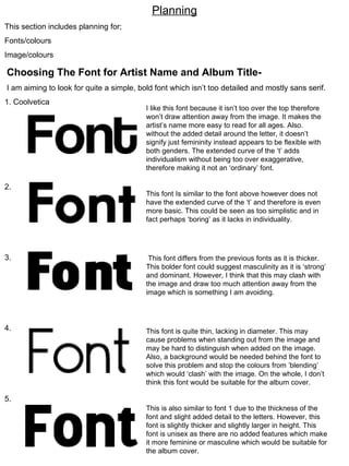
  • 1. Planning This section includes planning for; Fonts/colours Image/colours Choosing The Font for Artist Name and Album Title- I am aiming to look for quite a simple, bold font which isn’t too detailed and mostly sans serif. 1. Coolvetica 2. 3. 4. 5. I like this font because it isn’t too over the top therefore won’t draw attention away from the image. It makes the artist’s name more easy to read for all ages. Also. without the added detail around the letter, it doesn’t signify just femininity instead appears to be flexible with both genders. The extended curve of the ‘t’ adds individualism without being too over exaggerative, therefore making it not an ‘ordinary’ font. This font Is similar to the font above however does not have the extended curve of the ‘t’ and therefore is even more basic. This could be seen as too simplistic and in fact perhaps ‘boring’ as it lacks in individuality. This font differs from the previous fonts as it is thicker. This bolder font could suggest masculinity as it is ‘strong’ and dominant. However, I think that this may clash with the image and draw too much attention away from the image which is something I am avoiding. This font is quite thin, lacking in diameter. This may cause problems when standing out from the image and may be hard to distinguish when added on the image. Also, a background would be needed behind the font to solve this problem and stop the colours from ’blending’ which would ‘clash’ with the image. On the whole, I don’t think this font would be suitable for the album cover. This is also similar to font 1 due to the thickness of the font and slight added detail to the letters. However, this font is slightly thicker and slightly larger in height. This font is unisex as there are no added features which make it more feminine or masculine which would be suitable for the album cover.
  • 2.
  • 3. I exported the letter ‘F’ as a brush and slightly overlapped this letter onto the rest of the word. This makes the font unique and more interesting when in comparison to a simple font. I like this font due to this and in addition, the red and the black combine both femininity and masculinity together. For this font, I have only changed the colour of the font, using the colour of black to highlight the letter ‘F’ instead of the rest of the word. This draws the focus onto the ‘F’, however, I prefer the appearance of the other font because it comes across more sophisticated. For the font above, I decided to use shadowing for the part of the word ‘ont’. This was done by exporting ‘ont’ as a brush and overlapping in either the colour maroon red or black. For the ‘F’, I kept it simple and did not create any shadows. However, a negative of doing this is that it makes the rest of the word stand out when next to the ‘F’ making this font a bit too over the top. Once again, I only have changed the colour, this time creating the black to be on top of the maroon colour. This makes the font stand out in comparison to the font to the left. The lighter shadowing also makes it more interesting than a simple black font. Although, this design is still a bit too over the top and therefore I am looking for something a little more basic. I like this font for the main reason of not being too over complicated. The shadowing adds individualism and the black in front of the red helps the word to stand out more, creating the main focal point to be on the artist name. I also like this font for the same reasons as the font on the left. This font could be ideal for an album name rather than an artist name as it shows a link between the two. As the colours have simply changed in being either the shadowing of the word or the word itself. Chosen Design
  • 4. Chosen Font- Now I have chosen the font for the artist name, I will now design the album name with the artist name deciding on the layout. After I have completed this, I will be able to apply it to the cover when I am creating it, applying it to the image. Designs- I like the idea of changing the colours for the artist name and album name as it shows a relationship between them both, however I am worried that it be ‘too much’ and perhaps too much of a complicated design. I have designed it so the lining of the words is also straight, avoiding to make it any more complicated. On the other hand, I haven’t aligned the words so it makes it a little more interesting and appealing to the audience. However, the fact that both features are the same font size may confuse the audience therefore on the design below I have increased the size of the ‘Artist Name’ to make it more prominent against the album cover. Chosen Design
  • 5. On the design above, I have used the ‘rotate’ icon to slightly tilt the artist name. This adds individualism to the design, ‘playing’ with the angles rather than keeping the font on a straight line. However, I think that this design is a little too much and goes against my theme of ‘realism’, over-complicating a simple design. I will now apply my chosen design to a mock-up layout of the album cover. IMAGE By this being in the corner, it is away from the image, not attracting too much attention away from the image, yet still being part of the audience’s main focus.
  • 6. IMAGE IMAGE By the album name and artist name being separated, this creates an almost ‘balanced’ layout throughout.
  • 7. IMAGE IMAGE For this design, I experimented with the size of the artist name. I like this idea because it helps the artist name stand out and creates a large amount of room for the images. Using this design, I could also perhaps slightly overlap the images onto the letters Chosen Design
  • 8. IMAGE IMAGE SONG NAMES SONG NAMES Barcode & additional information Barcode & additional information Back Of Album Cover- Basic Layout Ideas Chosen Design I have chosen this design due to the song names being on the right hand side of the back cover. This could also support the audience’s reading of the cover as we interpret text from left to right in the way in which we read- therefore we would see the image first.
  • 9. Designs for album cover- Underneath I have drawn some ideas of what the album cover should look like, playing with props, types of shots and clothing. These were just brief ideas, which I tried to make different from each other experimenting with different features. In this design I decided to do a close up shot, which was preferred in the results of my questionnaire. Next to the image I have also written the colour of the image, which I chose black and white. I chose black and white because it is simple and basic and relates to realism, stripping back to basics. To match this theme, I have chosen the clothing to be a basic polo shirt therefore it doesn’t attract attention away from the face. The mise-en-scene of the image would preferably be black or a dark grey which could fade towards the edges of the album cover. Idea 1-
  • 10. In this design I have chosen to go more ‘casual’ which was created by using casual clothing such as a jumper or polo t-shirt and a casual stance, this will be created by him leaning against a brick wall. Props could include a musical instrument such as a guitar (preferably acoustic) which will also lean against the wall beside him. For this shot, I will use a long shot in order for the audience to establish his body language. Colours used will be quite dim, not highly contrasted, instead more ‘naturalistic’. Idea 2-
  • 11. Chosen Design Idea 3- Each image will be a long shot of the male, which is shown to be preferred by the audience in the album cover research. OR medium shot. This design will relate to the music advertisement as in the advertisement we will also be using the tool of cropping the images to make a whole image showing consistency within our ancillary products.
  • 12. Above, I have drawn out some ideas for an album back cover. I wanted to get a brief idea of an ideal layout and where each feature, for example, song names, should be positioned. I have decided to place the image to the left hand side. This is because the audience are more likely to look at the image first before reading the song names which is the most important feature. The image is the feature that attracts the audience therefore, with a dominant image, the audience will feel appealed to the album.
  • 13. Instead of using a person in this album cover, I decided to use a different approach and use an object such as a record player. The record player could be surrounded in daily objects such as a cup of tea or stationary which represent a daily routine/life. Colours could be slightly dimmer than usual bright colours to add to realism. However, the problem with this idea is that the record player which is seen as a common object in past times, could refer to the ‘older generation’ more than the ‘younger generation’. Therefore, I don’t think this design is ideal for my album cover. Idea 4-
  • 14. Album Cover Name ideas- For the album cover, we wanted a name that will in someway link with the concept of the song. The main themes portrayed in the song is passion/romance/love/infatuation therefore the name of the album cover should show a relationship with these themes. Below are a few ideas of names: By the Way In the Beginning/ In The End You Can Be Later On With You You Are Majority of these names are portraying a link to a female, for example ‘You can be’, ‘With you’ and ‘You Are’ are all names which signify his passion for the female. ‘In the beginning’ or ‘In the end’ could signify the beginning of a relationship or the end of a relationship. However, ‘In the end’ has more of a negative reference to relationship and goes against the themes of a new romance which is indicated in the song. We have chosen to use the album name ‘You Are’ as it signifies a relationship with the song (which will be featured as the main hit of the album’ ‘Just the way you are’. Song Name ideas- Most of the song names will also be based on the theme of love. I have come up with a range of names to use based on relationships. Trying Dream She Did It Something That I Like I Feel You Intuition Infinity Be The One You Know What Just The Way You Are The Songs will be in no particular order and there will be a total of 10 songs. All of these are based on relationships. For example; ‘She did it’ relates to what made the male attracted to the female and what she did to make him attracted to her. The song name ‘Trying’ Could have references to the hard times of a relationship, constantly trying to make an effort and make the experience of love more positive than negative None of these songs will have explicit contents. Although this disagrees with what makes an audience more appealed to an album cover (ranked 3 rd out of 4 choices), it was not the priority feature as it was not ranked first. Therefore, having a parental advisory is not necessary
  • 15. Ideas For Side Covers Of Album Cover- Artist Name Album Music Record Details For the side of the album cover I wanted it to be quite simple with only the main features presented. These features included the artist name, album name and the music record details which I will be creating. Making The Designs- For the logos, I wanted to create designs which were similar but different from usual music record companies. I did this by analysing different logos and found that the majority consisted of a basic shape and either a letter of a couple of letters within the shape. Using this information, I made two designs, shown on the left, which included the shape of a star and the letter ‘R’ inside it. The letter ‘R’ represents the word ‘record’, altogether representing the music company, ‘Star Records’. For the other, I used the image of lobster to represent the name ‘lobster records’- this makes it unique and stand out from other music record companies making it more easy for the audience to remember and recognise. To make this logo I imported the lobster as a brush, and the same with the fonts, I then combined these together. For each design I inverted the colours so that the logo would show on a black and white background. To do this I had to ‘import’ the images and font from ‘DaFont’ in white and black. Websites used For the creating the logos- DaFont Graphics Factory
  • 16. Analysis Of Photos For Album And Back Cover- Front Cover- As I have decided to go with idea 3 for my album cover, I need to take a variety of images which include different poses, clothing and camera distances. The front cover will have a range of 4 shots, each in different standing positions, which will need to be cropped and put on a possibly white background. I am aiming to look for confidence within casual poses and sophistication. In all the images- Lighting- Artificial lighting has been used followed with the flash of the camera. This is mainly due to wanting a brighter image that does not lack in a vibrant feel by being ‘dim’. Distance- Each picture is a long shot to show his standing position which portray a certain emotion. Denotation-In this picture, the male is standing casually, with hands placed in both jean pockets and with his head facing down whilst looking to the ground. The picture could connote insecurities as holding your head down shows that you are avoiding eye contact and possibly lacking in confidence. He is wearing a casual shirt and jeans and red trainers. The red trainers are very vibrant and stand out compared to the shirt and jeans, this suggests that he isn’t afraid to stand out from the crowd and shows his ‘vibrant’ personality through the clothing that he wears. I like this image mainly due to the casual pose. It is quite a warming pose and does not intimidate the audience. It also does not have a specific gender that it may appeal to, for example, the male is not trying to be attractive so females will feel appealing to the image rather then men. This is ideal as our target audience is aimed at both male and female. Denotation- In this picture the male is standing with his arms folded feet apart and keeping his gaze at the camera. By holding his gaze to the camera this could suggest that he is confident and has high self esteem as he connects with the audience. The audience can fee like they can relate to the artist as the eye contact makes it personal towards them. The fact that he is folding his arms could show insecurities as if he is holding a ‘barrier’ against him and the audience, securing himself from reality. The stance, does not come across ‘openly’ friendly due to this and therefore may intimidate the audience. Because of this, I think this photo is not ideal for the album cover at it conflicts with the ‘friendly’ theme.
  • 17. Denotation- In this photo, the male is standing with his body facing his right looking towards the ground with his head down. His hands are also in his jacket pockets. This is quite a casual shot and looks like it was taken unexpectedly as if he is not purposely posing for the shot. This suggests that he is not vain and not overly confident therefore comes across as approachable to the audience. On the other hand, the fact that he is holding his head down could portray that he is insecure as he is avoiding eye contact from the audience. Overall however, I think that this picture is ideal for the album cover as the pose is ‘different’ from other poses and therefore will ‘stand out’ when featured on the album cover. Clothing- For the following shots, the artist is now wearing a jacket. We wanted a variety of shots each with a slight change in clothing. By having different shots with a slight change in costume, it may make the images more interesting as there is more of a variety and therefore will be appealing to the audience. It is quite a casual styled jacket, one which is in fashion, which suggests that he is ‘update’ on fashion. This could attract females as it shows that he takes care of his appearance and appeal to males as they may feel that they could relate to his sense of fashion. Denotation- In this picture, the artist is slightly leaning forward holding his jacket upwards whilst facing downwards. This pose is slightly unusual and therefore connotes confidence. Again, the image could look as if it was taken unexpectedly (as if he was ‘fixing’ his jacket) or could look as if he is posing, again connotating confidence. Because the theme of confidence has been connotated frequently in this image it may suggest that he is ‘big egoed’ which may not attract the audience. On the other hand, females may feel appealed this type of attitude as it suggests a ‘bad boy’, however has a negative affect on males as they may see him as arrogant. Below is also a similar image which I would also be using that has the same connotations at it is a similar image. The only difference between this image is that the artist is looking in a different direction, over his shoulder as if he is curiously looking to see what is behind him. This pose again looks like it was taken unexpectedly and therefore not purposely posed.
  • 18. Denotation- The male is standing straight towards the camera, feet pointing forwards and hands in his pockets. This is a very casual shot and simple. He comes across as approachable as his body is ‘open’ towards the camera. This therefore doesn’t intermediate the audience and they may feel attracted to the album cover. He is also holding a straight gaze at the camera which comes across as almost a ‘cool’ expression. This relaxed expression also comes across as approachable for the male and female audience. However, the fact that he is standing ‘straight-on’ towards the camera could suggest that he is over-ly confident as if he is portraying himself to have high self esteem. This high self esteem, as mentioned before may have negative and positive connotations. Denotation- In this image the male is standing with his face slightly facing opposite directions whilst looking to his side. He is also standing with his hands in his jacket pockets. In this image, the artist comes across as quite uninterested and in some ways ‘bored’, giving negative vibes towards the audience. This is because he is looking away from the camera avoiding eye contact with the audience. His feet are also pointing in a different direction as if he is not bothered of the presence of the audience. Because of this, I won’t be using this image as part of the album cover. A criticism of the photos taken is that the mis-en-scene is not aligned and is at a slight slant. On the other hand, this can be adjusted as on the front cover as I will be cropping out the images using tools such as ‘magnetic lasso’
  • 19. Denotation- In this image the male is standing with his side towards the camera and facing over his left shoulder. His hands are casually sitting in his jacket pockets. I like this image because represents the artist as laid back, confident, ‘uptown’ and stylish. These connotations relate to the our aimed themes. This confidence can be quite appealing to the audience as it shows that he doesn’t lack in personality. It also makes him look quite innocent and therefore not intimidating for the audience. Because of this I have chosen to use this image for the cover of the album. Chosen Images for the front cover- Above are the four images that I will be using for the album cover. I have chosen these ones altogether because they share a link as the poses are different yet similar. For instance, in each of the photos the artist is looking away from the camera and in three of the images, he is holding his jacket. I did this because if I was intending to crop the photos out I wanted them to relate to each other as I didn’t want them to be too different.
  • 20. Back Cover- For the back cover, we have decided to use a medium shot. This conflicts with the idea of a long shot in idea 3, however, having a different use of distances adds variety as there will be a use of 4 different long shots on the front cover. Denotation- In this image, a medium shot to long shot has been used. He is also wearing the additional clothing of a hat and is sitting his hands in his pockets. He is also slightly leaning towards the camera. The artists is staring straight at the camera signifying confidence within his poses. It also makes it personal towards the audience as he is holding their gaze. However, his expression comes across as almost threatening instead of friendly as he is not smiling. Due to this I will not be using this image for the album cover. Denotation- In this image the artist is again holding his hands in his pockets however, he is looking away from the camera which makes the image look posed. This posed position could suggest vanity as he is avoiding eye contact, however this could also have the negative connotations of low self esteem. On the contrast, is quite an unusual pose so therefore could suggest confidence. The artificial lighting creates a harsh shadow in the background as it is very bright. It could also flatter the artists complexion and hide imperfections. We wanted to use bright light to make the image quite vibrant and appealing for the audience rather than dim light that would highlight imperfections areas such as blemishes.
  • 21. Denotations- In this image the artist is holding his head down while holding onto his jacket. He is also wearing a hat. I like this this image as it is different and unique from all the other images. It is quite a stylish and sophisticated pose which may attract females as it comes across as ‘open’ and friendly. His smirk portrays ‘friendly-ness’ therefore making it appealing towards the audience and showing a ‘glowing’ personality to the audience. However, this image has been ‘cut-off’ on the arm and for it to be featured on the back of the album cover, it would need to be a whole image. Because of this, I won’t be able to use the image. This image is different from the other pictures as it was taken in the park. It shows the artist sitting, facing away from the camera on a bench. I like this image because it only shows the back of him, as for the front the artist was looking towards the camera creating a balance between the images. It also could suggest that he is in deep-thought while looking over at the scenic views. It could show that he is thinking about the woman who is the focus of the songs on the album. I have decided to use this as part of the back cover therefore I will need to crop the artists sitting on the bench out and ‘fill out’ the view with a white background. Chosen Image
  • 22. Production Process in Abode Photoshop Elements- For cropping the photos I used ‘magnetic lasso’ which was more accurate and quicker than using the ‘eraser’ tool to remove the background. This was used around the whole of the body image. For the areas which magnetic lasso didn’t crop accurately, I then used the rubber tool which I used under the magnifier. I used the tool ‘spot healer’ to airbrush flaws such as blemishes from his skin. This is mainly because If I was to use a grey tone of colours on the images then the blemishes would be more obvious in a darker tone. I used this tool in moderation as I didn’t want it to cover his true identity and still show some of his imperfections.
  • 23. To make the images more realistic I chose to add a grey tone. This was done by following the process of – Enhance- Convert to black and white. I then altered the settings for ‘brightness’ and ‘contrast’. For the back of the album cover, I had to crop out the mise-en-scene of the image and fill it in with a white background instead. I wanted to keep the size and position of the artist the same but found that the bench didn’t fit the whole size of the back cover. Therefore, I had to use the tool ‘clone’ to give the impression that the image fits the whole size and that the bench covers the white background.
  • 24. For the background of the song names I decided to use notepaper as if they have been written onto a piece of paper. This adds a more personal touch as if the artist is writing a letter the woman his songs are aimed at. I wanted to keep the effect of the hole punches as it adds to the realism and makes it look as if it had been torn out of a notepad. However, because the paper originally came from a black background it was difficult to keep the hole punches looking realistic after removing all the black. Because of this I decided to cut out the hole punches so it looks like a clean sheet of paper. Here I have shown all of the parts of the album cover. To find the measurements I measured the actual length of the side, back and front cover using a ruler and filled in the measurements on the programme.
  • 25. Final Product- Front Cover- Side Cover- Back Cover- Additional information was inspired by other album covers. I used another album cover to analyse how they had laid out information such as music record companies, the artist website and CD information. Barcode has been featured to also show additional information. This makes the album cover individual from other album covers. Name of the album cover on the back, relates the back to the front. I did this because I used different images so I wanted to show some consistency through the front and the back. I added a dark shadow around the images to make them look more 3D. This makes the images stand out more, becoming more attention focusing for the audience. Same information used as the back of the cover such as record companies and coding.