

Recommandé
Contenu connexe
Tendances
Tendances (20)
Similaire à Basic interior design
Similaire à Basic interior design (20)
Plus de Bangkok, Thailand
Plus de Bangkok, Thailand (20)
Dernier
Dernier (20)
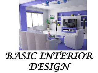
Basic interior design
- 2. When you know the basic interior design principles you can transform any space to look fabulous. You know what it feels like when you walk into a well designed room. You can sense how everything feels cohesive and put together. It feels just right. You can achieve that effect in your own home with a little knowledge of basic design principles. Pair that knowledge with practice and experimentation and you’re on your way to creating a beautiful home.
- 3. “Interior design is the process of shaping the experience of interior space, through the manipulation of spatial volume as well as surface treatment. Not to be confused with interior decoration, interior design draws on aspects of environmental psychology, architecture, and product design in addition to traditional decoration.
- 4. SEVEN PRINCIPLES OF INTERIOR DESIGN I.
- 5. When doing interior design it is necessary to think of the house as a totality; a series of spaces linked together by halls and stairways. It is therefore appropriate that a common style and theme runs throughout
- 7. This is not to say that all interior design elements should be the same but they should work together and complement each other to strengthen the whole composition. A way to create this theme or storyline is with the well considered use of color. Color schemes in general are a great way to unify a collection of spaces. For example, you might pick three or four colors and use them in varying shades though out the house.
- 9. Harmony can be achieved when color (in fabrics, paint, accessories, etc.) and shapes (in furniture, architecture of home, accessories, etc.) and textures (in fabrics, finishes, rugs, etc.) combine to look like they all belong together.
- 11. Harmony creates a sense of restfulness. For instance, you can create harmony by using just one color, even though your forms vary greatly in shape, size and texture.
- 14. 2)
- 15. In design, balance creates a feeling of equilibrium. It is all about equalizing or approximating the visual weight of objects. Balance is created not just through shape, but through color, pattern, and texture as
- 16. Balance can be described as the equal distribution of visual weight in a room and is an important factor to incorporate into all interior spaces. Balance can be achieved in one of three ways: symmetrical, asymmetrical, and radial.
- 18. Symmetrical (formal): where elements are given equal "weight" from an imaginary line in the middle of a piece. For the most basic example of symmetry, think of your eyes in relation to either side of your nose.
- 20. Symmetrical or formal: Traditional or formal spaces call for symmetrical balance where the space is evenly split into two sides that mirror each other. For example, two chairs on either side of a coffee table can be said to be symmetrically balanced. This kind of balance is easy to achieve as design elements are repeated on each side. If you are not careful, this kind of balance can become monotonous and boring.
- 22. Types of Symmetry 1) Reflectory or Bilateral • Reflection symmetry is also known as bilateral symmetry. It is the "mirror" effect, or when one object is reflected across a plane to create another instance of itself. • Reflection symmetry can take on any direction: vertical, diagonal, and anything in between.
- 23. Reflectory or Bilateral Symmetry
- 24. Rotational symmetry (or radial symmetry) is when an object is rotated in a certain direction around a point. Rotational symmetry in nature is found in everything from the petals of a flower to the topside view of a jellyfish. In art and design, rotational symmetry can be used to portray motion or speed. Even on a static medium, rotational symmetry can convey action.
- 25. Rotational symmetry (or radial symmetry) is when an object is rotated in a certain direction around a point. Rotational symmetry in nature is found in everything from the petals of a flower to the topside view of a jellyfish. In art and design, rotational symmetry can be used to portray motion or speed. Even on a static medium, rotational symmetry can convey action.
- 27. • Translational Symmetry • Translational symmetry is when an object is relocated to another position while maintaining its general or exact orientation. In the example below, we’ve moved one object several times at even intervals. These intervals do not have to be equal in order to maintain translational symmetry; they just need to be proportional.
- 29. Asymmetrical or Informal: The visual weights of lines, colors, forms and textures are balanced without exact duplication. It is not as ordered as symmetrical balance and can be more complex and interesting. For instance a sofa can be balanced by placing two chairs in each side.
- 31. Use Asymmetry to Draw Attention • Asymmetry can make designs more interesting overall, but it serves another primary purpose: to grab attention and create visual hierarchy. Sometimes a design can intentionally be thrown off balance to direct the viewer’s eyes to a certain area.
- 33. Asymmetry vs. Symmetry An asymmetrical object is visually heavier than symmetrical objects. Therefore, symmetry is great for patterns, backgrounds, the general layout, content, and anything else that is meant to be visually passive. Asymmetry is effective in drawing attention and breaking monotony.
- 35. 3 . Interior design’s biggest enemy is boredom. A well-designed room has one or more focal points. A focal point must be dominant to draw attention and interesting enough to encourage the viewer to look further. A focal point thus must have a lasting impression but must also be an integral part of the decoration linked through scale, style, color or theme. A fireplace or a flat TV is the first example that most people think of when we talk about a room focal point.
- 36. If you don’t have a natural focal point in your space, such as a fireplace for example, you can create one by highlighting a particular piece of furniture, artwork, or by simply painting a contrasting color in one area. Try to maintain balance, though, so that the focal point doesn’t hog all of the attention.
- 37. If we would speak about music we would describe rhythm as the beat of pulse of the music. In interior design, rhythm is all about visual pattern repetition. Rhythm is defined as continuity, recurrence or organized movement. To achieve these themes in a design, you need to think about repetition, progression, transition and contrast. Using these mechanisms will impart a sense of movement to your space, leading the eye from one design element to another.
- 38. Repetition is the use of the same element more than once throughout a space. You can repeat a pattern, color, texture, line, or any other element, or even more than one element.
- 39. Progression is taking an element and increasing or decreasing one or more of its qualities. The most obvious implementation of this would be a gradation by size. A cluster of candles of varying sizes on a simple tray creates interest because of the natural progression shown. You can also achieve progression via color, such as in a monochromatic color scheme where each element is a slightly different shade of the same hue.
- 40. Transition is a little harder to define. Unlike repetition or progression, transition tends to be a smoother flow, where the eye naturally glides from one area to another. The most common transition is the use of a curved line to gently lead the eye, such as an arched doorway or winding path.
- 41. Finally, contrast is fairly straightforward. Putting two elements in opposition to one another, such as black and white pillows on a sofa, is the hallmark of this design principle. Opposition can also be implied by contrasts in form, such as circles and squares used together. Contrast can be quite jarring, and is generally used to enliven a space. Be careful not to undo any hard work you’ve done using the other mechanisms by introducing. too much contrast.
- 42. Another important element of interior design where it is necessary to take infinite pains is details. Everything from the trimming on the lamp shade, the color of the piping on the scatter cushion, to the light switches and cupboard handles need attention. Unlike color people find details boring. As a result it gets neglected and skimmed over or generally left out. As color expresses the whole spirit and life of a scheme; details are just as an important underpinning of interior design. Details should not be obvious but they should be right, enhancing the overall feel of a room.
- 44. Scale and Proportion – These two design principles go hand in hand, since both relate to size and shape. Proportion has to do with the ratio of one design element to another, or one element to the whole. Scale concerns itself with the size of one object compared to another.
- 45. Color – Colors have a definite impact on the atmosphere that you want to create when doing interior design.