
Recommended
More Related Content
Viewers also liked
Viewers also liked (14)
Similar to Branding Red Scarf Creative
Similar to Branding Red Scarf Creative (16)
Recently uploaded
Recently uploaded (20)
Branding Red Scarf Creative
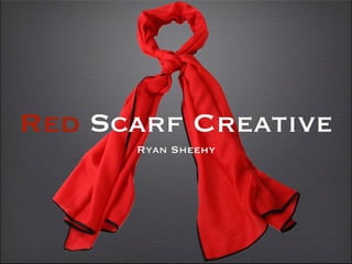
- 1. Red Scarf Creative Ryan Sheehy
- 4. Back Story Love the color RED Scarfs Love / Beauty Film = Passion
- 5. Strengths / Weaknesses Arbitrary General Easy to say Not trademarked Memorable Not Brand specific Flows Opinionated Bold Colors Misleading
- 6. LOGO Letter Form Logo Must Signify Includes Title Flexibility Includes Red Scarf Passion title and Scarf Boldness intertwined.
- 7. LOGO Red for a Reason Clean Classy Font Esthetically pleasing Simple words Turn Unique
- 8. Inspiration
- 9. Inspiration
- 11. Mission / Tag line Memorable Content “Working efficiently Red Scarf Creative is committed to providing unique and promotional content for every client.”
Editor's Notes
- \n
- Red scarf creative is a name that I choose for a few reasons. First of all I choose the color Red. The color red is bold and it symbolizes Passion, Love, beauty, and sacrifice. We apply these emotions and feelings into all of our work. \n
- A scarf is warm. It keeps you from the cold during the winter. I think of a scarf as comforting. You can also wear a scarf for a nice classy style.\n\n
- \n
- \n
- \n
- Easy to read. Must Be horizontal for reading purposes. Red is an attention getter. Like the content in our videos Our logo will be remembered. We want our Brand to be flexible. Having the Scarf wrapping around the text could show that we are willing to do what ever it takes to please out clients. The words Red Scarf are simple words. Simplicity in a way is artistic and fascinating to many people. With a mix of attracting colors and simple memorable words people will be intrigued by this production company and demand out services. \n
- Very simple. One word, not brand specific but Tells a story. I think of a summit as a challenge. Something to concur, like every project yet to be completed.\n
- RED Classy simple delicious \n
- Trend setters, Provide content that out clients will love. Have a fun experience with our productions. Be professional. Fun with out dangerous horse play. Constant team of hard working crew. Family that works very well together. Morels ... no porn\n
- \n
- \n