
Recommandé
Contenu connexe
Tendances
Tendances (20)
En vedette
Plus de s9037
Plus de s9037 (16)
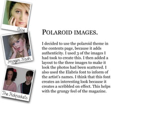
Polaroid images
- 1. Polaroid images. I decided to use the polaroid theme in the contents page, because it adds authenticity. I used 3 of the images I had took to create this. I then added a layout to the three images to make it look the photos had been scattered. I also used the Elabris font to inform of the artist’s names. I think that this font creates an interesting look because it creates a scribbled on effect. This helps with the grungy feel of the magazine.