Digipak Analysis: The Long Road - Nickelback.
•Télécharger en tant que PPTX, PDF•
0 j'aime•786 vues

An analysis of the digipak for The Long Road by Nickelback.

Recommandé
Contenu connexe
Tendances
Tendances (20)
En vedette
Similaire à Digipak Analysis: The Long Road - Nickelback.
Similaire à Digipak Analysis: The Long Road - Nickelback. (20)
Plus de Sarah Byard
Plus de Sarah Byard (20)
Digipak Analysis: The Long Road - Nickelback.
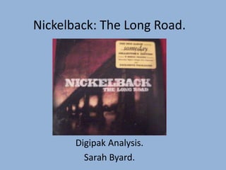
- 1. Nickelback: The Long Road. Digipak Analysis. Sarah Byard.
- 2. Here is what the digipak looks like:
- 3. Colours
- 4. The deep purple gives the album a more serious and more melancholy feel. This is because the album has a more mellow feel to it. Silver Side Up (the previous album) had a heavier feel to it but The Long Road is a bit mellower.
- 5. There is a lot of black on the digipak. The band wears black, this image is black, some of the font is black. Nickelback are an ‘alternative’ band and a stereotype of their genre is to have a lot of black.
- 6. Fonts
- 7. This font is the band logo. It stands out, because it is in block capitals and contrasts the background. The band would want it to stand out so that it is easily recognisable, so that people will know they have a new album out and buy it.
- 8. This font looks like a scribble that Chad Kroeger would have made when he was writing the lyrics. This makes the album seem more personal and the band more human, because it shows that the album progressed from scribbles to what you see in the digipak, and was the work of a person.
- 9. Images
- 10. There are two images of the band on the digipak. Because Nickelback had only recently gained fame, they would still want to get their faces out there so that people would recognise them.
- 11. This bridge stretches a long It looks like a way, across “the sunrise in the long road”. sky, possibly symbolising the The “long road” new era or “new could represent day” for touring and the Nickelback hardships of it, as following their lyrics to Feeling chart success Way Too Damn with Silver Side Good feature this Up. theme.
- 12. These paintpots could represent the band starting afresh with this album. The paint is black, so they could be symbolically blacking out their other albums so they can start something new.