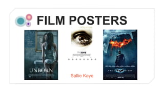
2. The main image on Horror film
posters is vital, when researching
in to the posters I commonly
found that they don't give anything
away and keep the storyline of the
film a mystery. I think that this is
effective and I would like to apply
this to my final film poster. (1)
This is a tagline, it is a sentence
that is used to intrigue an
audience in to watching the film.
The tag line usually gives
something away about the
film, for example here we are able
to tell that the characters in the
film all believe something then
they die, this enhances peoples
interest (2)
The background on a film poster is very
important as it needs to reinforce the
genre of the film yet it can't take the focus
away from the main image. This
background is effective because it is a
mixture of blacks, greys and whites, it
almost looks as if the girl is
glowing, however our attention is still on
the main image (5)
The title needs to be big, bold and clear to
the readers and it needs to be obvious to
them. The title needs to attract people's
attention and make them want to watch
the film. This title looks effective because
it is in white which is the contrasting
colour to black, therefore it stands out
immediately (4)
This is the fine print on a film poster, it
includes information such as actors
names, directors names and the film
producers etc. When researching in to
existing film posters, I found that they all
included the fine print at the bottom
centre of the page, this looks professional
and gives the poster a clear layout (3)
3. When making my film poster, I am going to have one character as the main image (the protagonist). I have chosen to do
this as I feel I can put a lot of detail on one person and will be able to edit the image to look scary and this way I am not
giving away too much. I am going to aim to make my character look scared or evil depending on which image comes out
best, our protagonist has dark hair which I feel is helpful as it is very common for horrors to include characters with long
dark hair as it adds to the spookiness. (1)
When creating my film poster, I am also going to add a tagline, I am going to place the tagline near the bottom of the
page as I don't want it to distract the readers attention from the main image as it is the most important aspect of a film
trailer. I would like to use a catchy tagline that won't give too much away but will grab the readers attention. (2)
I am going to include the fine print at the bottom of the page on my film poster like The Apparition poster as I feel that,
although this information is needed, it isn't as important and won't attract the readers attention, therefore I feel that if it is
at the bottom of the page I feel it will be successful and will appeal to our target audience (3)
When designing a title for my poster, I am going to place it near the bottom of the page as I feel it will catch the eye but
not distract it from my main image, as well as that I am going to have all of my title in captial letters so that it differentiates
from the other pieces of texts on my poster. (4)
I am unsure at the moment, on what colour background I am going to have, I feel that after I have taken my photos I will
have a better understanding on what colours I will use. Similarly to The Apparition film poster, I am going to make my
main image and my background contrast, so if my main image is mainly white and lighter colours then I will aim to have a
dark background (5)
4. The tagline on this poster is at the
top of the page, I feel that this
isn't as effective as it is one of the
first things you look at rather than
the main image of a voodoo style
doll. (1)
The main image on this poster is
frightening and reinforces the
films genre of horror, however I
feel that the colours of the image
and the background are too
similar, therefore it doesn't stand
out as much as it would with a
lighter background (2)
This film posters title is again near
the bottom of the page and is very
big and catches the eye, I feel
that it is effective as the colour of
the title matches the rest of the
poster perfectly. (3)
The background on this poster is
effective as the red and oragne
colours that are portrayed are
linked with horror as people
automtaically think of danger or
blood when they see these
colours (5)
The fine print on this poster is
again at the very bottom of the
poster, it is very hard to read on
this poster as the white writing
isn't clear on the cracked
backrgound. (4)
5. The tagline on this poster isn't very effective as it isn't clear to read and is in an awkward place as it distracts readers from
looking at the main image. When creating my tagline I want to avoid this problem and make sure that my tagline is in a good
place and has a catchy sentence. (1)
When creating my poster, I want to make sure that my main image is in the centre of the page as I want to make sure it is
my readers main focus, as well as that I want to make sure my image is obviously linked to the horror genre as it will need
to attractmy target audience and make them want to watch the film. (2)
I would like to make sure that I choose an appropriate colour for my title as it needs to link to my genre of horror and needs
to go with the background colour and main image. (3)
Although the fine print isn't as important as the rest of the features on the poster, it is a necessity, therefore itis important
that it is clear and people are able to read it. The Apparition poster's fine print isn't clear to read and is very squished
together, this therefore looks slightly unprofessional so I am going to avoid this problem. (4)
As I've previously mentioned I would like to make sure I have an effective backgroun colour/image as I feel it is the second
most important feature of a film poster. It will again need to link to my trailers theme of genre as people will need to be clear
on what genre my film trailer is. (5)