Mobile optimisation - a short and simple guide
•
0 j'aime•603 vues

Our presentation/guide to mobile optimisation: why you should do it and how to go about it.

Recommandé
Recommandé
Contenu connexe
Dernier
Dernier (20)
En vedette
En vedette (20)
Mobile optimisation - a short and simple guide
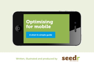
- 1. Optimising for mobile A short & simple guide Written, illustrated and produced by
- 2. 8,000,000 people in the UK access the internet from their smartphones every day.
- 3. 94% Have searched for local info. 70% Called a local business after searching.
- 4. do people How access your web site from a smartphone and what kind of experience do they get?
- 5. Your logo here Link Link Link Link A nice marketing email for you And you send them to a teeny tiny replicv a of your website. Your logo here Where everything is small. And everything is hard to read. A lot of people will read it here and click on a And it’s a bit tricky to click things like this. link that goes to your And basically it’s all a web site... bit of a pinch and zoom nightmare. The number is under the Here’s some marketing fold somewhere. information that nobody really wants to read on a smartphone. And frankly probably don;t want to read on a desktop or tablet either but there you are
- 6. Zap !! Or maybe you’ve got one Your logo here of these new fangled Link Link Link Link things and you want to use it. And you send them to a teeny tiny replicv a of your website. Where everything is small. And everything is hard to read. And it’s a bit tricky to click things like this. And basically it’s all a bit of a pinch and zoom nightmare. The number is under the Here’s some marketing fold somewhere. information that nobody really wants to read on a smartphone. And frankly probably don;t want to read on a desktop or tablet either but there you are
- 7. Your logo here Link Link Link Link And you send them to a teeny tiny replicv a of your website. Where everything is small. And everything is hard to read. And it’s a bit tricky to click things like this. And basically it’s all a bit of a pinch and zoom nightmare. The number is under the Here’s some marketing fold somewhere. information that nobody really wants to read on a smartphone. And frankly probably don;t want to read on a desktop or tablet either but there you are
- 8. That’s a bit Your logo annoying. Link here Link Link And Link y teen ou send y web tiny re them to It’s all a bit tiny. Pinch, zoom, site. plicv a a of your Whe re ev eryth ing is sma And ll. every thing is ha rd to read . I can’t click the ...grrr...goodbye! links. And it thing ’s a bit tr s like ick this. y to click And b bit o asically it fap ’s all Here nigh in info ’s so tmare ch and z a rm me m . oom I needed to quickly reall ation arketin sma r y wa th nts t at nobo o re g The n fold umber is prob tphone. a dy som And d on a find the info I read eith ably d fr on a on;t wa ankly er b deskto nt to ewhe under th re. e needed. ut th p ere y or table ou a t re Is the stuff I really want here?
- 9. 57% Say they won’t recommend a business with a poorly designed mobile site. :-( 40% Have turned to a competitor’s site after a bad mobile experience.
- 10. Context is King Different devices means different needs & habits Desktop users Tablet users Smartphone users In the office, Relaxed, on the sofa, On the go, in at a desk? after work? between places?
- 11. “What should we do?” Content over navigation Anticipate users Make buttons What matters a bigger target behaviour. most to them? Remove the superfluous On-the-go tasks
- 12. “How should we do this?” Responsive Web Design Separate Mobile Site One size for different devices Dedicated site for mobile Which way to go depends on your audience
- 13. Key resources used in this presentation: www.themobileplaybook.com tiny.cc/responsive-mobile Recommended reading: www.abookapart.com/products/mobile-first by Luke Wroblewski iPhone visuals: www.pixeden.com If you’d like to know more about mobile optimisation please get in touch. © Seedr Creative Ltd. 2012