
Recommandé
Contenu connexe
Tendances
Tendances (17)
En vedette
Similaire à Schlegelmann paul cse615-assignment9-4-interpretivesigndesigns
Similaire à Schlegelmann paul cse615-assignment9-4-interpretivesigndesigns (20)
Dernier
Dernier (20)
Schlegelmann paul cse615-assignment9-4-interpretivesigndesigns
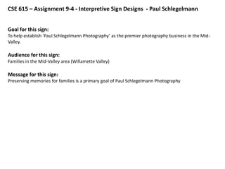
- 1. CSE 615 – Assignment 9-4 - Interpretive Sign Designs - Paul Schlegelmann Goal for this sign: To help establish ‘Paul Schlegelmann Photography’ as the premier photography business in the Mid- Valley. Audience for this sign: Families in the Mid-Valley area (Willamette Valley) Message for this sign: Preserving memories for families is a primary goal of Paul Schlegelmann Photography
- 3. Key Changes from Previous Design For this next design (next slide) I did a major redesign trying to create a different ‘feeling’ with this slide. That is, I wanted to get the audience to think of all of the ‘bad’ family photos they had and see that visually here. Then I wanted them to see how much better their photos could be if they used Paul Schlegelmann Photography. Major changes I made: • Added ‘bad photos’ to elicit the feeling of a family having ‘lost their good memories’ by virtue of often having the bad photos to remember them by • Added the arrows to direct the eye to the flow from bad photos to good photos to ‘who’ can solve this problem of bad photos and provide good photos instead. This redesign ended up being too cluttered, with little white space, too many boxes around everything, and therefore hard to read overall. The message just got lost.
- 5. Key Changes from Previous Design For this next design (next slide) I did a major redesign primarily focusing on the Alignment and Proximity design rules. This new design was significantly better than the first two designs. Major changes I made: • Reduced the clutter, by removing many of the photos, going back to my original two photos. This gave it a lot more white space and made it much easier to see and read. • Removed the boxes around the title and other text. I only left the boxes, as frames, around the photos. • Used a simple two-color scheme. • Used repeating elements with the black-and-white photos, black-and-gold frames, blue horizontal rules/lines.
- 7. Key Changes from Previous Design For this next design (next slide) I did a major redesign primarily focusing on the Contrast design rules. This new design is significantly better than the previous designs. Major changes I made: • Added the long, gold rectangular blocks at the top and the bottom behind the text in those areas to help draw attention to that important text. • Moved the contact information down to the bottom of the slide allowing the eye to first read the title, then flow downward viewing the photo and associated text quote, and then flowing down to the contact information. • Moved the photos to be on either side of the one remaining central text box. • Removed the horizontal rules.
- 9. Key Changes from Previous Design For the final design (next slide) I did a redesign primarily focusing on the Simplicity and Contrast design rules. This is clearly the simplest and, as a result, the most effective design. Major changes I made: • Made the title very large, using a big, bold san serif font, to grab attention. I tried the same size script font in the title but it (and other script fonts) all looked a bit jagged. • Removed one of the photos to simplify the design which allowed the one remaining photo to be enlarged as well as the associated quote. • Removed the gold color leaving the sign as solely a black-and-white design. This matched the design to the black-and-white photo and gave the overall design a very ‘classic’ look. This ‘classic’ look matched the photo and the overall message of preserving memories. • Overall, I am really happy with this design and it’s a huge leap of improvement over my original designs.