
Recommandé
Contenu connexe
Tendances
Tendances (20)
Similaire à Cd cover designs
Similaire à Cd cover designs (20)
Plus de shahnaziee
Plus de shahnaziee (20)
Dernier
Dernier (20)
Cd cover designs
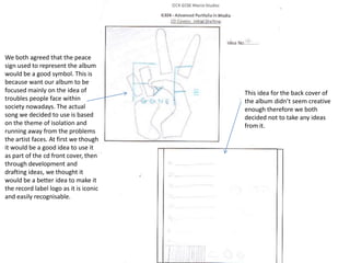
- 1. We both agreed that the peace sign used to represent the album would be a good symbol. This is because want our album to be focused mainly on the idea of troubles people face within society nowadays. The actual song we decided to use is based on the theme of isolation and running away from the problems the artist faces. At first we though it would be a good idea to use it as part of the cd front cover, then through development and drafting ideas, we thought it would be a better idea to make it the record label logo as it is iconic and easily recognisable. This idea for the back cover of the album didn’t seem creative enough therefore we both decided not to take any ideas from it.
- 2. We found that the font on the title of this album was too feminine therefore didn’t represent or focus much on our target audience therefore we decided no to use this type of font on the final piece We liked the idea of having a long shot of the artist walking on the road into the distance, this links in with the ideas for the music video we have planned to create as it adheres to the theme of walking away into darkness whilst trying to run away from the problems of reality. The fact that the artists back is towards the camera, it doesn’t sell our artist enough therefore we thought that this would be a better idea as part of the inlay sleeve or advert where it doesn’t have to directly represent the artist, but promote the album and its contents. Although this was a design for the back of the cd album, we liked the idea of having the main image of the artist on the front cover fading just as in this picture. This would link to the theme of the album as well as the album name ‘gone’. This allows us to use a medium close up shot of the artist therefore he is promoting his own music and will be able to gain recognition for his work as well. We therefore decided that this would be the main image for our front cover rather than a feature on the back of the album.
- 3. In this album cover design, we mainly focused on getting medium close up shot of the artist in order for him to gain recognition for his music. We thought by having a close up shot it allows the audience to feel more closer to the artist in order to relate to his music. By having a side profile shot it makes the album seem more mysterious therefore we thought it would be an interesting feature as a part of the main image. the font here is more masculine so we thought it was a better idea to use for our cd cover. It is bold so will easily attract the audiences attention. The name is also short so therefore more effective and more iconic. This idea consists of a long shot of the artist leaning against a wall. Although this was originally for the back cover, we thought it would look better as part of the advert as it allows us to show our ability to take a variety of different shots. This also represents the theme of isolation and being lost in thought and away from reality which successfully adheres to the theme of the album.
- 4. Neither of us liked the designs on both front and back of these designs therefore we chose not to use anything from these designs.
- 5. We found this was too colourful which didn’t link with the theme of both the album and our music video therefore this was unsuccessful. The colours used aren't very masculine therefore it doesn’t match our target audience which is towards the male audience. The font here is also really plain and doesn’t stand our enough against the colourful background. Neither of these designs consisted of an image of the main artist which therefore doesn’t promote the artist enough as a result. Both front and back covers drawn here are too boring and don’t give an insight to the albums contents or the genre of music of the artist within this album.