SlideShare a Scribd company logo
1 of 5
The colors that I have chosen here are ones
that I think will work well alongside the
packaging and font choice. I have chosen
these colors as they seem to be neutral and
don’t sway any gender. The colors also can
range from light to dark so I have different
options to choose from when combining
them with the fonts. I think that these colors
will also work with the target audience
because of the light to dark category,
although I can already eliminate a couple of
color schemes that won’t work with the age
demographic. I do not think that the grey
tone will work on my product, it is a boring
color and will not translate with the rest of
the packaging or the mood of the product. I
also think that the green will not work
because it is associated with more organic
energy drinks. I tried to base the color
schemes on the kits in football – linked with
the sports theme, however the majority of
the kits are red and I think this is a poignant
color in attracting the target audience and
can be a bright color in ‘showing off’ the
product. The yellow is also a bright color but
is one that won’t work unless you try it, it
represents a happy factor which most energy
drink’s don’t offer.
I think that red is a different color
to experiment with. It could be
too harsh on the eye or it could
contrast well. I like the idea of
using red because it is linked to
football kits, however it could be
too bright and distract the
attention of the overall packaging
and color.
I think that blue is a good color to
have as it represents a calm
nature. Although when dealing
with sport nothing is calm as
football is a physical game. I think
this is another color that won’t
work well unless it is tested with
different shades.
Black is a bog standard color that is
used for almost everything. It is a
boring color however I think that a
black and white contrast would be
interesting. I think it is a color that can
unveil mystery or used reflectively i.e.
sports wise – reflect on the
performance.
I like the idea of using a purple color
because I think it is unusual and has
not been used on existing sports
drinks. To every color there are
different shades. No matter how
much I like the color I don’t think it
will work alongside my product
because like the red it can be too
harsh on the eye and not portray
what the actual product is selling to
the specific target audience.
Yellow is another color which could
work well or it could not. The yellow
color also gives off a happy vibe but I
don’t think I want to use this
because it wouldn’t match with my
content of the energy drink. I will
test the color in different shades but
it doesn’t represent what I’m looking
for in terms of colors for my product.
I have chosen this color scheme as I think that the color of pink
reflects on the color background and is also a color which is open to
both genders. I didn’t want to create a gender specific color scheme
so the pastel pink blends the tone. I also like the idea of black
writing on a pastel pink background as (when) selecting the right
font it will enhance the wording and make it stand out. I think this
color will work on my product because it isn’t a harsh color and
there is different combinations to choose from. Some people might
see pink as a girl color however I think that the consumers will focus
more on the packaging and the wording rather than the foreground
color. I also want to make my product colors have a natural feel,
although it is a sports energy drink there doesn’t have to be harsh
colors and I don’t want it to attract the complete opposite of the
target audience.
Because I am going for a natural feel I could have opted for colors
that reflect that. I feel that the color green is more of an organic
color rather than sports. I also think that a paler pink will be better
to use than a darker pink because it is not as loud and there will be
more focus on the packaging and logo. Pastel colors are also soft but
a darker pink could portray more energy which is the effect that
normal sports drinks would want to have.
In comparison to existing sports drinks and their color schemes,
black blue and yellow seem to be the running colors, the leading
sports drink Lucozade is taken with blue and yellow but I want a
totally different color scheme that is off market. The good thing
about picking a pastel color and a normal color is that there is a
scale to choose from and therefore can conduct different
experiments to see how it would fare with the font on top.
This is the shade of color that I would want to use on my product. It
is pale but not too pale and would allow to have a good font as well
as the font color on top of it. The color is also still neutral and
doesn’t have such a bouncing effect that doesn’t work.
I think that this color will work on the product because it is
different and will work well with the other fonts and images to do
with the packaging. The color could go either way on the product
but I strongly feel it will work – it is not too masculine or too
feminine so I am still keeping my target audience in mind.
One of the main reasons why I chose pink is because it is a color
that not many people would associate with a sports drink, I want to
make it as unique as possible but also make sure it stands out with
some purpose.
Fonts
12th Man
12th Man
12th Man
12th Man
12th Man
12th Man
12th Man
12th Man
12th Man
12th Man
12th Man
12th Man
12th Man
12th Man
12th Man
12th Man
12th Man
12th Man
12th man
12th Man
12th Man
12th Man
My favorite color and font combination is the
black and green the only disappointment is that
the font is hard to read from close up and afar and
wouldn’t appeal to people on a shop shelf
because they wouldn’t be able to read it. My
favorite font at the minute is ‘Da Mad Rave’ (on
the red background) I wouldn’t have it in that
color as in my opinion it would look better against
the black. Upon change the blue and black works
and it looks balanced in the centre, the blue is the
main focus.

More Related Content

Similar to Color schemes and fonts (20)

Media colour schemes
Media colour schemesMedia colour schemes
Media colour schemes
 
Colour schemes
Colour schemesColour schemes
Colour schemes
 
Desig pro forma
Desig pro formaDesig pro forma
Desig pro forma
 
Design Pro Forma (with improvements)
Design Pro Forma (with improvements)Design Pro Forma (with improvements)
Design Pro Forma (with improvements)
 
Pro forma 2
Pro forma 2Pro forma 2
Pro forma 2
 
Planning of front cover
Planning of front coverPlanning of front cover
Planning of front cover
 
Colour palette analysis
Colour palette analysisColour palette analysis
Colour palette analysis
 
Desig pro forma 2
Desig pro forma 2Desig pro forma 2
Desig pro forma 2
 
Idea development
Idea developmentIdea development
Idea development
 
Colour palettes
Colour palettesColour palettes
Colour palettes
 
Colour palette
Colour paletteColour palette
Colour palette
 
Pre production fmp
Pre production fmpPre production fmp
Pre production fmp
 
10 colour palettes
10 colour palettes10 colour palettes
10 colour palettes
 
Pre production
Pre productionPre production
Pre production
 
Colour scheme
Colour schemeColour scheme
Colour scheme
 
Task 4.1
Task 4.1Task 4.1
Task 4.1
 
What Color is Response? An Inside Look at How Color Improves Your Sales
What Color is Response? An Inside Look at How Color Improves Your SalesWhat Color is Response? An Inside Look at How Color Improves Your Sales
What Color is Response? An Inside Look at How Color Improves Your Sales
 
Desig pro forma
Desig pro formaDesig pro forma
Desig pro forma
 
1. initial plans
1. initial plans1. initial plans
1. initial plans
 
Desig pro forma
Desig pro formaDesig pro forma
Desig pro forma
 

More from shaniajane (20)

Nuj presentation
Nuj presentationNuj presentation
Nuj presentation
 
Pitch
PitchPitch
Pitch
 
Task 8
Task 8Task 8
Task 8
 
Social action initial responses
Social action initial responsesSocial action initial responses
Social action initial responses
 
Task 8 research
Task 8 researchTask 8 research
Task 8 research
 
Defining an audience
Defining an audienceDefining an audience
Defining an audience
 
Task 4 mood board design for advertising
Task 4 mood board design for advertisingTask 4 mood board design for advertising
Task 4 mood board design for advertising
 
Nuj presentation
Nuj presentationNuj presentation
Nuj presentation
 
Writing copy evaluation
Writing copy evaluationWriting copy evaluation
Writing copy evaluation
 
Indesign products and fonts pptx
Indesign products and fonts pptxIndesign products and fonts pptx
Indesign products and fonts pptx
 
Primary research
Primary researchPrimary research
Primary research
 
Research on gerrard
Research on gerrardResearch on gerrard
Research on gerrard
 
Bias essasy
Bias essasyBias essasy
Bias essasy
 
Writing copy research 1
Writing copy research 1Writing copy research 1
Writing copy research 1
 
Task 6
Task 6Task 6
Task 6
 
Swot analysis
Swot analysisSwot analysis
Swot analysis
 
Lo2 workbook(1)
Lo2 workbook(1)Lo2 workbook(1)
Lo2 workbook(1)
 
Lo1 workbook(2)
Lo1 workbook(2)Lo1 workbook(2)
Lo1 workbook(2)
 
Evaluation
EvaluationEvaluation
Evaluation
 
Lo1 workbook(2)
Lo1 workbook(2)Lo1 workbook(2)
Lo1 workbook(2)
 

Recently uploaded

怎样办理伯明翰大学学院毕业证(Birmingham毕业证书)成绩单留信认证
怎样办理伯明翰大学学院毕业证(Birmingham毕业证书)成绩单留信认证怎样办理伯明翰大学学院毕业证(Birmingham毕业证书)成绩单留信认证
怎样办理伯明翰大学学院毕业证(Birmingham毕业证书)成绩单留信认证
eeanqy
 
Abortion pills in Kuwait 🚚+966505195917 but home delivery available in Kuwait...
Abortion pills in Kuwait 🚚+966505195917 but home delivery available in Kuwait...Abortion pills in Kuwait 🚚+966505195917 but home delivery available in Kuwait...
Abortion pills in Kuwait 🚚+966505195917 but home delivery available in Kuwait...
drmarathore
 
一比一原版(ANU毕业证书)澳大利亚国立大学毕业证原件一模一样
一比一原版(ANU毕业证书)澳大利亚国立大学毕业证原件一模一样一比一原版(ANU毕业证书)澳大利亚国立大学毕业证原件一模一样
一比一原版(ANU毕业证书)澳大利亚国立大学毕业证原件一模一样
yhavx
 
Abortion pill for sale in Muscat (+918761049707)) Get Cytotec Cash on deliver...
Abortion pill for sale in Muscat (+918761049707)) Get Cytotec Cash on deliver...Abortion pill for sale in Muscat (+918761049707)) Get Cytotec Cash on deliver...
Abortion pill for sale in Muscat (+918761049707)) Get Cytotec Cash on deliver...
instagramfab782445
 
Q4-Trends-Networks-Module-3.pdfqquater days sheets123456789
Q4-Trends-Networks-Module-3.pdfqquater days sheets123456789Q4-Trends-Networks-Module-3.pdfqquater days sheets123456789
Q4-Trends-Networks-Module-3.pdfqquater days sheets123456789
CristineGraceAcuyan
 
怎样办理伦敦国王学院毕业证(KCL毕业证书)成绩单留信认证
怎样办理伦敦国王学院毕业证(KCL毕业证书)成绩单留信认证怎样办理伦敦国王学院毕业证(KCL毕业证书)成绩单留信认证
怎样办理伦敦国王学院毕业证(KCL毕业证书)成绩单留信认证
eeanqy
 
Top profile Call Girls In eluru [ 7014168258 ] Call Me For Genuine Models We ...
Top profile Call Girls In eluru [ 7014168258 ] Call Me For Genuine Models We ...Top profile Call Girls In eluru [ 7014168258 ] Call Me For Genuine Models We ...
Top profile Call Girls In eluru [ 7014168258 ] Call Me For Genuine Models We ...
gajnagarg
 
Design-System - FinTech - Isadora Agency
Design-System - FinTech - Isadora AgencyDesign-System - FinTech - Isadora Agency
Design-System - FinTech - Isadora Agency
Isadora Agency
 
一比一定(购)卡尔顿大学毕业证(CU毕业证)成绩单学位证
一比一定(购)卡尔顿大学毕业证(CU毕业证)成绩单学位证一比一定(购)卡尔顿大学毕业证(CU毕业证)成绩单学位证
一比一定(购)卡尔顿大学毕业证(CU毕业证)成绩单学位证
wpkuukw
 
ab-initio-training basics and architecture
ab-initio-training basics and architectureab-initio-training basics and architecture
ab-initio-training basics and architecture
saipriyacoool
 

Recently uploaded (20)

怎样办理伯明翰大学学院毕业证(Birmingham毕业证书)成绩单留信认证
怎样办理伯明翰大学学院毕业证(Birmingham毕业证书)成绩单留信认证怎样办理伯明翰大学学院毕业证(Birmingham毕业证书)成绩单留信认证
怎样办理伯明翰大学学院毕业证(Birmingham毕业证书)成绩单留信认证
 
LANDSCAPE ARCHITECTURE PORTFOLIO - MAREK MITACEK
LANDSCAPE ARCHITECTURE PORTFOLIO - MAREK MITACEKLANDSCAPE ARCHITECTURE PORTFOLIO - MAREK MITACEK
LANDSCAPE ARCHITECTURE PORTFOLIO - MAREK MITACEK
 
How to Create a Productive Workspace Trends and Tips.pdf
How to Create a Productive Workspace Trends and Tips.pdfHow to Create a Productive Workspace Trends and Tips.pdf
How to Create a Productive Workspace Trends and Tips.pdf
 
Abortion pills in Kuwait 🚚+966505195917 but home delivery available in Kuwait...
Abortion pills in Kuwait 🚚+966505195917 but home delivery available in Kuwait...Abortion pills in Kuwait 🚚+966505195917 but home delivery available in Kuwait...
Abortion pills in Kuwait 🚚+966505195917 but home delivery available in Kuwait...
 
一比一原版(ANU毕业证书)澳大利亚国立大学毕业证原件一模一样
一比一原版(ANU毕业证书)澳大利亚国立大学毕业证原件一模一样一比一原版(ANU毕业证书)澳大利亚国立大学毕业证原件一模一样
一比一原版(ANU毕业证书)澳大利亚国立大学毕业证原件一模一样
 
Jordan_Amanda_DMBS202404_PB1_2024-04.pdf
Jordan_Amanda_DMBS202404_PB1_2024-04.pdfJordan_Amanda_DMBS202404_PB1_2024-04.pdf
Jordan_Amanda_DMBS202404_PB1_2024-04.pdf
 
Abortion pill for sale in Muscat (+918761049707)) Get Cytotec Cash on deliver...
Abortion pill for sale in Muscat (+918761049707)) Get Cytotec Cash on deliver...Abortion pill for sale in Muscat (+918761049707)) Get Cytotec Cash on deliver...
Abortion pill for sale in Muscat (+918761049707)) Get Cytotec Cash on deliver...
 
Q4-Trends-Networks-Module-3.pdfqquater days sheets123456789
Q4-Trends-Networks-Module-3.pdfqquater days sheets123456789Q4-Trends-Networks-Module-3.pdfqquater days sheets123456789
Q4-Trends-Networks-Module-3.pdfqquater days sheets123456789
 
Hackathon evaluation template_latest_uploadpdf
Hackathon evaluation template_latest_uploadpdfHackathon evaluation template_latest_uploadpdf
Hackathon evaluation template_latest_uploadpdf
 
怎样办理伦敦国王学院毕业证(KCL毕业证书)成绩单留信认证
怎样办理伦敦国王学院毕业证(KCL毕业证书)成绩单留信认证怎样办理伦敦国王学院毕业证(KCL毕业证书)成绩单留信认证
怎样办理伦敦国王学院毕业证(KCL毕业证书)成绩单留信认证
 
Mohanlalganj ! Call Girls in Lucknow - 450+ Call Girl Cash Payment 9548273370...
Mohanlalganj ! Call Girls in Lucknow - 450+ Call Girl Cash Payment 9548273370...Mohanlalganj ! Call Girls in Lucknow - 450+ Call Girl Cash Payment 9548273370...
Mohanlalganj ! Call Girls in Lucknow - 450+ Call Girl Cash Payment 9548273370...
 
Q4-W4-SCIENCE-5 power point presentation
Q4-W4-SCIENCE-5 power point presentationQ4-W4-SCIENCE-5 power point presentation
Q4-W4-SCIENCE-5 power point presentation
 
TRose UXPA Experience Design Concord .pptx
TRose UXPA Experience Design Concord .pptxTRose UXPA Experience Design Concord .pptx
TRose UXPA Experience Design Concord .pptx
 
Raebareli Girl Whatsapp Number 📞 8617370543 | Girls Number for Friendship
Raebareli Girl Whatsapp Number 📞 8617370543 | Girls Number for FriendshipRaebareli Girl Whatsapp Number 📞 8617370543 | Girls Number for Friendship
Raebareli Girl Whatsapp Number 📞 8617370543 | Girls Number for Friendship
 
Top profile Call Girls In eluru [ 7014168258 ] Call Me For Genuine Models We ...
Top profile Call Girls In eluru [ 7014168258 ] Call Me For Genuine Models We ...Top profile Call Girls In eluru [ 7014168258 ] Call Me For Genuine Models We ...
Top profile Call Girls In eluru [ 7014168258 ] Call Me For Genuine Models We ...
 
Abortion pills in Riyadh +966572737505 <> buy cytotec <> unwanted kit Saudi A...
Abortion pills in Riyadh +966572737505 <> buy cytotec <> unwanted kit Saudi A...Abortion pills in Riyadh +966572737505 <> buy cytotec <> unwanted kit Saudi A...
Abortion pills in Riyadh +966572737505 <> buy cytotec <> unwanted kit Saudi A...
 
Design-System - FinTech - Isadora Agency
Design-System - FinTech - Isadora AgencyDesign-System - FinTech - Isadora Agency
Design-System - FinTech - Isadora Agency
 
一比一定(购)卡尔顿大学毕业证(CU毕业证)成绩单学位证
一比一定(购)卡尔顿大学毕业证(CU毕业证)成绩单学位证一比一定(购)卡尔顿大学毕业证(CU毕业证)成绩单学位证
一比一定(购)卡尔顿大学毕业证(CU毕业证)成绩单学位证
 
Pondicherry Escorts Service Girl ^ 9332606886, WhatsApp Anytime Pondicherry
Pondicherry Escorts Service Girl ^ 9332606886, WhatsApp Anytime PondicherryPondicherry Escorts Service Girl ^ 9332606886, WhatsApp Anytime Pondicherry
Pondicherry Escorts Service Girl ^ 9332606886, WhatsApp Anytime Pondicherry
 
ab-initio-training basics and architecture
ab-initio-training basics and architectureab-initio-training basics and architecture
ab-initio-training basics and architecture
 

Color schemes and fonts

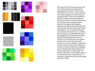
  • 1. The colors that I have chosen here are ones that I think will work well alongside the packaging and font choice. I have chosen these colors as they seem to be neutral and don’t sway any gender. The colors also can range from light to dark so I have different options to choose from when combining them with the fonts. I think that these colors will also work with the target audience because of the light to dark category, although I can already eliminate a couple of color schemes that won’t work with the age demographic. I do not think that the grey tone will work on my product, it is a boring color and will not translate with the rest of the packaging or the mood of the product. I also think that the green will not work because it is associated with more organic energy drinks. I tried to base the color schemes on the kits in football – linked with the sports theme, however the majority of the kits are red and I think this is a poignant color in attracting the target audience and can be a bright color in ‘showing off’ the product. The yellow is also a bright color but is one that won’t work unless you try it, it represents a happy factor which most energy drink’s don’t offer.
  • 2. I think that red is a different color to experiment with. It could be too harsh on the eye or it could contrast well. I like the idea of using red because it is linked to football kits, however it could be too bright and distract the attention of the overall packaging and color. I think that blue is a good color to have as it represents a calm nature. Although when dealing with sport nothing is calm as football is a physical game. I think this is another color that won’t work well unless it is tested with different shades. Black is a bog standard color that is used for almost everything. It is a boring color however I think that a black and white contrast would be interesting. I think it is a color that can unveil mystery or used reflectively i.e. sports wise – reflect on the performance. I like the idea of using a purple color because I think it is unusual and has not been used on existing sports drinks. To every color there are different shades. No matter how much I like the color I don’t think it will work alongside my product because like the red it can be too harsh on the eye and not portray what the actual product is selling to the specific target audience. Yellow is another color which could work well or it could not. The yellow color also gives off a happy vibe but I don’t think I want to use this because it wouldn’t match with my content of the energy drink. I will test the color in different shades but it doesn’t represent what I’m looking for in terms of colors for my product.
  • 3. I have chosen this color scheme as I think that the color of pink reflects on the color background and is also a color which is open to both genders. I didn’t want to create a gender specific color scheme so the pastel pink blends the tone. I also like the idea of black writing on a pastel pink background as (when) selecting the right font it will enhance the wording and make it stand out. I think this color will work on my product because it isn’t a harsh color and there is different combinations to choose from. Some people might see pink as a girl color however I think that the consumers will focus more on the packaging and the wording rather than the foreground color. I also want to make my product colors have a natural feel, although it is a sports energy drink there doesn’t have to be harsh colors and I don’t want it to attract the complete opposite of the target audience. Because I am going for a natural feel I could have opted for colors that reflect that. I feel that the color green is more of an organic color rather than sports. I also think that a paler pink will be better to use than a darker pink because it is not as loud and there will be more focus on the packaging and logo. Pastel colors are also soft but a darker pink could portray more energy which is the effect that normal sports drinks would want to have. In comparison to existing sports drinks and their color schemes, black blue and yellow seem to be the running colors, the leading sports drink Lucozade is taken with blue and yellow but I want a totally different color scheme that is off market. The good thing about picking a pastel color and a normal color is that there is a scale to choose from and therefore can conduct different experiments to see how it would fare with the font on top.
  • 4. This is the shade of color that I would want to use on my product. It is pale but not too pale and would allow to have a good font as well as the font color on top of it. The color is also still neutral and doesn’t have such a bouncing effect that doesn’t work. I think that this color will work on the product because it is different and will work well with the other fonts and images to do with the packaging. The color could go either way on the product but I strongly feel it will work – it is not too masculine or too feminine so I am still keeping my target audience in mind. One of the main reasons why I chose pink is because it is a color that not many people would associate with a sports drink, I want to make it as unique as possible but also make sure it stands out with some purpose.
  • 5. Fonts 12th Man 12th Man 12th Man 12th Man 12th Man 12th Man 12th Man 12th Man 12th Man 12th Man 12th Man 12th Man 12th Man 12th Man 12th Man 12th Man 12th Man 12th Man 12th man 12th Man 12th Man 12th Man My favorite color and font combination is the black and green the only disappointment is that the font is hard to read from close up and afar and wouldn’t appeal to people on a shop shelf because they wouldn’t be able to read it. My favorite font at the minute is ‘Da Mad Rave’ (on the red background) I wouldn’t have it in that color as in my opinion it would look better against the black. Upon change the blue and black works and it looks balanced in the centre, the blue is the main focus.