SlideShare une entreprise Scribd logo
1  sur  9
Analysis of magazine front covers Cover 1.NME Sept 2009  Dizzee Rascal Edition
FRONT COVER ANALYSIS THE MASTHEAD THE HEADER… These are used to “talk” to the audience from the cover of the magazine. They sometimes advertise or interest you of things to make you read the magazine. THE SELL LINES/COVER LINES THE MAIN IMAGE …. THE MAIN COVER LINE Barcode-date/issue/price THE FOOTER USE OF A PULL QUOTE BACKGROUND USE OF A FLASHER-(offering something extra to T.A) RULE OF THIRDS/THE LEFT THIRD The masthead is ‘NME’ which is made to sound like “Enemy”. This reflects the genre of music it represents and allows the audience to easily identify that genre ‘ Autumn Tour Special’ is in bold which makes this stand out and draws attention to the reader. It shows the reader what in the magazine without them having to open it. Main image is of a popular ‘Grime/Hip-Hop’ artist in a candid angle and reflects unique music. His attitude reflects his views towards music as a whole. The footer shows other artists who are featured in the magazine so straight away the audience know what type of magazine it is. This appeals to the target audience and gives them an incentive to buy the magazine. It is made to stand out, so it has a shaped background and is apart from over text, such as cover lines. The graffiti background can be made to connote the artistic style of music which the artist creates. On the other hand it could insinuate the style of music goes against the rules and is controversial. The pull quote gives an insight to magazine article and a taster of what can be expected. This is made to draw in the audience as it makes them want to read on to find out what it’s actually about. The rule of thirds is used well in this magazine, it has all the main areas and aspects of the magazine in each third, which is where the audience will look first, therefore they will read on. The barcode holds vital information for marketing so this must be displayed. It is in the corner so it is out of the way but can be easily found. This is the main focus point for the reader, it is big and bold and simply states the Artists’ name so if a fan was walking past they would pick it up as it stands out.
NME  Target Audience
STRETCH AND CHALLENGE ACTIVITY-  USE THE HYPERLINK FOR DIRECT ACCESS TO NME   http:// www.nme.com /magazine ,[object Object],WHO PUBLISHES THE MAGAZINE-HOW MANY SALES DOES IT MAKE GENERAL BACKGROUND HOW, WHEN IT STARTED, HOW IT HAS CHANGED AND WHY WHAT GENRE/TYPE OF MAGAZINE IS IT? DETAILS OF ITS TYPICAL CONTENT AND THE ARTISTS/BANDS IT CURRENTLY FEATURES
Typical Artists featured by NME http://www.nme.com/magazine
Analysis of magazine front covers VIBE Beyonce Edition
FRONT COVER ANALYSIS   Masthead The Masthead is big, red and bold, it is – along with the cover artist – the first thing the audience would identify. It is rarely in front of the Artist, which highlights it can be easily recognised without trying too hard to stand out. Background The background is very simplistic, this is to make the foreground (Image) the main focus point. It adds to the mise-en-scene as the bottom half is tiles you would expect in a bathroom and helps to portray the shower type of wet look the photographer and cover designer are trying to present. Header The header matches the colour scheme of the magazine and is right at the top of the magazine, featuring popular Artists inside so the audience can easily see if the magazine relates to them.  Sell/Cover Lines These are there to entice the audience, the “sexy” language used matches the picture, and because of this the audience might be tempted to read on. “Beyonce Strips Down” is in bigger font to stand out and make the audience pick up the magazine to see what it’s about. Rule of Thirds This magazine complies with the rule of thirds, there are cover lines on each of the left and right third and the picture is set just off-set from the middle. This is the first place the audience will look so important information is put there. Website This magazine has inputted their web address to promote the fact they can find out information about the magazine online as well as just purchasing the hard copy magazine. Barcode The barcode is in the corner so it is out of the way, and not the main focus point of the magazine. It shows the date and issue number of the magazine for the reader to easily identify each issue. Main Image The main image is in the foreground and is dominant, which is the main focus point of the magazine. It is a recognised Music Artist, of the genre which represents the magazine. She is wearing seductive clothes to entice the audience.
Analysis of magazine front covers XXL
FRONT COVER ANALYSIS Masthead Cover/Sell Lines Main Image Background Footer Barcode Rule of Thirds The masthead is bold and stands out without having to dominate the magazine. It has a striking red colour to be easily identified by their target audience. The main image dominates the magazine, and has the featured artist not making eye contact with the camera, which is rare. This is because the artist is so easily recognisable and the main focus is on the hand gestures. The main cover line features the cover artists name, most other sell lines highlight other artists of the genre so the audience can easily identify who is in the magazine. The colour of sell lines is either white or black, these colours stand out good on the background. The footer also highlights names of recognisable artists featured in the magazine. They are in white as this contracts nicely against the black background they’re on. It also has a semi-flasher where it says ‘Plus’ to indicate the readers are getting something extra. The barcode is in the corner so it is out of the way, and not the main focus point of the magazine. It shows the date and issue number of the magazine for the reader to easily identify each issue. The background colour is a faded yellow colour which contrasts well with the black and white font on it. The subtle yellow reflects the target audience and makes it easily recognisable for which target audience it is for. The rule of thirds is used very well throughout the cover of this magazine. The sell lines all feature within the side thirds of the magazines while the main image dominates the middle third. This is very tactical and ensures the audience recognise the key points and that they stand out.

Contenu connexe

Plus de shaqsuave

Question 1-7
Question 1-7Question 1-7
Question 1-7shaqsuave
 
Researching nme
Researching nmeResearching nme
Researching nmeshaqsuave
 
Analysing double page spreads
Analysing double page spreadsAnalysing double page spreads
Analysing double page spreadsshaqsuave
 
Stages of development contents
Stages of development   contentsStages of development   contents
Stages of development contentsshaqsuave
 

Plus de shaqsuave (9)

Question 1-7
Question 1-7Question 1-7
Question 1-7
 
Researching nme
Researching nmeResearching nme
Researching nme
 
Task 6
Task 6Task 6
Task 6
 
Task 9
Task 9Task 9
Task 9
 
Analysing double page spreads
Analysing double page spreadsAnalysing double page spreads
Analysing double page spreads
 
Task 4
Task 4Task 4
Task 4
 
Task 5
Task 5Task 5
Task 5
 
Task 7
Task 7Task 7
Task 7
 
Stages of development contents
Stages of development   contentsStages of development   contents
Stages of development contents
 

Dernier

Mitochondrial Fusion Vital for Adult Brain Function and Disease Understanding...
Mitochondrial Fusion Vital for Adult Brain Function and Disease Understanding...Mitochondrial Fusion Vital for Adult Brain Function and Disease Understanding...
Mitochondrial Fusion Vital for Adult Brain Function and Disease Understanding...The Lifesciences Magazine
 
Geostrategic significance of South Asian countries.ppt
Geostrategic significance of South Asian countries.pptGeostrategic significance of South Asian countries.ppt
Geostrategic significance of South Asian countries.pptUsmanKaran
 
Foreign Relation of Pakistan with Neighboring Countries.pptx
Foreign Relation of Pakistan with Neighboring Countries.pptxForeign Relation of Pakistan with Neighboring Countries.pptx
Foreign Relation of Pakistan with Neighboring Countries.pptxunark75
 
15042024_First India Newspaper Jaipur.pdf
15042024_First India Newspaper Jaipur.pdf15042024_First India Newspaper Jaipur.pdf
15042024_First India Newspaper Jaipur.pdfFIRST INDIA
 
Emerging issues in migration policies.ppt
Emerging issues in migration policies.pptEmerging issues in migration policies.ppt
Emerging issues in migration policies.pptNandinituteja1
 
13042024_First India Newspaper Jaipur.pdf
13042024_First India Newspaper Jaipur.pdf13042024_First India Newspaper Jaipur.pdf
13042024_First India Newspaper Jaipur.pdfFIRST INDIA
 
12042024_First India Newspaper Jaipur.pdf
12042024_First India Newspaper Jaipur.pdf12042024_First India Newspaper Jaipur.pdf
12042024_First India Newspaper Jaipur.pdfFIRST INDIA
 
16042024_First India Newspaper Jaipur.pdf
16042024_First India Newspaper Jaipur.pdf16042024_First India Newspaper Jaipur.pdf
16042024_First India Newspaper Jaipur.pdfFIRST INDIA
 
Transforming Andhra Pradesh: TDP's Legacy in Road Connectivity
Transforming Andhra Pradesh: TDP's Legacy in Road ConnectivityTransforming Andhra Pradesh: TDP's Legacy in Road Connectivity
Transforming Andhra Pradesh: TDP's Legacy in Road Connectivitynarsireddynannuri1
 
Power in International Relations (Pol 5)
Power in International Relations (Pol 5)Power in International Relations (Pol 5)
Power in International Relations (Pol 5)ssuser583c35
 
11042024_First India Newspaper Jaipur.pdf
11042024_First India Newspaper Jaipur.pdf11042024_First India Newspaper Jaipur.pdf
11042024_First India Newspaper Jaipur.pdfFIRST INDIA
 
lok sabha Elections in india- 2024 .pptx
lok sabha Elections in india- 2024 .pptxlok sabha Elections in india- 2024 .pptx
lok sabha Elections in india- 2024 .pptxdigiyvbmrkt
 
Political-Ideologies-and-The-Movements.pptx
Political-Ideologies-and-The-Movements.pptxPolitical-Ideologies-and-The-Movements.pptx
Political-Ideologies-and-The-Movements.pptxSasikiranMarri
 
14042024_First India Newspaper Jaipur.pdf
14042024_First India Newspaper Jaipur.pdf14042024_First India Newspaper Jaipur.pdf
14042024_First India Newspaper Jaipur.pdfFIRST INDIA
 

Dernier (14)

Mitochondrial Fusion Vital for Adult Brain Function and Disease Understanding...
Mitochondrial Fusion Vital for Adult Brain Function and Disease Understanding...Mitochondrial Fusion Vital for Adult Brain Function and Disease Understanding...
Mitochondrial Fusion Vital for Adult Brain Function and Disease Understanding...
 
Geostrategic significance of South Asian countries.ppt
Geostrategic significance of South Asian countries.pptGeostrategic significance of South Asian countries.ppt
Geostrategic significance of South Asian countries.ppt
 
Foreign Relation of Pakistan with Neighboring Countries.pptx
Foreign Relation of Pakistan with Neighboring Countries.pptxForeign Relation of Pakistan with Neighboring Countries.pptx
Foreign Relation of Pakistan with Neighboring Countries.pptx
 
15042024_First India Newspaper Jaipur.pdf
15042024_First India Newspaper Jaipur.pdf15042024_First India Newspaper Jaipur.pdf
15042024_First India Newspaper Jaipur.pdf
 
Emerging issues in migration policies.ppt
Emerging issues in migration policies.pptEmerging issues in migration policies.ppt
Emerging issues in migration policies.ppt
 
13042024_First India Newspaper Jaipur.pdf
13042024_First India Newspaper Jaipur.pdf13042024_First India Newspaper Jaipur.pdf
13042024_First India Newspaper Jaipur.pdf
 
12042024_First India Newspaper Jaipur.pdf
12042024_First India Newspaper Jaipur.pdf12042024_First India Newspaper Jaipur.pdf
12042024_First India Newspaper Jaipur.pdf
 
16042024_First India Newspaper Jaipur.pdf
16042024_First India Newspaper Jaipur.pdf16042024_First India Newspaper Jaipur.pdf
16042024_First India Newspaper Jaipur.pdf
 
Transforming Andhra Pradesh: TDP's Legacy in Road Connectivity
Transforming Andhra Pradesh: TDP's Legacy in Road ConnectivityTransforming Andhra Pradesh: TDP's Legacy in Road Connectivity
Transforming Andhra Pradesh: TDP's Legacy in Road Connectivity
 
Power in International Relations (Pol 5)
Power in International Relations (Pol 5)Power in International Relations (Pol 5)
Power in International Relations (Pol 5)
 
11042024_First India Newspaper Jaipur.pdf
11042024_First India Newspaper Jaipur.pdf11042024_First India Newspaper Jaipur.pdf
11042024_First India Newspaper Jaipur.pdf
 
lok sabha Elections in india- 2024 .pptx
lok sabha Elections in india- 2024 .pptxlok sabha Elections in india- 2024 .pptx
lok sabha Elections in india- 2024 .pptx
 
Political-Ideologies-and-The-Movements.pptx
Political-Ideologies-and-The-Movements.pptxPolitical-Ideologies-and-The-Movements.pptx
Political-Ideologies-and-The-Movements.pptx
 
14042024_First India Newspaper Jaipur.pdf
14042024_First India Newspaper Jaipur.pdf14042024_First India Newspaper Jaipur.pdf
14042024_First India Newspaper Jaipur.pdf
 

Analysing cover

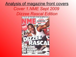
  • 1. Analysis of magazine front covers Cover 1.NME Sept 2009 Dizzee Rascal Edition
  • 2. FRONT COVER ANALYSIS THE MASTHEAD THE HEADER… These are used to “talk” to the audience from the cover of the magazine. They sometimes advertise or interest you of things to make you read the magazine. THE SELL LINES/COVER LINES THE MAIN IMAGE …. THE MAIN COVER LINE Barcode-date/issue/price THE FOOTER USE OF A PULL QUOTE BACKGROUND USE OF A FLASHER-(offering something extra to T.A) RULE OF THIRDS/THE LEFT THIRD The masthead is ‘NME’ which is made to sound like “Enemy”. This reflects the genre of music it represents and allows the audience to easily identify that genre ‘ Autumn Tour Special’ is in bold which makes this stand out and draws attention to the reader. It shows the reader what in the magazine without them having to open it. Main image is of a popular ‘Grime/Hip-Hop’ artist in a candid angle and reflects unique music. His attitude reflects his views towards music as a whole. The footer shows other artists who are featured in the magazine so straight away the audience know what type of magazine it is. This appeals to the target audience and gives them an incentive to buy the magazine. It is made to stand out, so it has a shaped background and is apart from over text, such as cover lines. The graffiti background can be made to connote the artistic style of music which the artist creates. On the other hand it could insinuate the style of music goes against the rules and is controversial. The pull quote gives an insight to magazine article and a taster of what can be expected. This is made to draw in the audience as it makes them want to read on to find out what it’s actually about. The rule of thirds is used well in this magazine, it has all the main areas and aspects of the magazine in each third, which is where the audience will look first, therefore they will read on. The barcode holds vital information for marketing so this must be displayed. It is in the corner so it is out of the way but can be easily found. This is the main focus point for the reader, it is big and bold and simply states the Artists’ name so if a fan was walking past they would pick it up as it stands out.
  • 3. NME Target Audience
  • 4.
  • 5. Typical Artists featured by NME http://www.nme.com/magazine
  • 6. Analysis of magazine front covers VIBE Beyonce Edition
  • 7. FRONT COVER ANALYSIS Masthead The Masthead is big, red and bold, it is – along with the cover artist – the first thing the audience would identify. It is rarely in front of the Artist, which highlights it can be easily recognised without trying too hard to stand out. Background The background is very simplistic, this is to make the foreground (Image) the main focus point. It adds to the mise-en-scene as the bottom half is tiles you would expect in a bathroom and helps to portray the shower type of wet look the photographer and cover designer are trying to present. Header The header matches the colour scheme of the magazine and is right at the top of the magazine, featuring popular Artists inside so the audience can easily see if the magazine relates to them. Sell/Cover Lines These are there to entice the audience, the “sexy” language used matches the picture, and because of this the audience might be tempted to read on. “Beyonce Strips Down” is in bigger font to stand out and make the audience pick up the magazine to see what it’s about. Rule of Thirds This magazine complies with the rule of thirds, there are cover lines on each of the left and right third and the picture is set just off-set from the middle. This is the first place the audience will look so important information is put there. Website This magazine has inputted their web address to promote the fact they can find out information about the magazine online as well as just purchasing the hard copy magazine. Barcode The barcode is in the corner so it is out of the way, and not the main focus point of the magazine. It shows the date and issue number of the magazine for the reader to easily identify each issue. Main Image The main image is in the foreground and is dominant, which is the main focus point of the magazine. It is a recognised Music Artist, of the genre which represents the magazine. She is wearing seductive clothes to entice the audience.
  • 8. Analysis of magazine front covers XXL
  • 9. FRONT COVER ANALYSIS Masthead Cover/Sell Lines Main Image Background Footer Barcode Rule of Thirds The masthead is bold and stands out without having to dominate the magazine. It has a striking red colour to be easily identified by their target audience. The main image dominates the magazine, and has the featured artist not making eye contact with the camera, which is rare. This is because the artist is so easily recognisable and the main focus is on the hand gestures. The main cover line features the cover artists name, most other sell lines highlight other artists of the genre so the audience can easily identify who is in the magazine. The colour of sell lines is either white or black, these colours stand out good on the background. The footer also highlights names of recognisable artists featured in the magazine. They are in white as this contracts nicely against the black background they’re on. It also has a semi-flasher where it says ‘Plus’ to indicate the readers are getting something extra. The barcode is in the corner so it is out of the way, and not the main focus point of the magazine. It shows the date and issue number of the magazine for the reader to easily identify each issue. The background colour is a faded yellow colour which contrasts well with the black and white font on it. The subtle yellow reflects the target audience and makes it easily recognisable for which target audience it is for. The rule of thirds is used very well throughout the cover of this magazine. The sell lines all feature within the side thirds of the magazines while the main image dominates the middle third. This is very tactical and ensures the audience recognise the key points and that they stand out.