
Recommandé
Contenu connexe
Tendances
Tendances (20)
En vedette
Similaire à Excel Graphs Charts
Similaire à Excel Graphs Charts (20)
Plus de simply_coool
Plus de simply_coool (20)
Dernier
Dernier (20)
Excel Graphs Charts
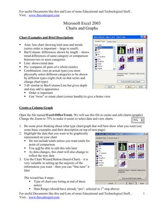
- 1. For useful Documents like this and Lots of more Educational and Technological Stuff... Visit... www.thecodexpert.com Microsoft Excel 2003 Charts and Graphs Chart Examples and Brief Descriptions Area: line chart showing total area and trends (series order is important – large to small) Bar/Column: differences shown by length – shows trend differences of same category or comparison between two or more categories Line: shows trend data Pie: compares all parts of a whole (totals) Combination: (not an actual type) you must physically select different categories to be shown by different types (right click on that series and change chart type) 3-D: similar to Bar/Column/Line but gives depth and may add to appearance Order is important Can “twist” or rotate chart (corner handle) to give a better view Create a Column Graph Open the file named Excel-OfficeTreats. We will use this file to create and edit charts (graphs). Change the Zoom to 75% to make it easier to select data and view charts. 1. Do some prior thinking about what type chart/graph that will best show what you want (see some basic examples and their description on top of next page) 2. Highlight the data that you want to be graphically represented on your chart Do not include totals unless you want totals for point of comparison You will be able to edit this info later As data changes, this chart will also change to reflect the new data 3. Use the Chart Wizard Button (Insert-Chart) – it is very valuable in setting up the majority of the information you want – then you can “fine-tune” it later The wizard has 4 steps: Type of chart (see listing at end of these notes) Data Range (should have already “pre”- selected in 1st step above) For useful Documents like this and Lots of more Educational and Technological Stuff... 1 Visit... www.thecodexpert.com
- 2. For useful Documents like this and Lots of more Educational and Technological Stuff... Visit... www.thecodexpert.com Add Title and Axis labels (X is horizontal, Y is vertical for 2-D graphs) Choose where you want the graph (same sheet or its own sheet) 4. Select the Range A5 to G9. (Do not include the totals.) 5. Click the Chart Wizard button. 6. A dialog box will appear. Make sure that the Chart type says Column, and the Chart sub- type is Clustered column with 3-D visual effect. (Middle Left). 7. Use the push button to preview your chart. Click Next. 8. Verify the Data range in Step 2 of 4 of the Chart Wizard. Click Next. 9. Step 3 of 4 will allow you to add a Chart Title and Axis labels. 10. Type Treats by Month in the Chart Title box. 11. Type the X axis label (for horizontal info. Note that is the labels of the data columns. (See example for axis labels.) 12. Type the Z axis label (for vertical info. Note that is the labels of the data rows. (See example for axis labels.) Notice the preview window as you type your titles. (NOTE: Y is used for depth) 13. Click Next when finished. 14. No changes are necessary on the next screen (4 of 4). Click Finish. Move the Chart: The chart will be placed in your worksheet. Notice the handles for sizing and moving. Click anywhere in the white area of the chart and drag to cell A12. Change the Background: Right click anywhere on the chart and then click Format Chart Area. Click Custom in the Borders field. Then choose Red in the Colors field. Click Shadow and Rounded Corners. (Notice the sample in the lower right corner.) Click OK. For useful Documents like this and Lots of more Educational and Technological Stuff... 2 Visit... www.thecodexpert.com
- 3. For useful Documents like this and Lots of more Educational and Technological Stuff... Visit... www.thecodexpert.com Click on any cell outside of the chart to deselect the chart. Remember to use Undo if you don't like the results! For useful Documents like this and Lots of more Educational and Technological Stuff... 3 Visit... www.thecodexpert.com
- 4. For useful Documents like this and Lots of more Educational and Technological Stuff... Visit... www.thecodexpert.com Resize: Hold down shift key while stretching bottom right corner “handle” to keep from distorting the proportions Formatting Individual Parts of Your Graph: Bring up Chart Toolbar – VIEW Toolbars Chart (or Click within the chart) (or Right click on the toolbars and select Chart.) Toolbar buttons: Format, Chart Type, Legend, Data Table, By Row, By Column, Angle Text Downward, Angle Text Upward Formatting Individual parts of your graph – select the part from the Chart Objects drop-down then click on the Format button (1st button to the right of the Object drop-down) Category Axis (“x”axis) – Pattern (tick marks), Scale, Font, Number/Text Format, and Alignment Chart Area – Patterns, Font Legend – Patterns, Font, Placement Plot Area- Patterns Value Axis (“y”axis) – Pattern (tick marks), Scale, Font, Number/Text Format, Alignment Value Axis (“y”) Major Gridlines – Patterns, Series – Patterns, Axis (separate axis), Y-Error Bars (amount), Data Labels, Series Order, Options (overlap, gap width) Drawing: VIEW Toolbars Drawing Add other drawing features to existing chart (shapes, text, etc) NOTE: You may also click on the area of the chart that you wish to change and go to the format button. LET’S SELECT VALUES AND CLICK ICONS Changing Chart Types: Chart Type, Legend, Data Table, By Row, and By Column can be clicked/un-clicked at any time Type – was selected during wizard (highly recommended) but can be altered by clicking on small drop-down arrow to the right of the Chart Type button. You may also click on the chart and click the chart wizard icon to select a new type. Legend – toggles back-and-forth showing/not-showing the legend in the graph Data Table – toggles back-and-forth showing/not-showing the data table within the graph By Row/By Column – allows you to change which header is on which axis – select one or the other (can be toggled at any time) Format, Angle Text Downward/Upward are used to format individual parts of the chart (see below) For useful Documents like this and Lots of more Educational and Technological Stuff... 4 Visit... www.thecodexpert.com
- 5. For useful Documents like this and Lots of more Educational and Technological Stuff... Visit... www.thecodexpert.com For useful Documents like this and Lots of more Educational and Technological Stuff... 5 Visit... www.thecodexpert.com
- 6. For useful Documents like this and Lots of more Educational and Technological Stuff... Visit... www.thecodexpert.com Printing: Click on any empty cell outside of chart FILE Page Setup – make any necessary changes If you just want the chart, click on it and then FILE Print Connecting Charts to Word: Linking vs. Embedding in Word Embedding: Places a copy into Word that will not change regardless of any subsequent changes you make to he original Excel Worksheet Linking: Allows Word to reflect any changes made to original Excel Worksheet. Choosing to link creates a “path” to the source file – if you change the name of the source file or move it to another location the link/path will be broken. Copying the Graph Click on the graph and choose copy Open Word document you want to paste into Embed: EDIT PASTE Link: EDIT PASTE SPECIAL *Must have Link box checked Click File, then Close. You do not need to save your changes. Create a Pie Chart for One Data Range: 1. Open Excel-Sales 2. Select the range A4 to A8. Now, press and hold the Ctrl key and then select the second range - H4 to H8. 3. Click the Chart Wizard button. 4. Change the Chart type to Pie, and select the Pie with 3D visual effect from the upper middle. 5. Click Next. 6. Verify the range in Step 2 of 4 of the Chart Wizard. Click Next. 7. Type Total Pizza Sales by Flavor for a Chart Title, then click Next. 8. On the next screen, click Finish. 9. The chart will be added to your worksheet. Notice the handles for sizing. 10. Click anywhere in the white area of the chart and drag the new Pie chart to a location just below your Column Chart. 11. Click anywhere off the chart to deselect. 12. Click Print Preview to see how the Charts will look in your document. 13. Click the Close button to exit Print Preview. Click File, then Close. You do not need to save your changes. For useful Documents like this and Lots of more Educational and Technological Stuff... 6 Visit... www.thecodexpert.com
- 7. For useful Documents like this and Lots of more Educational and Technological Stuff... Visit... www.thecodexpert.com Create an Organization Chart You can use the diagramming tool on the Drawing toolbar to create an organization chart to illustrate hierarchical relationships, such as department managers and employees within a company. (This works both in Word and Excel) Click on the Insert diagram or org chart icon. Insert the desired chart, and simply click on the boxes to enter the text. Insert Shapes: Click on the desired box, and add Subordinates, Co-workers, and Assistants Layout: Allows for formatting justification (left, right, etc) Select: Select a level or a branch, etc, and make changes (such as size or font) that are applied to all. AutoFormat: Allows for several formatting schemes. Zoom: Changes appearance for ease of use. When you add or change an organization chart, the organization chart appears with drawing space around it, outlined by a non-printing border and sizing handles. You can size the organization chart by using sizing commands to make the drawing area larger so you have more room to work, or you can get rid of extra space by fitting the border more closely to the diagram. Format the entire organization with preset styles; or, format pieces of it like you format shapes— add color and text, change line weight and style, and add fills, textures, and backgrounds. Add shapes— such as manager (superior), employee (subordinate), assistant, or coworker— or change branch layout options with the Organization Chart toolbar, which appears when you insert or select the diagram. 1. On the Drawing toolbar, click Diagram or Organizational Chart 2. Click the Organization Chart diagram, and then click OK. 3. Do one or more of the following: If you want to add text to a shape, right-click the shape, click Edit Text, and type the text. Text cannot be added to lines or connectors in organization charts. If you want to add a shape, select the shape you want to add the new shape under or next to, click the arrow on the Insert Shape button on the Organization Chart toolbar, and then click one or more of the following: NOTE: You must uncheck “Auto Format” to change the format of a level or branch. For useful Documents like this and Lots of more Educational and Technological Stuff... 7 Visit... www.thecodexpert.com
- 8. For useful Documents like this and Lots of more Educational and Technological Stuff... Visit... www.thecodexpert.com Coworker— to place the shape next to the selected shape and connect it to the same superior shape. Subordinate— to place the new shape below and connect it to the selected shape. Assistant— to place the new shape below the selected shape with an elbow connector. If you want to add a preset design scheme, click AutoFormat on the Organization Chart toolbar, and select a style from the Organization Chart Style Gallery. 4. Click outside the drawing when you are finished. Create a Flowchart Create a work flowchart by assembling various shapes and connectors. Some templates are available through the Help feature. (This works both in Word and Excel) Move a shape Select the shape and when the pointer becomes a four-headed arrow, drag it to a new location. Note The locked connectors attached to the shape move with the shape. To unlock a connector, select the connector and the connection point and drag it off the shape. Add or delete a shape On the Drawing toolbar, click AutoShapes, point to Flowchart, and then click the shape you want. Click where you want to insert the flowchart shape. Note If you want to delete a shape, select the shape and press DELETE. Change the color of a line or connector Select the line or connector you want to change. On the Drawing toolbar, click the arrow next to Line Color. Do one of the following: To change to the default color, click Automatic. To change to another color, click one of the colors below Automatic. Change the style of a line or connector Select the line or connector you want to change. On the Drawing toolbar, click Line Style. Click the style you want; or click More Lines, and then click a style. Add or delete a connector On the Drawing toolbar, click AutoShapes, point to Connectors, and then click the connector line you want. Point to where you want to lock the connector. Connection sites appear as blue circles as you pass the pointer over a shape. Click the first connection site you want, point to the other shape, and then click the second connection site. Locked or attached connectors will keep the shapes connected even when you move the shapes. For useful Documents like this and Lots of more Educational and Technological Stuff... 8 Visit... www.thecodexpert.com
- 9. For useful Documents like this and Lots of more Educational and Technological Stuff... Visit... www.thecodexpert.com Locked connector Unlocked connector Note To delete a connector, select the connector and press DELETE. Move a connector Do one of the following: Reroute a connector to the closest points between shapes Select one of the connected shapes. On the Drawing toolbar, click Draw, and then click Reroute Connectors. If more than one connector line is attached to an object and you don't want to reroute all the lines, select only the ones you want to reroute, and then click Reroute Connectors. Move a connector Do one or both of the following: To move the connector line, drag one of its ends and connect it to another site or shape. To override the automatic locking of the end, hold down ALT as you drag the end. You can place the end wherever you want on the object, but the end will not be connected. To detach the entire line, drag its middle. Note If the connector line has a yellow “adjustment handle”, dragging the handle will change the shape of the connector line but not detach it. Hold it all together 1. Hold the shift key down and click on each of the objects in the group. 2. Let go of shift key 3. Right click anywhere on objects 4. Click Grouping Group For useful Documents like this and Lots of more Educational and Technological Stuff... 9 Visit... www.thecodexpert.com
- 10. For useful Documents like this and Lots of more Educational and Technological Stuff... Visit... www.thecodexpert.com For useful Documents like this and Lots of more Educational and Technological Stuff... Visit... www.thecodexpert.com For useful Documents like this and Lots of more Educational and Technological Stuff... 10 Visit... www.thecodexpert.com